
Photo from Vecteezy
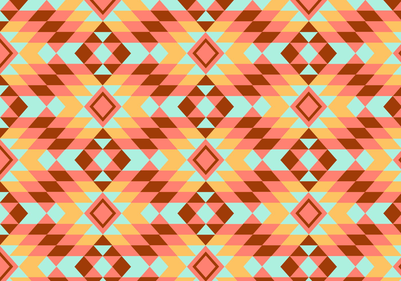
This pattern is comprised of four different colors, red, pink, orange and blue. All of these colors are heavy in their saturation but appear light due to the hue change adding more white to their bases. This whole pattern feels quite warm with primary colors in it being naturally warm while the blue is very light and feels warmer with the intense red directly next to it. In a very similar fashion the red and light blue amplify the presence of both with such a strong level of contrast between the two. In this color pallet the colors are mostly complimentary with the orange and red being more of an analogous set. The light blue compliments the rest of the colors chosen for this pattern giving a good contrast in values compared to the rest of the colors chosen. Due to the pattern covering the whole image there appears to be no negative space in this design. While the whole space is used it makes the positive space less intense then say a black box surround by a white plane. There are several points in this pattern, the light red triangles with a smaller red triangle inside make some points; when used with the other triangles in red vertical lines can be formed as well.
