Weekly Blog: Show and Tell: Jennifer Engelke

Weekly Comic 14 composed on Adobe Illustrator by Jennifer Engelke.

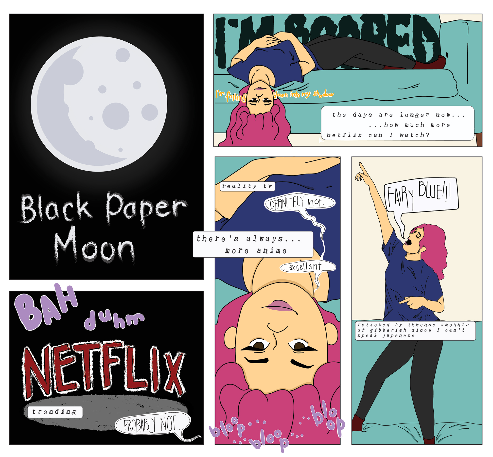
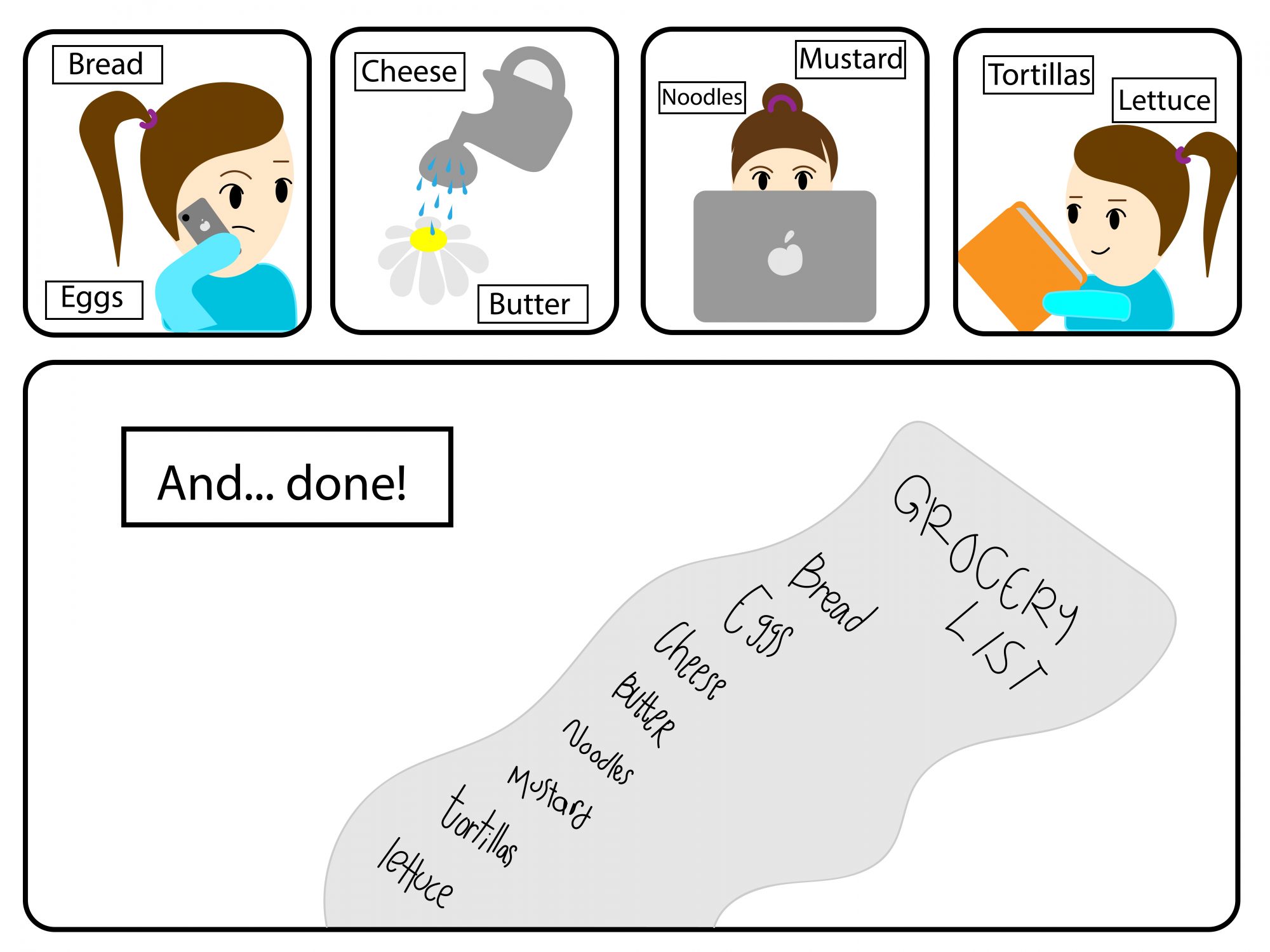
I chose to make a comic this week that displayed the interdependent word-picture combinations concept of parallel. Parallel is when “words and pictures seem to follow very different courses” according to Scott McCloud. I showed this in my first 4 frames when the girl is doing everyday tasks: talking on the phone, watering her plants, browsing the web, and reading a book. The words surrounding her do not fit the theme of the panel which might confuse the reader at first but then they realize by the end that the girl was just composing her grocery list in her head throughout the story. I used a lot of the paintbrush tool in Illustrator for this weekly comic. While it was an easy way to create the shapes I wanted, it was also a very easy tool to write letters with. I used the paintbrush tool in the final frame and wrote out the grocery list for the girl. I like how this gives the girl more personality. The reader of my comic would not automatically think that it is my writing but it is the girl’s, allowing them to sympathize and realize that this character (even though she really isn’t) is human. In addition to this, I also believe I have covered the concept of closure in my weekly work. I allowed the reader to understand that in between panels there is time occurring and that this comic takes place over the course of the girl’s day. Each panel is a new activity in the girl’s day and the reader must visualize that there were steps the girl took in-between to get to where she is in the next panel. I am very pleased with the work I have created this week. I find my story to be relatable, and hopefully, my readers can also relate. I believe that I have incorporated this week’s reading concepts and past concepts into my work.

Posted in 201 Blog, Sample Posts by Students, Show and Tell | Leave a comment

Weekly Blog: Show and Tell: Daylon Hicks

My comic this week shows the plan of a riding a wave between two brothers. Although you can not see the two brothers, it is clear that they speaking to each other through the text bubbles. One of the things you may notice throughout the comic is how the red and purple text bubbles rotate each time. The purpose of this was to broadcast how they focusing on everything else except for the main wave. It is shown as in the end, the moon is out and the other brother says, “We done enough today.” Another thing that I wanted to broadcast is the squiggly lines on the bottom. They crossed the line to show how the bottom half can represent the waves dying out. The brother with the red text was eager to ride the huge wave even though the waves would die out quickly.

For this comic, I wanted to focus on the drawing, but also on the storytelling. The drawing of the waves are too great, but you can tell there are waves because of the squiggly lines which are supposed to represent the water and the brother’s conversation which mainly talks about the waves. For my storytelling, I decided to focus on the end when the brother said that they done enough. This might cause readers to raise the question on why they didn’t ride the wave even though it was there the whole time.

I also thought of Scott McCloud’s idea of interdependent. All on page 155 shows conversation between people, but the people talking may not be featured or they talk about another topic that may be in front of them. For example, on page 155, shows a man who looks raggedy and dirty while another person asks, “I ask you, does this guy look like a C.E.O. to you??” I decided to use that same idea but rather it is about two brothers and the topic is about the wave that is in front of them.

Posted in 201 Blog, Show and Tell | Leave a comment

Weekly Blog: Show and Tell: Shira Feinberg

Created by Shira Feinberg

My comic this week looks takes a look into the stars and the beauty of the universe through the lens of two people. Although we do not see the people, we can see their conversation between one another. This is seen through both the speech bubbles and the written word constellation in the sky. This an illustration of montage as the words are integrated into parts of the picture; the constellation makes up the words “Look at all the stars.” Some other word-picture combinations which are seen in my comic are duo-specific and picture specific. In the first cell, we see a bit of picture specific combination with “WOW” illustrating how gorgeous the night sky is, behind the mountains. Duo-specific word-picture combination is seen as the words tell the identical story of those of the picture.

              For this comic, I decided to focus more on using the shape tool to create the mountain along with making the stars using the polygon shape. Another shape I used was the line, to make the shooting star. I also made the text bubble through the shape tool, using the polygon (3 sided) and an oval. Other tools that I used, included the text tool and the gradient tool. These allowed me to create the text in the text bubble, the text in the sky, and the night sky. Overall, I noticed that these tools were fairly easy to use or at least compared to the pen tool, which took me a long time to get the hang of.

              This comic uses a lot of moment to moment, with the stars beginning to come out in the night sky, seeing the Milky Way come out, and the shooting star entering the image. As per time frame, there is one location in which this is seen, and time is questioned. That is the first three frames in the second line, where the image of the mountain with the Milky Way is split up into three frames. This may take the reader a second to realize that it is one image rather than a story that goes either down or right.

Posted in 201 Blog, Sample Posts by Students, Show and Tell | Leave a comment

Weekly Blog: Show and Tell: Anthony Sanchez

See yaa later Quarantine by Anthony Sanchez
  1. My comics uses interdependent word picture combinations by using a duo specific comic style. With this comic I believe I captured the style well because both the comic and the word combination show the exact same meaning. And made the comic to were everything flows together well. 
  2. With my comic you can say that I used picture specific comic style because the words purpose isn’t as big as the comic itself. But my intentions were more for the duo specific comic style. But if I had to see it in another style it could fit under that style of comics. 
  3. With tools and techniques, I used my iPad to create my comic. With this I decide to use different brushes that I had on the program to capture different aspects. For example, I used color and exaggerated the line types on the main focus of the comic. As well with the words I made it bold to share spotlight alongside the drawing. 
  4. With the other observations that I learned were more digital then that of materialistic. I learned certain tools of sending some stuff to the back of the project with the app’s functions. As well how to use mask layers with this app, which is similar to what we learned in class. 
  5.  With the closure that I have going on here it’s more of a subject to subject. Although my comic is a single comic, I could have made it to a two-part comic to better have shown this type of style. 
  6. With this comic I do work inventively with the comic. For example, based on things that I’ve seen before I create the comic that I think fits the prompt. So, with this I wanted it to be more of a joke about how I feel about once the quarantine is over with. 
Posted in Uncategorized | Leave a comment

Weekly Blog: Show and Tell: Jasper Contreras

Weekly Comic by Jasper Contreras created in Adobe Illustrator

Similar to last weeks comic, with all the quarantine and social distancing, I’ve found more time being alone than I’m used to. This sparked another comic of me continuously watching more anime since streaming services is about all the entertainment I’m getting now. 

For the most part, in general, it’s pretty interdependent because without the words it doesn’t mean exactly thee same thing. It could still give off the effect that someone is bored and finds a way to be entertained, but it’s the details that really specify what and how of these moments. In addition to the interdependence of the word-picture combination, I used picture-specific and additive combinations. 

I used a few combinations of word-picture combination, mostly just by assessing the general tone I had and experimenting with the panels themselves. A lot of the words used were picture-specific instances, only belonging to their respective frames, otherwise it wouldn’t make as much sense. As far as additive combinations go, I decided that it would be fun to try and make sound effects to amplify the actions happening in or out of the panels. For instance, I tried to make the sounds of Netflix opening and the sound it makes when you go through the different shows and movies. 

I created this similarly to last weeks, mostly using the paintbrush tool for line work, the blob brush for the actual coloring, and then the shape maker for the panels. Most of the words I wrote by hand exception for a couple of the captions I typed out. Although, this time I used more color than I had previously. Last weeks formation was more muted colors and then black and white, this time I tried to use more vibrant colors and just a lot more color in general. 

I did try using the pencil tool at some point because it has less of a “smoothing” effect that the paintbrush tool has and decided that wasn’t what I wanted. I’ve become even more comfortable using the drawing tools versus the shape creators, which was where most of my knowledge was in this program. 

Posted in 201 Blog, Sample Posts by Students, Show and Tell | Leave a comment

Weekly Blog: Show and Tell: Rachel Fox

Rachel Fox April, 2020

This week’s comic was made in adobe illustrator, with the idea that the words and pictures used in the comic are interdependent on each other. I chose to write my comic about how a lazy quarantine has made me in comparison to the life of my cat. I chose this idea based on real life events of how lazy I have become and how bad my cat wants me to leave the house again. 

The words and images are interdependent on each other in the aspect that if you did not see the cat speaking or licking its paw in one of the panels you would think there is a very gross and lazy human not just a normal feline. The only panels that are mostly word dependent are the last two because it refers to the cat and there is no action occurring not being described by the words. 

In illustrator the main tools that I used were the shape tool to create the larger colored images and the curvature tool to make the shapes more unique and less uniform. The pen tool was used to create the detailed lines in my character’s face, as well as the cat’s whiskers, claws, and teeth. Every time I use the tools in illustrator I get more familiar with them and learn something new so it becomes easier to use. This time I learned more of the keyboard commands so I could select all my shapes and duplicate them without having to frequently click around the tool bar. 

The time frame that this comic works in is fairly short, Where there is a quick back and forth between the human and the cat and in the gutter at one point my human character takes a shower so in the last panel there is no stink lines and messy hair from just waking up.

Posted in 201 Blog, Show and Tell | Leave a comment

Weekly Blog: Show and Tell: Devon Anderson

My Comic is interdependent because if you were to separate the words from the picture you would not be able to come to the same conclusion. The image depicts a star in the sky, and unfortunately my painting skills are not amazing so the reader could believe that a child has painted a canvas and stuck a star in the middle. If you read the wording you know that the star aids in navigation however, because you do not know if the star is in the sky, the star could be some kind of item. I would categorize my comic as Duo-Specific. I do not believe that either the picture or words weigh more than the other, both depict the same idea. 

I used the text tool to express the verbiage. That said, I believe that changing the font helped to give the feeling of magic. If the text had stayed original the effect would not push through. I used the star tool while holding the shift key to make the star not deform while resizing. I also changed the opacity so that the star would not stick out like a sore thumb. I used the line and square tools to create the outer box and separation between word and pictures. The most exciting tool I used was the painting tool, I played around with different texture strokes and decided on one that had a soft edge to show a mixture of colors while trying to recreate the sky, this stroke is called feather. After painting I rearranged the strokes so that no feathered color would pass over the border. I also added an extra border as the top layer so that it would look crisp and clean.

In this comic I did not utilize the idea of closure, you can see no actions or difference in time.

Posted in 201 Blog, Show and Tell | Leave a comment

Weekly Blog: Show and Tell: Kirk Brown

For this weeks blog I made a comic with a much different theme than last week. Previously, I created a comic that made use of time frames. This week I decided to make a murder comic. I wanted to leave a lot of the interpretation of the comic to the reader. The parts of the comic that cannot be debated is that the two characters have a love conflict. It begins with the man giving his lover a rose. She’s sniffling with a very serious look in her face. We can tell she doesn’t appreciate the gesture by the man. Are they married? Is this the last straw? What is their past? Once again, this comic was created so YOU will create your own interpretation. Regardless, the woman pulls out a pistol and opens fire. In a moment of reconciliation she wipes off a tear and fires another shot. I wanted to create an action-to-action scene in these panels. The gunshots are interdependent on the “BANG” words that I drew. I would consider this comic duo-specific as Scott McCloud had explained to us this week. Much of the text goes hand-in-hand with the actions and illustrations.

Kirk Brown 2020 DTC 201

The comic ends with the woman repeating the phrase “I never loved you..,” for a third time. I wanted to express the insanity it takes for a person to kill one they once loved. The relationship drove this girl insane, which is why I ended it with her giving an eerie smile in a mirror as she repeats herself. I was inspired by the ending of the award-winning movie Sunset Boulevard when Norma Desmond greets the press with a smile after murdering her boyfriend. I used markers instead of colored pencils this week. The actual art I believe improved a lot. Much of the imagery takes on the style of great pop culture artist Roy Lichtenstein. I wanted create a 1950’s setting.

Posted in 201 Blog, Show and Tell | Leave a comment

Weekly Blog: Show & Tell: Haydyn Wallender Edition

Hello friends! I hope that everyone is managing their work load okay with TWO WEEKS left in the semester. Remember to take breaks, drink some water and call a loved one or two.

For this week’s blog, I decided to continue with the nature theme in Oregon that I posted about last week, and do something related to a quarantine guide, because that’s all I seem to be writing about for The Daily Evergreen. So, without further ado, here is a breakdown of my “Show and Tell” comic.

Scott McCloud’s definition of interdependent word-picture combinations is as follows: “…where words and pictures go hand in hand to convey an idea that neither could do alone” (pg. 155). I believe my comic is an example of this because I chose to incorporate pictures from my personal life that have meaning to me. Other people who didn’t grow up in Oregon, or even in Eastern Oregon for that matter, might not have any idea what a mud pit is, or why it’s so gosh-darn fun to play in as a child. Other people might not have experienced fishing or farmland adventures like I have, so looking at these pictures out of context with no idea of where they were taken or who is in them doesn’t get the full effect across to my audience that I would hope. With these captions, however, I think (and hope) that it becomes more clear. Hence why my comic is interdependent – one cannot be without the other.

Quarantine Survival Guide. Created by Haydyn Wallender, Spring 2020.

I also feel that I leaned more towards McCloud’s definition of “duo-specific” (“…in which both words and pictures send essentially the same message” (on pg. 153)) and “additive” (“…where words amplify or elaborate on an image or vice versa” (on pg. 154)). The pictures that I chose convey the suggestions I have in the “quarantine guide”, however, the words also elaborate on more than what is shown in the picture, falling under both categories of these definitions.

As with last week’s blog post, I chose to use the “insert shape” tool for my stick figure girl to represent myself, as well as for the speech bubbles. Twice I used the “pencil tool”, and that was for the arms of my girl at the end of the comic. (I LOVE THAT TOOL). The color panel was also incorporated, but this time for more solid, basic colors rather than multiple colors for different things like last week. This comic to me had a more aesthetic vibe – the colors are similar and the text, like a typewriter, pairs well with the timeline of when these pictures were taken (in the early 2000’s). By using these basic shapes, it gave the comic a more childish appeal, which was what I was going for with parents, and the pictures gave a sense of truth to what I had written. Overall, I was much more pleased with how this one turned out in regards to layout and color than I was with the previous one.

The only observations that I really have about these tools and how I created this comic digitally is that it’s been a lot harder than I thought learning new skills on software. I am not a techy person in general, but I think I finally am starting to get the hang of some of these skills that are no doubt important in the future.

Posted in 201 Blog, Show and Tell | Leave a comment

Blog #5 – Northwest Alternative Comics

The example that I saw at  the WSU Museum Collection Study Center was the art piece named Dirtbag by Eroyn Franklin. The work that shows elements and principle of design is multiple of colors. The direction featured is horizontal as the lines of the houses shows direction going upward. The texture shape is rough because of the different color palettes shown with blue and the fire. The elements and principles I have chosen to write about affect my interpretation of the comic because it shows how impactful the comic is even with simple colors with the white, blue, and the orange. A example of closure in this comic is how the family is full of the color orange and how the rest of the art is blue.

Posted in 201 Blog, Northwest Alternative Comics | Leave a comment