Putting It All Together: Haydyn Wallender

Hi, friends! Can you believe that this is the last blog post of the semester?! I know I can’t. It’s craziness.

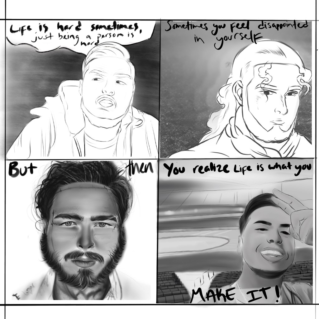
For my last blog post, I took what Scott McCloud said to heart, (literally), when he said (wrote, really), that “no other human being can ever know what it’s like to be you from the inside” (pg. 194), and created a comic to express that. (Yes, I know that was the prompt, but sheesh, I wanted it to be mysterious). I wanted to take the idea of individuality very seriously and literally, because of some personal reasons.

For years I was known as the “perfectionist”, the “smart girl” or whatever label people wanted to slap over my identity. I had a hard time fitting in and truly knowing who I was, because people were often defining me and what they thought I was. I’m sure many people can relate to that. Many people can also relate to the fact that you can present something on the outside, and it is NOTHING like what is actually occurring on the inside.

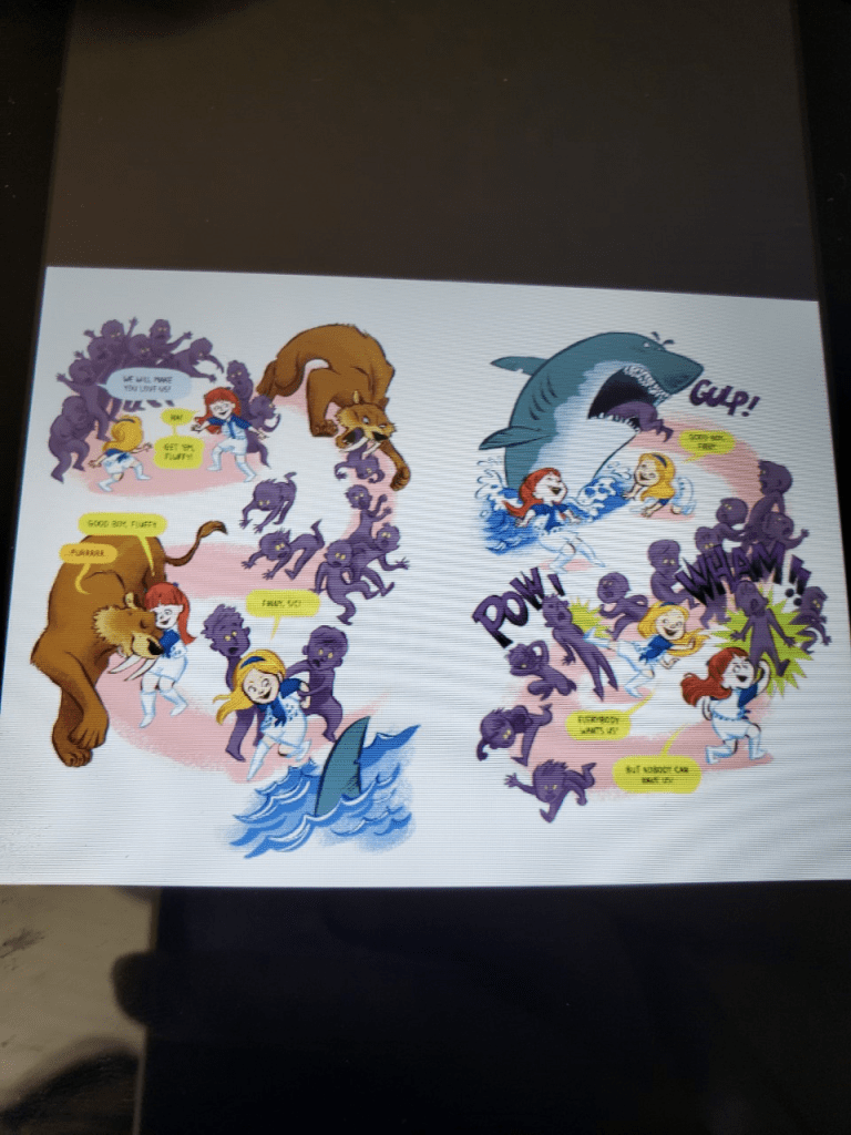
I wanted this comic to express that feeling. So I chose to focus on the main things that I have been battling this semester. That was the inspiration behind the idea/purpose: I wanted my internal parts that no one sees to be just as prominent as the parts of self that people do see. The content was based off of this, as I mentioned earlier: the things that I have been battling this semester; the things you can’t see.

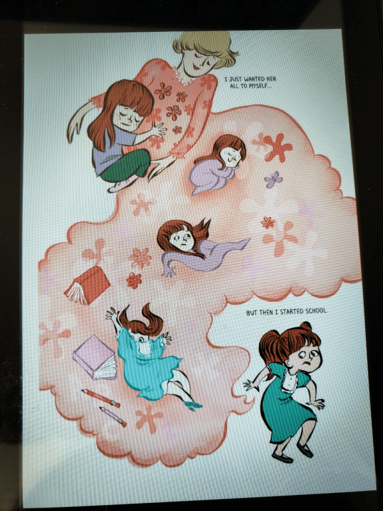
Outer vs. Inner Appearances. Created by Haydyn Wallender, Spring 2020.

The form was a comic, but a different structure than before for me. I chose to really play with different frame sizes, the line stroke of the boxes, and the colors of the comic. Each specific internal piece of me is linked to a pattern that I felt would express that part of me. The boxes are, in a way, meant to be reflections, or mirrors, to show the two different aspects of a person at once. You can read the middle panels in a specific or very vague way; I wanted the experience to be up for interpretation and not be so “black and white” like my other comics have been.

The idiom and genre of work was based off of a memoir I have been writing for another class this semester. In that piece of writing, I focus a lot on the abstract parts of self I show here, but in a more flowing, loopy sort of way, where there isn’t a definite conclusion. Internal conflicts and trauma can’t really come to a definite conclusion in my mind, but I reached a conclusion with art that was different than with my writing, so I thought that contrast would be interesting to display.

This leads to the structure of my comic, which I would argue is interdependent as well as additive. The words of my comic amplify the little girl’s thoughts, which are my thoughts, reflected in her world. If the phrases weren’t there, the comic would not only be difficult to understand, but readers would only see a surface level, when there is more there to decipher. As for the interdependent part of the comic, what she is experiencing as a cartoon is similar to what I go through internally and externally, and the words that I chose to write go hand in hand with the images to convey a deeper meaning and idea that the images couldn’t do alone.

The craft of the comic was simple enough: I doodled my idea while Kristin was discussing the new project during the recorded lecture, and then decided how I wanted to set up the panels, how I wanted the color schemes to go, what size and kind of font, and how I wanted the comic to be portrayed to readers. The surface, or the finishing touches, were spacing of letters in the “depression” panel, as well as the perfecting of aligning shapes and colors and making sure that things were easy to read. I also went back and did the “create outlines” suggestion that Kristin mentioned to ensure my font would be read “accurately”.

Overall, I think this comic had more depth, color and thought put into the creation of this piece than any of my other comics. I loved getting to work with Illustrator (though it was a pain in my butt), and struggle through to make such an accurate comic. This is why I believe that my comic was more ambitious. Though the images and shapes were simple, more detail was put into each frame, and I hope that is evident.

Thank you for reading this post! I hope that you all have a safe, wonderfully well-deserved summer, and do some fun things. I hope to see y’all around in Avery next fall. (:

Posted in 201 Blog, Putting It All Together, Sample Posts by Students | Leave a comment

Putting It All Together: Anthony Sanchez

Shades of Black By Anthony Sanchez

For my final comic and last blog post I really wanted my comic to reflect and express my individuality in a unique way. As a person I’m very calm and mellow. But like everyone else there are times where I question very simple things in life. So, with the comic I thought it would be perfect to show perspective. As I started the comic, I had a set plan were the structure of the comic would be set to where you can see a clear change in perspective between the drawings but the more I drew I realized my individuality can’t be shown by just looking into perspective. But it can be shown in shades of black which is why I title the comic “Shades of Black.” “Shades of Black” means everything to me that help build me to who I am now. Each panel has its own purpose and its own meaning. I wanted the text itself to hold more meaning rather than the pictures.

The comic itself was drawn up on an app called Procreate on my iPad. With each section I had to draw individually to get its own vast amount of details.  So, with the first panel I decided it should be of me. I decided that the background and the foreground should hold equal value. With the background I decided to go with a brush that was similar to dry acrylic brush. I wanted this dark fading affect to represent hardships that I have still yet to face. But with the foreground it’s white because I want to show how calm and pure I am. But still having this like whatever face going on. In the way of form, this “whatever face” is something that I would say show’s a unique characteristic of myself.  Now with the second panel I wanted to show more of my love for anime. This panel doesn’t have as much meaning but its drawn to represent a character who had faced hardships in life but is moving towards a better lifestyle. The panel itself was created with a brush called a studio pen to get the outline of the man, but with the background I used a tool called soft airbrush to get that misty look.

With the third panel I though it be important to show what inspires me to be me. Music is something that has impacted my life positively and it defiantly shows my individuality. Post Malone is someone who’s generally a positive guy but his music at times can show negative feelings which fits perfectly with my theme of “Shades of Black.” Now with this panel I started it of tool called a HB Sketch pencil. I sketch the general outline with it. But I also used a tool called sketch blunt hard fade. Now with that tool it gave hard lines but with a fade towards the end to give of the smooth look. With the final panel it’s another drawing of myself. This panel is to be the polar opposite of the first panel. I wanted to show happiness and that I’m at a peacefully state. The tools used are similar to the ones I used on the previous panel.

With this comic I thought really hard in how to capture the prompt of showing my individuality. I thought the best way would be to go the simple way but as I progressed with the comic, I soon realized that it wasn’t. I realized going out of the norm and being different and showing the different shades of black would be the way to go. So, with this comic I defiantly think I went far beyond the previous two. I put more thought and details into the comic. I wanted it all to have meanings but at the same way capture the prompts that needed to be done.

Posted in 201 Blog, Sample Posts by Students | Leave a comment

Putting It All Together: Korie Cedre

For my final comic, I decided to not only take a bit more time and thought into my comic, but to incorporate a bit of myself as well. The general idea of the comic is someone missing their significant other during social distancing and simply wanting to get away with them, but at last, have to resort to their phone for communication. I used song lyrics from “On Melancholy Hill,” by the Gorillaz, to not only encourage this story in my comic, but to also incorporate my creative writing side. So, before diving into my process of creating this comic, I want to address some of the small yet significant details that can be found in my comic. First, I tried something different with the formatting of my frames in which they do have an order to be read in, but might not be easy to identify. This is my attempt to have the reader participate in which if they are familiar with the text shown throughout the comic, they most likely will be able to understand how to read it. If not, the proper way to read it is from first the top left, bottom left, middle two columns, and then top right, finishing with the bottom right frame. The text is also in a font to make it seem thought-like, or as though she is listening to these words. With this, I attempt to produce an aesthetic response and emotional understanding within my six frame comic.

As mentioned, my idea for this comic is to represent the longing to be with someone, but being prevented from doing so. Many might recognize it due to today’s situation, which is where my idea came from, but essentially it could be equivalent to long distance relationships. Regarding the form in my comic, I do have the frames next to each other but in a certain order so that I could experiment with the pictorial sequence, something I had never tried in previous comics. This can be seen in the middle two frames, an idea inspired by page 115 in Scott McCloud’s graphic novel where he addresses motion across multiple frames. Unfortunately, my art abilities limited me and I could not display motion across multiple frames, though I tried, so I settle with making the background of these two frames look like they could be pieced together into one still frame. However, by not being in the same frame, it helps the reader identify that they are not together in person, but perhaps sharing the same thought or feelings. (I also realize that the boy looks like a turkey, once again due to my limited art abilities).

In terms of Idiom, I struggled, but decided the the triangle can represent the flag on a boat, while the phone can mean long distance communication, which can have an even deeper meaning upon recognizing the purpose of the comic. This then becomes followed with structure in which I use a soft blue to set the comic in a variety of ways, for example the blue creates the setting of the sea, night time, and distance as it can be associated with longing and sadness.

Then the crafting, in which I believe is where my ambition shows the most. I decided to try new tools that I was not too familiar with and find something that seemed interesting or full of room for creativity, then made it work. An example of this can be the opacity bar which I played around with a lot. The background of each frame is filled with a color at a lower capacity to help other pictorial elements stand out. For example, the moon in the first frame is yellow, but the opacity in the reflection is lowered in which, despite being the same color, it shows to be a reflection due to the brightness of the moon. The middle two frames are also full of different levels of opacity as I, for the first time, attempted to create shadowing on the individuals clothing, and to create texture in their hair. I also used layers here the most, creating a few layers of outline before hiding them to show the final product. I also attempted to use the paint brush in these frames, using different sizes and opacity levels to add texture into the overall comic. Finally, the most ambitious decision I made was the order of my frames and making the text small so that the images stand out first rather than the diction. Of course I still used some tools I was familiar with, but tried to use them in a different way than before such as the bolding of the pencil tool to represent vibration rather than sound. This is concluded with surface, in which it appears to readers to be a comic about sailing to sea with a lover, but not being able to.

Comic by Korie Cedre, made on Adobe Illustrator. May 2020.


Posted in 201 Blog, Putting It All Together, Sample Posts by Students | Leave a comment

Putting it All Together: Sophie Dimry

Comic made in Adobe Illustrator by Sophie Dimry

For my final comic I thought about individuality and what makes us individuals. Scott McCloud thought of individuality in the way that “no other human being can ever know what it’s like to be you from the inside,” (McCloud, 194). As individuals we each have a different set of ideals that set us apart from one another. I thought of those ideals as dreams and figured that no other person can know or understand another individuals’ dreams like they can. I took the dream idea in a more physical manner, and thought it would be interesting to physically portray some common dreams or ideas that people have, that I have also had.

The ideas that I had for this assignment are portrayed in comic form, made by Adobe Illustrator. In this comic I have created a short story or portrayal of dreaming, but more in a literal sense rather than figuratively. The comic shows a person sleeping at night with a large thought bubble meant to represent his dream. In his dream, a dream wizard appears and asks him what he would like to dream about this time and below is a set of options. I structured the dream into three different sections or options. The structure differs from the traditional paneled comic because it has more organic shapes. In the set of options are common things people dream about that also represent a deeper meaning that is different for each individual. The first option is a “Save the World” narrative that is represented through a superhero icon. This option is meant to represent the idea that everyone has (figurative) dreams about something or someone that they wish they could save or even to be a hero to someone. It could also be interpreted as becoming a superhero which represents society’s view of the perfect person- something everyone finds themselves wishing for at some point. The next option is the “Become a Millionaire” option which represents the dream that most people have of becoming successful, whether it being financially or in any other aspect of their lives. Finally, the last option is memories. This option represents the memories of the past that people hold on to or regrets about the past people may still have.

For this comic I used Adobe Illustrator for the first time and found it more time consuming than I originally thought it would be. I found it easier to stick to a more simplistic style or idiom, since I do not have much experience. To do this I used the shape tool frequently and chose to draw more stick figure looking characters. For the craft step, I incorporated some factors seen in the typical comic that we learned about in class. I conveyed expression, time, and interdependent word combinations. To convey expression, I mostly did this through the way I chose to draw the faces on the stick figures- mostly the eyebrows. In the first panel, the man is sleeping peacefully with a smile on his face. Then throughout the comic the character is happy in all of his dreams except for the last one, where he appears to be apprehensive. I conveyed a sense of time by showing the night sky in the background window so that the audience understands the character is sleeping at night. Lastly, interdependent word combinations are an aspect of this comic because the words help the reader understand the story and put it into context. Without the words, the images don’t exactly speak for themselves or seem to fit together. Finally for the surface, or production step I used Illustrator and applied different techniques within the program. I mostly played with color, dimension, and contrast. In the first panel the colors are all solid with no contrast or dimension and are dark colors to show it is night time. The rest of the images in the comic are made with lighter colors and have more dimension and layering. The background dream bubble contains many different hues of blues that are all layered. The brush strokes are also different than that of the first panel. The brush strokes are not as solid and opaque as the rest of the images to show a more airy, dreamlike feel. Also, in the last panel or circle the colors are slightly darker and there is less contrast than the rest of the panels. This is done to demonstrate the idea that the image represents a distant memory, which is why there is less detail. In memories we often can not recall all of the details about the setting it took place in, so I tried to convey that in this image by only highlighting a couple of the objects in color.

This weekly comic was much more ambitious than my last comics because I used Illustrator rather than drawing this time. This was my first time using Illustrator so I learned how to use it while making the comic. I found it a lot easier than photoshop and actually enjoyed using it. It was more difficult to convey the exact images I wanted to, but I think the ideas were communicated effectively.

Posted in 201 Blog, Putting It All Together, Sample Posts by Students | Leave a comment

Putting It All Together: Feifan Li

This comic is similar to my previous two comics, and it is a story that happened around me, so I want to make it resonate with everyone. Finally, I was thinking about privacy. I thought of the most important thing in this period of time. The first picture is that I think everyone should learn to buy some supplies for backup. Then remember to bring a mask. This is to protect your own safety. In the two pictures, I chose to call my parents to tell them that they are safe and let them rest assured. Because I am an international student, my parents always worry about going out. I do n’t want them to worry. This is a comfort.

The third picture tells everyone that it is the last week!!! After the end of the semester, it is summer vacation, and you can play casually! I hope everyone can take advantage of the end of the final period to increase their grades. Then in the last picture, I just want to tell everyone that summer is here and summer vacation is here. This comic shows us the things in my life. These things are basically a portrayal of my roommate and my classmates.


Final Weekly Comic by Feifan Li created in Adobe Illustrator

In this task, I chose Illustrator as the main tool. I used the graphics tool, pen, and pencil tool to complete the comic. Although it looks rough, I mixed a lot of my ideas into it. In order to look more friendly, I chose to write each sentence by hand and then used the graphics to construct ice and the sun to describe the changes in time. However, the disadvantage is that it has not deviated from the traditional format, and my comic still needs to be improved. Because this project requires us to have our own personalities, I think the personalities and characteristics of the things I create are realistic, and the distance between each other is shortened through the same experience between people. At the beginning of this project, when I created it, I was thinking about whether to be a sad experience for my friend, because my friend has received a lot of frustration recently, I want to help him encourage him by the way, but he thinks this is not good, so I changed the project The most common story in this epidemic. I constructed the background of the story through a few simple and clear buildings, objects and characters, and resonated through language.

In the end, I think this comic is quite interesting. Although he is not perfect, he is also a step in my success in learning. It’s not pretty and I dare not try it. But now that I have done it many times, I think it ’s okay because every homework brings me new experience and experience. I hope that I will not change this kind of thinking and mood in the future, and I will try my hard work in exchange for achievement, and I am worthy of myself.

Posted in 201 Blog, Putting It All Together | Leave a comment

Graphic Novel Review: Kylie Michael

The graphic novel I chose for this class is Real Friends by Shannon Hale. I have never read a graphic novel before and didn’t know what to choose. I knew that I didn’t like the superhero genres or sci-fi.  I spent some time looking at different graphic novels. Real Friends is about Shannon, a young girl going through school and the struggles of finding real friends. She starts at kindergarten up to high school. She has issues with her older sister and how they relate with each other. I guess I never considered a graphic novel as a novel. I thought it was just a comic book. Reading Real Friends I could relate to the struggles of Shannon and making friends. It brought back memories of me in school and having a best friend one year then the next we weren’t friends anymore. Trying to hang out with the popular girls and feeling like something was wrong with me because I wasn’t the popular girl.  This book is a graphic novel but also touches real life struggles in an entertaining way. I think the artist used iconography through bright colors and showing her as a young girl . Specific concepts from Scott McCloud’s book “Understanding Comics” in chapter 5 “Living in Line” the author uses dark colors, the lettering style, and. faces showing fear. Also the panels have no lines around them. In this picture the girls are creating a story that they are going to write together, the colors of the background change from bright and sunny to dark and gloomy. The girls are wearing winter clothing but in this picture they are wearing capes that are worn and torn.  The girls’ faces change from soft shapes with innocent looks then in the dark pages they express sunken faces and thin smiles expressing that they are scared, hungry orphans. The lettering is jagged along with the balloon shapes to represent them hitting the bad guys and running away.

Posted in 201 Blog, Graphic Novel Review | Leave a comment

Putting It All Together: Jasper Contreras

Final Weekly Comic by Jasper Contreras created in Adobe Illustrator

Compared to my last two weekly comics, this is something completely different. Where I was basically just talking about my rediscovery of my love for anime since quarantine began, this time around I decided to actually think of a story. As expressing something about my individuality, it’s not necessarily about my every day life — that’s kind of what the last two were about — this is more about what I want out of life. And that’s to be a writer, so I tried to make a story. Therefore, “no other human being can ever know what it’s like to be you from the inside,” is still very fitting because, while the premise is simple, this was my creation and no one else would make it exactly like mine. 

For the idea, I wanted to be able to showcase something that’s actively a part of my life that isn’t physically me. By that I mean, I am a very internal person. Most of who I am exists in storytelling, or various forms of art — painting, drawing, filming, etc. Like I mentioned before, this story is inherently mine because I made it, just because it doesn’t have me as a character doesn’t mean it isn’t me, because it still is. 

Since Illustrator is the preferred mode of creation for this assignment, that’s exactly what I did. But differently than I had before. I’ll say this later, but I used tools that I don’t use often or am not as comfortable with. Similarly, I played around with the frames — the distance from each other, how they overlapped and how I wanted to translate readability which can be interpreted through the text of the panels. As I’ve already mentioned a few times about the panelling changing and not being in the traditional format that I was using before. What I also changed structurally, was that all the panels essentially lived in one panel itself. The background of the trees and forestry is a panel on its own that sets the tone in conjunction with the panels. 

This is definitely a more ambitious project than the last two were. Not only did I use tools that I wasn’t as comfortable with, but I also used a completely different formatting. The last two weeks I’ve done a fairly traditional layout, perfect rectangles that had equal amount of space between the panels and the edge of the image itself. This time, I allowed the panels to be more free-flowing and even created an overall backdrop for them. In the actual Illustrator file, there are over 50 layers. While a lot of the coloring was still pretty flat like the last two weeks and I continued to use the paintbrush tool, I began to mess with the opacity of certain things. I used the pen tool for the trees of the big background and grouped smaller shapes to make bigger ones to manage them more. This comic was so completely different from the last two in nearly every way and I think it shows, as well, how much more time and effort I put into this one. 

Posted in 201 Blog, Putting It All Together, Sample Posts by Students | Leave a comment

Closure and Time Frames: Kylie Michael

The graphic novel I chose for this class is Real Friends by Shannon Hale. I have never read a graphic novel before and didn’t know what to choose. I knew that I didn’t like the superhero genres or sci-fi. Real Friends is about Shannon, a young girl going through school and the struggles of finding real friends. This book is a graphic novel but also touches real life struggles in an entertaining way. This is a good read for any age girl. I think it is geared more towards middle school girls but I enjoyed it at my age. I struggled with making friends through the years. Girls can be mean to each other and tend to move from one friend to the next. This book did a good job of addressing the issues and showed how it made them feel and trying to be a better friend. One interesting example of closure in the graphic novel Real Friends is on page 6. Shannon is starting kindergarten for the first time and having to leave the security of her mother. The author Shannon Hale uses subject to subject to create closure. At the top of the page it is Shannon  being held in her mother’s arms, then a picture of Shannon sleeping then being tossed with books and crayons. Finally Shannon stands up dressed ready for school. The picture flows with no boundaries or panels. The mother’s dress is most of the frame, and Shannon and her changing is all part of her dress. Your imagination creates  the process of infancy to childhood to ready for school.  Another interesting example is time frames in the book is that the author doesn’t use frames at different times in the book or panels. It gives you as a reader the opportunity to look at the images without any boundaries, your eyes can move freely over the pages.

Posted in 201 Blog, Closure & Time Frames | Leave a comment

Physical to Virtual: Kylie Michael

Scanned by Kylie Michael, February 2020

I brought in a variety of items from my dorm room. I wanted things that told a story about who I was. Many of the items I brought in were pink. I had two reasons for this. The first reason was because pink tells a bit about me. It has always been my favorite color. The other reason is because when you take a picture of pink it doesn’t seem to look the same color. The color pink seems to show up too light or too dark. I brought in things like my lanyard, a sticker, a granola bar wrapper, and a pink camo shirt. When I scanned it there was a big difference in the color. On the first day I scanned a pink camo shirt of mine. I could tell that the lines of the leaves showed up more when I scanned it. I think this is because the resolution was changed. In a photo the pixel size is much different, so when you zoom in to see the details it starts to get fuzzy. When scanning it you can change the pixel size so when you zoom in the details say sharp. I now want to consider scanning items that have more detail. I have a small blanket that has pastel colors that was hand stitched and has some small flowers on it. I think it would be interesting to bring out the detail of the hand stitching. I would like to be able to have items that I can show the large version of and then use the scanned item to zoom in and show the details that are hidden in a normal picture. Things like a blanket stitching to the camo details on a shirt. Scanning an item changes the resolution and adds more detail then a normal picture shows.

Posted in 201 Blog, Physical to Virtual | Leave a comment

Final Digital Comics Collage: Kylie Michael

For my comic I wanted to focus on one of my hobbies. I got a sewing machine when I was eleven years old. My friend Elizabeth’s mom gave me sewing lessons. I have created many projects using my sewing machine. I love to create personal gifts for the people I love. Going to the fabric store is like a seperate world where all your senses get to experience. So many different colors and patterns popping out and calling me to just touch them. The designs whisper to me, the special people in my life who I would choose to create for. My hands glide against each fabric begging to be touched.  So many different options my mind is spinning and dancing with all ideas and creations possible. Picking patterns of fabric is like working with photoshop. When I pick the main fabric I have to pick a complementary fabric so it doesn’t become too confusing or overwhelming to the eye. I want it to contrast a bit too. Making a quilt I have to make adjustments to the size of the main fabric and contrast fabric.  Adding a bow or ribbon to a quilt adds more depth to the quilt and texture. Cutting and measuring fabric is also like using photoshop. In Understanding Comics by Scott McCloud in chapter  two it describes inanimate objects, the author writes “ All the things we experience in life can be separated into two realms, the realm of the concept and the realm of the senses.” (39) Creating a project with  fabric and thread taking the concept of a blank slate to a final project is like someone creating a comic. The finish project means something to me but the person I give the gift to means something totally different.

I have used Photoshop before and am pretty comfortable using it. I like composing in a digital environment. Usually when I am composing the picture I have already adjusted the light, size and shape. I guess I have a love / hate relationship with Photoshop.  I like the ability to create with Photoshop and make new photos with it. I don’t like that you can manipulate a photo. I feel that a photographer is an artist. Using photoshop anyone can manipulate a photo and take the creativity away from that photographer.

Posted in 201 Blog, Final Digital Comic Collage | Leave a comment