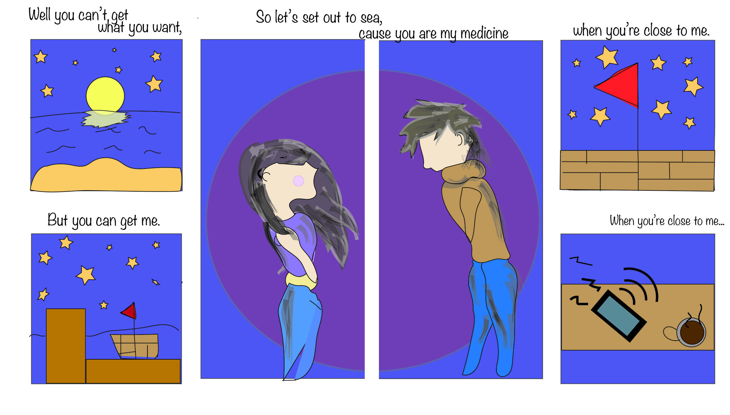
For my final comic, I decided to not only take a bit more time and thought into my comic, but to incorporate a bit of myself as well. The general idea of the comic is someone missing their significant other during social distancing and simply wanting to get away with them, but at last, have to resort to their phone for communication. I used song lyrics from “On Melancholy Hill,” by the Gorillaz, to not only encourage this story in my comic, but to also incorporate my creative writing side. So, before diving into my process of creating this comic, I want to address some of the small yet significant details that can be found in my comic. First, I tried something different with the formatting of my frames in which they do have an order to be read in, but might not be easy to identify. This is my attempt to have the reader participate in which if they are familiar with the text shown throughout the comic, they most likely will be able to understand how to read it. If not, the proper way to read it is from first the top left, bottom left, middle two columns, and then top right, finishing with the bottom right frame. The text is also in a font to make it seem thought-like, or as though she is listening to these words. With this, I attempt to produce an aesthetic response and emotional understanding within my six frame comic.
As mentioned, my idea for this comic is to represent the longing to be with someone, but being prevented from doing so. Many might recognize it due to today’s situation, which is where my idea came from, but essentially it could be equivalent to long distance relationships. Regarding the form in my comic, I do have the frames next to each other but in a certain order so that I could experiment with the pictorial sequence, something I had never tried in previous comics. This can be seen in the middle two frames, an idea inspired by page 115 in Scott McCloud’s graphic novel where he addresses motion across multiple frames. Unfortunately, my art abilities limited me and I could not display motion across multiple frames, though I tried, so I settle with making the background of these two frames look like they could be pieced together into one still frame. However, by not being in the same frame, it helps the reader identify that they are not together in person, but perhaps sharing the same thought or feelings. (I also realize that the boy looks like a turkey, once again due to my limited art abilities).
In terms of Idiom, I struggled, but decided the the triangle can represent the flag on a boat, while the phone can mean long distance communication, which can have an even deeper meaning upon recognizing the purpose of the comic. This then becomes followed with structure in which I use a soft blue to set the comic in a variety of ways, for example the blue creates the setting of the sea, night time, and distance as it can be associated with longing and sadness.
Then the crafting, in which I believe is where my ambition shows the most. I decided to try new tools that I was not too familiar with and find something that seemed interesting or full of room for creativity, then made it work. An example of this can be the opacity bar which I played around with a lot. The background of each frame is filled with a color at a lower capacity to help other pictorial elements stand out. For example, the moon in the first frame is yellow, but the opacity in the reflection is lowered in which, despite being the same color, it shows to be a reflection due to the brightness of the moon. The middle two frames are also full of different levels of opacity as I, for the first time, attempted to create shadowing on the individuals clothing, and to create texture in their hair. I also used layers here the most, creating a few layers of outline before hiding them to show the final product. I also attempted to use the paint brush in these frames, using different sizes and opacity levels to add texture into the overall comic. Finally, the most ambitious decision I made was the order of my frames and making the text small so that the images stand out first rather than the diction. Of course I still used some tools I was familiar with, but tried to use them in a different way than before such as the bolding of the pencil tool to represent vibration rather than sound. This is concluded with surface, in which it appears to readers to be a comic about sailing to sea with a lover, but not being able to.