
Compared to my last two weekly comics, this is something completely different. Where I was basically just talking about my rediscovery of my love for anime since quarantine began, this time around I decided to actually think of a story. As expressing something about my individuality, it’s not necessarily about my every day life — that’s kind of what the last two were about — this is more about what I want out of life. And that’s to be a writer, so I tried to make a story. Therefore, “no other human being can ever know what it’s like to be you from the inside,” is still very fitting because, while the premise is simple, this was my creation and no one else would make it exactly like mine.
For the idea, I wanted to be able to showcase something that’s actively a part of my life that isn’t physically me. By that I mean, I am a very internal person. Most of who I am exists in storytelling, or various forms of art — painting, drawing, filming, etc. Like I mentioned before, this story is inherently mine because I made it, just because it doesn’t have me as a character doesn’t mean it isn’t me, because it still is.
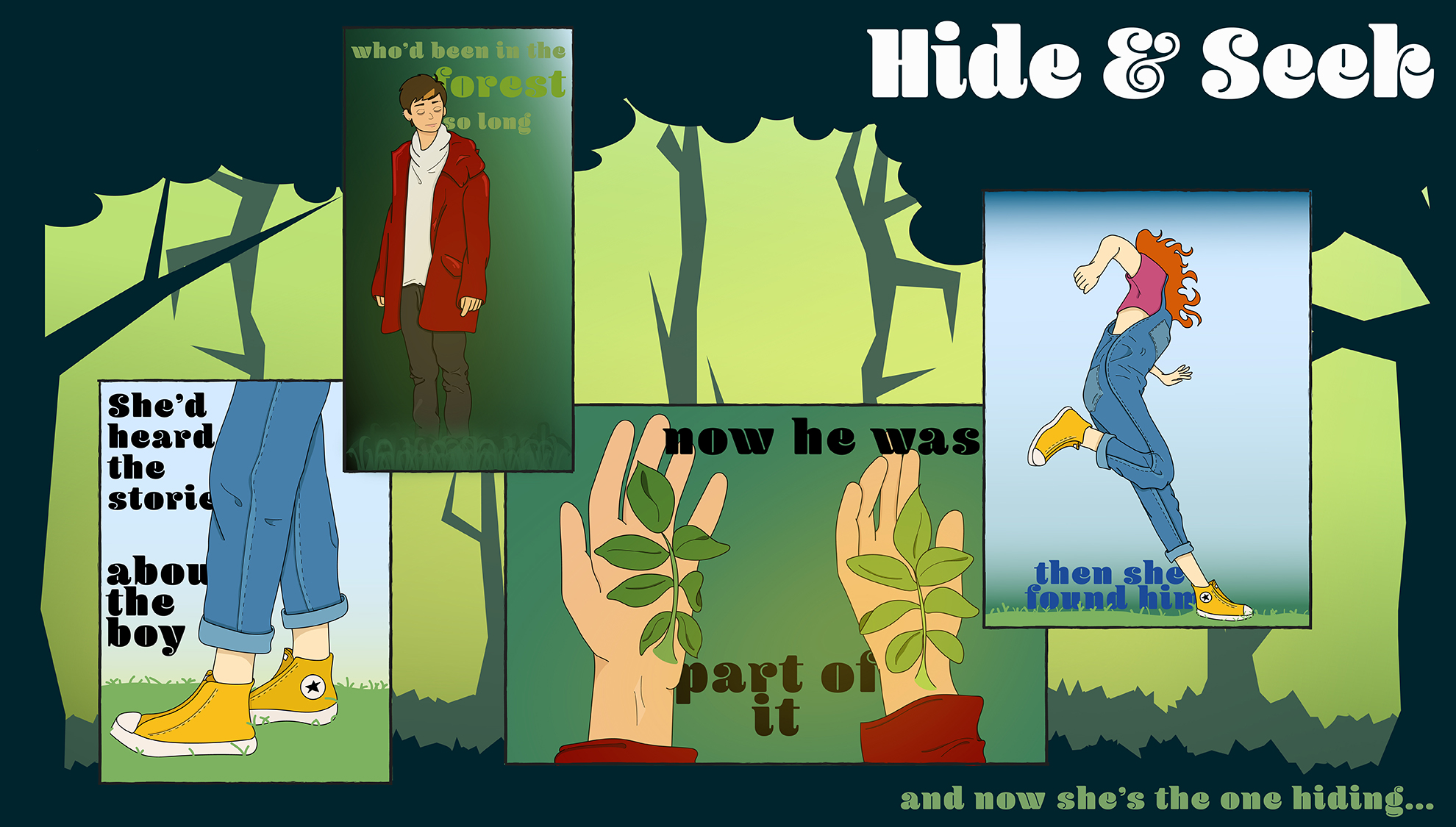
Since Illustrator is the preferred mode of creation for this assignment, that’s exactly what I did. But differently than I had before. I’ll say this later, but I used tools that I don’t use often or am not as comfortable with. Similarly, I played around with the frames — the distance from each other, how they overlapped and how I wanted to translate readability which can be interpreted through the text of the panels. As I’ve already mentioned a few times about the panelling changing and not being in the traditional format that I was using before. What I also changed structurally, was that all the panels essentially lived in one panel itself. The background of the trees and forestry is a panel on its own that sets the tone in conjunction with the panels.
This is definitely a more ambitious project than the last two were. Not only did I use tools that I wasn’t as comfortable with, but I also used a completely different formatting. The last two weeks I’ve done a fairly traditional layout, perfect rectangles that had equal amount of space between the panels and the edge of the image itself. This time, I allowed the panels to be more free-flowing and even created an overall backdrop for them. In the actual Illustrator file, there are over 50 layers. While a lot of the coloring was still pretty flat like the last two weeks and I continued to use the paintbrush tool, I began to mess with the opacity of certain things. I used the pen tool for the trees of the big background and grouped smaller shapes to make bigger ones to manage them more. This comic was so completely different from the last two in nearly every way and I think it shows, as well, how much more time and effort I put into this one.
