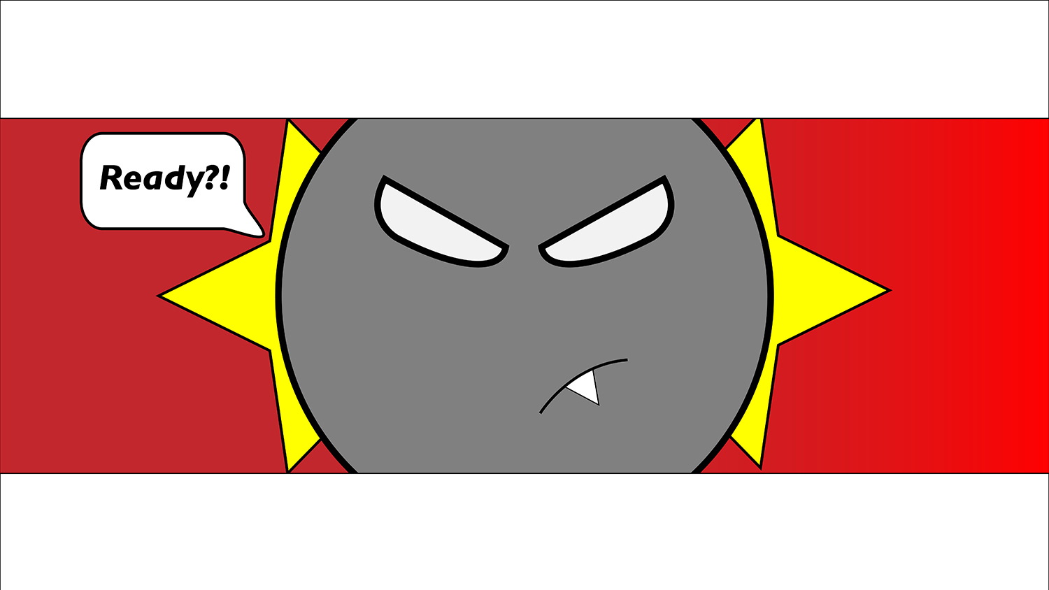
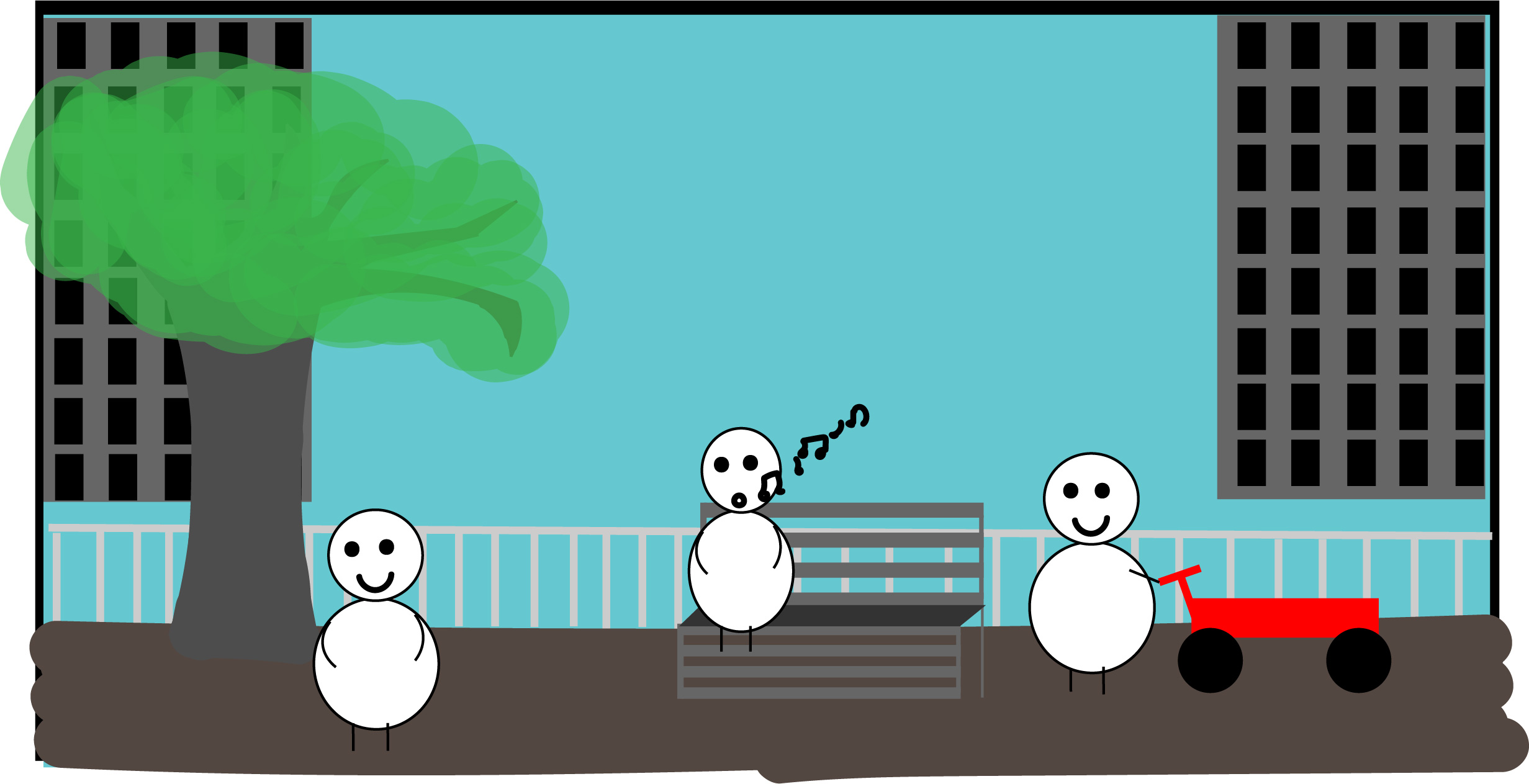
For my comic I wanted to try a gif because I really liked how Eroyn Franklin’s comics looked. I was inspired by it. I also felt like the gif was something we haven’t really had chance to do yet in class since this we can only view gifs through web and it was the first time doing web comics, but I didn’t think I could do it since I have never made a gif before. I wanted to stick to what I was familiar with, but I’m glad I pushed myself and tried something that was out of my comfort zone. What really helped was the tutorials and that made it easier than I initially thought it was going to be. I wanted to guide the audience by making a gif that looks like a constant loop from day to night, and then night to day. I wanted to create a continuous cycle to show how time just keeps moving forward and how fast the days actually pass by without realizing it sometimes. By showing a gif that seems like there isn’t really a beginning or an end I wanted to showcase that. I feel like my comic doesn’t really change much with the different devices, besides the size difference since there is no scrolling needed. I think Scott McCloud would agree that even if it’s a a gif it still fits the definition of what a comic is. There is still a sequence of pictorial images that conveys an aesthetic response even if it’s not a traditional comic.

I first used illustrator to create the frames because I just wanted to use a program that I had the least experience with. I wanted to expand my knowledge on illustrator. Then after making my frames I used photoshop to make it into a gif. For my website, I decided to just use WordPress because using WordPress to post gifs works just as well as other websites like Wix. It was actually pretty smooth sailing when it came to using a gif file to put onto my website. There really wasn’t any problems with uploading the gif. I learned a lot working with this project. Since I created the different transitions of the sky, I feel like I got way better with the gradient tool in illustrator. If you pause on each frame, the ones with gradient skies, honestly looks like what an actual sunset or sunrise would look like. The one big thing I learned while making this project was on how to make a gif in photoshop. Having this knowledge would come in handy if I ever want to make another gif again. Overall, I really liked making this comic. This was probably my favorite project that we made in this class.
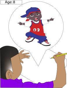
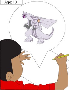
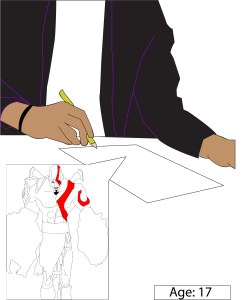
Web Comic: Erika Epperson