Final Web Comic: Hyelim Min

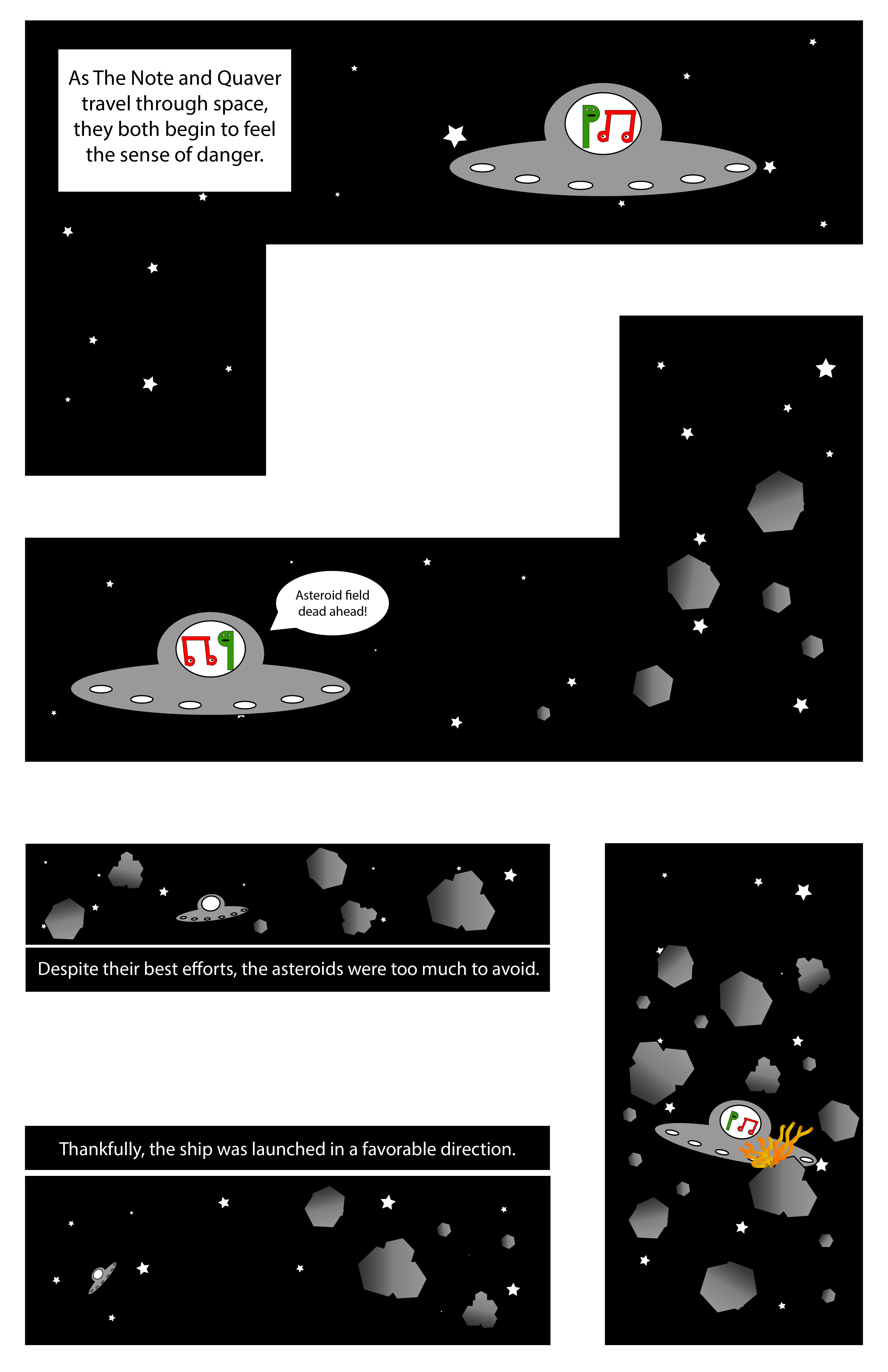
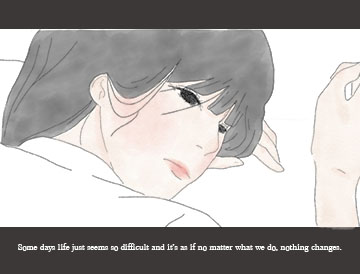
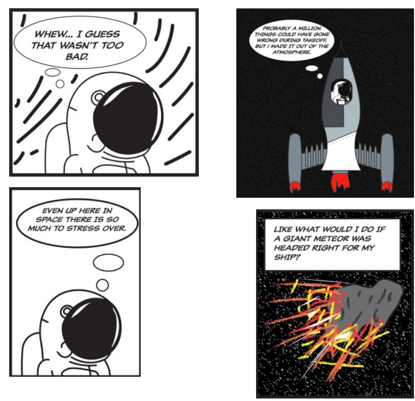
I was interested in reading simplistic webcomic. I enjoyed reading webcomics that express the character’s emotions and speech with the different way of speech bubbles. Those way of web comics have inspired me to draw a comic with their speaking in expression of speech bubbles and simplistic way. I have contained the message that is very realistic and possible to happen to any students who have been struggled in their school life. Many of the students would have felt the feelings of overwhelmed with school either middle school, high school, or even in the college at least once. I have contained those feelings onto my web comic so that the viewer can identify with the story, understand it, and know why the character has dreamed like that. I think the viewer would be able to interact with my comic by having empathy with my subject from the web comic. My comic can be viewed on different devices but it would only be able to view by scrolling down the each panels. I would expect Scott McCloud to positively react on comic based on containing good storytelling and a closure.

Basic RGB

Web Comic by Hyelim Min. December 2019

When I constructed my web comic, I have used illustrator program. I wanted to draw my own artwork by hand and using the pen tool. Through those experience of drawing a comic with illustrator program, I think I have increased my skill to use the illustrator and photoshop program and advanced my understanding of those programs. I have posted my site on the WordPress website. I have launched the site and posted the page like a blog posting. I have tried to build a website myself, however there was little bit of challenge and struggles in those progress. Therefore, I have chosen the WordPress website which is more familiar with me by posting blogs for the DTC201 class. The experience with my publishing site on the WordPress was interesting, because although it was more familiar than other websites such as Wix or creating HTML and CSS, it was my first experience to launch my own site to post my webcomics. Therefore, there was some troubles on launching my site. I thought I have done everything for posting my site, however it was actually not on my site because I have not launched my site yet. Except for those problems, I think I have used the WordPress website well to show my web comic to the viewer. The files I have made in Illustrator program was saved as JPEG by exporting my files to photoshop files and then saved with maximum quality. I have posted my saved work onto my website.

This is the website of my web comic! https://hyelimdot.wordpress.com/2019/12/10/escapism/

Posted in Fall 2019 Archive (201 Blog) | Leave a comment

Final Web Comic: Bobby Brown

When it came time to both create and present my web comic in a digital space, I felt most inspired by the work of Eroyn Franklin’s work with web comics. The way she uses color against her backgrounds make her panels pop off the page, and I like the overall simplicity of everything. Since I’m able to control the amount of content seen on the page at a time, I took that to my advantage and put the majority of the action in the middle of the comic, which forces the reader to scroll. I guide the reader through my comic in a relatively traditional way, left to right, and down the page. I don’t expect the reader to do much more than a scrolling motion, but I’m hoping the contrasting colors from dark to bright will help catch their attention. One reason I specifically chose to go with Wix, is because of how simple it is to adjust your website to be viewed properly on mobile devices. I was able to adjust and test my website on my laptop, phone and iPad, and they all displayed it the way I intended it to be viewed.

An excerpt from my web comic “The Note’s Saving Grace,” created in Adobe Illustrator.

I was originally on the fence when I was trying to choose between Photoshop and Illustrator for my web comic project, but I chose to go with Illustrator simply because I didn’t want to deal with resolution based graphics. Even though I feel I have much more experience in Photoshop which would’ve made assembling everything easier, the constant resizing of assets would have become extremely frustrating over time. I felt somewhat nervous to attempt to build a website from scratch, so I chose to use a template based website on Wix. While this gave me a large amount of freedom when it came to the overall layout of my website and colors, I originally wanted my comic to scroll horizontally rather than vertically, but Wix does not allow for horizontal scrolling anymore. While this slightly changed the way I wanted my comic to be viewed, I’m still happy with what I was able to do. Bringing my comic from Illustrator into Wix was originally somewhat frustrating as well, because my individual panels were not staying where I wanted them to on the page, especially when viewed on a mobile device. I ended up bringing these panels back into Illustrator and laying them all out on a 11×17 canvas, then uploading that image to my website. Since my websites background matches the white background on my Illustrator canvas, it makes it feel like my comic panels are floating on the page. While I didn’t necessarily learn any new tools in Illustrator this time around, I did spend more time creating custom shapes using the Pathfinder tool. I also realized just how time consuming the creation of a website can take, even if you’re using a software based creation tool to do it.

My comic online: https://bobsteriffic.wixsite.com/thenotesadventures/comics/manage-your-blog-from-your-live-site

Posted in Fall 2019 Archive (201 Blog) | Leave a comment

Final Web Comic: Brayden Jacobs

My comic started out as a knock-off version of Rick and Morty that would go on a few short adventures to a few different alternate dimensions. The main piece of my project that changed as I started to make was that I hadn’t realized how many comics are made with vector-based graphics similar or very close to how we have created objects in illustrator. My viewing of ‘embracing bed comics’ was to take advantage of the dimensions aspect I planned on using with my comic and have each different dimension be a different web page. This would give the comic a 3-D sense and bring more viewer interaction. My initial views and hopes for the project were a little out of my grasp of time with dead week and finals week I wasn’t left with much free time to complete the project to the level of professionalism that I would have hoped, but this is a project I plan on continuing in my free time and work out a lot of the kinks from the second page to make it much more fitting to the iconography I hold myself to. The web presentation gave me a few issues, specifically that I wanted to have an image hyperlinked (the portal) to go onto the next section of the comic but was left with limitation with Wix, Google Slides and WordPress. I ended up going with google slides and adding hyperlinked text that allowed the reader to move to the next page. Besides that, the comic reads vertically and is a pretty simple layout. I think Scott McCloud would say my comic has some potential but was perhaps not completed as much as it could have been. I took a lot of time in making the characters of Rick and Morty but fell behind on time with schoolwork when it came to Tom and Jerry. They were meant to not look the same as Rick and Morty as I was making a ‘Russian cartoon knock-off” joke, but it came across as sloppy in the end.

Rick and Morty Comic – Brayden Jacobs

I only used Illustrator for my comic. I had originally planned on using both illustrator and Photoshop, but after examining the Adult Swim TV show, Rick and Morty, I found that the entire show is created with vector-based graphics and went from there to create my characters and backgrounds all in Illustrator. I tried a few different web options but settled on Google Slides when none of the template options had just what I wanted, and I didn’t have the time to learn HTML and CSS. My experience overall was okay with using an online format however I may have been a little too ambitious on what I wanted to do from the start. I think it worked its way onto a digital platform perfectly and uploading each slide as a separate .jpg allowed me to move the images around the screen in a more interesting fashion than if I had simply put up a basic vertical or horizontal comic. I learned a lot about how artists and comics of today create their work and watched a ton of informational YouTube videos on vector graphics and even looked into other options than just Illustrator to complete my project.

Posted in Fall 2019 Archive (201 Blog) | Leave a comment

Final Web Comic- Jon Klaveano

The creative plan I originally had for this final project was to make something manageable. At the same time though I wanted it to look like an idea for a movie. I was asked to design this comic for the web, and to do accomplish this I used Wix. Which is a website that allows you to build a website. Wix was tremendously useful in creating my final comic and actually inspired my final product. I was also really inspired by the online comic we looked at that would show one frame at a time. Luckily for me Wix had a similar option which I

The last frame in my comic.

used for my final product. I believe that because my work will be shown only frame by frame the reader will be more likely to understand my story. Even before I made my website I had the idea that the reader would come to a conclusion on the ending. I wanted my storyline to be kind of obscure. Regardless of the device my comic is viewed the same way. I strongly believe that Scott McCloud would categorize my project as a comic. I used photoshop for my last project because I felt the most comfortable in the software. I also believed that it would work best for my idea. As stated before I ended up using Wix because of my little to no knowledge in HTML and CSS. Wix ended up working perfectly for my assignment it was just so easy to learn and use. I was able to directly upload my files to wix with ease. I learned a ton with this final project in both Photoshop and Wix. https://jonklaveano.wixsite.com/dtc201jk

Posted in Fall 2019 Archive (201 Blog) | Leave a comment

Final Web Comic: Min Kim

Website: https://jminkikim.wixsite.com/webcomicdtc201

Remembrance that days will get better. Web comic by Min Kim, December 2019

The web presentation format allowed me to present my work in a vertical scroll down style that I have always wanted to try, since I read a lot of Webtoons (which are there scroll down web comics it has heavily influenced me to choose this style of format. How my reader is guided through my work, is exactly through the scrolling and in addition the distance of the panels and the text underneath and i-between help pace the reader and also allowed the reader to pace through the comic themselves. In terms of different views on other devices, I have made it so that it is not only viewable on desktop but is also mobile friendly, so that it may be read from all devices. Scott McCloud would say that my comic is interdependent in the use of words and pictures to interpret my comic as neither could work to the fullest extent without each other. In addition, he would also not a strong element of closure where the ending is not defined and my comic in particular because the viewers are their own main character the ending is based on their lives and what is to come in the future.

For this project I have used photoshop and although using illustrator would have saved me the trouble of sizing and resolution problems, photoshop offered a wide array of brushes for the stylistic part of my comic. Photoshop enabled me to take a greater artistic approach than vector lines as I decided to use a graphite and watercolor aesthetic for my comic. I decided to put my comic on a Wix generated website because I have previously used Wix before. Wix was very simple to use and it fit my desired vertical format well overall. I had taken my high resolution JEPG and inserted into the website, the file was big enough to fill the screen and was sufficient. hat I learned in photoshop was the new use of brushes and pressure dynamics on the stylus, as well as correcting hues, saturation, and other elements of the color later on at the end of my comic making process. For Wix I did not learn much of anything new but I got to recap on how to add and edit to suit mobile use.

Posted in Fall 2019 Archive (201 Blog), Uncategorized | Leave a comment

Final Web Comic: Eddie Abellar

Web comic by Eddie Abellar Fall, 2019.

For my final web comic, I decided to create my own superhero and present it in the class blog on WordPress. My web comic is read from top to bottom, so when people view my web comic on WordPress, the only thing they have to do is scroll down to read the rest of my web comic.

My web comic can be read on any device whether it be a smart phone, tablet, or desktop computer because of the way I structured it. When I created the document for my final web comic, I made sure that it was the right width in order to be presentable in a scroll down fashion on WordPress for any device.

I think Scott McCloud would declare that my final web comic fits his definition of a comic which is “juxtaposed pictorial and other images in deliberate sequence, intended to convey information and/or to produce an aesthetic response in the viewer. In my final web comic, I have organized images in a sequence from top to bottom in order to tell a story to the viewer.

For my final web comic, I used only Illustrator. Illustrator was my program of choice because I felt more comfortable with it than I did with Photoshop. I also enjoy creating new designs out of shapes more than I do taking photos and editing them.

I chose to put my final web comic on WordPress because it was the easier option. I also wanted to put all of my focus towards the web comic instead of spending time learning how to create my own website. I am very pleased with the way my web comic looks on the class blog. Posting the web comic on the class blog was the best option for me since my web comic can just be read by scrolling down the page.

Getting my Illustrator file on the class blog was fairly simple. After I saved my web comic as an Illustrator file, I then exported it as a JPEG at the highest quality. All I did after that was upload my file into the media library in WordPress, make sure the dimensions were right, then uploaded it.

While working on the final web comic, I learned a lot of new techniques in Illustrator that helped me create some of the designs I was struggling with. One technique I learned was creating text that resembled the Superman font style. I learned this technique from a video on YouTube. In order to create this text I made the text outlines, used the direct selection tool, the shear tool, and the 3D & Bevel panel. Another technique I learned while creating my web comic was how to create superhero characters out of shapes. I also learned this technique from a YouTube video. The Vaporizer, the character in my comic, is made up entirely out of shapes. I mostly used the rounded rectangle and ellipses tool to create the Vaporizer. Once I was done creating him, I copied him and reflected him over the y-axis, then I changed his super suits colors in order to create the villain in my final web comic.

Posted in Fall 2019 Archive (201 Blog) | Leave a comment

Final Web Comic- Joseph Gardner

My website.

7-1

This image was created December 2019 by Joseph Gardner.

I really liked the idea of having a full-frame on one page. It makes it so you can put more detail into each frame, and the reader/ viewer can pay more attention to the small things. I used this idea, but with a simplistic approach. I made my comic minimalistic and was intentional with my blank space. I did this so people would pay attention to the text, and the fact that it actually happened.

I put buttons on either side of the comic frames. It should be pretty intuitive for the reader because people usually read from left to right. Their first instinct should be to click to the right and keep going. It’s in a slideshow format, which increases the level of interactivity.

If it’s viewed on a phone, the website removes the buttons on the slideshow. It makes it so the reader can swipe to view it instead after tapping on it. It seemed like a logical way to integrate it into mobile because usually, people swipe instead of clicking on things like that. On the desktop, the only difference is the dimensions and the arrows on either side of the slideshow.

I think that Scott McCloud would say that it’s definitely a comic. The interactivity element is a little bit simple, but it doesn’t need to be super crazy for these purposes.

I used Illustrator for my project. I did so to challenge myself, and to make my illustrations easier. I also wanted to make it so the text was easily readable. I feel like typography is easier on Illustrator than Photoshop. I also wanted to create it completely from scratch, which is easier to do with Illustrator.

I put my comic on Wix. I used the create a website from scratch tab instead of using a more solid template. I had an idea of how I wanted to do things. I just wanted a simple one-panel interactive site, and I think I accomplished it. It was pretty easy to do. Wix’s website creator is really intuitive. It’s definitely easier than it would have been to make a whole website from scratch, and it looks better than it would have on WordPress.

I got my files onto the website by simply just dragging and dropping them in order to the website. I renamed them to numbers that coordinated with how they would appear on the website.

I learned how to use the pen tool more competently. I also learned how to make a website with more polish on Wix. I had used it with a template earlier, but it lacked personalization.

Posted in Fall 2019 Archive (201 Blog) | Leave a comment

Final Web Comic: Mareenah Galang

I was really interested in a more simplistic vertical webcomic layout, similar to Eroyn Franklin’s. They were very straightforward, simple, and easy to read. This type of layout also kept the focus on the webcomic. I also really liked Scott McCloud’s interactive zoom-in webcomics, but found it was very hard to make something similar unless one has extensive knowledge of coding. 

I created my website to scroll vertically, and only displaying one image by itself. Essentially my webcomic is one column with only one image per row. Since the webcomic is comprised of only eight different images that are displayed one by one, it should be relatively easy for the viewer to follow. 

Since I used Wix, a website builder, to create my webcomic, I didn’t really have to worry much about the mobile view for my webcomic. Wix was able to automatically make my webcomic compatible with mobile devices. On the mobile version, the vertical layout is exactly the same as the desktop/laptop version, however, there is less of the background being shown. The way to scroll through is still vertically.

I think Scott McCloud would say that my webcomic does a good job of telling a story, with scenes that do have a bit of closure.

One panel from my webcomic, titled “Long Distance”

I used Adobe Illustrator to create my webcomic. The iconography that I wanted to use was more suited for this program. For example, I had used a lot of simple shapes that I easily created using the star tool, eclipse tool, rectangle tool, etc. I also chose Illustrator because I felt like this program allowed me to play around with colors and gradients more easily. This was an important factor in my webcomic. 

I had originally planned on creating my own website to host my webcomic using HTML/CSS. However, due to time constraints I decided to use Wix instead. Although I could have had a lot more freedom with my webcomic layout if I coded it myself, Wix provided a lot more convenience and took less time to use. The process of coding a website is very tedious and time consuming. With many deadlines and homework assignments coming up, using a website builder like Wix made a lot more sense to use. Sometime in the future, I do hope to learn some HTML/CSS and experiment with making my own website. 

To get my work from Illustrator to my Wix website, I saved the work that I did on Illustrator as JPEGS. On Wix, I had inserted sections onto the webpage that had placeholders for images on them. I uploaded the JPEG images from Illustrator into these placeholders.

Throughout this project, the main new thing that I learned is the amount of adjusting to your comic that you may have to do in order to get it accommodated by a web platform. It is definitely a lot simpler than it sounds!

Here is the link to my Webcomic!

Posted in Fall 2019 Archive (201 Blog) | Leave a comment

Final Web Comic: Patrick Istvan

What inspired me the most was the ease of access. With a book or a comic one needs to either go to a library or have physical space to store books. Where as with a web comic access is through the world wide web. Anyone can gain access instantly. Readers will scroll vertically to read the comic. After clicking on a button labeled “my comics” from a home screen they are taken to the actual comic. If my comic is viewed on a smart phone it becomes easier to “zoom in” which I like. I think Scott McCloud would appreciate how the continuation is fluidly accessible. With paper comics pages need to be turned and the viewer is exposed to whole batches of panels per page where as with a vertical scrolling web comic the panels are viewed fluidly as the reader scrolls. This scrolling can also be examined as an action is more required continuously, where as with comics its simply just moving ones focus from panel to panel.

I used both Illustrator and Photoshop to make my webcomic. I used Illustrator to make the characters and Photoshop to edit my face and put it on the stick figures. Photoshop is much better at editing images and I found a tutorial online for getting a “comic book” like effect for my face.

I built my own website using HTML and CSS. I used a skeleton (copied and pasted pre-made code) from one of my other websites and edited it a bit. I changed the background picture to fit the comic and act as a setting for the events in the webcomic. To get the png files from photoshop to appear on the website I used the simple code of “<img src=”___.png”>” for all the pictures I wanted to put in the website. This put the pictures in a vertical order that was big enough and well enough where I didnt feel I needed to change their size or the way they display. I learned more about filter galleries which is what I used to make the comic book effect on my face.

Link to my webcomic.

Posted in Fall 2019 Archive (201 Blog) | Leave a comment

Final Web Comic: Zach Morgan


First four panels of The Anxious Astronaut

When we first looked at Scott McCloud’s “The Right Numbers part 1” in class, I really wanted to make a comic that kept zooming in on itself to navigate to the next panel. However, I didn’t really know how to do that, or how I would go about doing that. After reading Eroyn Franklin’s web comic Bikram Addict, I knew that I wanted to take advantage of the fact that the viewer would has to scroll in lieu of turning a page to advance through the comic. I wanted to incorporate some large panels to ensure that my viewers’ attention stayed on a single panel. I made my comic assuming that my readers would read the first four panels left-to-right and top-to-bottom. In class, however, Kristin pointed out that the two panels on the left are left-justified and the right panels are right-justified, so she thought to read it top-to-bottom, left-to-right. Having each panel justified to each side was necessary for putting the images on WordPress. Because the comic is meant to scroll, the platform that it is being viewed on does not change the comic at all. I think that Scott McCloud would say that I manipulate time in an interesting way in this comic. Almost all of the panels take place in the astronaut’s imagination, I am able to manipulate the passage of time to make a long trip to moon only take a few panels.


To create this comic, I used Illustrator to make almost all of the image, but I used Photoshop to create the worm hole using distortion tools. I composed each panel on it own separate Illustrator file. I then saved these each panel as a .jpg so that I could upload each panel to WordPress individually. If I could change how I composed my comic on the web, I could’ve done a couple different things. I could I have created a single artboard on Illustrator and saved one big .jpg so the I could move each panel to where I wanted it. I also could have made a Wix site instead of just using the WordPress site.


Web Comic: The Anxious Astronaut by Zach Morgan

Posted in Fall 2019 Archive (201 Blog) | Leave a comment