
My website.
This image was created December 2019 by Joseph Gardner.
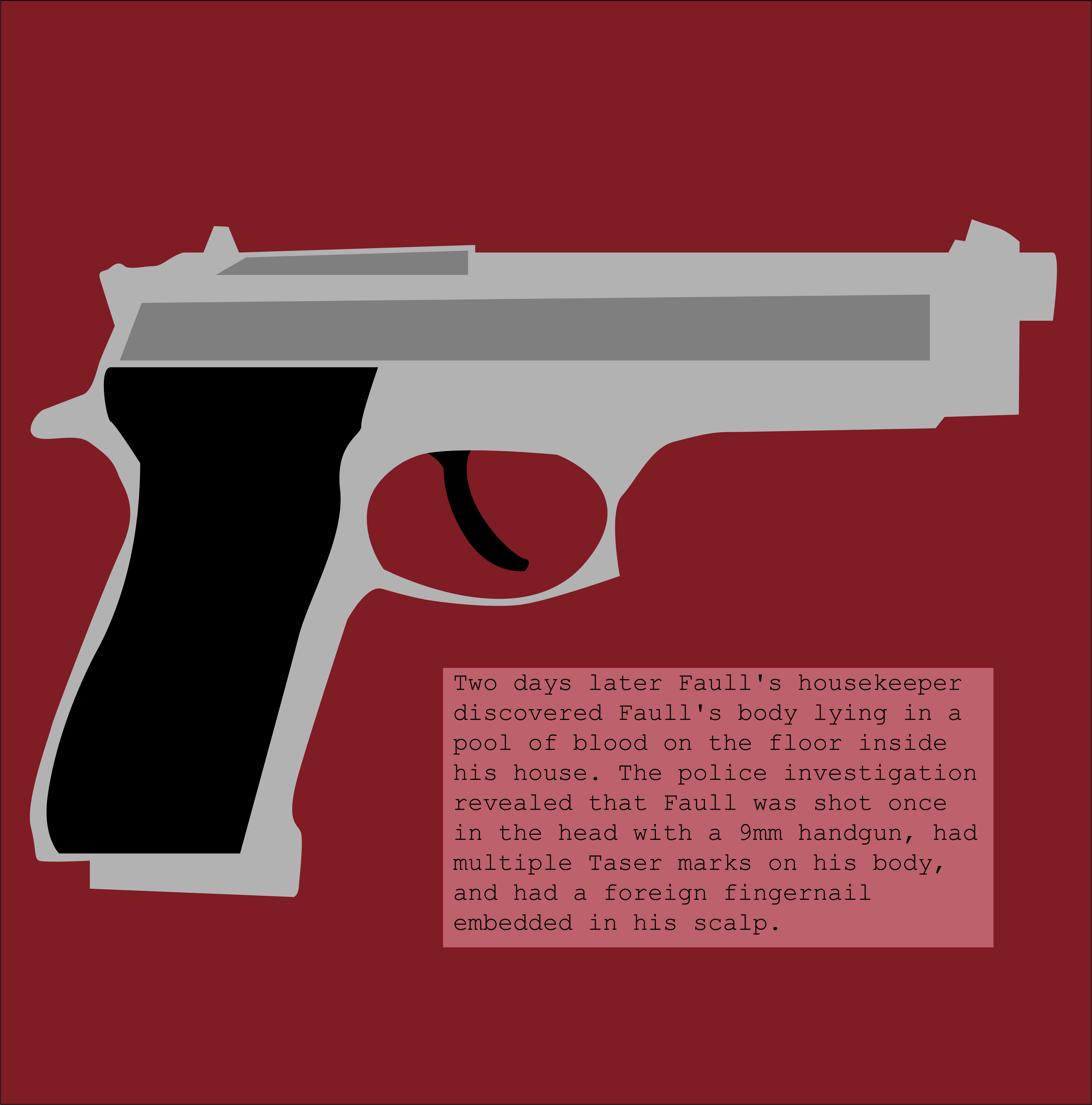
I really liked the idea of having a full-frame on one page. It makes it so you can put more detail into each frame, and the reader/ viewer can pay more attention to the small things. I used this idea, but with a simplistic approach. I made my comic minimalistic and was intentional with my blank space. I did this so people would pay attention to the text, and the fact that it actually happened.
I put buttons on either side of the comic frames. It should be pretty intuitive for the reader because people usually read from left to right. Their first instinct should be to click to the right and keep going. It’s in a slideshow format, which increases the level of interactivity.
If it’s viewed on a phone, the website removes the buttons on the slideshow. It makes it so the reader can swipe to view it instead after tapping on it. It seemed like a logical way to integrate it into mobile because usually, people swipe instead of clicking on things like that. On the desktop, the only difference is the dimensions and the arrows on either side of the slideshow.
I think that Scott McCloud would say that it’s definitely a comic. The interactivity element is a little bit simple, but it doesn’t need to be super crazy for these purposes.
I used Illustrator for my project. I did so to challenge myself, and to make my illustrations easier. I also wanted to make it so the text was easily readable. I feel like typography is easier on Illustrator than Photoshop. I also wanted to create it completely from scratch, which is easier to do with Illustrator.
I put my comic on Wix. I used the create a website from scratch tab instead of using a more solid template. I had an idea of how I wanted to do things. I just wanted a simple one-panel interactive site, and I think I accomplished it. It was pretty easy to do. Wix’s website creator is really intuitive. It’s definitely easier than it would have been to make a whole website from scratch, and it looks better than it would have on WordPress.
I got my files onto the website by simply just dragging and dropping them in order to the website. I renamed them to numbers that coordinated with how they would appear on the website.
I learned how to use the pen tool more competently. I also learned how to make a website with more polish on Wix. I had used it with a template earlier, but it lacked personalization.
