Final Digital Comic Collage: Korie Cedre

Collage digitized and created by Korie Cedre, February, 2020.

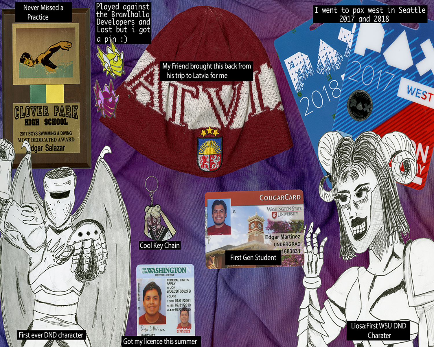
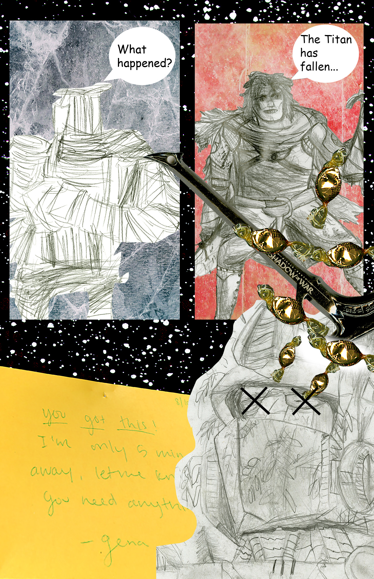
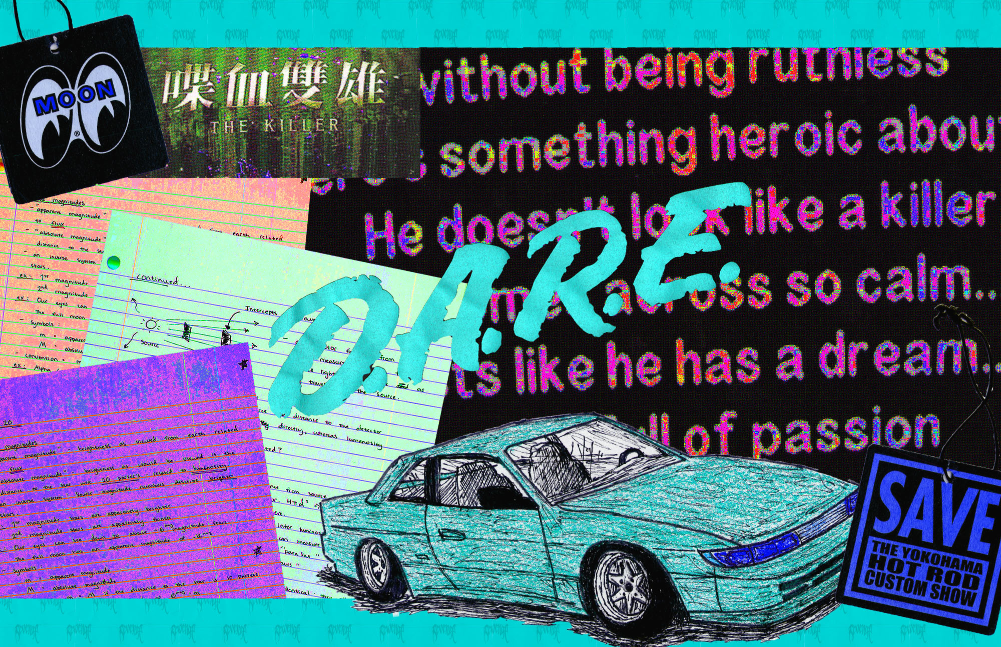
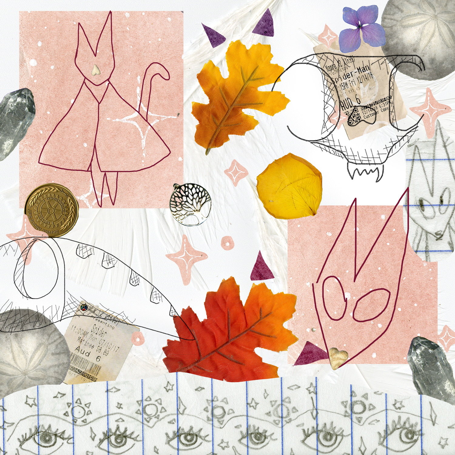
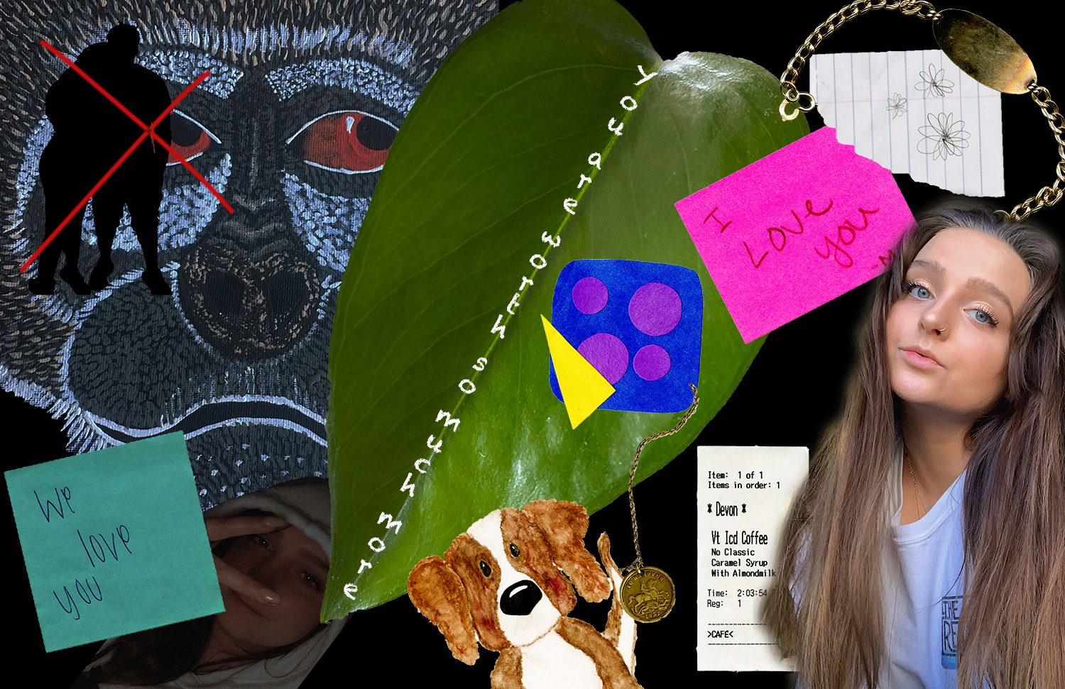
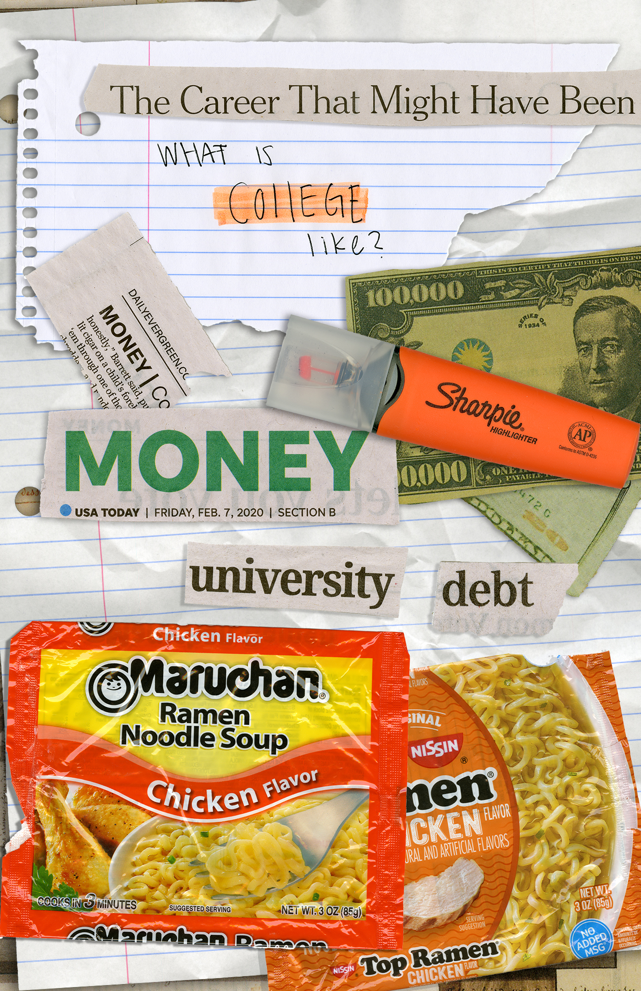
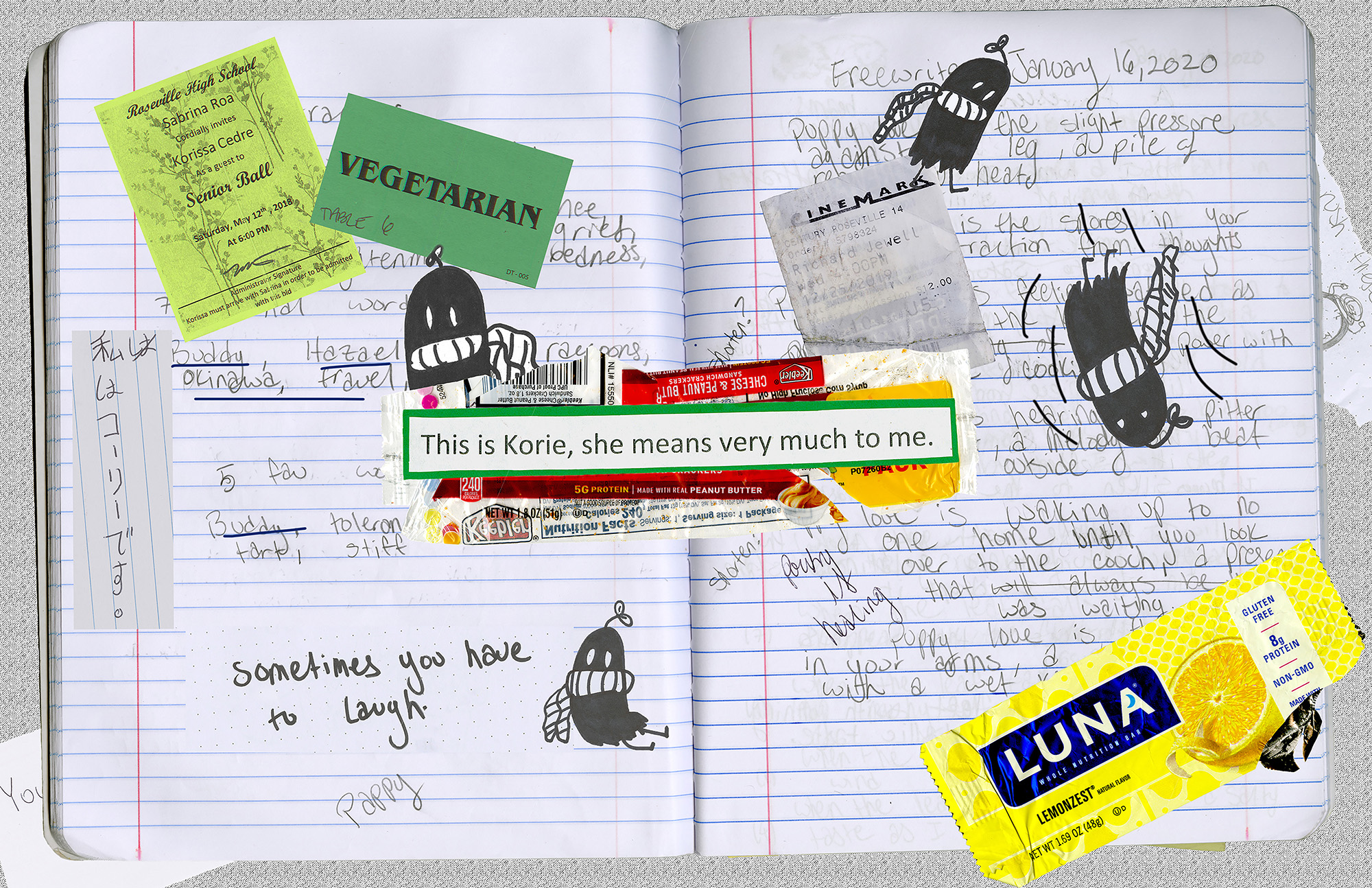
My creative motivation for this project was “characterization,” rather than storytelling, which was most likely sprouted from me majoring in creative writing. Characterization involves more than how one appears in a writing piece, but also includes their interests, response, and decisions. With this, I decided to attempt a characterization of myself through this project, scanning items that I believed best represented myself. Some of these items include some writing prompts from my old creative writing notebook, a little ghost with a twig on his head that I doodle often, movie tickets, the wrappers of my favorite snacks, and things from those most important to me. One of the items I used came from my significant other and says “this is Korie. She means a lot me,” in which I used for both as a linguistic mode, but a juxtaposition mode too. Understanding McCloud’s definition of a comic, I placed this said material in the middle of the entire collage to support readers in knowing where to start. It is large and in the middle in which should pull people to look at it. This is where the linguistic aspect comes to play as the words suggest that the surrounding images to this text are the items that either represent Korie, or are the reasons why Korie means so much to this person. I also use my said doodle of a ghost to direct viewers around the notebook pages, starting near the first text, to the movie ticket. I made it so the ghost appears as though he is falling through the materials, being my attempt at juxtaposing images in a sequence to convey a sense of direction through the collage, and an understanding of what is being shown. Another reading that helped me to organize this collage is Lynda Barry’s reading in class as she leaves little to no space on her creative pieces. As a creative writing major, this was not my first time seeing her work and being influenced by it, so I was glad to see a DTC perspective towards her. With this, I grew fond on how she creates a sense of direction in her work. Furthering on, these materials helped me to make meaning through my collage process as they do not only represent me, but they allow me to make use of the linguistic mode and my visual choices. As mentioned above, my writing pieces can be seen throughout the entire collage, and more importantly as the background. However, since the lighting on the notebook is darker and does not stand out too much, I placed a ghost next to the writing section I wanted to stand out. With this, the page lists my favorite words, being linguistic, in which I do list my favorite items or words. This is another way for the readers to grasp an idea of what makes Korie significant.

In terms of photoshop before this class, I have had minor experience with it. I do have the app on my phone, but can only do so much on it. I also took a class last semester that required us to make flyers or book covers with photoshop. However, I had little idea on how to make these projects look clean and sharp, often using the erasure tool instead of masks. This is the most significant thing that I have learned, the clipping and vector masks. I used this tool a lot during this project, always having open the videos provided on the DTC website for class, such as “use layer masks to adjust parts of photos” and “removing and replacing a background” found on the photoshop materials page. They are pretty clear videos, but I often find technology confusing so it did take a minute to adjust to using it. I did enjoy composing in a digital environment, but it can be less enjoyable when you are not artistic individually.

Posted in 201 Blog, Final Digital Comic Collage | Leave a comment

Final Digital Comic: Edgar Martinez

My Photo Collage

Motivations

I really wanted to create a collage similar to Lynda Barry’s style and her book. I loved the idea of having a variety of items just placed together with what seems to be no direction. I had a colorful bandana that I wanted to use as a background to give the illusion of the items being placed on a wall, like a board of memorabilia. Looking at past examples of what students had done really opened my eyes to what could be done and was a great help. When we first started I struggled to figure out what I wanted to do for my collage, but after the examples I decided to place objects that interested me. I used text boxes to give some sort of insight into my objects as without the context then it would seem like a random assortment of items. I went with a black box with white text just to make something different and give a nice visual. I usually don’t collect items that mean to me as I like to just live in the moment, so it was difficult for me to find the items that i needed for the collage. So I chose items that had some deep connection to me or some memories. I included some of my characters from dungeons and dragons as it has become something i do every weekend. Most of my fond memories have been preserved in pictures and videos but I didn’t want to use digital pictures for this project as I wouldn’t be able to scab them.

Photoshop Experience

My senior year of high school I took a beginners photoshop class that taught me some basics. It was mostly step by step instructions so I remember very little. However there are things that Ive seen and remember learning about it in my photoshop class. Clipping masks was something that I learned while doing our tutorials and would’ve saved me some time last year. I was already familiar with making selections and layer masks as those were the two features that I used the most. The layer mask tutorial was the most useful to me as I finally learned what it exactly did and how i could use it. Normally i would spend all my time making that perfect selection to make sure it was just right. I would use shift to add extra selections and alt to remove part of the selection. So when I learned that layer masks can use a brush to hide parts and not remove it, then everything I knew began to click. The layer mask was extremely helpful as it allowed me to fine tune my selections and removed the worry of removing pixels. The text box was the only confusing thing that I remember dealing with making sure the text went where you wanted it to was sometimes difficult.

Posted in 201 Blog, Final Digital Comic Collage | Leave a comment

Final Digital Comic Collage: Ivan Franco

Fall of the Titan, 2020, Ivan Franco, Photoshop, digital collage

I wanted to juxtapose the images of my sketches with designs that contain color. The sketches are people or characters, while the colored layers are backgrounds, places, and objects. The sketches were done with pencil and and black and white with a photoshop effect on their saturation to make the darks pop out more. The discussion of panels came to mind when making the collage. I am not the biggest fan of collages since I think they are unfocused, unsatisfying to look at, and a bit messy. I didn’t want to put any more layers on this collage then I needed to so that the image would be pleasant to look at and simple. Most of the colors in the image are muted but still serve a purpose to give the black and white sketches a background and hopefully make them easier to see. The panel backgrounds were textures that serve to give a different scene or location to the two sketch characters opposed to the sketch out in front. the sketch out front is imposed on the space stars background as well as on the panels to make it look like the two are focused on him as the subject. The language in the collage is simple. The tow sketch panel characters have an exchange about the defeat of the “Titan”. This is meant to imply a victorious battle that ends with the somber end of the Titan. The only other words are the note from my sister Gena. I put this in the collage to compliment the image and also appear as maybe a good luck note to the characters regarding their battle with the titan.

The characters are my sketches that I have done over time. The two panel characters are my heroes of the collage story. One being a sketch of the statue in front of the Terrell Mall Library. I drew him for a class and thought he looked interesting. The other is my character rendition from my Dungeons and Dragons Campaign. The DnD character is meant to be a straightforward hero or warrior, while the statue is meant to serve as his advisor friend. The Titan is represented by Optimus Prime spliced with nature. He has trees and plants all over his body to give him more story. I drew him for a class back in High School.

This is not my first time using Photoshop. I have taken a class in high school that focused on using photoshop to change photos and edit them to make surreal images. That same class had us use Illustrator to make illustrated character posters. I also took a class last semester, COM 210, that had us use photoshop to create ad posters for our personal WordPress blogs. That class also had Illustrator and we used it to make logos for our brand blog. Using clipping masks helps the collage look more professional, it looked like part of a comic and gave the image depth and story. Unfortunately, because this is a collage, I couldn’t find many tools beyond the clipping mask, selection, and layer tools to utilize. The point of a collage is to mash together images that juxtapose each other. I’m not sure what a digital environment is, but I definitely enjoyed creating in photoshop. I love how PH can allow you to make anything and get creative.

Posted in 201 Blog, Final Digital Comic Collage | Leave a comment

Final Digital Comic Collage: Anna Davenport

About Me By: Anna Davenport 2020

My creative motivation was based on the idea that we learned about in class. While looking through Lynda Barry’s style of comics I was inspired by her work. According to McCloud, the definition of a comic is “juxtaposed pictorial and other images in deliberate sequence, intended to convey information and/or to produce an aesthetic response in the viewer” (McCloud pg 9). I believe that my comic fits this definition because I used many objects and pictures in a specific juxtaposition to tell the story of who I am. For example, I purposefully had the butterflies that I cut out of the image in the left corner in a path that brought the readers eye around the comic. Another thing that I tried to do was to try and have a specific point of focus so that the reader knew where to start. Therefore, I used the be creative in the top left area with a glitter back group so that the reader’s eye would be drawn there. Being creative is a really important part of who I am and so that is why I chose to make this my first focus point. I then used the cutout butterflies as a line for people to follow around who I am. The teabag that I used added a really interesting texture to the composition because you can see the leaves inside the bag. This is my favorite tea and it has quotes on the tag that is inspirational about nature. Another object that added a nice texture was my favorite scrunchy. I’ve had that scrunchy since high school and I have worn it or had it with me through a lot of challenging exams, sports events, and hospital visits. I like the way that it bunched up and you can see the individual folding in the fabric. The language that I used was words that I hand made on some graph paper. I think that this added character to my comic because it was something that I made myself and my faith is something that is really important to me.
I have used photoshop a lot in the past couple of years, however, this type of photoshop was pretty difficult for me to learn. Remembering all of the buttons to press in the right order was hard for me to remember. The tool that I thought was the most helpful was the edit in quick mask mode. This allowed me to cut out the parts of the big object that I wanted. Another thing that I used a lot was saving a selection. This was helpful when I was going from one composition to another. At first, the most confusing thing for me was actually copying and pasting the selected area into another document. However, after trying a couple of times I got the hang of it pretty quick. This was one of my favorite projects that I have had in any of my classes this semester. I love working to compose a document in a digital environment because I can do more interesting things than if I was making it by hand. I also really liked being able to use the things that are important to me and things that I made in a digital environment.

Posted in 201 Blog, Final Digital Comic Collage | Leave a comment

Final Digital Comic Collage: Ben Apostol

The first thing that I did when preparing for this assignment was to make sure that all of the items that I was going to scan had some sort of theme or meaning to me. In doing this, I ended up taking graphics from clothes, stickers, and cards with specific designs. The look I was going for in the project ended up changing a couple of times because of how hard it was to assemble the collage in a way that made sense. Throughout most of the project I was putting different things in different places, changing the size and the color. Eventually, I started grouping some of the objects together that were similar. According to Scott McCloud, the definition of a comic is “Juxtaposed pictorial and other images in deliberate sequence, intended to convey information and/or to produce and aesthetic response in the viewer”. My project resembles this definition because the color of the items gives it a theme and makes the project more aesthetic, as well as how the items are arranged in the space. The way that arranging my items gives them meaning was how they were all similar in style, theme, and orientation, however, since they were similar it made it easier towards the end to arrange them in a way that made sense. For example, I wanted to showcase work from one of my notebooks that looked a certain way, which I could pair up with a drawing that was cut out and placed from a piece of lined notebook paper. Adjusting the size and the orientation of the car allowed me to make it look like the drawing was coming off of my paper. The words in my project originated from the back of a shirt, which was scanned and then manipulated with different colors and styles until I felt good enough about it to use it as a decent amount of background space. Originally I only had one word on the shirt colored differently, but after multiple attempts at pulling the image off of the project and messing with the filters and colors in a separate file, I ended up stylizing all of the white text and using a chunk of it for the background of my project.

This is not my first time using Photoshop for a project that is this in depth. Last semester I took a DTC refresher on Adobe products and completed a few tutorials and some smaller assignments. In high school I learned and was able to use most Adobe products including Photoshop, but I mainly worked with Illustrator at that time. Some things that I learned for this project was how to mess around more with layer masks and colors. There was a lot of filtering, adjustments, and even some graphics that I was going to create by hand but ended up not rendering them into the project because it did not fit well. I learned how to render fire using a basic line shape, as well as how to create a colorized theme in a collage. The inspiration for the colors in this project was going for a vapor wave theme in the colors and the small dots that are film grain and different kinds of pixelation. I think that learning this process of scanning images and creating a whole collage on top of that was a very interesting and a good art style to know how to create. However, I thought that it was very difficult to come up with the orientation of the project because I had so many images and so many things that I could do to them, but I was not sure how to get inspired and get some ideas. It took me probably the longest just to get all of the images onto the art board and find a way to show what I wanted to and have the project still make sense. In conclusion I think that my opinion has changed on creating a digital environment and with the right direction and inspiration I think I could achieve much more than I did.

Posted in 201 Blog, Final Digital Comic Collage | Leave a comment

Final Digital Collage Comic: Erin Rockwood

The information I hope viewers will take away from my work is an aesthetic response to the textures in my image and the pictures I used. I purposefully added three different types of drawings I did, including my sketches on paper, my sketches with the pencil tool and my drawings in the panels. I used a lot of natural elements as well, like the leaves and the gemstone, to create a more earthy feeling to it, kind of like a witch’s magic, but modern-day. Linda Barry’s work that we read gave me a lot of inspiration because I thought it was really cool how many different mediums and textures she added, making a flat paper look heavily layered. I wanted to make that feel with my own as well. The images I used together create meaning because it gives a distinct feeling to the viewer and their connection to it. This is not my first time using photoshop, I took a class in high school and I’ve been doing a lot of projects in it lately. I learned about layer masks and how easy/quickly they can be used during this project. I’m so excited to learn this part of Photoshop because it opens up a lot of other things that I can do now. I used the select and mask workspace for my tree necklace part to get every part of the image cut out. I did have issues with my file, it was completely erased and I had to redo the entire thing last night in a different form, it looks similar to how I wanted it, but I wish I had my old file. I like composing in a digital environment because it gives me the freedom to add different kinds of media together, and most of the time I can fiddle with it until the thing that appeared in my head appears on the paper.

Posted in 201 Blog, Final Digital Comic Collage | Leave a comment

Final Digital Comic Collage: Rachel Fox

My digital collage fits into McClouds definition in the aesthetic response category, and less of the story telling part of the definition. I attempted to bring together a mix of busy textures and painted patterns that blend and relate to each other in different forms. I tried to embrace McClouds chapter about color and tried to choose patterns and colors that create a positive emotional response like pinks, greens, reds, and blues. I tried to create a clear space in the middle of the very busy background and use a handwritten type font to continue the chaotic and playful theme carried out in the rest of my comic. I wanted to bring in movement in the cloud raining hearts in the left corner to edge. I wanted to words to be misaligned so the center was properly balanced and didn’t contain too much wasted space, the color of the text is the same color of the pink foil behind the stationary. I did this to try unify the words with the background. 

I had not used photoshop to very much of an extent prior to this semester but I am in both this class and COMM 210 which is very focused on the creative cloud, so while working on this project for this class I was simultaneously working on a project in photoshop for that class. Both classes taught photoshop principles that carry over into the other. Using the quick selection tool on an image and then using the select and mask option to make a clipping mask and export to the rest of the collage was how I selected almost every image in my collage. I enjoy composing in a digital environment quite a lot, I enjoy how meticulous something can be until you learn a shortcut and its instantly easier. Photoshop is very fun to use because there are so many elements that you can learn more about and use in different and more creative ways. 

Posted in 201 Blog, Final Digital Comic Collage | Leave a comment

Final Digital Comic Collage: Devon Anderson

Final Comic Collage

This project was very dear to me. This collage comic is meant to express the anger and darkness that last semester possessed compared to this semester and how I am focusing upon myself. I believe that my comic falls under McClouds definition because I believe although they are not in sequence a reader can comprehend and interpret the feelings and story that I am trying to present. Although multiple readings factored into how I wished to present my comic, Lynda Barry’s comics had the most influence. I enjoyed how hers was unconventional and up to the reader to interpret. I believe that mine is easier to follow than hers, however mine is influenced by her comics visual appearance. 

The Materials I used were specific to me and my story, however an unintended bonus was the textures both scanned and photographed items presented within the project. For example, the leaf is actually a photograph of the plant I planted when I cut out a toxic person in my life and is a huge part of my comic. While looking at the comic you can also see the light hitting angles of the leaf exposing different vanes and textures the leaf accompanies. When it came to the visual choices in regards to the linguistic parts of the comic, some came with the scans however I also used photoshop to place the most important text upon the leaf. I Also changed the font of the text to look like the texture of chalk, a texture and item I use to communicate with my residents as a resident advisor. 

Although I have had the photoshop product for a while, this is the first time I have buckled down and attempted different processes. It took a couple videos coupled with trial and error to gain the effect I was looking for within the comic, however once I understood the steps to a process it was easy for me to replicate those choices again later. Layer masks were a huge help in getting the effect I was looking for when bringing different scans into the larger project, however it was one of the most frustrating techniques to use because my laptops program did not like to complete this task. 

In the end I enjoyed having the opportunity to express myself through photoshop digital environment. It was frustrating with the trial and errors however I was able to produce a product that looked much more like what I had envisioned than if I had taken a different approach.

Posted in 201 Blog, Final Digital Comic Collage | Leave a comment

Final Digital Comic Collage: Jennifer Engelke

Digital Comic Collage by Jennifer Engelke

For my comic I chose to put items together in which were parts of my college experience so far. I believe my collage comic fits into Scott McCloud’s description of what a comic is because though my work I am telling a story of how my life at college has been. One inspiration I used for my project was Linda Barry. I thought her work with lined legal paper was stunning. However, to fit my theme more properly I scanned a piece of spiral notebook paper that I had ripped and crumpled up. Crumpling up the paper gives it a 3D aspect and is visually more interesting. In addition to this piece of paper I added layers of newspaper clippings on top in photoshop. The placement of these papers put my comic in linguistic mode. However I kept visual mode as well when I placed them as if you read them like a normal page, left to right and top to bottom. I even put another layer with a different clipping that repeated the use of the word “money” to emphasize it. 

This was not my first time using photoshop as I had used it briefly in a course before. However, I believe after watching the tutorials I know much more about how to use the program than I ever did before. The most useful thing I learned from the tutorials was selective subject. I found it was very easy to take my digital scans and click the button to select what I wanted and get rid of the background. Although I mostly was impressed with the selective subject I also thought that learning about all the other options I had for selecting was very helpful when creating my project. At the beginning of my project I was able to get these selections but I had trouble figuring out how to move, rotate, or scale them. Quickly though I was able to learn and could piece together my image. I enjoy working in a digital environment because of the alterations that can be made to an image without harming the original photo. This was seen in the “Try Out Simple Selection Tools” tutorial and I thought it was very interesting. I know I will keep using photoshop throughout my life so I am glad to learn it so early on. 

Posted in 201 Blog, Final Digital Comic Collage | Leave a comment

Final Digital Comic Collage: Zackary Reynolds

Created by Zackary Reynolds, February, 2020.

My creative motivations were things that I enjoyed and some things in my life. I wanted my comic to have a simplistic look but at the same time have a texture look to it. The way my comic fits into McCloud’s definition of what comics are is because I put the images in a certain way to express things in my life and to provide texture to my comic. Some of the class discussion and readings has helped me think about my work by giving me an idea that comics can have many different looks. 

For texture I used was a piece of sandpaper, cardboard, and another slightly transparent fabric. These materials helped my collage by providing more depth, texture, and color. I also used a part of one of my t-shirts I wear to provide more texture. I used a couple of things I found outside. The leaf and the part from a tree are supposed to represent that I enjoy going outside. I used a workout glove to show that I enjoy working out. The workout glove does not show that I enjoy calisthenics, but it does show that I enjoy some type of exercise. For my reason of using my WSU beanie is to show that I go to WSU and that the weather can get cold occasionally. I used three little Minecraft figures to show that I enjoy playing games and one of those games is Minecraft. Finally, I added a Rubix cube to show I enjoy learning how to do new things even if they seem difficult. 

This was not my first-time using Photoshop. I have used it in the past in high school but not very much. The new thing I learned was about clipping mask which allowed me to edit photos without taking out pixels from the original photo. This was very helpful for when I made mistakes or decided to do something slightly different with the things I scanned. 

A tool that helped me make my collage was the magic wand tool. In tutorials section 2 number 5 it shows how the magic wand tool can help. The tutorial helped learning when to use it and how to adjust the settings on it like the tolerance of the wand. I used the magic wand to help select my images to help create a mask. 

I enjoyed composing in a digital environment because it allowed me to adjust things easily. The digital environment helped for when I made mistakes or decided to change something on my collage because it made it, so I did not have to start all over. Being able to adjust things easily helps with bigger projects in my opinion because I might make more mistakes. 

Posted in 201 Blog, Final Digital Comic Collage | Leave a comment