
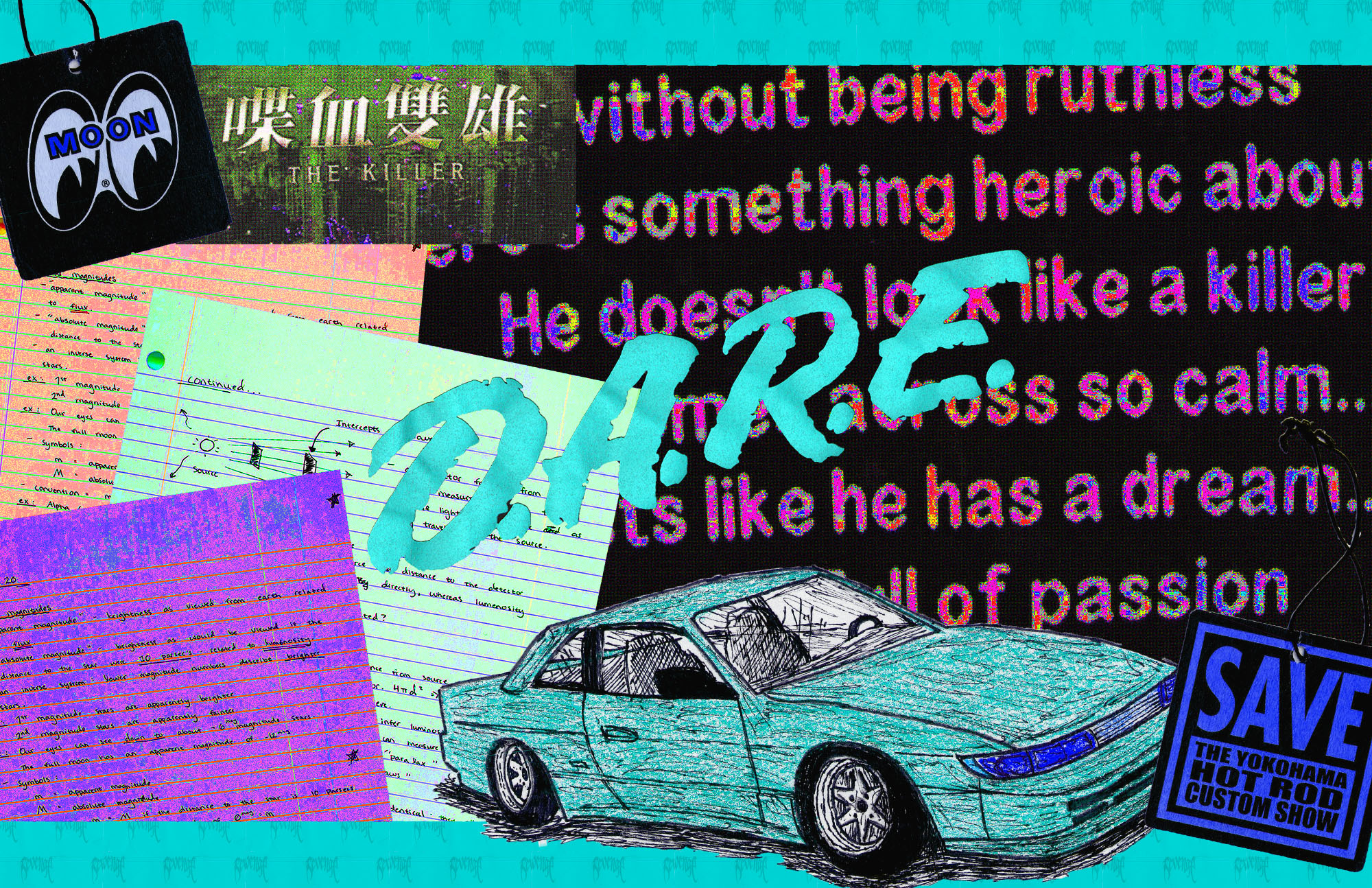
The first thing that I did when preparing for this assignment was to make sure that all of the items that I was going to scan had some sort of theme or meaning to me. In doing this, I ended up taking graphics from clothes, stickers, and cards with specific designs. The look I was going for in the project ended up changing a couple of times because of how hard it was to assemble the collage in a way that made sense. Throughout most of the project I was putting different things in different places, changing the size and the color. Eventually, I started grouping some of the objects together that were similar. According to Scott McCloud, the definition of a comic is “Juxtaposed pictorial and other images in deliberate sequence, intended to convey information and/or to produce and aesthetic response in the viewer”. My project resembles this definition because the color of the items gives it a theme and makes the project more aesthetic, as well as how the items are arranged in the space. The way that arranging my items gives them meaning was how they were all similar in style, theme, and orientation, however, since they were similar it made it easier towards the end to arrange them in a way that made sense. For example, I wanted to showcase work from one of my notebooks that looked a certain way, which I could pair up with a drawing that was cut out and placed from a piece of lined notebook paper. Adjusting the size and the orientation of the car allowed me to make it look like the drawing was coming off of my paper. The words in my project originated from the back of a shirt, which was scanned and then manipulated with different colors and styles until I felt good enough about it to use it as a decent amount of background space. Originally I only had one word on the shirt colored differently, but after multiple attempts at pulling the image off of the project and messing with the filters and colors in a separate file, I ended up stylizing all of the white text and using a chunk of it for the background of my project.
This is not my first time using Photoshop for a project that is this in depth. Last semester I took a DTC refresher on Adobe products and completed a few tutorials and some smaller assignments. In high school I learned and was able to use most Adobe products including Photoshop, but I mainly worked with Illustrator at that time. Some things that I learned for this project was how to mess around more with layer masks and colors. There was a lot of filtering, adjustments, and even some graphics that I was going to create by hand but ended up not rendering them into the project because it did not fit well. I learned how to render fire using a basic line shape, as well as how to create a colorized theme in a collage. The inspiration for the colors in this project was going for a vapor wave theme in the colors and the small dots that are film grain and different kinds of pixelation. I think that learning this process of scanning images and creating a whole collage on top of that was a very interesting and a good art style to know how to create. However, I thought that it was very difficult to come up with the orientation of the project because I had so many images and so many things that I could do to them, but I was not sure how to get inspired and get some ideas. It took me probably the longest just to get all of the images onto the art board and find a way to show what I wanted to and have the project still make sense. In conclusion I think that my opinion has changed on creating a digital environment and with the right direction and inspiration I think I could achieve much more than I did.
