Northwest Alternative Comics: Shira Feinberg

Unidentified Feeling Objects by Mita Mahato
page 2

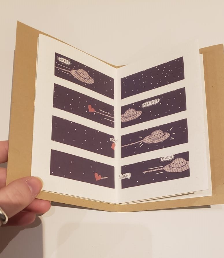
After viewing the Northwest Alternative Comics, I saw numerous unique artists that all expressed their comics in different ways. Mita Mahato’s art stood out the most to me. She used several design elements along with design principles to help convey her message in her short comic. I will discuss her comic Unidentified Feeling Object. Although it was short, Mahato was able to use several design elements and design principles to contribute to the piece. For example, she used lines to help the reader know where to read. This can be seen in her second and third pages as the second page shows the spaceship pulling a heart that goes from left to right, whereas the third page uses lines to show the path of the falling heart. She also uses color to contrast the darker background and spaceship to the bright red heart and the adventure that the heart takes. This catches the readers eye due to the contrast in color. With that said, the reader is also pulled to look at the spaceship for its unique texture, newspaper, which is unlike that of the background or heart. All these design elements are seen in the image, but they are not the only ones she used.

Unidentified Feeling Objects by Mita Mahato
page 3

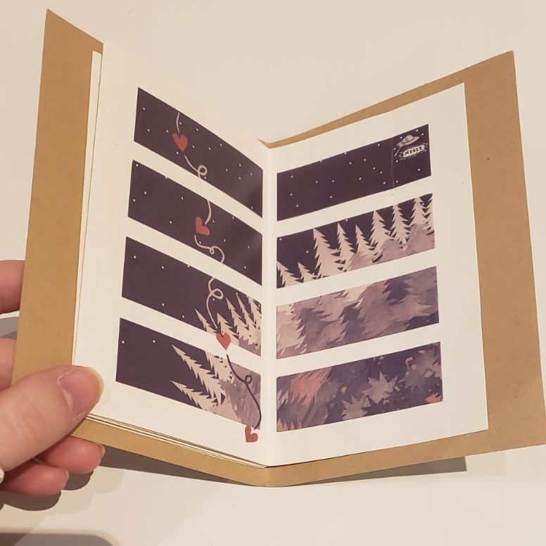
Mahato also used design principles to help bring her piece together. She used repetition of the same scene with slight adjustments to allow the reader to truly focus in on the scene almost as if the cartoon was a few frames from a stop motion film, which is seen both on the second and third page. Furthermore, she used gradation to represent depth, on the third page, thereby illustrating how the heart is falling further down and even goes out of the frame. This shows dominance as the heart is not only a contrasting color, but it also goes out of the frame which emphasizes its importance.

Another thing that Mahato does is that she causes the reader to question time. This is seen in the third page as it seems like Mahato wants the reader to look at the image as a whole, but she wants you to follow the heart. I think this as by looking at the image as a whole, you can see the trees growing up into the sky. As per closure, it seems like there is a lot of aspect to aspect with the image continuing onto another frame which shows a continuation of the image.

Overall, Mita Mahato uses several design elements, design principles, closure, and time frame in her short cartoon. These pieces all come together to make the whole piece come together as one.

Posted in 201 Blog, Northwest Alternative Comics | Leave a comment

Northwest Alternative Comics: Anh Ngo

Attractive Woman, 2015″ – Ride the Worm by Dune#33

During our visit to the WSU Museum collection study center from the Northwest Alternative comics collection, the comic that really caught my eyes was the “Ride the Worm” by Dune#33. This is due to the fact that there are over 70 different comic artists who came together and created individual short stories, in which were put together to create a full book. This makes the reader (at least for me) feel very refreshing when reading and seeing the different art styles and stories within one space. Not only that, some stories played with juxtaposition pictorial as not all of the short stories followed the traditional comic format by using panels. For example, Attractive Woman, 2015 does not show any defined line separations in between images. Instead, they used speech bubble and connections of objects to direct the reader to the following panel that is intended for the story to move smoothly.


Some of the characters and objects within the stories have a more defined line and shape. Some lines are thinner than others, with little to no type of shading, no hatching or solid shadows. while others still have some pencil marks underneath pen marks. This makes the readers feel like they are actively watching the artist in the process of creating their art pieces.


Since these are all short stories put into one book, the timeframe of some stories are of different actions are happening all at once, while others are traditional style of showing different actions happening within different panels as time progress or at the same time. In other word, the actions are being divided in which is happening within the same time and space, allowing more contents to be shown within the story. The closer of each story varies. Some doesn’t really have too much words or other images that would automatically tell us about its story. With these, it leaves it to the readers’ imagination by “mentally filling in the gaps of what we observe, thus allowing readers to comprehend the action and meaning between two seemingly unrelated panels”. (McCloud)

Posted in 201 Blog, Northwest Alternative Comics, Uncategorized | Leave a comment

Northwest Alternative Comics: Edgar Martinez

Hybrid Moment by Mac Clotfelter

When looking at the Northwest alternative comics this was one of the large framed ones. It was kind of hard to believe that these comics were created by people with pen and paper. There was a particular comic in which I took a really close look and could see the pen strokes. This large framed comic by Max Clotfelter caught my attention as I was browsing the comics due to its unique art style. This comic really makes excellent use of texture and value as it can be seen during the transformation and the brick wall. I am a huge fan of texture when it comes to art and seeing that comic artist employ this design choice makes me happy. This page is an example of how closure isn’t used and instead each step is shown through each panel. I think its a good idea to have a mix of closure and showing the reader what is happening.

By Max Clotfelter

This is another short comic by Max Clotfelter but this one came from one of the zinnies. After seeing the first image I wanted to explore more of his comics and happened across this one. The way time frames are used in this particular example were really fascinating to me. When I think of creative ways of using panels in comics this is what i think of. I love Max Clotfelters kinda gross art style and the creative ways in which he uses texture and tone. The different shades of black make the comic appear to have depth. This short comic seems to be heading in one direction but the closure is the exact opposite of what we think, it is a subversion.

Posted in 201 Blog, Northwest Alternative Comics | Leave a comment

Northwest Alternative Comics: Korie Cedre

When visiting the WSU Art Museum Collection of the Northwest Alternative Comics collection, one artist stood out to me as I read one of her printed works. However, for this post, I will be focusing on the printed work by her, “Making Tide and other stories” by Eroyn Franklin. In this work, it seems to be a comic made of pen and ink, scanned perhaps, and turned into a printed piece. “Making Tide,” follows a girl throughout her travel in a country that is near a beach of some sorts, suggested by the title. The main story seems to be how her and her friends approach bodies in a cave while on an activity. With this, some elements and principles of design I noticed in this work is the lines/shape as the work seems to be done entirely in pen. This makes the texture of the work appear smooth, or more soft hard, much like a pen does to paper due to the heaviness ink can have. Franklin also avoids color as the entirety of the comic is in black and white, once again due to her chosen tool. In terms of principles, I recognize dominance, and contrast. This can especially be seen in the example provide below. The girl and those with her are admiring all of the birds flying in a group around them. This is until the birds land on a wire for electricity and a lot of them get shocked, unfortunately dying. As you can see on the left hand of the pages below, the background where the frames how the persons are lighter and remain a simple background shaded in. However, upon the birds dying, the people are shown in three frames in which the background is darker. This affects my interpretation of the comic as this simple decision enhances the thoughts and emotions shared between these two people, such as disbelief, and severity of what happened. The background on the right hand differs by not only being darker, but shows a bit of a pattern with squares, being dominance. It is also contrasts in light or dark between the frames on the left and the right, a decision made so readers can read the situation without a linguistic tool. In terms of closure, I noticed subject-to-subject in this same example as readers can see birds become shocked and die by the electric cords running through the city. A few frames after, a linguistic tool says that the electricity is out everywhere, in which since the two situations are related in terms of subject, it becomes an example of closure through subject-to-subject. This is for readers are able to connect the two situations and state that the birds are the cause for the electricity to be out everywhere.

Pages from Eroyn Franklin’s, “Making Tide and Other Stories,” a comic from the Northwestern Alternative Comics collection (Eroyn Franklin, Making Tides and Other Stories, 2014).


Posted in 201 Blog, Northwest Alternative Comics | Leave a comment

Northwest Alternative Comics: Sophie Dimry

from “Abruption” by Taylor Dow

I chose to focus on a spread from Taylor Dow’s comic book, “Abruption”. I was attracted to his work because of his style. Dow uses an ultra fine point radiograph pen to draw his comics, which creates an complex, detailed style yet with simple figures and drawings.

This comic is interesting to me because of the use of panels. I think by using the same size of panels, it conveys a consistency in time. These panels show that time is consistently passing by at the same rate. Dow also shows this by keeping many panels black. In the first panel there is a man running into a dark room. By keeping several panels black, the reader visualizes the man walking through the room for a period of time until he reaches the light. This demonstrates the repetition principle of design. You see the silhouette of the man slowly appear in the panels. The whole scene shows harmony in that each panel effectively flows into the next. I really liked the use of light in these drawings and found it very interesting how he chose to draw the light in different ways. This scene is very simplistic but I think it shows different elements of design like texture and color. The texture in the frames on the second page is interesting to me because of the pointillism style Dow uses. The pointillism is a very effective way of creating hazy shadows in the dark and looks very similar to how our eyes see in the dark. I also liked how this comic differed from other by only using black and white as color. This is because of the tool used, the ultra fine pen. Overall, I loved Dow’s work because of how different it was from the traditional comic and because the story was so unconventional and interesting. The drawings were very detailed yet simple which I thought stood out from some of the other comics I viewed.

Posted in 201 Blog | Leave a comment

Northwest Alternative Comics: Rachel Fox

This is a digital comic from Artist Ellen Forneys digital collection. Ellen Forney – Comics, ellenforney.com/comics.html#&gid=1&pid=1.

For this post I chose to analyze something from Ellen Forney Web collections, I was unable to attend the WSU Art Museum Collection Study Center so am opting this as my media choice. The piece is a one panel comic about spiders in a home ec class. The comic is one moment of time but has a whole story captured in it. The spider teacher demeaning the spider student named Lawrence over his minimalist artistic web design tells a whole tale of Lawrence not wanting to be caught in a life of web building but creative web design. The faces are very abstract and simply illustrated so it is easier to grasp them as a human like face in a day to day situation. It is also easier to project oneself into the spider situation because there is so little to the face and design you can only recognize it as a face or a being with a certain emotion. 

The illustration in the comic is fairly simple but intentional. The varying line thickness in the border and detail illustrations create a sense of motion and energy in the still background. The slightly muted but spring tones chosen for the color pallet give the comic life and energy and the young spiders being pastel spring tones makes them seem young like this comic is occurring in an elementary school or middle school. 

This  short moment in time holds an interesting time frame because the flow of the comic keeps things moving from the text to the art that Lawrence the spider made then the other student art. Lastly you see Lawrence and his reaction that occurs to the teachers statement. The shifting of the clock in one panel is well displayed here because the construction of the comic is in such a way that it is clear how the reader will pass through it so everything makes sense at the right time. 

Posted in 201 Blog, Northwest Alternative Comics | Leave a comment

Northwest Alternative Comics: Jasper Contreras

Sorry Sheets by Eroyn Franklin

There were a lot of examples to go over from the Northwest Alternative Comics collection. One of the zines/comics I noticed was Sorry Sheets by Eroyn Franklin. It was pretty minimalist in it’s art style and wasn’t overly complex with colors or anything. Most of the art style consisted of basic outlining and a bit more line work to create a sense of texture or of movement as within the water from the faucet. Franklin tells a pretty simple story with a minimalist art style and is able to convey this narrative through the simplicity and minimalism so the reader can more digest what exactly is happening. 

The whole thing moved pretty linearly in a moment to moment kind of closure. It moved frame by frame and didn’t have much other structure to it than those frames. I liked it for it’s simplicity  and lack of over complexity because I thought it helped to deliver the tone of the narrative. The form of closure this comic used, had a fairly average “gutter” size but also didn’t necessitate a lot of interpretation from the reader. Because the images were fairly simple, it did have a sense of repetition to it with the way the frames functioned and moved from moment to moment in it’s uses of language. 

Sorry Sheets by Eroyn Franklin

Sorry Sheets wasn’t a necessarily long story to follow, nor was it hard to. But it had this sort of vagueness that left it open-ended and broad. The story has to happen over, maybe, an hour or so. There’s time for her to fall in a bath, get cut, just sit on the floor bleeding, her husband complains about the water temperature, what seems to be a regular morning or night for this dynamic. Overall, I think this comic had a nice simplicity to it that allowed for a pleasing aesthetic appeal that drew the reader in. 

Posted in 201 Blog, Northwest Alternative Comics, Uncategorized | Leave a comment

Northwest Alternative Comics: Cameron Cain

In his zine Abruption, Taylor Dow appears to focus on the uses of line, direction, size, and contrast to direct the reader’s experience. As the comic is only black ink on brown paper, there is no color, though there is value. In many visuals, all the reader sees is a wild mess of lines running generally in one direction, such as when the man approaches the tree to begin climbing; the lines run vertically. When we see the whole tree, and how tall it stands, the tree itself is used as a line in the upward direction, contrasted by the dark sky behind. It is also shown in its entirety to emphasize the disparity between the enormity of the tree and the smallness of the man.

Another notable employment of these elements comes at the drawn-out conclusion, where the man leaps across the abyss to meet the shadow man in the middle. Here, the emphasis is on contrast – the faces of either side of the chasm against the dark night sky beyond, and the position and movement of either man as they fly through the air.

I really like this sort of visual style – high contrast, and made with simple black lines and shapes. It is a sort of style wherein texture is created through the use of lines, rather than the use of gradation or shape. We can see the tree is rough, with a complex, uneven exterior that can be believably gripped by our protagonist, even though each individual line used to achieve this effect is smooth and curvy. To me, this visual style is good for unsettling and absurd imagery. The texture is personal, and the high contrast and simple lines are great for creating strange proportion in what are supposed to be more familiar images – such as the bloated man in the tree hollow and his long, snaking arms.

I also appreciate the time framing used in the ending, it almost makes the moment feel like it’s in slow-motion, each moment being experienced in its entirety before moving on to the next, near-identical moment. The progress is slow and deliberate, despite the apparent peril the two men face from the chasm below. We are forced into a suspense and left without resolution in the final frames.

Posted in 201 Blog, Northwest Alternative Comics | Leave a comment

Northwest Alternative Comics: Ivan Franco

Abruption by Taylor Dow 2014

When in the Fine arts Building. I read this book called Abruption. It was the most interesting book I read at the table. A combination of a surreal story, amazing visuals and a melancholic mood made for a interesting read and view. The book follows this nameless character through strange and trippy events. The book has little color, just black and white, but it makes good effort on depending on the colors to describe the story. The shapes of characters are nor boxy and rarely stagnant, the characters display motion very effectively. Most of the textures are smooth and pleasing to look at. Even if the story is chaotic and unpredictable, it is never in any danger or threatening. there are great uses of hue and light later in the book when the main character encounters an inverted dark character of himself that mimics his moves in the opposite direction, because of the minimal colors the dark character represents a perfect alternative. The book also constantly does this breaking of panels to move across time and images. In the photo above the character breaks through the panel into the water below. and just before you can see the character crawl across multiple panels to show the progression of space and time.

Posted in 201 Blog | Leave a comment

Northwest Alternative Comics: Ben Apostol

The comic that I chose to take a look at analyzing closure and time frames was a piece by David Lasky. This one in particular stood out to me because of the free form style the art takes on in letting the person viewing decide how to interpret it. Each of the components of the comic presents new smaller details that adds to the complexity and the message. When looking at the image as a whole, there is a vivid scene set up by the artist that uses balance and different shape orientation to make the image look complete and whole, instead of random details pasted onto the scene. The artist uses the message bubbles in the scene to communicate to the viewer what is happening to each of the depicted figures. It shows characters either speaking or thinking, but without using words. The artist uses smaller images in the bubbles to give the viewer a symbol. The symbolism in the piece translates through the viewer to use context and the details surrounding the characters to understand who they are and what they are doing. Although the artist gives a lot of the interpreting of the comic to the viewer there is still a fair amount included into the comic that helps the viewer piece together what is happening, such dialog between the characters. This was an interesting a inspiring way to orient a comic, and is a unique way to let the reader or the viewer look at the details and create their own interpretations.

Posted in 201 Blog, Northwest Alternative Comics | Leave a comment