
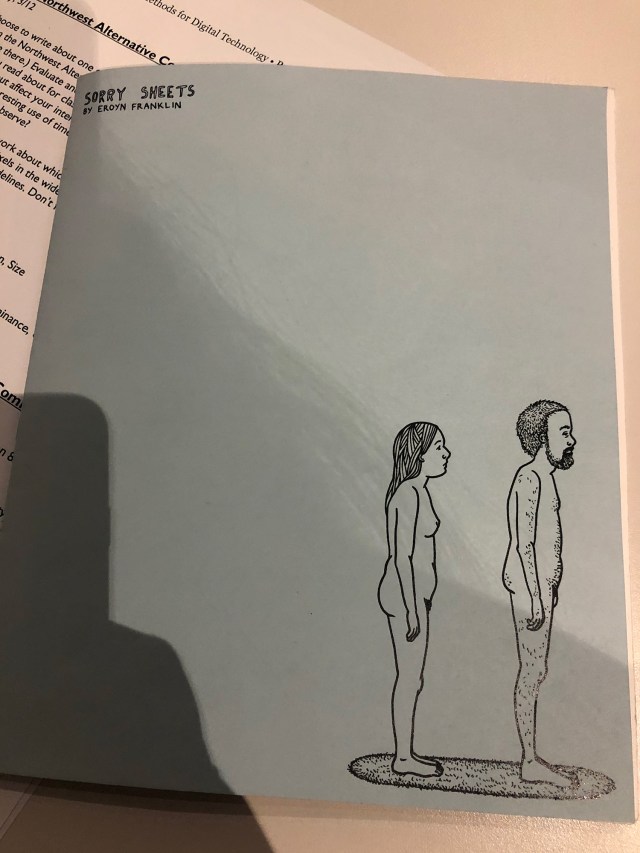
There were a lot of examples to go over from the Northwest Alternative Comics collection. One of the zines/comics I noticed was Sorry Sheets by Eroyn Franklin. It was pretty minimalist in it’s art style and wasn’t overly complex with colors or anything. Most of the art style consisted of basic outlining and a bit more line work to create a sense of texture or of movement as within the water from the faucet. Franklin tells a pretty simple story with a minimalist art style and is able to convey this narrative through the simplicity and minimalism so the reader can more digest what exactly is happening.
The whole thing moved pretty linearly in a moment to moment kind of closure. It moved frame by frame and didn’t have much other structure to it than those frames. I liked it for it’s simplicity and lack of over complexity because I thought it helped to deliver the tone of the narrative. The form of closure this comic used, had a fairly average “gutter” size but also didn’t necessitate a lot of interpretation from the reader. Because the images were fairly simple, it did have a sense of repetition to it with the way the frames functioned and moved from moment to moment in it’s uses of language.
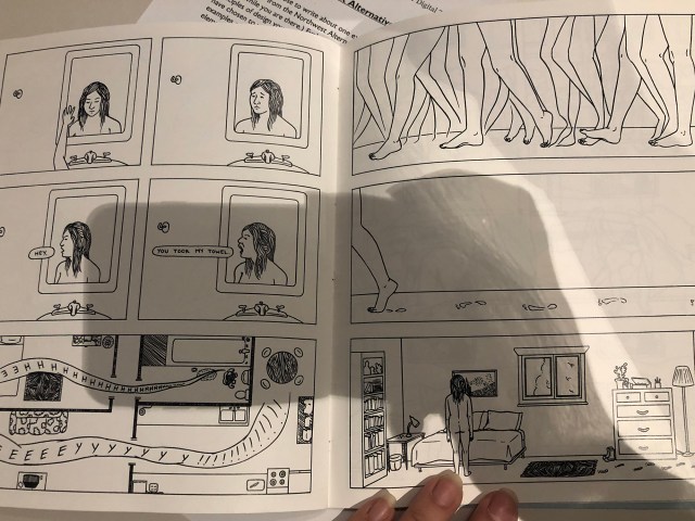
Sorry Sheets wasn’t a necessarily long story to follow, nor was it hard to. But it had this sort of vagueness that left it open-ended and broad. The story has to happen over, maybe, an hour or so. There’s time for her to fall in a bath, get cut, just sit on the floor bleeding, her husband complains about the water temperature, what seems to be a regular morning or night for this dynamic. Overall, I think this comic had a nice simplicity to it that allowed for a pleasing aesthetic appeal that drew the reader in.
