Time & Motion: Tia Caton

comic_smile_post-5

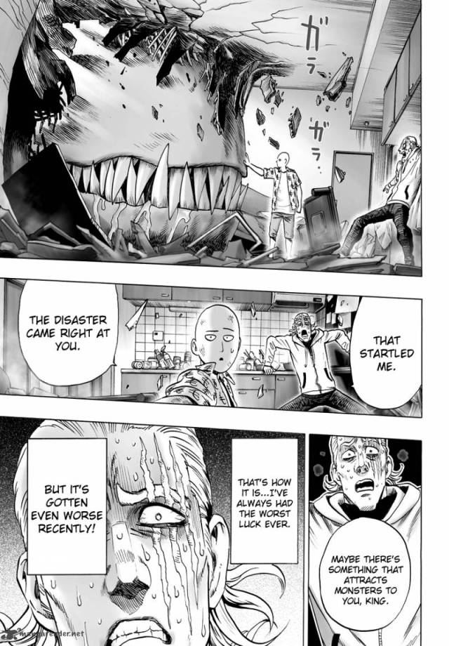
Raina Telgemeire’s comic “Smile”

For this post I really wanted to use an image from the comic Smile by Raina Telgemeire that I read earlier in the semester. After reading the chapter I thought this was a pretty good example of the use of time and motion. Time and motion were said to be two closely related principals. It was said that motion is a type of change and that change takes place in time. This motion can also be implied or literal, meaning that an object can actually move or just look like it has moved. There are also alternative modes of change which are scale, transparency, color, layer and more. By changing one of these modes you could create the appearance of motion. Along with these, the use of scale, cropping, repetition, overlap, rotation and shape help with the visual appearance of movements in two dimensional works.

In this comic you can see the that each of the frames have their own sort of “zooming” appearance. By cropping the image so that the people are closer or farther it looks as if they are moving the camera view closer or further away. Specifically in the last frame the man’s arm is the only thing there. By cropping the rest of his body out it appears as if his arm is zooming into the frame and furthering the “shoving” motion that is happening. A similar effect is happening in the second to last frame as well. By having the doctors hand in the corner and appropriately scaled to fit near the girls face it looks as if he is inching his way closer to her face. I think that the only other element really present here is the use of shapes and words in order to portray movement. In many of the frames you can see little dashes or lines that run along the path of moving objects such as the doctors arm. By including little details like this and following the path that the object is traveling it makes it really look like and indicate that the characters are moving. My favorite example of this is the last frame of the girl getting the dental equipment shoved into her mouth. It was this exact frame of movement that made me want to look at this comic again and use it as an example.

Posted in Spring 2017 Archive (336) | Leave a comment

Time & Motion: Eva Guillen

Page 125 from Lynda Barry's graphic novel "What it is."

Page 125 from Lynda Barry’s graphic novel “What it is.”

When looking at this page from the graphic novel “What it is” I can spot the movement of the characters at the bottom. I am able to see their movement as the characters wrap around the text. There is a repetition used when it comes to the rotation of the characters; I can tell that they are all rotating clockwise. Then if I glance at the bottom ghost-like character I am able to tell that it is cropped out from the rest of the graphics done on this page. This is due to the shape around the character that overlaps the background of the other ghosts. Yet, because this character is in a shape that surrounds it, I can tell that it holds importance. The importance is noticed when the character stands out at the bottom of the page. Especially because compare to the other similar ghost, this one is framed to make it seem that it’s separate. The shape surrounding this bottom ghost also makes it feel like it is floating. Then I would also describe that the other two characters that are floating around the middle text appear as if they are moving because of the overlap they have on the background. The background seems it has repeated lines going the same direction, creating the effect of wind. This effect allows me to assume that the ghost like characters are moving along with the wind that is drawn. The page from the graphic novel that I chose helps me see what the quote states “Motion can be implied” if you look at the formatting done and the overall structure.

Posted in Spring 2017 Archive (336) | Leave a comment

Time and Motion – Javin Nash

time-and-motion

“Apocalypse Dad” by Taylor Dow. http://www.taylorhdow.com page 13

Motion is a kind of change and change takes place in time. This picture exemplifies this because the character is falling in space and as he falls his body is getting closer to the bottom of the black square or what we call the frame. The images at the top left and bottom left show that the main image was cropped. The first four images were designed to display a sense of movement whereas the last two images were static. Although there was no real repetition in this series of images or rotation the illustrator captured a moment in time of the character falling until he hits the ground to display the object at a dramatic instant (static). Another way the illustrator showed Time and Motion was through eruption of form with the white air contrasting, as the character was falling, the black background. I would have imagined the characters scale to change as he fell. From a bird’s eye view or an ants point of view I would have made the characters scale change instead of keeping it the same to show change in time and motion but the way the illustrator chose to do this was unique. I enjoyed the way the character was made with restless lines because usually people are drawn with solid lines and this caught my attention. There was no change in depth, color or transparency, there was hardly any change over time at all according to the book’s definition but there was a sense of change in position.


Posted in Sample Posts by Students, Spring 2017 Archive (336) | Leave a comment

Time and Motion: Alexa Berg

Time and motion are very important aspects of graphic design, as they convey temporal change in both still and time based media. In the graphic memoir Smile by Raina Telgemeier, the author does a good job of illustrating implied motion within her still based frames. One way she was able to do so was by drawing her figures diagonally, rather than statically and centered with its edges parallel to the frame to show that something is progressing forward. The image also uses points and lines to highlight that there is in fact a motion occuring with in the scene. For instance, the girl jumping out from the vehicle is surrounded by a series of lines beneath her feet to evoke the movement. Each action is assigned a different graphic element to support the implied motion that takes place. Shapes are also used to show that these images are above the ground in the air moving forward by the use of shadows. Cropping can also help to illustrate motion, and in this example, the cropped arm in the bottom frame shows that the image is suppose to be far behind, and since we can just see her arm reaching out for only part of another image, we can observe implied motion.

smile2

Smile, Raina Telgemeier

Posted in Spring 2017 Archive (336) | Leave a comment

Time and Motion: Sophia Price

https://kristinbeckerdtc.com/wp-content/uploads/2017/02/img_07321.jpg

Page 76, from Lynda Barry’s One! Hundred! Demons!

Motion in two-dementional art is something that is often implied. This is done through cropped images, such as the frame on the right in the comic from Lynda Barry’s One! Hundred! Demons! The teacher is entering the same area as the girls through the way her body is partially cropped out of the image, and partially in it. Her movement is implied- an image does not actually have the ability to move within a frame. Barry uses several different skills to show movement within her graphic novel. The tilting of the girls in the left frame adds tension to their grasp on the bunny. The shadowing, under their bodies lets the reader know they are being held up by this tension, even though they are just within a image. By rotating their bodies to be slanted, with the bunny static in the center, it is clear that motion is implied to be pulling on the toy in between them. The lines around the bodies add to this notion, giving air and movement to the frame. Though they are not actually shown moving here, it is easy to tell that is what Barry wants to relate within the picture. Through the shading and the rotation of the bodies, Barry has discovered a way to let her reader’s know the movement within the image. It is one that is relatable, two girls fighting over a toy, and one that can be easily interpreted. In the right frame, it is easy to interpret the wagging of fingers at each other, even without added skill to the comic. The anger in the girls eyes and the pointed fingers is all that is really needed to imply that motion. Barry adds emotion and movement to most of her comics, making it easy to feel her characters flow throughout them.

Posted in Spring 2017 Archive (336), Uncategorized | Leave a comment

Scale: Cleana Broman

beast_titan_mikes_horse

Hajime, Isayama. “Attack on Titan.” Bunkyō, Tokyo: Kodansha, 2009. Print.

In this scene from the comic book (or manga) “Attack on Titan”, this titan is seen grabbing this horse and pulling him from off the ground. We all have relative knowledge about how large or small everyday animals or objects are that we have in our mind, and when we see it compared to another unfamiliar object we can gauge the size more accurately. In this case, we can see the titan is gigantic because of how he towers over the horse. The perspective also contributes to making this creature look giant. In Graphic Design The New Basics, the author discusses how when a designer prints off their work, they are often disappointed with the outcome compared to how it looked when designing it on the computer itself. I definitely related to this, after I’ve made a few fliers for Cable 8 here at WSU and various other works that were meant to be scaled down and printed on smaller pieces of paper, after seeing them larger on the screen of my laptop the results were disappointing sometimes, or some images or aspects didn’t look as clear when they were printed at a smaller size that what I saw while designing it. It’s definitely something good to keep in mind.


Posted in Spring 2017 Archive (336) | Leave a comment

Point, Line, Plane : Cass McKay

I forgot to save a picture of the war comic I read in the library with Mrs. O’English but next time I am in there I will and I’ll upload it to this post.  Im also currently spacing the title but it was one of the really famous war comics.  When I was reading this comic you could see the composition was varying from a lot of the popular super hero comics, this one had no boxes to frame the scenes.  Yet, its design allowed for my eyes to flow more smooth throughout the scene because they weren’t restricted by borders.  This is a fairly rare technique in comics because I cant say I’ve seen this method anywhere else before I read this non fiction war comic.  It allowed for the page to hold less content and be more whimsical since there weren’t any separators within a page.  I personally wouldn’t mind if this style made somewhat of a comeback in comics and the graphic novel field as its much more appealing to the eye then the current way.  I think a hybrid form could be made out of it by allowing there to be some dividers and giving some space the freedom.

Posted in Spring 2017 Archive (336), Uncategorized | Leave a comment

Henry Buehler-Scale

Scale is a tool used by artists that allows for them to visually shape a scene and add to the context simply by using size and perspective. In the manga adaptation of the webcomic, One Punch Man, scale is utilized many times throughout the series to showcase the main character’s strength. In the scene pictured, a giant monster’s face has smashed through his apartment. The monster is held back by Saitama, who is only half the size of the monster’s mouth and is doing so one-handed. When examining this scene, the reader understands how strong Saitama is, even without being told directly, and the scale allows for a direct comparison due the difference in size and the simplicity of the exchange between them.

Another example of scale is shown below the scene between Saitama and the monster. Saitama’s friend King is shown huddling in the back in fear. When Saitama speaks to him, most of his upper body is in the panel along with a speech bubble below his face. When King thinks to himself, his face is shown much more closely to “the camera” and is drawn in more detail in order to showcase his much more terrified expression.

In short, I would say the greatest effects of scale are context and emphasis. Scale is the “flavoring” of a scene that can make action scenes more dynamic and impressive and dramatic scenes more emotional.


onepunch_man_55_13

One Punch Man Chapter 55 Page 13, Written by One and Illustrated by Yusuke Murata

Posted in Spring 2017 Archive (336), Uncategorized | Leave a comment

Formstorming

2017-01-31-09-32-09
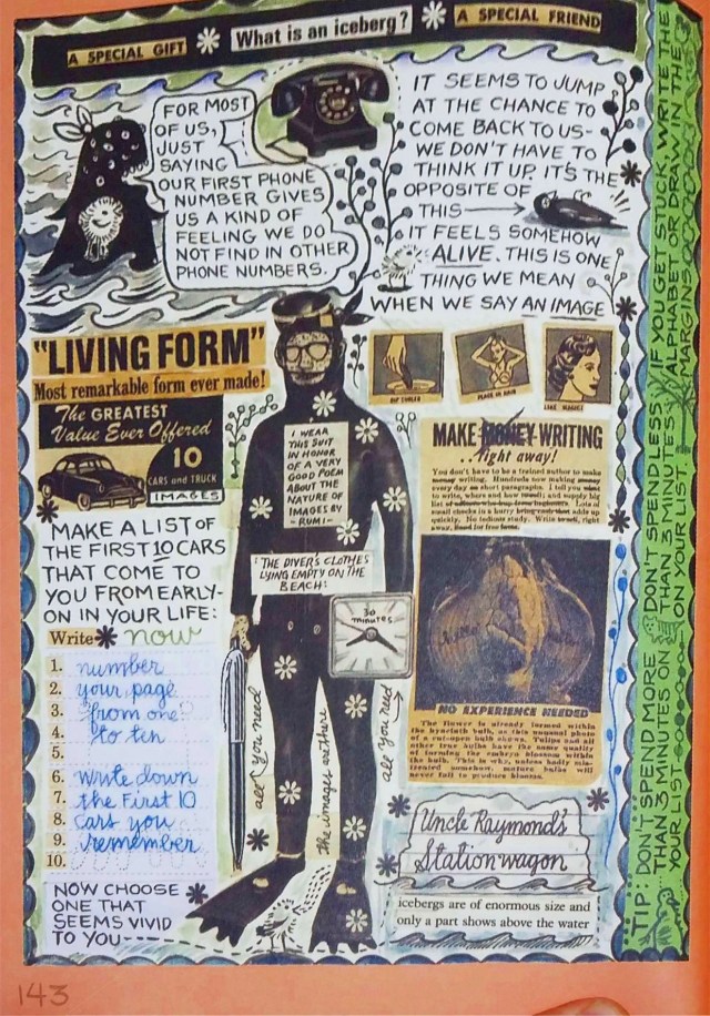
This is the page (#143) from Lynda Berry’s book What It Is that I chose to select on the topic of “formstorming”.  I believe that this is or could be a very efficient way of visually working to find a solution.  I do know that a lot of people learn better visually than orally and vice versa.  The page I selected is a good demonstration of formstorming as the page is very visually appealing while it still on the topic of working through your ideas.  Personally i’m not a big visual learner, I do better when i’m listening to guidelines for a project.  If i were a visual learner id be drawing things that connect personally to my ideas so I can remember them easier that way.

Posted in Spring 2017 Archive (336) | Leave a comment

Scale: Conor Reich

ant man.jpg

Page from, Avengers #223

In class we have discussed how the concept of scale can be both subjective and objective. Objective scale means an image is depicted in relation to other images in a way which makes the scale of the image seem actual. In other words, as readers, we will most commonly see a human character’s hands and feet in proportion to their body. Similarly, if the character was speaking on the phone, we would expect the phone to fit in the size of their hands. In other words, scale is important because it clues the reader into the intractability of the character’s world.

When I think of scale my mind instantly jumps to the Ant-Man Comics. Ant-Man is a character which can shrink and grow at the press of a button. Therefore,  proper scaling is immensely important.

In this excerpt we see Ant-Man Shrink down so small he can grab on to the end of an arrow and ride it into battle. The first panel depicts the scaling down of Ant-Man. In a way this panel is objective scaling because he is actually shrinking to the size of an ant. However, in the next panel the illustrator chose to demonstrate subjective scaling.  We know Ant-Man is meant to be small enough to latch on to the arrow yet the top right panel appears to make him slightly larger in order to incorporate some of his costume detail. In other words, his scale is subjective and objective. Sure, he is small enough to ride an arrow and this is portrayed objectively via his shrinking, yet the scale is subjective when it comes down to exactly how small he is. All we know as readers, is that Ant-Man can shrink or grow to adapt and interact with nearly any object big or small.

Posted in Spring 2017 Archive (336), Uncategorized | Leave a comment