Graphic Novel Review: Blaine Casil

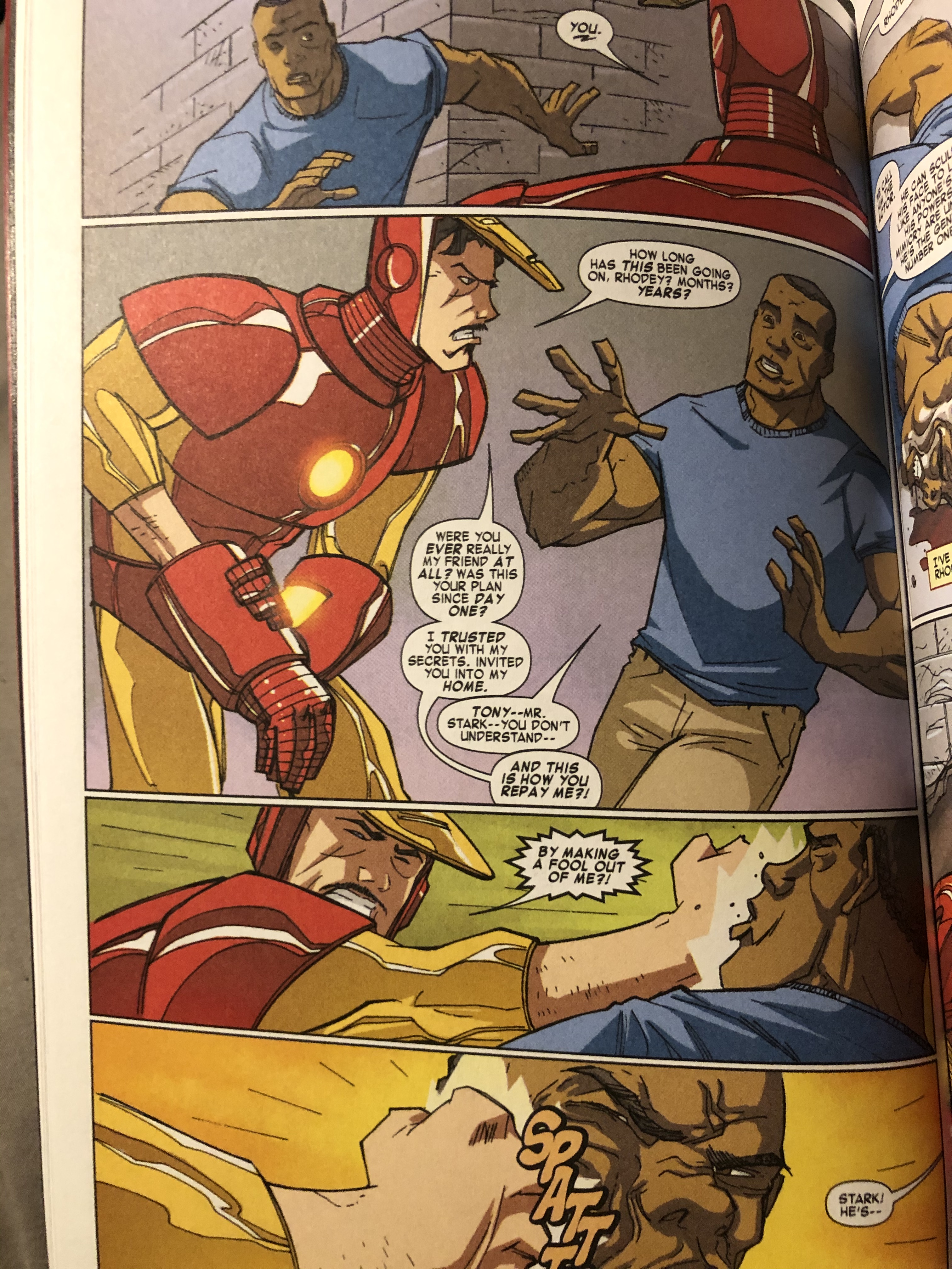
The comic book I read was “Iron Man: Armor Wars” by Joe Caramagna and Craig Rousseau. This specific story of the Iron Man collection took me through the struggles of Tony Stark, aka Iron Man. Tony is a character, not only in this comic story but in many others, who is cocky and has a big head, but in this story he had a lot of doubt about what he did. It was explained in a few parts of it that he stopped doing what he does best, which is creating new and better weapons, because people had mixed emotions about it. Many said that he built weapons to kill others not to make peace. This hit him because as he was trying to prove them wrong, his Iron Man suits were stolen and causing danger to the public. This proved the public’s view of him correctly, that he is solely to be blamed for endangering people. However, at the end, he realized that people kill people and that his technology did not. Of course it was used, but it was used out of ill intentions. 

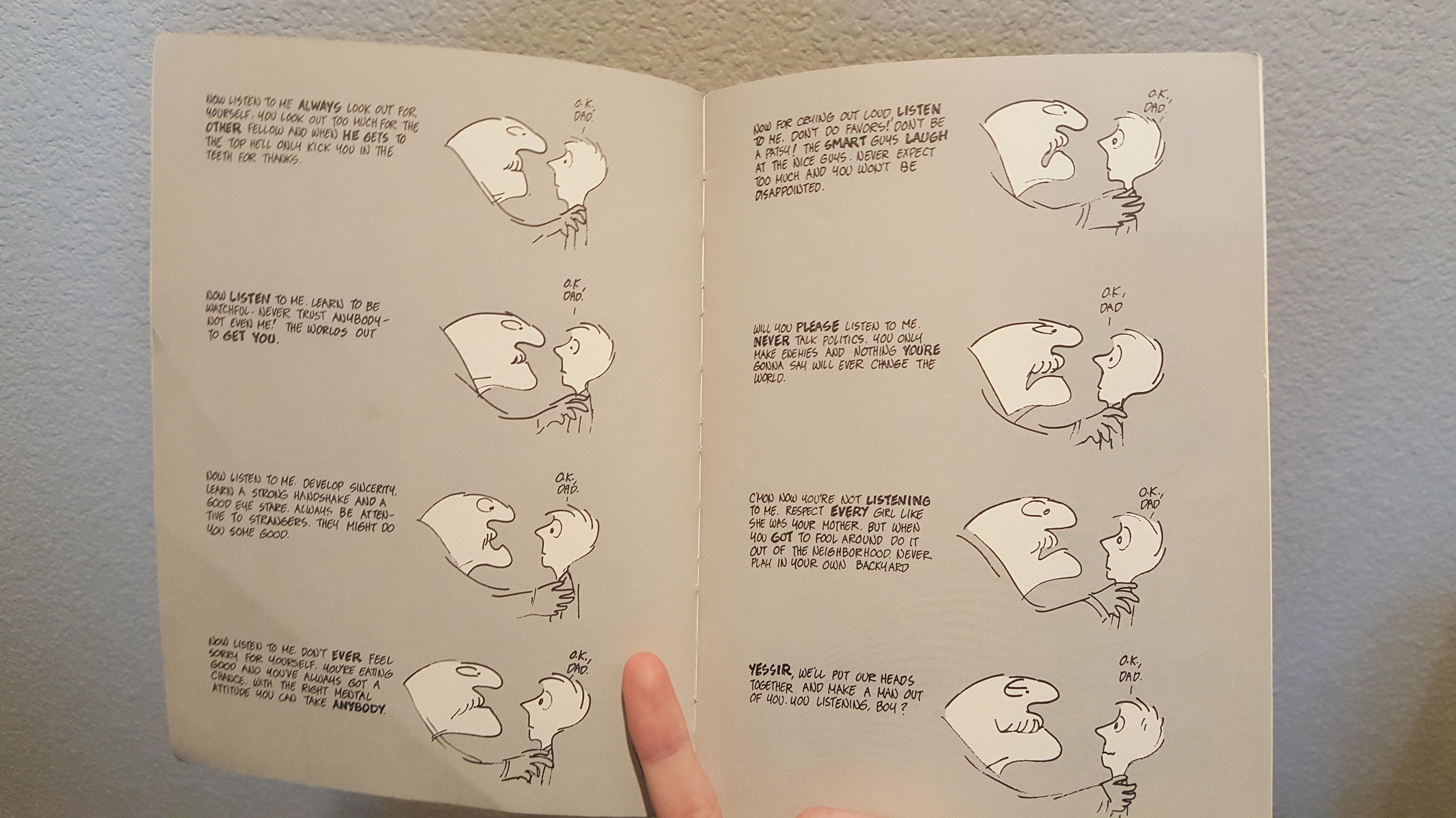
In Scott McClouds book “Understanding Comics” he wrote a chapter about “living in line” which was about how emotions can be used within comics. This can vary between lines, images, colors and text bubbles. A few of the ways that Joe Caramagna and Craig Rousseau used to show emotions were through the facial expressions of the characters, the scenery, as text bubbles. For facial expressions, throughout the comic, all the characters had different expressions depending on the situation, whether they were panicked, happy, or angry. For the scenery, when the villains were portrayed, they were in a lair which had very little color to it, mostly black, grey or white. If it was outside or a happier scene, there were brighter colors like red, yellow, and blue. One of the most unique things that showed expression were the text bubbles. There were the normal text bubbles while the characters were talking, however, when what they were saying had anger behind it, the text bubbles became rigid and spiky. Another example is also when the characters had a hard time breathing, the text bubbles were curvey and also more spread out to show that they could hardly get their sentences out. 

Iron Man: Armor Wars by Joe Caramagna and Craig Rousseau

Posted in 201 Blog, Graphic Novel Review | Leave a comment

Graphic Novel Review: Maddy West

The comic that I choose to read and review is “Exits” by Daryl Seitchik. This book follows Claire Kim, a girl who hates herself and her world. She works at a mirror store and as she shows customers their reflections, she wishes to erase her own, mainly because she is never truly able to control how others see her. She constantly deals with objectification and others telling her what they believe that she is. Claire’s inability to control her life and the people around her lead to her feeling both isolated and alienated from the world around her. She even tries to ask for help but is ignored and pushed aside. On her way home from working at the mirror store, Claire desire to disappear comes true, and she begins to explore her city (and her own brain) invisibly. Throughout this exploration, Seitchik explores many different topics, addressing the feelings that people have when they don’t believe that they fit into society and the anxiety that comes with that. It also addresses Claire’s status in society as a woman and how they experience constantly being the “other” that is often not addressed in mainstream media. Claire is no longer willing to be the object that women are typically forced to be in and so she just leaves (or exits, which is the title of the book).

I think that the artwork that Seitchik uses is very interesting for many different reasons. First off, he only uses three colors throughout the whole comic (black, white, and gray). This combination really forces the reader to look closes at the images to understand what they are trying to show as there is no “highlighting” any part of the image with a specific color. In Scott McCloud’s “Understanding Comics” chapter “Living in Line” I was really interested by his explanation about how different elements (such as background, line type, and font type) can evoke different emotions/experiences. In Exits, the backgrounds typically remain artistically pretty minimal but have a lot of texture, brought in by dots and lines, and details. These combine to help bring out the emotions of the reader. I think the best example of this is that it shows details of everyday real life, like a homeless person sitting out on the street. Another thing that McCloud mentions is having more and less developed characters. I think that Seitchik uses this concept well in adding more details to the characters that are important to Claire (even if she may not like the person). As shown in the example, when Claire pictures her own funeral, most of the people attending are almost faceless but her mother and Brad (her stepfather) are detailed. This scene is also a good example of the simple background (which is all white) but how there are details (such as on all of the attendees’ clothes/bags. Overall, I really liked this comics message and iconography due to the unique factors of both.

Posted in 201 Blog, Graphic Novel Review | Leave a comment

Graphic Novel Review: Cameron Cain

The book I chose for this assignment was The Explainers by Jules Feiffer. This is not a graphic novel, but a collection of comics. I know I was supposed to find a graphic novel. I intended to find one. When I was looking for one at the WSU library, every selection I could find in the database turned out to be unviable. So, I went and searched manually in the library in a section that appeared to be comics and graphic novels. By the time I finally found an interesting one, I had forgotten the nature of the assignment. By the time I realized this, a pandemic had broken out and I couldn’t get a replacement. I’m sure I had a chance to rectify this at some point, but was probably just too stupid or lazy or something to fix it. Apologies to the instructor. I will try to complete this blog.

The Explainers is a collection of comics, mostly expressions of philosophy, criticisms of certain ideas, and satirical portrayals of societal behavior. The art style is rough, black-and-white pencil sketches. There are no defined panels, the moments of each comic are all free-floating on the pages. Often, one comic will span multiple pages, with each page only containing one or two “panels”. The art style and presentation work to keep the focus of the text on the ideas presented, rather than the visuals used to convey those ideas. The moments where the reader is forced to flip through several pages reinforces the illusion of time passing, or brings the focus in to a particular moment or visual. The transitions within each comic are entirely action-to-action, each comic featuring only a small number of subjects, mostly just talking to each other or the reader.

A comic from The Explainers

Though most of the experience of reading The Explainers is interpreting the written text, there is a certain measure of gesture, expression, and abstract effects on the text that enhance that experience. In the included example, the father’s text is bold in certain places, sometimes changing the implication of his speech. Additionally, his face grows in intensity over the comic, as if he grows more and more desperate to get his son to hear him, despite the fact that his son appears to be listening. All this to say: the art is expressive and wild without getting in the way of understanding the message, even if it isn’t always designed to be relevant to that message.

Overall, The Explainers is rich with messages and humor. It could be a bit dull at times – many comics were basically just walls of text – but I enjoyed it on the whole.

Posted in 201 Blog, Graphic Novel Review | Leave a comment

Blog #6 Graphic Novel Review: Brady Davis

First of all, apologies for the belated post. Still getting the swing of these online schedules and have also been battling some sort of stomach bug in bed over the past few days.

For my Graphic Novel, I chose Here by Richard McGuire. This novel intrigued me as it takes normal settings such as a living room, and contrasts the frames of things happening in that place throughout time. I found this concept to be so intriguing as I grew up in a house that was built by my Great-grandfather back in the 1950s. I recently came across an old box of photos from the attic and found pictures from a dinner party at my house back when my Dad and his brother were children. I was instantly infatuated with the small details of these photos, trying to figure out where they were taken, and what has changed. I think what Richard did here is extremely creative and nostalgic.

In this frame from Here, the same room is shown but from 4 different years: 1941, 1975, 1990, and 1996. The 1941 frame shows a boy sleeping on the couch. In the 1975 frame, there is a figure walking through the house wrapped in a blanket. The wallpaper and carpet have changed, but the rug is still there. In the 1990 frame, there appears to be an older man sitting on the couch after a nap (this could be the boy from 1941?). The blinds have now been replaced. In the 1996 frame, it’s difficult to make out exactly what’s going on, however it seems as though the wallpaper and blinds are still the same. I see a person holding a book looking out the window but this is definitely up for interpretation.


Here really hit home for me. It actually kind of inspired me to do something similar in my own house with old photos. I think it would make a fantastic gift to my Dad for a birthday or something one year.

Posted in 201 Blog, Graphic Novel Review | Leave a comment

Graphic Novel Review: Anh Ngo

The graphic novel that I read over the semester is called Here by Richard McGuire. Here is not like a traditional comic book. The timeframe of the novel ranges between the year 500,957,406,073 B.C. to the year 2033 A.D. The layout of the novel is similar to a time capsule collage. There isn’t much words written in the novel, instead, each panel (6 panels, in total of about 36 panels throughout the novel) consist of dates and images of what a location looks like from that time period. Not only that, every few pages consist of the same location, but at different time period, telling a story about age, changes, and history. I believe artist, Richard McGuire’s idea behind this is to demonstrate the topic of changing narrative of a location and/or ones’ life.  

Here by Richard McGuire

One example of the page layout is shown in the image on the right. The image consists of three girls dancing inside a yellow room. The room itself is dated back to 1964. However, in each of the three panels, the dates are different. 1932 is a young girl with short blond hair and yellow poka-dotted jumpsuit. 2014 is a younger girl wearing a blue dress and blue boots. 1993 seems to be an older girl wearing a tainted yellow dress and bending backwards. All three are dancing to a woman playing the piano in the background. There isn’t much information on this page except that these three girls are all having a grand time but at different time period, demonstrating that there could be similar events happening in one location, even if they are occurring at different times. However, not every page’s juxtaposition is as happy and colorful as this. Other stories are much darker. Some shows natural disasters such as a flood inside a one beautiful home, while others show man-made disasters such as a house fire.

In conclusion, the artist plays with time and panels to demonstrate changes. The novel is filled with unexpected images and surprises. Not every story are the same, making it even more enjoyable. And with the lack of words in some of the stories, it does not distract the readers from understanding what the story may be about. Instead, it made the readers stop and analyze the pages, trying to understand what is going on by somewhat making up a shorter story of their own. Although there were not as many text, it still took me a couple of hours to finish it.

Posted in Graphic Novel Review | Leave a comment

Graphic Novel Review: Diana Alonso

“Monster” Adapted by Guy A. Sims

The comic graphic novel I decided to read for the semester is called “Monster” adapted by Guy A. Sims, and illustrated by Dawud Anyabwile. I decided to chose this grapgic novel because the comic seemed a little different than most of the comics that I have been recently introduced too. Most comic novels I have seen either include some sort of information that is related to comics, random topics, or heroes (Batman or Spider-man). In this novel, I think that the topic is pointed more towards my interests, like causes of racism, other cultures, white privilege, injustice, and drama all combined. As I was reading this comic, it felt as I was watching a movie, and it had me hooked most of the time I was reading the book.

The book is about a black 16-year-old boy called Steve Harmon that is being on trial for murder. His lawyer, Kathy O’Brien (A white female), has been trying to prove that Steve was not the one who killed the citizen killed in a robbery. The other side of the court is trying to prove how there are decent hardworking citizens in the community, but also “monsters” that are willing to steal and kill. At the end, Steve was found not guilty after they found out who really killed the guy, and at the end of the comic, it showed how it was just a film created by Steve, to show his father who he really is and mentions how he records moments in his life to prove to his father who he really is, as well as telling himself.

In this image, it expresses a few set of emotions on both facial expressions and words. First, it shows how frustrated and scared Steve looks, which shows us how emotion is being portrayed through an image. Another thing represented in this image is the type of lines used, which are the dynamic but friendly, which are also shown throughout the whole book. Lastly we also see how the word “murder” is displayed to be felt or seen as scary and sort of looking like fire to give us a feeling of how serious this topic is.

Posted in Graphic Novel Review | Leave a comment

Graphic Novel Review: Amanda Retchless

undefined
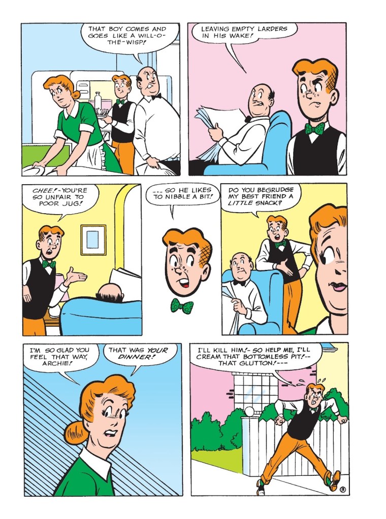
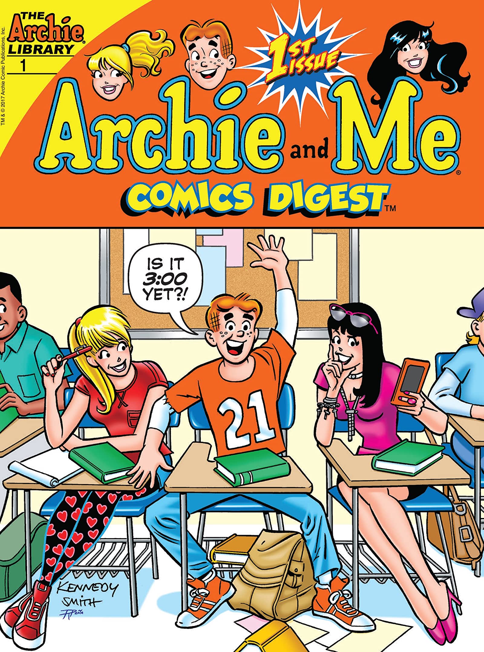
The comic book that I have read was the Archie and Me comics. I read this because I really liked the bright art style and the humor in each of the comics. In the comic that I read, it was full of smaller short stories. Each one of the short stories contained at least Archie or one of his friends, mostly Jughead, as one of the main characters. They were short skits of humor, one of them was about how Jughead went around the town and ate everyone’s food. There was another story on how Jughead and Archie were trying to make it on a TV show by going around making weird and strange noises and how Veronica thought it was silly of them to make those noises. Then Veronica was about to get robbed, but Archie and Jughead scared the robber off with their fake cop noises. I think that Kennedy Smith chose to make the comics so bright and cartoon-like because the comics themselves are bright, light, and funny. The art style suits the stories and the characters personalities. I really liked this comic because it was different. This comic wasn’t one of those super popular and serious superhero comics, it was more uplifting and relatable. This scene that is pictured below was probably one of my more favored and relatable stories. This is about Jughead going around the town eating everyone’s food before he is even seen. Eventually, he hits all of the main characters’ houses, so they all go around to look for him. They found him in the end, but then Jughead “apologizes” by giving his friends tickets to a show that they missed the year before. He gives them the tickets and they notice it was to the right show, but to the show the year before. Before the group could confront Jughead, he was already gone eating someone else’s food. 

This is a scene from “Jughead ‘Never Too Late'” in he Archie and Me comics by Kennedy Smith.
Posted in 201 Blog, Graphic Novel Review | Leave a comment

Graphic Novel Review: Anthony Sanchez

For my graphic novel review, I decide to read “Sweet Tooth: Book One by Jeff Lemire. The story of “Sweet Tooth” takes place in the future where there’s an affection that killed millions of people. And that the only children being born were a human-animal hybrid. That’s were our main character Gus is brought in. Since Gus is this hybrid, he’s in danger by the potential of hunters trying to kill him and he tries to escape to safety with a man named Jeppered. With this novel I believe the author wanted to capture this dark/glory feel to the story. But he supported this by showing dark colors and bold texts in the story, which captured the feel of the story as so. But with each scene the author displayed violent glory actions as shown below.

Sweet Tooth Page 47, Jeff Lemire

What I like about the novel was that the author wrote this story out to show the hardships of Gus but while using color, scene to scene and different visuals such as interaction text, it made you get into the novel more then you’d expect. But even after this assignment it makes me look into how authors compose there stories to show some kind of meaning.

Posted in 201 Blog, Graphic Novel Review | Leave a comment

Graphic Novel Review: Benjamin Apostol

The comic that I chose to review over the course of the semester was “Superman Adventures vol 1” by Scott McCloud. In this series, the comics follow a collection of adventures by the known comic book hero Superman, as he fights villains and saves the day from evil as per usual for a superhero comic. The reason that I chose this comic was number one; the comic was created by Scott McCloud, which is the author of the textbook assigned for DTC 201. I chose this because the best way to learn about the different art styles and framing techniques that are shown through the text book was to get a closer look at the authors non educational work. Using this I could directly relate the concepts that were talked about in the textbook and see the best real world examples of them from a piece by the same author and creator. The art style of the comic is more focused on an old fashioned comic book look. The typical art and style that you would see in any given superhero comic classic that was made in the later 1900’s closer to the beginning of the comic book franchise. Scott McCloud uses very similar color schemes and character design for obvious reasons of sticking to the cannon look, but at the same time inputs his own design while looking at the use of text boxes, sounds, and all around page framing. The iconography was very much oriented towards keeping the feel and delivery of an original comic from DC. The details surrounding the underlying iconography was what set this work apart from any other typical superhero comic, mostly because in some cases Scott McCloud would use different layouts and structures to add more detail and direction to the seemingly simple old time comic look. One important idea that was brought to life on the page time and time again was the closure of the art and how Scott McCloud could make one large seemingly simple scene that in reality has a lot of moving parts that simultaneously help you to build background context in the scene. Referencing the chapter of “Understanding Comics” Living in Line, you as the reader can start to understand the purpose behind the shapes and imagery that is used to provoke emotion in certain scenarios. For scenes that were based on villains and dire situations, jagged and sporadic imagery was used surrounding the subjects of the page to show in visual form what emotions you are supposed to be feeling. I think that in the case of this comic Scott McCloud does a lot of style referencing to classic comic imagery that is used to show emotion. However, there is really no way to show a difference in Scott McClouds imagery and classic comics because although the art is abstract, its style generally fit in very well with the scenes verbal tone, color scheme, and context. I think that the fact that you cannot tell a difference in the style of Scott McClouds work and original comics is a very good quality that he has as an artist, because the work and structure is obviously his, it does not stray far from the classical feel that older comic works would emphasize.

This page in particular I wanted to use to show Scott McClouds use of closure as well as time frames. One interesting thing this page does for the reader is allows them to see the variation in the structure of the page design, but at the same time keeps it simple and understandable.
Scott McCloud & Rick Burchett, Superman Adventures Volume One, 2015
Posted in 201 Blog, Graphic Novel Review | Leave a comment

Graphic Novel Review: Ivan Franco

Watchmen Chapter 3, Alan Moore

For the Graphic novel review I decided to read the Watchmen comic. I read the book fairly quickly and I enjoyed it very much. After I read the novel I watched the movie to see how faithful the film could be to the comic. The comic does a great job of establishing a pattern of graphics that come up frequently. The most notable you can see in the image above. Throughout the novel there are scenes that splice together and go back and forth. when it shifts images it shows a change in color. Color is the most in depth value that the comic utilizes. The comic is full of bright colors, ranging from dark to pastel and neon. The novel is not afraid of the aesthetic that it establishes and it uses to its ability.

I enjoyed the story very much and I love the alternative take on superheroes and the superhero comic genre. It is a rather mature novel that tackles issues of sexual harassment, racism, class, violence, and good vs evil.

Overall, I liked reading this novel very much and I’m glad I choose this comic over some others. It honestly makes me want to read some other comics like Moon Knight or other independent novels.

Posted in 201 Blog, Graphic Novel Review | Leave a comment