
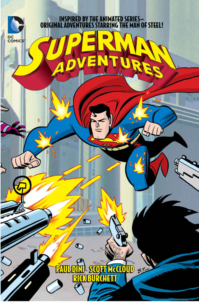
The comic that I chose to review over the course of the semester was “Superman Adventures vol 1” by Scott McCloud. In this series, the comics follow a collection of adventures by the known comic book hero Superman, as he fights villains and saves the day from evil as per usual for a superhero comic. The reason that I chose this comic was number one; the comic was created by Scott McCloud, which is the author of the textbook assigned for DTC 201. I chose this because the best way to learn about the different art styles and framing techniques that are shown through the text book was to get a closer look at the authors non educational work. Using this I could directly relate the concepts that were talked about in the textbook and see the best real world examples of them from a piece by the same author and creator. The art style of the comic is more focused on an old fashioned comic book look. The typical art and style that you would see in any given superhero comic classic that was made in the later 1900’s closer to the beginning of the comic book franchise. Scott McCloud uses very similar color schemes and character design for obvious reasons of sticking to the cannon look, but at the same time inputs his own design while looking at the use of text boxes, sounds, and all around page framing. The iconography was very much oriented towards keeping the feel and delivery of an original comic from DC. The details surrounding the underlying iconography was what set this work apart from any other typical superhero comic, mostly because in some cases Scott McCloud would use different layouts and structures to add more detail and direction to the seemingly simple old time comic look. One important idea that was brought to life on the page time and time again was the closure of the art and how Scott McCloud could make one large seemingly simple scene that in reality has a lot of moving parts that simultaneously help you to build background context in the scene. Referencing the chapter of “Understanding Comics” Living in Line, you as the reader can start to understand the purpose behind the shapes and imagery that is used to provoke emotion in certain scenarios. For scenes that were based on villains and dire situations, jagged and sporadic imagery was used surrounding the subjects of the page to show in visual form what emotions you are supposed to be feeling. I think that in the case of this comic Scott McCloud does a lot of style referencing to classic comic imagery that is used to show emotion. However, there is really no way to show a difference in Scott McClouds imagery and classic comics because although the art is abstract, its style generally fit in very well with the scenes verbal tone, color scheme, and context. I think that the fact that you cannot tell a difference in the style of Scott McClouds work and original comics is a very good quality that he has as an artist, because the work and structure is obviously his, it does not stray far from the classical feel that older comic works would emphasize.

Scott McCloud & Rick Burchett, Superman Adventures Volume One, 2015
