Formstorming: Cody Li

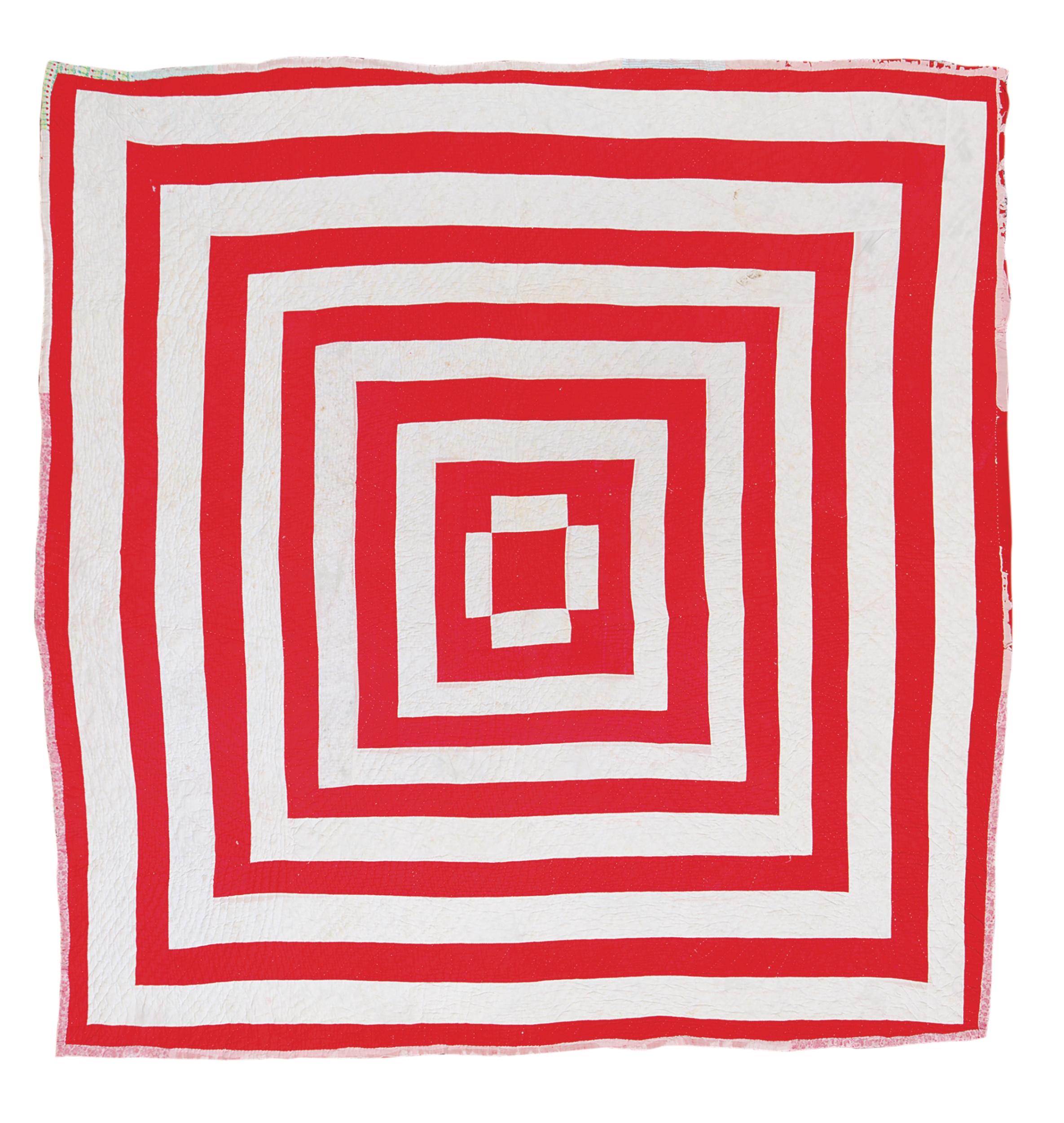
The Gee’s Bend quilts are very unique and are great examples of formstorming. Formstorming is defined as “an act of visual thinking.” We definitely can see how the Gee’s Bend Quiltmakers apply formstorming when they craft their quilts, the amount of thinking and sense of direction is displayed in their quilts show how much effort and thought is placed into them. Even when working with limited fabric or scraps of textiles, they used only pieces that would best fit whatever design they had on their mind. Loretta Pettway talked about how she HAD to make quilts in order to keep her children warm because no one would give her any. Even when caring for her kids, she didn’t randomly piece together a bunch of different fabrics to quickly create something for warmth. She took her time and effort to carefully piece out a sense of rhythm and balance, just like all the other Gee’s Bend Quiltmakers.

“Hexagon Mosaic With Multiple Borders On Three Sides, Tied With Yarn” by Mensie Lee Pettway of the Gee’s Bend Quiltmakers. Created in 1975.

The quilt I’ve chosen to examine was created by Mensie Lee Pettway, titled “Hexagon Mosaic With Multiple Borders On Three Sides, Tied With Yarn.” I really liked this quilt because of how well Mensie did with the color choices and the overall flow of the design. In terms of Rhythm; the visual balance is amazingly even throughout the quilt – despite the fact that it consists of 817 hexagon pieces. The eyes don’t instantaneously gravitate towards one part of the quilt over the other, the hexagons all share the same dimension; which gives it that nice overall balance. I also like how there’s a form of symmetry in which Mensie had laid down her hexagonal pieces, but the way she decided to randomly place the colors evenly throughout the entire quilt gives it that allusion that the quilt itself seems as if its asymmetrical. But as we closely examine the rows and columns of the hexagons, they’re placed in a sense of similar symmetry. Mensie’s use of analogous and contrasting colors fights against the hexagonal rhythm. Hexagons are nice evenly-sided shapes that allow for people to easily combine them together and create a constant pattern without kinks. But the color scheme that Mensie had chosen, displaces that sense of balance and is what creates that sense of asymmetry that I had mentioned earlier.

Posted in Spring 2018 Archive (336) | Leave a comment

Formstorming: Thomas Chiou

The Gee’s bend Quilts are so special because of its uniqueness. Due to its isolation by the Alabama River, and their struggles, they were able to create something so different and meaningful. Their quilts show the tradition of textiles made by their hands for their home and family. It represents their African American’s culture, religion, belief, community, and themselves. Most of the quits are simply being made from recycled materials. They had limited resources, so most of the quilts are being improvised. I think the Gee’s Bend Quilts uses formstorming for pretty much all their creation. Formstorming is a way for artist to be more creative with their arts. By having different variations, and iterations of the similar subject it helps give the artist a different angle, and perception. The process of making different variety help explore their own unique style. It shows the formstroming, and their thought process. Since most of the Gee’s bend are mostly improvised and have different variation. The quiltmakers also gain a lot of inspiration from their personal life, and the community’s tradition. Each quiltmaker has its own interpretation and style.

The quilt “Cross In Square” And “Bear Paw”—Nine-Block Variation made by Agatha Bennett has both geometric and organic elements. The quilt has nine geometric individual squares which has its own design. Each of the nine squares also have four even smaller squares inside. Each design of the square can be its own quilt or pattern, with organic colors and shapes. With each individual unique square, it creates a cross in the middle. The shape might be similar, but the design has its own identity, with its color scheme, geometric shape, pattern, placement, and other elements. The black squares and the gray rectangle bars give the art a balance, and symmetrical look. In a way Agatha is using formstorming on her artwork. Each square is a different variation of the similar design. Its a collection of her work on one quilt.

Posted in Spring 2018 Archive (336), Uncategorized | Leave a comment

Formstorming: Daniel Kim

I would say the Gee’s Bend ladies do a wonderful job at using formstorming because the book, Graphic Design: The New Basics, mentions how the concept is about finding solutions to design problems. The women of Gee’s Bend practically use this concept for every quilt they made due to the lack of material and former design/art education. When piecing a quilt they Gee’s Bend women have to keep in mind what materials they have and where that piece of material will fit in the quilt. These ladies are actively doing visual thinking and are using their problem solving abilities to make a quilt. They do not simply slap a piece of fabric in place, but they think about the size, shape, and color of the material before stitching it in place.

This quilt was the most fun and interesting to look at due the consistent rhythm created by the red and white strips. The rhythm of the piece gets more steady and full as one approaches the very center, unlike the short and separated red and white surrounding. The use of a more geometric form also helps create this rhythm due to it’s sharp corners. The sharp corners also create a cleaner rhythm that is properly enunciated, where as a circle or curved shape would have created a smooth and connected rhythm. The balance of this particular quilt is very nice because there are only two colors and there is no outlier piece of material that really stands out. The quilt is also symmetrical which also helps with the balance of this quilt. The concept of this quilt feels abstract because there is no direct message that anyone can really take from the design itself. With all of this being said, going back to the formstorming concept, all of the different elements mentioned are all apart of formstorming. When applying any of these concepts to design, the designer will constantly be finding solutions to their personal design problems.

Posted in Uncategorized | Leave a comment

Formstorming: Abby Larson

The women of Gee’s Bend, undoubtedly create beautiful pieces of art. Their work is similar to formstorming if you consider the process. They repeat the same process over and over again with multitudes of different results. These women push their creative boundaries to create completely unique and one of a kind quilts.

Made by Gearldine Westbrook
Created in 1950
Made from denim and cotton twill work clothes
80 x 70 inches large

This quilt to the right is made from denim and cotton work clothes, and the recycled clothing is pieced together to create a stunning and visually appealing work of art. This quilt is a great example of an abstract geometrical pattern. The squares and rectangles that make up this pattern are definitely not symmetrical, but there is still a sense of balance. The pieces of clothing guide your eyes to move across the entire quilt, creating a rhythm of movement. The color of each scrap of fabric also join together to give the viewer a sense of balance despite the abstract nature of the quilt.


Made by Lucy T. Pettway in 1970
Materials used are cotton and cotton blend
It is 80 x 76 inches large

This quilt to the right is at first, considered abstract, but when given context, it is representational. The title of this quilt is “Housetop” and once the viewer knows that, they can see that this pattern is inspired by the rafters that form to create a pointed roof. Looking at this quilt, the viewer gets a sense of depth, causing the eyes to move from the center to the edge and back in again. This movement is a form of rhythm. While not all the squares in the quilt are made of the same color/type of fabric, there is still a sense of balance. The squares with seemingly arbitrary pieces of fabric sewn in typically have another random piece of fabric on the opposite side. The geometric pattern that forms this rooftop comes together to gives the viewer a pleasing sense of geometric, representational balance.

Posted in Uncategorized | Leave a comment

Organic/Geometric: Abby Larson

This logo redesign for Sabra, a hummus company, is still very similar to the before image, but with some major and minor improvements. The old logo is much more organic than geometric, the stokes are less uniform and the line underneath is seemingly arbitrary. The orange circle is clearly representing a sun. In the new logo, the font is much more geometric and uniform. The strokes are all even throughout the image.


“A custom Sabra wordmark keeps the playful “musicality” of the previous version while adding a bolder impression,” designed by New York, NY-based Beardwood&Co for Sabra®

The sun in the new logo however, is very different from the old logo. It is much more abstract in the new logo. There are parts of this shape that are reminiscent of a plant, or a lightbulb, and these variations lead to different interpretations for different audiences. The color in this shape is also much richer than the old sun icon.

I think the designer made these choices to give the design an overall sleeker feeling. Also, this design incorporates uniformity among all the different shapes and strokes.

The company is a hummus company, but they also market flavored hummus, and pretzel cups. The redesign of their logo is intentional. The colors make it seem earthy, but the design makes it more modern, which is appealing to younger audiences.

Posted in Spring 2018 Archive (336) | Leave a comment

Organic/Geometric: Jacob Granneman

While observing the redesigned logos on the Brand New site, there exists a clear trend: simplicity. The ultimate goal for these modern redesigns is to simplify the old designs and sharpen the overall style. The most prominent way they accomplish this is by creating a more geometric look for many of these logos. The older styles of rounded, bubbly, elementary shapes, gave a sense of juvenileness, and potential immaturity. The addition of the more angular, symmetrical typefaces and shapes, gives things a more refined look.

It’s clear that the organic look is not appreciated in today’s branding world, at least, not in large doses. There are small areas where more “scripty” fonts and characters are used, but even they are surrounded by geometry that screams modern simplicity.

For many logos, the change gives the design a more representational meaning. In the Skype logo, for example, the switch to a cleaner corporate typeface became representative of the Microsoft brand, and tied the video chat program to other interfaces, like Word and Excel.

Many of these companies are trying to stand for a sense of trustworthiness. They want you to be loyal to them. Thus, these new designs emote a sense of professionalism that the previous designs often lacked. In essence, many of these logos are growing up. The days of free flowing, hand drawn logos, that look like your grade schooler drew them in art class, are gone. This site shows that we are ushering in the era of sharp, clean, often geometric design.

Posted in Spring 2018 Archive (336) | Leave a comment

Organic/Geometric: Samuel Jonsson

The purpose of this logo redesign is to apply it to a new wide range of mediums. The new logo was designed for free from a London based brand agency called The Partners. Tusk is a non-profit organization dedicated to conserving the African wild life.

The first logo is natural and representational. A silhouetted Africa stands behind the name and purpose of the non-profit organization. It’s made very clear for the audience what the purpose of this logo is. It’s considered a natural design because the organization copied the shape of an existing continent (there was no creative component = no geometry). This logo seems practical for their website or plain t-shirt.

The new logo is geometric and abstract. The straight lines and perfect circles are all that make up this logo creating its own new pattern. This new pattern is both geometric and traditional because a lot of the influence for this came from traditional African patterns (the colors also compliment the text accordingly to these traditions). There is not one curvy line in this composition, even the “s” is only made of straight lines.

I love the new logo because it’s not just a sticker for a company but also a palette for all sorts of different patterns and backgrounds for the company. Just take a look trough this. This logo is considered abstract because the letters are subtle and hidden and this is even further emphasized in the pattern.

As explained through the first logo, TUSK is a non-profit organization made for the conservation of African wildlife. So in a literal sense, the first logo makes a whole lot of sense but if you contemplate the numerous ways that a non-profit advertises a company then the second logo seems more practical because of its compatibility with cars, backgrounds and clothing. The second logo has transcended from its initial use as a logo and has become the entire identity for the organization.

Posted in Spring 2018 Archive (336) | Leave a comment

Organic/Geometric: Alex Hagen

The old “Nordwind Airlines” logo

I chose this logo for the company “Nordwind Airlines” because of the striking design differences between the Before and After images of the company logo. This is an airliner based in Russia with a fleet of over 20 planes flying to destinations within Russia and Europe. Their old logo wasn’t striking enough and definitive enough for the company, saying that it “…wasn’t very exciting or confidence-inducing.” Their decision for a new logo came from wanting a logo that more clearly identified them.


The new and improved “Nordwind Airlines” logo, designed by UMA

The new logo, designed by a company called UMA, drops the airplane tail graphic and instead uses an “N” monogram as the centerpiece behind the design. It contains “a bold combination of round corners and sharp angles and the extra wide structure is very airline-ish, as is the italic bent”, meaning that the new “N” seems like a representational of airlines themselves. The company seemed to use the same general sans serif through both iterations of the logo, but it seems more thin and streamlined in the after photo. Though both before and after logos were very geometric in style, the sharp lines and regularity of the shapes and font of the second logo lend themselves to a more definite geometric appeal. I think that while the regularity and the sharpness with which this representational logo is constructed seem somewhat sterile in nature, it definitely lends itself to a professional appeal.


The effect of the new logo is striking and definitely is more appealing than the first version. People who glance at this logo are left with a feeling of quiet professionalism and efficiency, both valued attributes in an airliner. In fact, looking at some of the mock-up designs for airplanes themselves definitely seemed like an improvement over the old design, with bolder lines and colors giving the new designs visual appeal. I definitely agree with the designs for the new logo and believe that the reasoning behind the changes is sound. The new logo is an embodiment of the values that Nordwind was trying to promote.

The mock-up design of the old and new logos on airplanes

Posted in Spring 2018 Archive (336) | Leave a comment

Organic/Geometric: Lexi Day

Screen Shot 2018-02-15 at 11.55.08 AM

The old logo for the U.S Ski and Snowboard team, found on Brand New 

For this blog post, I have chosen to look at the old and new logo for the U.S Ski and Snowboard group and team. For the old logo, it was very plain and didn’t convey what the logo was about. Without knowing about the U.S Ski and Snowboard team, I would have assumed the old logo was for a more professional type company or government agency. The yellow gold color seemed a bit outdated as well. In terms of organic and geometric, I would say the old logo was leaning more toward organic as the text was italicized and the red/gold/blue design underneath was more “fish shaped” and doesn’t have any straight lines. For abstract or representational, the before photo would go under abstract. It has nothing to do with any real world images, and instead just serves to create more depth to the words and ingrain “American colors” into the design. When the before design was made, I assume the designer was attempting to create something minimalist by using only the acronym, while also incorporating the traditional red and blue colors, as well as a gold to possibly signify winning (like an Olympic gold medal).


Screen Shot 2018-02-15 at 12.22.58 PM

The new logo for the U.S Ski and Snowboard team created by the Nike Senior Strategic Advisor, found on Snowboard Unveils New Brand 

For the new logo, it has a much more modern and cleaner feel. The purpose of the logo (to represent the ski and snowboard team for the Olympics) is clear and whomever is looking at the logo will be able to understand what it stands for. The logo is more geometric, due to the square triangle. The mountain inside also represents the winter teams, and the darker blue color works better than the lighter blue on the old logo. The red color doesn’t seem to have changed. This logo would lean toward representational, as the mountain part of the logo is an easy recognizable part of nature/object, as well as the stars over the mountain, meant to represent patriotism. I think the designer made the choice to change the logo in part for the upcoming winter Olympic game, and also to give it a more contemporary design.

Posted in Spring 2018 Archive (336) | Leave a comment

Organic/Geometric: Caleb McEnderfer

This is the original logo for the company Boodle and they provide short-term loans.

Boodles rebranded their companies image in 2011 and that included changing the logo. The original logo was geometric and very straightforward in what their company was about, which is provide short-

This is Boodle’s new logo and they re-branded their displays because it was outdated and naive visual language. Designed by Xfacta and this was the project page http://xfacta.co.za/work/boodle

term loans and the logo has a kid dragging a bag of money. The lettering is also on a straight line and in the new logo, the lettering is staggered to give it a more organic look. The new logo also creates a little cyclops character called “boo” that is part of their rebranding and the avatar is there to assist online. I think the “boo” avatar is much better than the kid dragging the money because the new logo makes a character suttle and it looks clean compared to the kid with multiple colors.

Boodle makes their new logo and brand more simplistic and clean by using just the color orange and black/white. Using multiple colors can make a logo look confusing and may distract the audience from the title. I think the new logo is more abstract than the original by creating the Boo avatar and the original was more representational because of the bag of money the kid is dragging around represents the money aspect of their company. I think the designer made this more abstract and organic because the logo feels more modern and I think they achieve the idea of less is more with their logo. Their new logo does not relate as much to what their company is about comparing to their old logo, which was straightforward with the money bag. There new branding and logo does a good job of simplifying their logo and making it stand out more.

Posted in Uncategorized | Leave a comment