Invisible Emotion: Erika Epperson

Crazy Men Go Wild

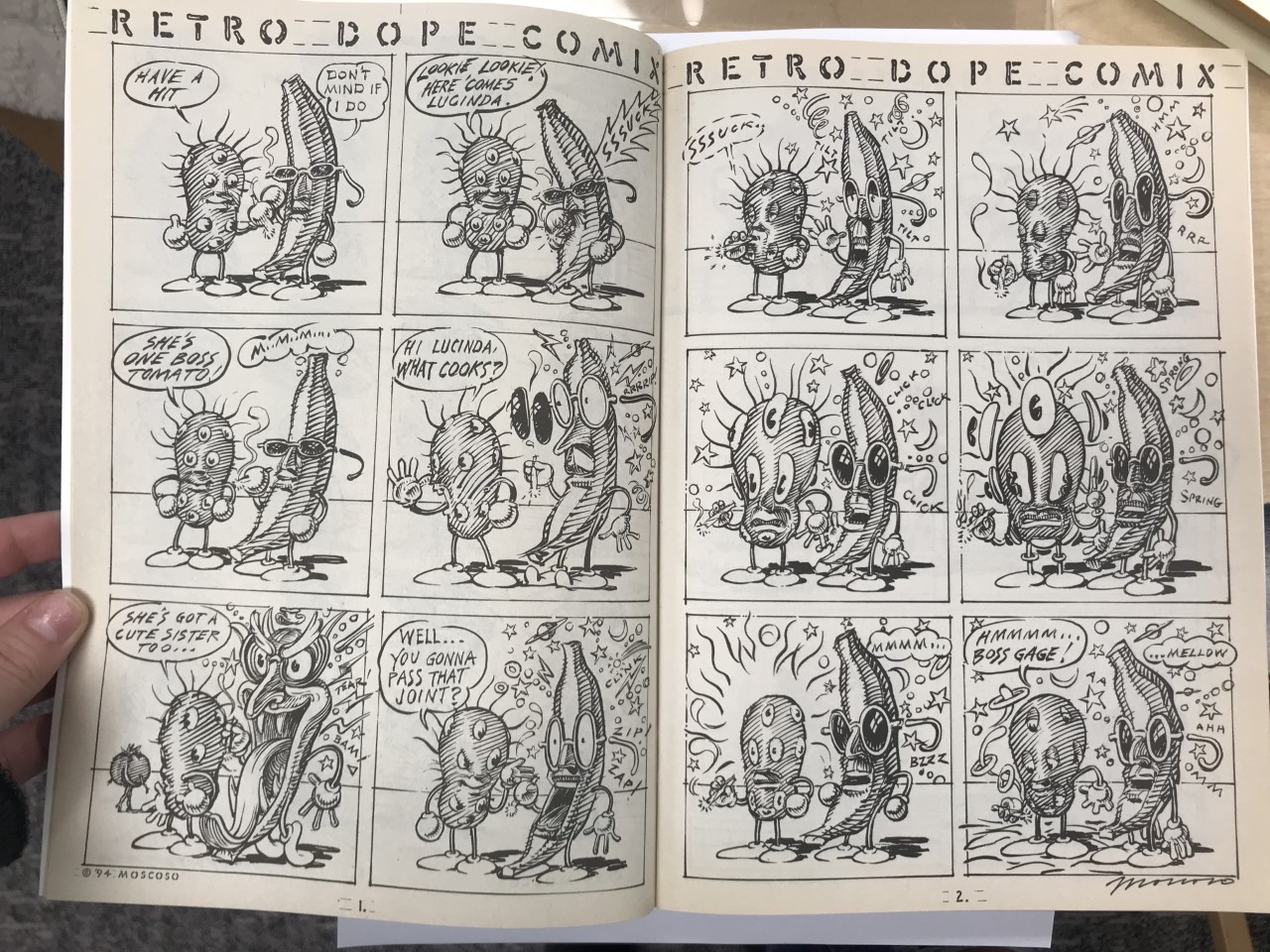
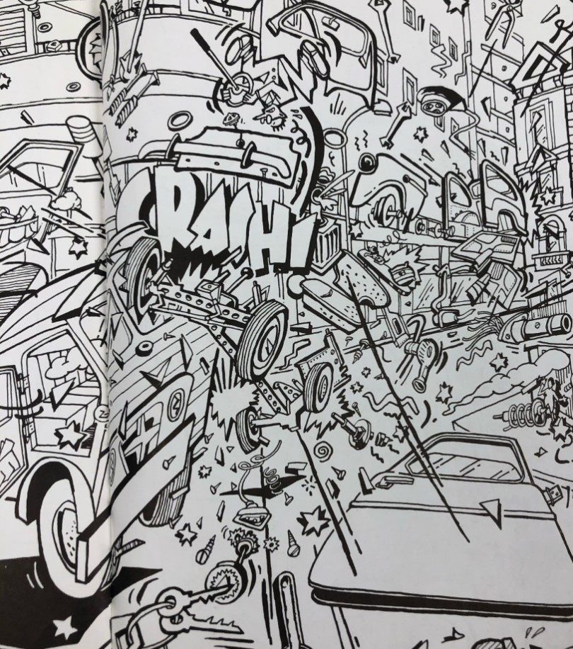
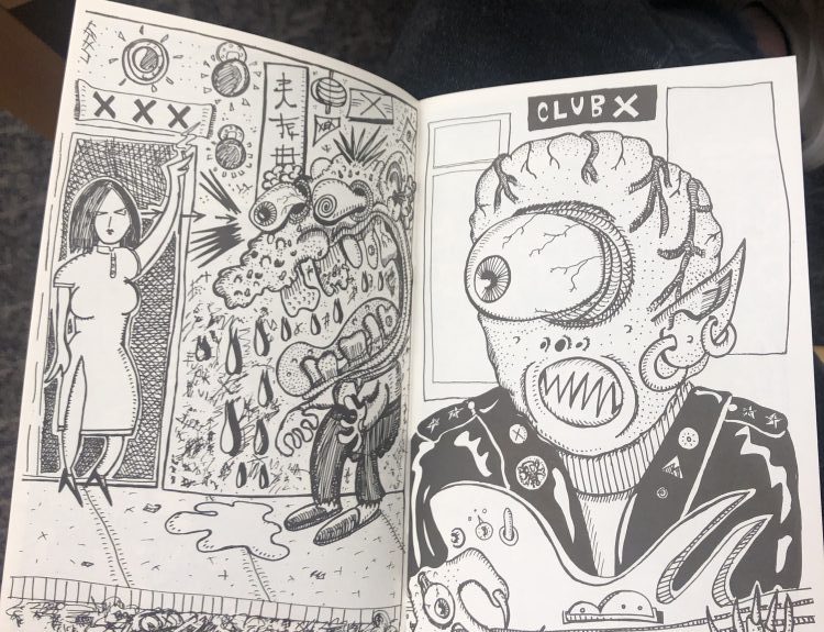
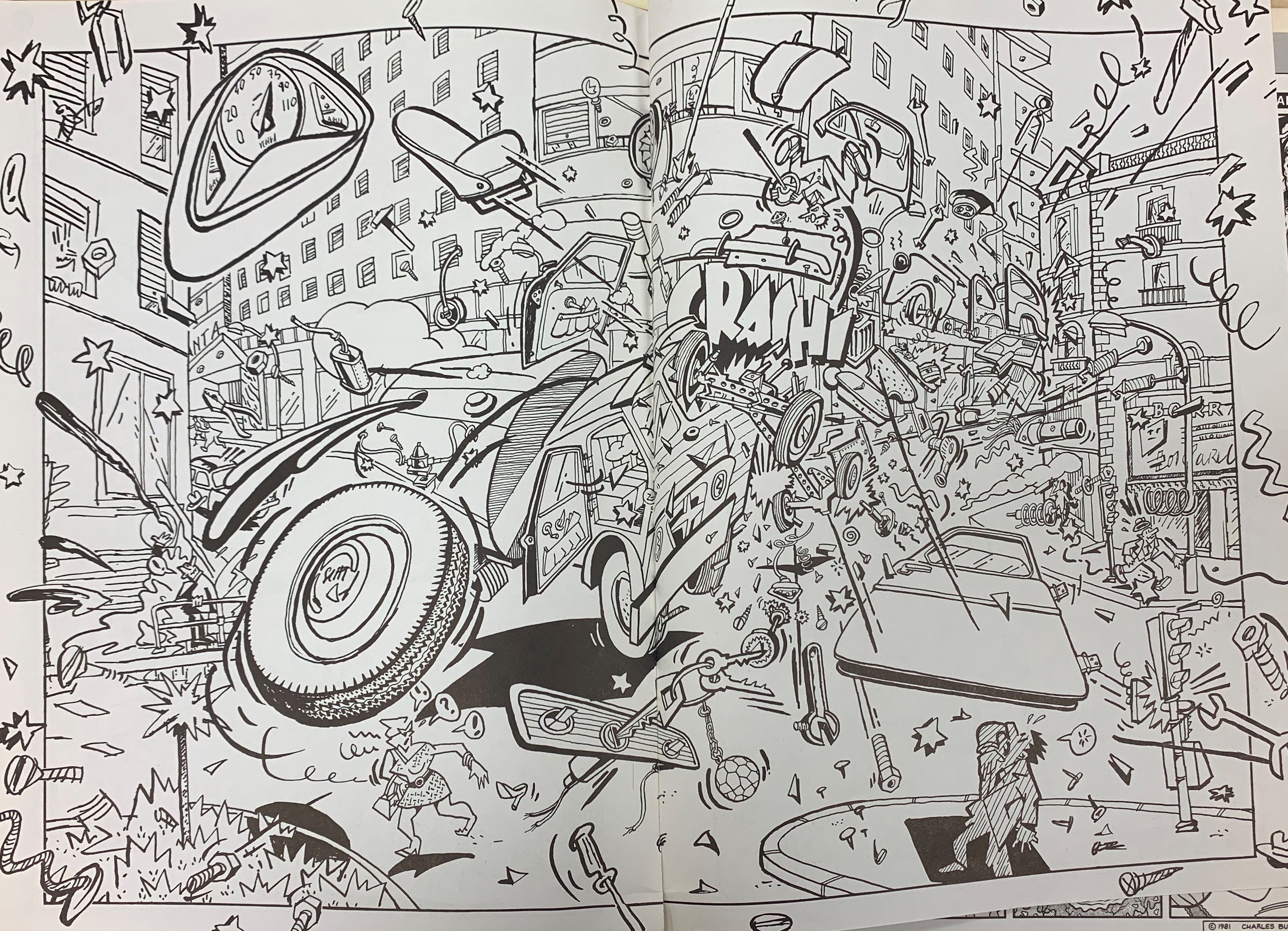
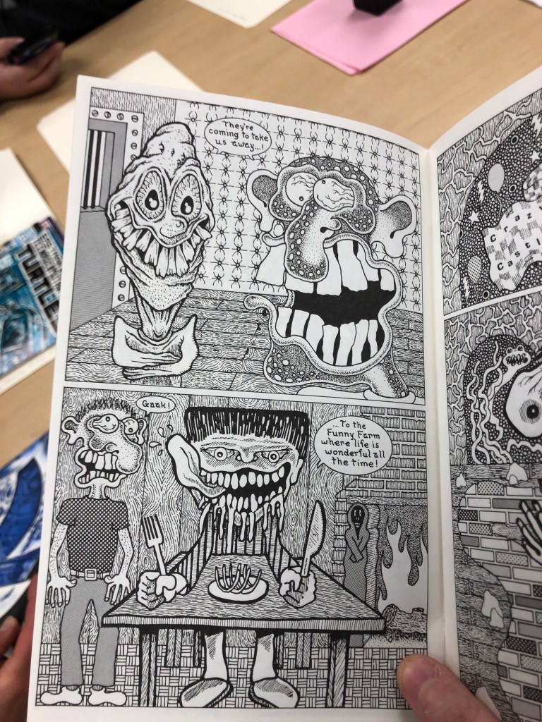
McCloud, in chapter five talked about conveying emotion through lines. I felt like the comic “Crazy Men Go Wild” was a good example of that because of the fact that this comic had a lot of lines and patterns throughout the whole book. The thing that really stood out to me were the abstract lines of these characters faces. It conveyed the emotion of chaos in these characters and it gave it a sense of uneasiness through the whole comic book.

Richie Rich Millions

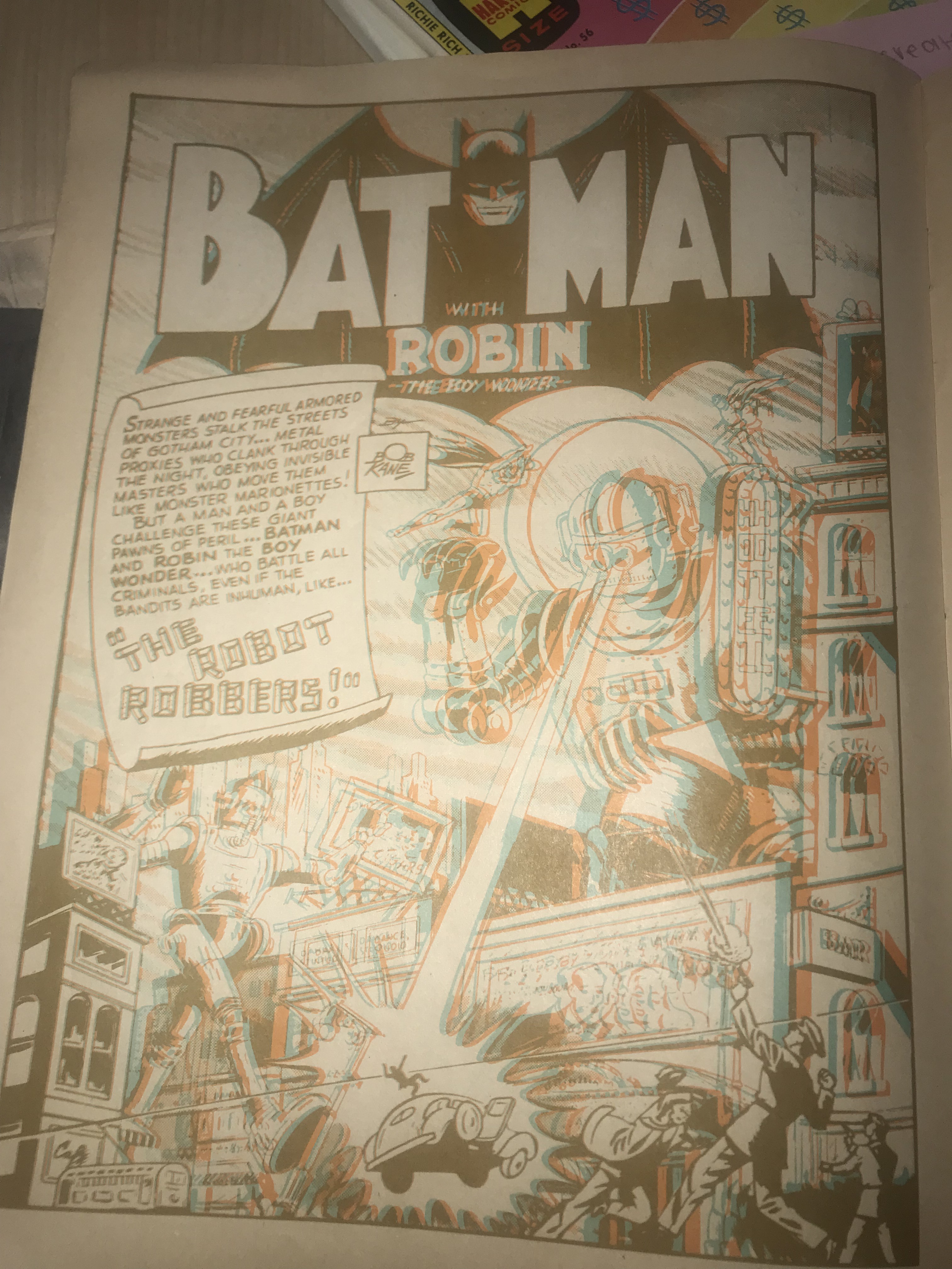
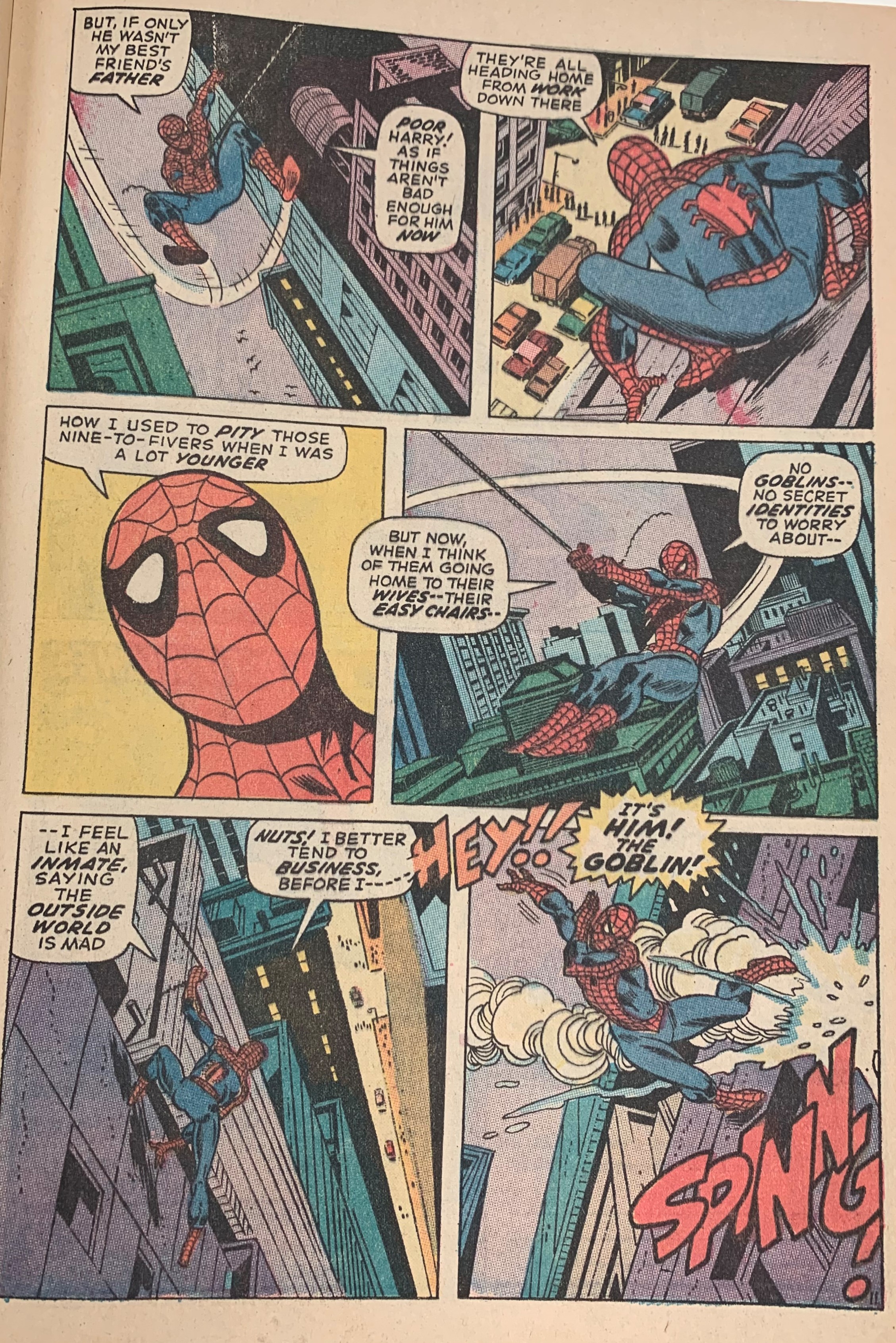
In Understanding Comics, McCloud talks about the word interdependent, meaning words and pictures that go hand in hand to convey an idea that neither could convey alone. An example I found was in the comic “ Richie Rich Millions” In this scene the astronaut seem as though he is being tested to make sure he is prepared to go on a rocket ship to go into space. Theres a part in particular that has a good example of the word interdependent. After what I assume are the scientists, have said that its 5000 degrees below in there, the astronaut replies “I didn’t feel a thing”. If you just read the text itself you would believe that what he says is what he really means. But if you add the visual images to the frame, you can see that he is either lying or being sarcastic. You can tell because the image shows him with ice all over his helmet. And although he might be smiling, you can also see the rough, sharp lines that creates his head shape, that gives off the feeling that he is probably very cold. Looking at the words alone or the picture alone, it wouldn’t convey the same emotion or context as putting them together. 

Posted in Fall 2019 Archive (201 Blog), Uncategorized | Leave a comment

Invisible Emotion: Ana Maria Alaniz Mendoza


Image1

This photo is of a comic called Cecil C. Addle by Ray Collins.

In chapter 5 of Scott Mcloud’s book titled, “Living in Line” he discusses the significance line styles play in the visual of a comic. While visiting the MASC, I really enjoyed analyzing all of the ways Ray Collins utilized lines in his comic series named Cecil C. Addle.

The lines presented here are solid and bold, similar to that of Scott Mcloud’s illustrations in our textbook. I personally tend to find these solid and bold lines more pleasing to look at because they are clean and cartoon-like. In the second panel of this example, three small dashed lines are indicating that hearts or loving nature is coming from the female character.

In the second panel, short and crescent-shaped lines are made to represent anxious shivers coming from the male character while the same lines are coming from the female character in the third panel which represents excitement. The expressions on the character’s faces allow the viewer to make sense of the lines in apposing ways even though they are the same when it comes to design.

Image4

This is a page from The Amazing Spider-Man: The Goblins Power Comic by Stan Lee. Published in 1971.

In chapter 6 of Scott Mcloud’s book titled, “Show and Tell” he went over the amazing ways image and text can complement another. While looking through The Amazing Spiderman comic by Stan Lee, I really loved the way this page conveyed the emotions this female character was feeling, however, the world bubbles provided an additional set of context that allowed a reader to see exactly what she was feeling and why.

In the first panel, the female character is gazing out of a window in deep thought, as many dramatic thinking scenes have shown on many creative platforms before. The visual in the first panel sets an obvious tone, but I would have had no way of knowing that the character was contemplating running away because she wasn’t happy with her relationship dynamic. My imagination could have taken the image in a totally different direction. The word/thought bubble coming from the female character explained that she was upset at first and then by the end of the page, she is more hopeful.

Posted in Fall 2019 Archive (201 Blog) | Leave a comment

Invisible Motion: Phuc Tran

The first example I chose for lines come from “Sacred Profane” by Justin Green

72633407_2992125860803008_6290297681680007168_n

Image from Sacred Profane by Justin Green

. Even though I do not fully understand the of the comics as they use some strange, old English. The lines that are used to create shadow caught my attention as it create the setting when the Kerosene lamp is the only light source. This give me a feeling that this guy has been working really hard, so hard that when the night come he use the lamp to keep working. This use of line to create the dark environments and character make me acknowledge the passion of the male character about what he is doing. In addition, not only the props and character but also the text bubbles were given some light to show that they are appear in the dark too which is interesting. By simply using multiple lines in object, the author successfully describe the emotion they want the reader to feeling when reading this page.

74455252_2426067267665317_7330990063049768960_n

Image from Richie Rich Millions by Alfred Harvey and Warren Kremer

For interdependent example, I found this character in “Richie Rich Millions” by Alfred Harvey, Warren Kremer who keep jumping to show his anger. Imagine when only the image exist. Although the drawing already did a good job in demonstrating the action of this character, we would assume that this guy only jump one time, which is not exactly what the artist try to say. In the other hand, when it combine with the word: “STOMP!” duplicated and showed multiple times next to the illustration. Not only we know that he does that more than one time but also “stomp”, which is the word to describe the same action as action as jump but more aggressive. In here, the use of word and picture come hand in hand to address the emotion and action of the character more accurate and effective.


Posted in Fall 2019 Archive (201 Blog), Uncategorized | Leave a comment

Invisible Emotion: Libby Fletcher

This is a comic spread from “ZAP13” that I chose as an example of the use of line to display emotion.

When we went to MASC this week, I was initially overwhelmed by how many different examples we were able to choose from, however, once I started looking around I was instantly drawn to this ZAP comic book.  I think this comic uses line in great detail to display emotion.  The spread is showing a banana and I believe a potato, smoking together. The panel that sticks out to me is on the second page in the middle.  The artist uses line to depict chaos or some sort of tension within the entire spread.  As the comic continues, the lines only get messier, which acts as a way for the reader to see that the characters are losing control.  By using line to create the stars and miscellaneous shapes behind the characters, the more cluttered they become, the more cluttered the characters’ minds become.

“The St. Kahuna Surfing Mysteries?” comic spread from ZAP13

I chose this spread as my example of an interdependent word/picture combo.  I would consider this comic to be interdependent because, without the words, there would be no way for the reader to comprehend the narrative that this comic is attempting to display.  At first glance, even just skimming over the comic as a whole (pictures and words included), this comic was a tough one for me to find meaning in.  I didn’t pay attention to the overarching title that spans across both pages, which was clearly meant to be read first, judging by the text size.  However, when I was first looking at this spread, it had so many different images that I was just overwhelmed.  I tried to take everything in at once, which left me thoroughly confused.  That being said, once I slowed down and read the text fully, I was able to understand that this comic was telling the narratives about one island’s surfing mysteries.  Honestly, without the text and without the images this comic would simply just not work which is why I would consider it to be a good example of an interdependent word/picture combination.

Posted in Fall 2019 Archive (201 Blog) | Leave a comment

Invisible Motion: Nicholas Kawaguchi

Keiji Nakazawa’s “I Saw It” describes the moments of the atomic bomb being dropped on Hiroshima from his perspective

Within the MASC’s exhibits are some very interesting pieces of comics and graphic novels that did not fail to show off the plethora of types and designs that reside within the genre. One that particularly interested me was Keiji Nakazawa’s true survival story entitled “I Saw It,” as it depicts Nakazawa’s first-hand encounter with the atomic bomb that was dropped on Hiroshima. Narrowing it down more specifically, the page in which the bomb makes an impact with the ground has some particular designs that pique some interest regarding our past readings. From what I could observe, there seemed to be no page number, but this page takes into account Nakazwa’s first-hand experience. Instead of showing the physical bomb drop and creating a shockwave from a bird’s eye view with different panels depicting the actual movement of the bomb, he suddenly shows a flash with emitting waves with lines on them. Without anything else but these rippled lines, it can already be assumed there was an impact of sort in the middle and with the addition of those transitioning warm tones of yellow, orange and red, the explosion This effect is only further amplified through the next panels which contain diagonal lines that represent the sheer force of the impact. It is then, in the bottom four panels that lines are utilized interestingly. He uses lines with varying degrees of thickness and length that all have a swirled, wave effect to them. These wavy, multi-colored lines represent the sense of confusion as to what just occurred for the normal Japanese schoolboy. There no sense of order and peace but rather chaos both physically and mentally. In a literal sense, these wavy lines also could represent the radiation that begins to spread from the atomic bomb as well.

Will Eisner’s “City: A Narrative Portfolio,” Text of the piece “Predator”

Looking to Will Eisner’s “City: A Narrative Portfolio,” many of his designs incorporate mainly a single large drawing with vast amounts of detail that is accompanied by a title and some text. This text is almost poetry-like and with its addition, creates that idea of interdependence. Mainly looking towards Eisner’s piece of “Predator,” observing the text alone discusses the idea of a predator as it hunts its prey, utilizing a descriptive language to get the most out of the text. When looking to the image by itself, one

Will Eisner’s “City: A Narrative Portfolio,” Image of the piece “Predator”

could interpret it as a dumpsite for trash or near an urban area that is dirty and full of junk. Figures are lurking around a single figure who calmly takes a drink, unaware of his surroundings. It is not obvious to what is going on, possibly homeless people scavenging through trash for any usable scraps. However, when the text and image are seen simultaneously, it creates something different. The “Predator” now describes, not animals but people and the greedy nature that some possess, especially where resources are thin.

Posted in Uncategorized | Leave a comment

Invisible Emotion: Bailey Tompkins

Illustration of Dance of Death, From the Nuremberg Chronicle of 1493, Located in Special Collections in the WSU MASC

Chapter 5: “Living in Line” from Understanding Comics, mentions how to use line quality in order to convey emotion. While in the MASC, at the WSU library, I found multiple examples on line quality which conveyed emotion, but I found the illustrations from the Nuremberg Chronicle to be most telling. The representation of the dance of death not only implements line quality with the aspect of thickness of the line but also the direction and angles of those lines. The thicker lines on the dead skeleton brings emotions of emptiness and coldness compared to the thin lines on the still living skeletons which brings emotions of lightness and joy. The direction of the line also plays a role in the emotion that it displays. The more horizontal lines bring a sense of calmness whereas the more vertical lines represent anxiety or anxiousness. Overall, the line quality used in the illustration of the dance of death utilizes the thin/thickness of the lines as well as the direction of the lines to express emotions.

Illustration from RAW, by Art Spiegelman and Francoise Mouly, pg. 87, Located in the WSU MASC

Chapter 6: “Show and Tell” from Understanding Comics, defines a lot of terms of the relation between words and images. The term that I would like to focus on is duo-specific. Duo-specific means both the words and pictures send essentially the same message. I found many examples of this in the MASC, but one example particularly stood out to me. In the graphic novel Raw, by Art Spiegelman and Francoise Mouly, there is an illustration of a car crashing along with the words “CRASH” emphasized. This is a clear example of duo-specific because if the words crashed weren’t on the page, the reader would still clearly know what was happening in the scene. The words “crash” and the image of the car crashing are sending the same message to the reader that the car is in a collision.

Posted in Fall 2019 Archive (201 Blog) | Leave a comment

Invisible Emotion: Ivy Padayao

When looking through the artifacts at the MASC there were a lot of different pieces that stood out to me for lines conveying emotion, but the one that stood out the most was a

“3D Batman” by Bob Kane published by National Periodical Publications in 1966 printed in USA

comic titled 3D Batman by Bob Kane. This is a comic about Batman and the crazy adventures he gets into, but expressed in 3D. When flipping through the book, I found that Bob Kane would often use lines and how we made the images to create tension for the reader, and the 3D aspect would make this feature stand out even more. In this example, for the inside cover page, you see a lot of sharp hard edges coming off of objects to create a sort of “sound” to go along with the image that conveys tension with the reader.


Also, while looking through the artifacts within the MASC there were a lot of examples I found while looking at the much older books that conveyed a lot of interdependent examples between lines and words in the works. In this example from A Pisgan-sight of Palestine and the Confines Thereof with the Old and New Testament Acted Thereon by

“A Pisgan-sight of Palestine and the Confines Thereof with the Old and New Testament Acted Thereon” by Thomas Fuller B.D 1652

Thomas Fuller B.D, you can see how the images are very descriptive, but there is also words throughout the images that are key for the reader to fully understand the image. While I don’t understand the language the author used within this piece, there is a reason the author incorporated the words into this piece. From what I can interpret it is the names of the places the images are conveying, or better describing to the viewer what is happening in the picture. 

Posted in Fall 2019 Archive (201 Blog) | Leave a comment

Invisible Emotion: Dahlia Xie

This comic shows a woman standing in front of a doorway with what looks like a half-monster half-man staring at her. I mainly focused on the left page but I thought it was interesting to see another monster looking at the characters on the other page, I thought it was meta in a way. The line quality on the left page is different between the two characters. The lines around the woman are minimal, clean, and organized. The combination of her stance and the line quality makes the woman seem bold, independent and put together. In contrast, the man/monster concoction to her left looks like something out of a completely different comic. The line quality for the man is a lot of hectic and random, there’s a lot of drips, scribbles, and harsh lines, it almost provokes a sense of fear. The artist also separated the two characters quite distinctly, it looks like if divided the page in half at the right-most part of the doorway, the two parts would not look like they’re related at all.

This page is from the Richie Rich Millions comic. I thought this page was a good example of a Duo-specific or additive combo. This comic page is about how Richie has too much money and is trying to figure out where to put all his money. If there was no text, I think that the reader might be able to get the general message out of the comic soley based on the images. I also think that the reader could get the same idea if there were no pictures, and just text, which is why I think this page is an example of a duo-specific combo. At the same time, I think the text adds a little bit more context to make it easier for the reader to understand the comic.

Posted in Fall 2019 Archive (201 Blog) | Leave a comment

Invisible Emotion: Cierra Haken

Image from “Crash”

When I visited the Manuscripts, Archives, and Special Collections (MASC) on Tuesday in class, I found examples for both the use of line, and the use of interdependent words and images in a comic. For my example of line, I examined this full-page spread found in the comic, Crash. This page depicts a car crash, and as you can imagine, a car crash would be very chaotic, giving people stress and anxiety. The artist of this comic created an image portraying the crash, just as it would make you feel. You can see the car parts and action lines flying in every way possible. These lines laying across the page with no specific order or sequence provokes anxiety to the average viewer because there is too much going on and it is stressful to look at. This anxiety is also caused by the way each line and shape in this crash scene is darkly outlined, but unique in its own way, not contributing to any order or sequence. In addition, the way in which the artist draws car parts and action lines outside of the borders of the panel goes to prove that the chaotic mess of this crash can’t be contained by the border.

Image from “Crazy Men Deluxe” Comic by Michael Roden in 1985.

For an example of interdependent words and images in a comic, I chose to look at this full-page spread found in Crazy Men Deluxe, which is an underground comic from the 1980s. This comic book has much of a different artistic style depicting men who look very different to Human beings. This leaves its audience unable to connect with the characters as easily, as well not be able to recognize a lot of what is going in. I chose to look at this page for an interdependent relationship between words and images because the only words on the page says, “Road Race Today,” which gives the reader insight to the context of the story, which is needed because of the possible confusion from the unique artistic style. While there are cars in the right page, it would still take a lot of audience participation to understand that there was actually a road race taking place without seeing the sign. On another note, if this was a mainstream comic and the characters were more identifiable to the viewer, we would more than likely already have the context of the story, which would cause the image and word relationship to be image-specific because the words do little to add to the story which is mostly told visually.

Posted in Fall 2019 Archive (201 Blog) | Leave a comment

Invisible Emotion: Zach Morgan

The Amazing Spider-Man, #98

Our class visited the MASC to analyze their comics collections and try to identify concepts from Scott McCloud’s Understanding Comics. One of the concepts that I tried to identify is the use of line. The example that I found for the use of line is from “The Amazing Spider-Man, #98,” particularly in how the artist manipulates lines to convey emotion to their audience. What I find interesting about this example is that the author is able to manipulate the lines to give the audience a little glimpse at how it would feel to be Spider-Man. In these panels, the hero is shown swinging through New York City. The artist uses accents lines on all the buildings to highlight to the reader that they are slanted relative to the panels. As the reader follows Spider-Man through the skies of the city, an uneasy feeling builds and builds as the reader gets the sense that the heights get gradually more dangerous as the lines on the building gradually become more vertical. These feelings build until the panel where something crashes next to the hero on the building. This is just one example of how comics artists can manipulate lines to convey emotions.


Read Yourself Raw by Art Spiegelman

The other concept from Understanding Comics I looked for is an interdependent combination of words and images. An interdependent combination means that both the words and images work together to tell a story that they could not have told on their own. For this concept, I looked at Art Spiegelman’s “Read Yourself Raw,” in which the words and images help each other as we follow this character. In the bottom right panel, a character is shown pushing a cart of some sort, while holding a bouquet of flowers in front of a flower stand. The character says, “Give these to my sister and tell her I’ll be up in six months.” If someone looked at just the image, or just read the words, they would likely be confused and not really know what is going on. This is an example of an interdependent combination of words and images because when separated, the words and images do not work, but when you put them together, they tell a single story.

Posted in Fall 2019 Archive (201 Blog), Uncategorized | Leave a comment