Final Digital Comic Collage: Yanir Govrin

Complete Photo Collage Comic

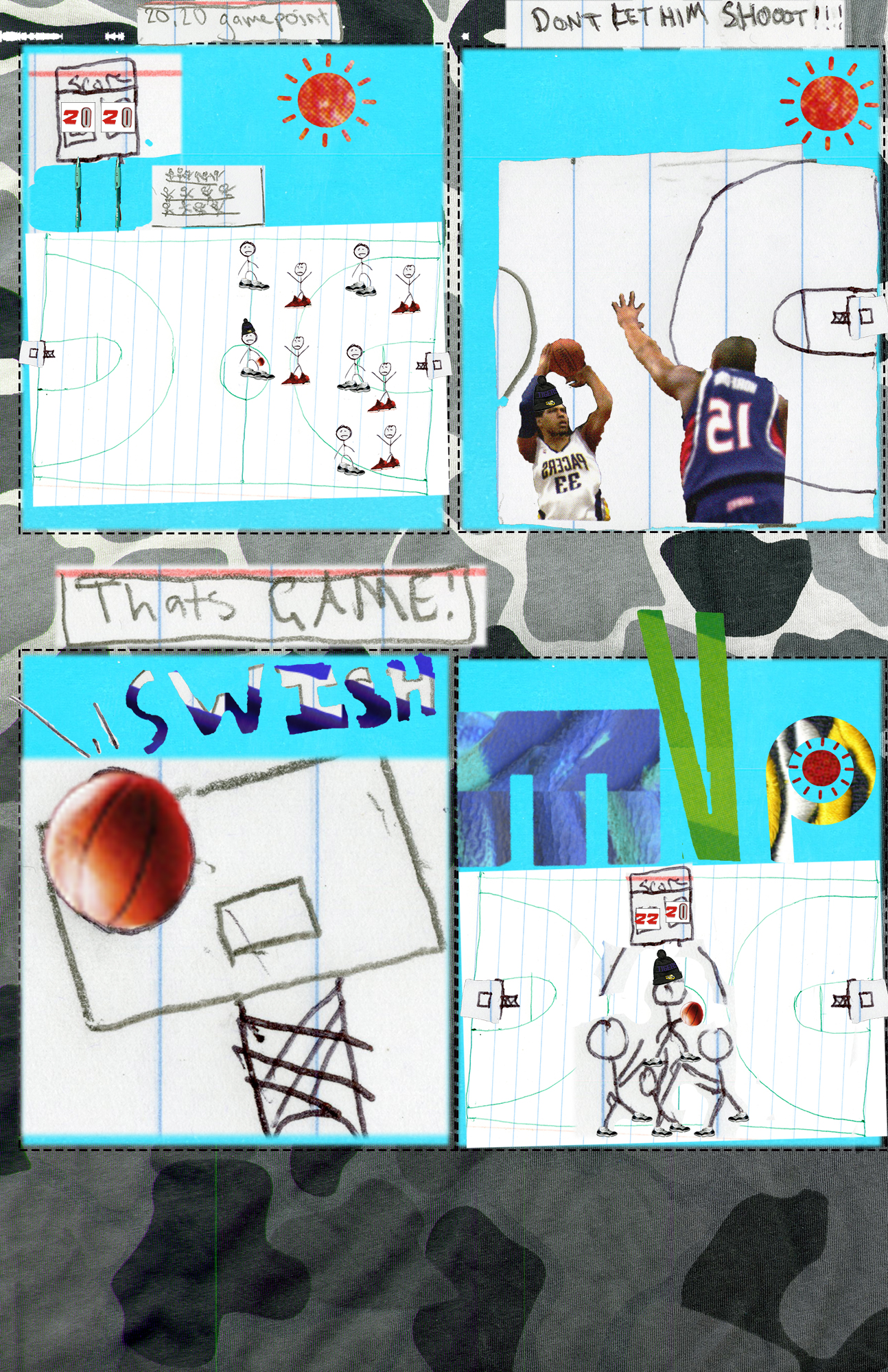
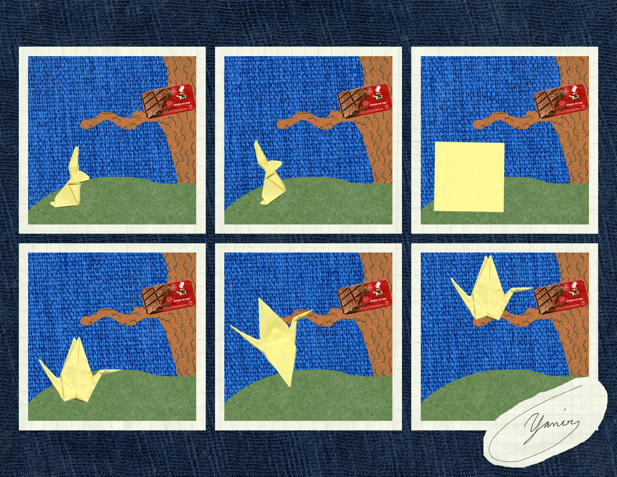
My image fits in to Scott McCloud’s definition very well. I basically made a “standard” comic that has separate panels. I came up with the idea for this comic before I scanned anything so everything is scanned was planned out in accordance to the idea I had laid out. I tried to convey a short story of an origami rabbit that changes in to a crane to get to the candy. Over all it is fairly simple. I tried to make sure that everything had some kind of texture to make all of the different features more prominent as they contrast to their immediate surroundings. I ended up using no text at all because I felt it would not add to the story or the over all understanding.

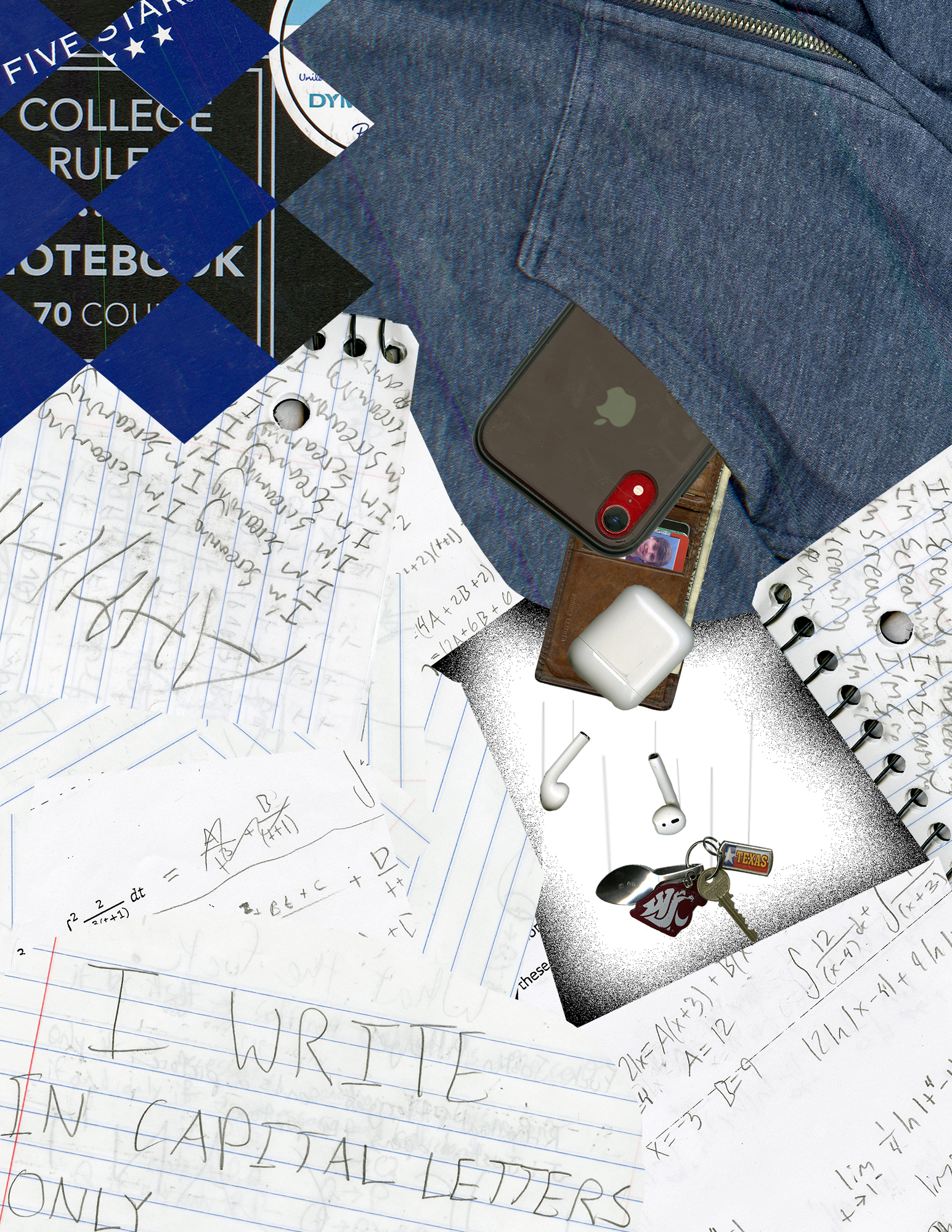
Other than our first very simple photo comic this was my first time using photoshop. There were definitely a few things that I found difficult to do in photo shop and a few interesting ways that I did things. For both the panel outlines and the panel backgrounds I created a 6 separate rectangles and grouped them together to form the panel outlines. I then did the same thing for the panels themselves. For the collage background i used a scan of one of my t-shirts and just dropped it in to the background as is. I then dropped in the panel outlines using the first group i created as a clipping mask. I then put in the background color for my panels (a scan of my kindle case) and used the second group of rectangles as a clipping mask for that. I then went to my grass scan (a scan of my green notebook) and used the lasso tool to cut out a ground for each panel. I copy and pasted six of them lining them up the same way with each panel. I then merged them all in to one layer and used the panel group as a clipping mask on them as well. Next I added the tree. For this I used the same I did for the grass but i also went and darkened the scan (my notebook on which I drew a texture) as it was too light in color. Next I added the chocolate bar in to each panel. I resized the image then used the auto selection to automatically select just the shape for me. I then lined them up the same way for each panel. Finally i went and added in my origami animals in the order of the panels. I first added the rabbit to the first using the auto select to select it. I did it again for the second panel but rotated the rabbit counterclockwise so it would face the chocolate. I then next put in a shrunken down scan of a sticky note also with the auto select tool. I then used the auto select tool on a resized image of the crane and put that in the fourth and sixth panels. I then got a scan of my crane with the wings open and resized it until it matched the other crane scan before using the auto select tool to copy and paste it in. Finally I cut out my signature that I had scanned with the lasso tool, shrank it a bit then put it in the corner. Overall I think this project went fairly well but I noticed after printing some issues with the auto selected images that I didn’t notice before. If i was to do this again i would make sure to go back and fine tune the selections.

Overall I found it fun to work in a digital space as there were lots of options and things i could do to easily manipulate the images and do what I want with them. However not everything was this easy, I found some things like scaling and rotating stuff to be awkward and harder then with paper.

Posted in 201 Blog, Final Digital Comic Collage | Leave a comment

Final Digital Comic Collage: Ethan Miller

low res image

For my digital comic collage, I was inspired by Lynda Barry’s work in her book, she made each page feel almost chaotic, a mess of different words and pages in the background to still convey an idea. I tried to fit Scott McCloud’s definition of comic by covering the text and notebooks back onto itself until I made something a little chaotic. In the middle of the chaos that was school work and notes is my jacket, and all the things I need in my pocket falling into a void. In order to create more meaning in my comic, I used scanned the things that mean the most to me, the things in my pockets. I wanted to model my collage after Lynda Barry’s work, that was my greatest inspiration on how I created this. I felt that by layering different samples of my writing and school work, especially the most flashy ones, it could create that jumbled feel and make the center of the comic feel different because it was the only place where it wasn’t covered in notebook paper and homework.

This wasn’t my first time using Photoshop, I’ve had design classes in the past and I learned some interesting tricks in those classes in applications like these. That being said, it has been many years since I’ve worked in this environment, so I am still a little rusty. The fanciest trick I was able to pull off in this project was making my phone and wallet actually come out of my jacket pocket, giving the effect that they were inside my jacket. Other than that I used a couple clipping masks, some layer merging and duplicating, and a lot of pixel by pixel erasing to make sure my selections were cut out and shaped just the way I wanted them. I had to play around with how I wanted everything to fit on the page a lot, moving the order of things being displayed dozen of times until I felt it looked a little like Barry’s drawings in her book.

I definitely like composing in a digital environment, its easier for me to learn to create better art in a digital environment than practicing for years on pencil and paper.

Posted in 201 Blog, Final Digital Comic Collage | Leave a comment

Final Digital Comic Collage: Sabrina Hoenes

Final Digital Comic Collage

For my comic I wasn’t entirely to sure what story or experience I wanted to convey. I went back and forth between ideas. Looking back at Lynda Barry’s “What It Is” and taking into consideration Scott McClouds definition of comics, it made me want to make a juxtaposition between the concept of life and death. But while comparing I also wanted to keep similar concepts between the two worlds, so when it is flipped 180, my comic message could convey a similar message.

For the top portion of my comic I wanted to keep it more colorful and lively. The materials I used was a heart light that I have take place as the sun, and a colorful paper flower behind it to convey the rays of the sun. I also brought in pictures of my succulent to show different forms of life in the living world. I also brought in embroidered birds to contrast the skeleton couple in the dead world and to add a different 2D texture. The miniature hearts are too be representative of the different beating hearts and life throughout the world. My use of words for this portion is just to symbolize how society always questions if there is life after death. Hence the question “Are You There?”

For the bottom portion of my comic collage I wanted to keep it more monotone and have minimal to no colors. The objects I used was this skeletal bride and groom decoration to signify the dead. The object behind them is a light stick that is used at concerts, this is to represent the moon, eluding to night. The miniature stars are a representation of the “souls”/”spirits” in death. The text is just a response to the text in the top portion. The answer to “Are You There?” is “We Are Here”.

This is not my first time using photoshop. However, this is my first time using more functions and tools of photoshop. The only way I used photoshop before was to make adjustments to photos I’ve taken. The new thing I learned is how to use layer masks, they made working on this project easier.

The most helpful tutorial was the layering masks, it allowed me to fine tune and mask the parts of my scans that I did not want in my final product. It also allowed me to fix any mistakes by quickly switching from black to white and adding back something I accidentally masked. I definitely do enjoy composing digital because it allows me to experiment more and try new things and execute different ideas with the ease of knowing I can always either change it or delete it.

Posted in 201 Blog, Final Digital Comic Collage | Leave a comment

Final Digital Comic Collage: Jasper Contreras

Project One by Jasper Contreras

First off, one of the big problems I had was combining both aspects of Scott McCloud’s definition and Lynda Barry’s examples into one cohesive project. When we first started scanning, I just worked with my denim jacket and all the patches I had and let an idea happen from those things. One of the patches says “Hello, I’m trying my best” and that is what gave me the idea to, essentially, convey my own creative process in this collage-styled comic. What creates a series of juxtaposition is the core background — and two pieces of writing at the foreground — are pieces of works in progress, versus finished pieces of works scattered around. 

In deciding what to use, I ended up scanning a lot of different pieces of writing and a lot of doodles or other pieces of art I’ve worked on. I kept putting in images and then messing with them in different ways until I could decide if they fit in well or not. Because the whole idea started off with my “Hello I’m trying my best” patch, I made it big and overlapping everything. I really wanted to use vibrant colors and I hadn’t quite planned on a strong use of yellow or reds, it 

Any of the writing I used from the scanning, the writing itself isn’t as important as the “feel” of it. Some of the writing I used is scribbled and and scratched out and that’s the whole “work in progress” vibe I was going for. However, there are a couple pieces where I attempted to subtly use the linguistic mode — two patches, “Hello, I’m trying my best” and “Society of Misery and Regrets” and then the Folgers coffee — but it wasn’t a strong aspect I was using. 

I’ve used Photoshop a lot before this so I was already comfortable using it and able to get around myself. I didn’t exactly implement any of the tutorials because I already knew the basics of what we were doing. I messed around on my own and figured out what needed to be done. I like this sort of process, creating digital artwork — although I am much more used to drawing with the program. I think it allows for a lot of different people to create something no matter what level of artistic ability they have and it can be a little forgiving sometimes when you don’t have a very high skill set in drawing or other visual aspects

Posted in 201 Blog, Final Digital Comic Collage, Uncategorized | Leave a comment

Final Digital Comic Collage: Trent Madison


Madison-Trent-Project-01-4-web-useWhen we learned about scanning in the CDSC, I was unsure of what i had that is meaningful to me. After I thought about it for several days, I figured out i just wanted to let people know more about who I am. The idea of my Collage is to let people know a few of the things that i enjoy.

My collage fits into McCloud’s definition of juxtaposition by making elements that are multiples of the same thing touch or overlap each other to create a series of leading lines throughout the piece starting with the Student ID card which leads your eyes to the title of my piece. The right edge of the ID card below the text leads you to look at the Dutch Bros card. This order is intended to lead your eyes throughout the piece starting with the card in the corner.

The Title at the top of the page is made from the lettering on 4 different NBA jerseys. The reason i did that is because I wanted to demonstrate that I am a fan of the NBA and I like to watch basketball. That is also the reason I combined the number zero from two different jerseys into one and put them in the composition. I included my high school student ID card, to give background on where I’m from. The stranger things tag is included because that is my favorite show. The jumpman tag is off a pair of retro Jordans I have, and represents that I like sneakers and buy my fair share of them. The polaroid picture is of me and a few of my siblings back in 2017. I used the polaroid to show that I am a big brother and i love my siblings. I put the torn up envelope and cardboard to add texture and layering to the overall composition.

I used a visual mode to make the words be adjusting the spacing between each letter to make each word and the space between the words readable and pleasing to look at.

I have some experience using Photoshop, but have not ever scanned items and used them in the program. I have used Photoshop in various classes from senior year of high school till currently ( my third year here). The Photoshop tutorials taught me that you can use the brush tool to get the fine details of a selection if the lasso or other selection tools do not get all of the desired area. The magnetic lasso tool was very useful to clip out the desired areas that I wanted of objects. I cut out each letter in the title at the top one by one and placed them where i thought was visually pleasing. Once i got my position of the letters for each word i linked those letters together so if I wanted to move the word I could do as a whole rather than letter by letter. For the stranger things cut out i used the rectangular selection tool since it was in a perfect square. I used the magnetic lasso tool for the rest of the objects. I copied and pasted a lot of the objects and played with the layering of some of them. I tried to use the pen tool to draw points on the objects however it was much more difficult that way, so I ended up using the other tool instead. I also Used Control T to transform most of my objects to set the orientation I wanted or to shrink it down to the size I wanted if it was too big.

I enjoyed compositing in the digital environment because it allowed people to use objects to create things that you would never think of doing in the physical world. For example i would never cut out the letters of my jerseys and put them together in the real world, but using Photoshop, i was able to create the idea and do it.


Posted in 201 Blog, Final Digital Comic Collage, Uncategorized | Leave a comment

Final Digital Comic Collage: Anthony Sanchez

Photo by Anthony Sanchez 2020

For my Final Digital Comic, I wanted it to be portrayed slightly different than what you’d normally think of collage or comic. I wanted the viewer to make their own take in what they thought my inspiration was. But I wanted my collage to also portray who I am as a person and who I want to become. But I also wanted my collage to relate to McCloud’s definition of Juxtaposition. I believe with my collage I was able to show the different textures with multiple images. For example, the center piece of the collage is a drawing that I scanned. The image itself was made with graphite from a pencil. It has its own shapes, textures and colors that are vastly different from the piece it connected to. Which it’s connected to a shirt. But with shirt I edited to the way it seemed to be a sweater. The texture and contrast from the shirt itself have this old feel to it. The printing on the shirt is rough and cracking. You can tell that its old and it has been through some things. Every item that I put on my collage represents some point in my life and has some meaning. But with that being said that’s the same reason I didn’t put any Linguistics into the Collage. I wanted the viewers to make their own representations of the project instead of me telling them what it is and what is meant.

With the designing process in Photoshop I didn’t really know what I wanted to achieve with it. I knew that I wanted my project to tell a story, but I also wanted everyone to have their own view.  To begin with I never used Photoshop before this course. I have a drawing app that I paid for on my iPad that I use that was similar to Photoshop. So, while learning some features on Photoshop I was able to pick up on some things a lot quicker than I would have. By all means there’s still tools and features that I need more practice with. But I feel like I’m picking up on it quickly. Using the paintbrush tool was probably what I spent the most time using. I tried to get as fine as I could with the collage images, but I also wanted to keep the simple soft look in some areas to create certain affects. I like composing in a digital environment. But I feel there are some things that I can’t do with a mouse that I can do with a pencil or with something that I can create in general with my hands. I do believe working on Photoshop has a lot of positive things rather then negative.

Posted in Uncategorized | Leave a comment

Final Digital Comic Collage: Chloe Brusseau

Created by Chloe Brusseau, February 2020

For my collage comic, I first had to gather items to scan in order to upload them for the collage. I thought about it for a while and decided that I should collect objects that represent me and my everyday life. When I finally came up with all of theses items, I realized that they told a story. When digitizing these items, I knew that the way they were juxtaposed was going to be very important in being successful executing this project. I couldn’t just throw them on a page randomly.

Getting into the actual creative inspiration behind my collage; I came to the realization that each item represented either my life as a “kid” and a student, transitioning into items that represent me growing up and getting ready to enter the workforce and the rest of my life. At the top of the comic, you will see cards from family, library cards, a WSU t-shirt design, ribbon, a “C” pendant that my best friend growing up gave me and a photo of my best friend and I at our graduation party. As you travel down the page, the items sort of shift into what represents me starting to grow up and start taking things seriously in life. A birthday card for turning 19, represents getting older. I have my first higher end wallet which was something I purchased with my work money, and a schedule from my job as a spin instructor. I also included metro tickets from my trip to New York, which represents my love for NYC, and how that is my next step because I eventually want to work there after college. In the center of my collage, stands a statue of liberty figure which I found from an online Creative Commons source. This represents my infatuation with NYC that I have always had ever since I was young, which remains a continuity throughout my life. The statue is saying “I’m very busy” because it represents my work ethic and the beauty behind working hard to achieve your dreams. These objects are juxtaposed in almost a chronological order reading from top to bottom, which is what fits it into Scott McCloud’s definition.

The different textures and colors I think create a sense of non-uniformity which reminds me of Linda Barry’s work. There is a combination of real objects, realistic pictures and crisp edges as well as handwritten pieces that might come off as a bit more “messy”. These different types of images meshed together really emphasize the aesthetic of it being a collage, and not a completely digitized or completely hand written comic.

I would consider myself as somewhat of a photoshop beginner. I have used it in a previous class somewhat briefly. The tool that I found the most helpful by far was the pen tool. I tried using the lasso and magic wand tool that I learned about in the photoshop tutorials but ultimately came to the conclusion that with the objects that I was working with, the pen tool was the fasts ways to mask the layers and isolate those objects so that I could isolate and position them. I have had prior experience with using the pen tool so this was what I was most comfortable using and was the most effective for me.

Ultimately, I do enjoy working in a digital environment. While it has been challenging for me at times using photoshop, I find the trial and error and practicing more useful and effective for me attaining my desired outcome. Creating things digitally gives more leverage to manipulate the work and clean it up, where working physically you have to get it right the first time.

Posted in 201 Blog, Final Digital Comic Collage | Leave a comment

Final Digital Comic Collage: Maria Alvarez

Comic Collage by Maria Alvarez

My comic collage conveys information about me in an aesthetic way. Lynda Barry’s book “What It Is” inspired me because her comics are done her way even if it doesn’t look like a traditional comic. The materials I chose make meaning through the collage process by putting images together and making them look good next to each other to create a good visual. I didn’t write any words but I chose some materials that had words on it. I chose not to make them the center of attention but enough where people can see them. So I put them around the collage and not right next to each other so it is more spread out. The words are important to me and that is exactly why I chose them.

This is not my first time using photoshop, but I don’t use it that much, so it’s still a learning process. Many things where new to me like the clipping masks, the blending tool was new to me, framing some of my images was also something I hadn’t tried before. The tools that were most useful was color changing the images into like dividing and changing the hue. I used dividing a lot to make the drawings I made stand out and it made the paper in the back transparent. I also liked using the effects button, I used it on one of my images and it made it stand out a little bit more. I also used the erase button a lot to erase some of the outside space from the materials I used. It made the collage look better because there wasn’t a lot of random white space around the materials. I did have some trouble to crop specific images because it wanted to crop the whole collage. I also had trouble editing specific images because they weren’t smart objects.

I do like composing in a digital environment because it makes me learn more about photoshop and I get to chose images and materials and put them in any way I like. I don’t have to draw anything which is also good because I am not that good at that. I also think the digital environment lets me be more creative and I’m able to do more things with it.

Posted in 201 Blog, Final Digital Comic Collage | Leave a comment

Final Digital Comic Collage: Henry Igwala

Project 1: Henry Igwala

My comic was motivated by my love for sports. So I tried to illustrate that in my comic to convey a story. I tried to make my comic seem colorful with a variety of different colors, tones and textures. This comic was based on a true story, as I was the one to win the basketball game with the game winning shot. My comic fits into McCloud’s definition: “Juxtaposed pictorial and other images in deliberate sequence, intended to convey information and/or to produce an aesthetic response in the viewer”, by creating multiple panes that are alike and different at the same time that tell a story in chronological order. Other readings in class helped me realize that there is not one specific way to make a comic, so that helped me form my own idea on how to go forward with this project. A lot of the material i brought were sport related so I think that helped me create a centralized theme. I used linguistic mode to help create captions so the reader can understand what is going on and what the characters are thinking.

This is not my first time using Photoshop but I have not used it in over 2 years, so it took a while for me to get used to it again. I learned how to use clipping masks properly and I thought is was very useful in this project. I think that clipping mask was the most helpful as it let me removing parts of images without permanently deleting it which allows me to go back and retrieve those removed parts. I did not really find any part of this project to be confusing thankfully. I enjoy working in a digital environment due to the fact that you can zoom in really closely and make precise details, compared to drawing on paper with a pencil.

Posted in 201 Blog, Final Digital Comic Collage | Leave a comment

Final Digital Comic Collage: Anh Ngo

Digital Comic Collage – Anh Ngo – February 26, 2020

For my digital comic collage, I came up with the theme revolving architecture and drafting. What motivated me in coming up with this theme is from my interest in pursuing architecture as my future career. When choosing the materials, I chose materials that I typically use in my designing classes. Some of these materials included my sketching journal, drafting pencils, pens, rulers, erasers, etc.

My vision for this comic collage is to show the viewers the process of drafting and building. I wanted to make the layout of the collage to be a bird-eyes view of what you may see on a designer’s desk. In the collage, the first thing that will catch the viewer’s eye is a polaroid picture of a building (WSU Spark building). This image is much bigger than a typical polaroid and how it is centered in the collage is to demonstrate the idea of it being a final product. What’s surrounding it, is a sample of the “behind the scene” process of how the building came to be. This is how McCloud’s definition of “Juxtaposed pictorial and other images in deliberate sequence, intended to convey information and/or to produce an aesthetic response in the viewer” (McCloud pg 9) comes to play. However, rather than doing the typical image by image type of Juxtaposing to create a sequence like in traditional comics, I was inspired by Lynda Barry’s structure of Juxtaposing organization.

If you look closely, you can see a sequence of how the processing goes. Using the idea of reading where you read words from left to right, I deliberately placed the sketching journal and any tools required for sketching are located on the far left of the collage. The protractor, pens, and pencils are touching the journal to indicate how these are all used at the same time; indicating the drafting process. The reason for the pencils to be located in the middle, touching both the journal and the objects on the right is to show how the pencils are needed to be used for both the drafting process and model making process.

As you move your eye to the right, you can see a crumbled up grid paper with some drawings on it. Notice how the paper is a grid paper, rather than a sleek white paper that is of the papers being used in the journal. This is to differentiate a digitalized process of drafting from the hand-drawn process of drafting. The digitalized process is created on the computer, using engineering softwares such as Rino and AutoCAD. The reason for the paper to be crumbled up is to indicate the frustration of how many architects and students feel when drafting.

The color swatches that located at the very bottom of the layers of objects indicates the last step in designing; color choosing. The case with a bunch of x-acto knifes, eraser, isometric rulers and tape indicate the model making process. The eraser is used to erase the unwanted pencil markings located on the edges of the models after outlining the shapes needed to create the model. the eraser marker (the rectangular metal sheet with different shaped cutouts) is located next to the eraser to show their relation to one another.

This is not my first time using photoshop as I have played around with the software before taking this class. However, I am nowhere near an expert when it comes to using the software. I have only used the software a couple of times to image fix some photos, but never to this extent of creating a new design using different images.

Some things that I have learned from doing this project is the clipping mask. I have never used or even heard of clipping mask before. It is so helpful when needing to make all images have the same size while moving the images around without needing to crop and un-crop images when changing its style. Another tool that I found helpful but never learned before doing this project was the selection tool. Throughout the project, I used the selection tool to crop out unwanted backgrounds. With the section tool, I was able to physically draw out an outline of an object to crop the object out of its background. This allows me to crop non-geometric objects without worrying about whether its background is going to hide my other objects or not. This makes the object feel more like I am moving the physical object rather than an image of the object due to its depth and “see through” space.

Before learning more about photoshop for this project, I was always a hand-on person. I like to be able to feel the objects when making, and with that, it allows me to move the objects around with ease, without needing to slowly rotating my mouse to have the object be place exactly where I want it to. After learning more about the software and actively using it, I have a more appreciation when using the software. I still feel more comfortable designing physically, but I do enjoy using the digital software now.

Posted in 201 Blog, Final Digital Comic Collage | Leave a comment