Pattern Design: Kai Amos

Screen Shot 2015-10-13 at 9.53.03 AM

This image is of the book cover, “Matisse’s Garden” authored by Samantha Friedman and illustrated by Cristina Amodeo. This children’s book takes an innovative look at the artistic process of Matisse in its own artistic and unique fashion. The book uses cutouts to reveal replications of Matisse’s work,  communicating the complex ideas of art to children.

Screen Shot 2015-10-13 at 9.53.53 AM

In this image of the book cover “One Million” the author, Hendrik Hertzberg, wanted to represent what a million physically looks like. On 200 pages, the author placed 2000 dots and then correlated a statistic with the number of dots. His goal was to allow people to fully grasp and understand how much or little a statistic represents in number.

The image to the left is the front cover of “Matisee’s Garden”, a children’s book. This book contains many different organic patterns in the form of paper cutouts. These cutouts overlap and create images of both the scenes and animals featured and Matisee’s actual work and the narrative of the children’s book. The shapes used appear to be organic due to little to no symmetry. The lines also appear wavy which  give it a feel of human error or imperfection which also adds to the organic characteristic of the shapes.As shown in the cover, the shapes encompass the page, never truly dedicating to a vertical or horizontal pattern. Color plays a large role in the patterns present in “Matisee’s Garden”. To create figure/ground, the author contrasted the shapes with bright and dark colors. This gives the viewer a sense 3 dimension because they eye is 1st drawn to the larger contrasted shapes and then to the light blue background that appears on a flat, single plane further away from the viewer. The use of color contrast creating foreground background and overlapping organic shapes creates an engaging, energetic visual for the viewer which is beneficial for a children’s book.

The next image is the cover of “One Million.” The use of patterns contrasts from the previous book and exemplifies the large scale at which patterns can be used. Unlike the playful feel of the organic shapes, the geometric pattern represented in “One Million,” has a mathematical feel.The book contains one million dots and every dot has its own number in that sequence while annotations present facts about specific  the numbers (represented by dots). The grid, created by each dot, allows the eyes to make vertical, horizontal, and diagonal lines to better understand where each dot is in relation to the others; this is especially useful in regards to comparing the statistics. The use of color, in this case, enhances the geometric pattern by providing lines and even a plane to guide the eye to follow a specific pattern of the dots. The red guides the eye to find the shape of then letters creating the title within the dots. The purpose of the patterns is to be informative.

Posted in Fall 2015 Archive (336) | Leave a comment

Pattern Design: Cesar Guerrero

 The Seamless pattern with realistic grey-shapes was made as a background for people in  2014-11-06

The Seamless pattern with realistic grey-shapes was made as a background for people in 2014-11-06 URL: http://seamlesssamples.com/?im=-seamless-pattern-with-realistic-grey-spheres-&image_id=228443755&system_id=2

The raster seamless background with green and orange chevron pattern was made for ST Patrick day, Thanksgiving and Halloween wrapping paper on 2015-08-26 URL: http://seamlesssamples.com/?im=raster-seamless-background-with-green-and-orange-chevron-pattern-for-st-patricks-day,-thanksgiving,-gift-wrapping-paper&image_id=181449878&system_id=2

The raster seamless background with green and orange chevron pattern was made for ST Patrick day, Thanksgiving and Halloween wrapping paper on 2015-08-26
URL:
http://seamlesssamples.com/?im=raster-seamless-background-with-green-and-orange-chevron-pattern-for-st-patricks-day,-thanksgiving,-gift-wrapping-paper&image_id=181449878&system_id=2

The pattern with the green and orange chevron pattern is a prime representation of a geometric pattern making it look very clean. It is very easy to tell that pattern is geometric because of it’s inorganic shape and lines. The contrast between the color in the pattern with the green and orange chevron pattern is more geometric in the sense that it is more man made.  Additionally, it has more of a symmetrical feeling because of the unnatural lines created.  They are natural because they could not happen through a natural event. There are also less irregularities and clear cut shapes something that can only be human made. The type of cuts matched with he color gives this pattern a natural 3D feeling. In contrast the image with spheres, could still  be considered geometric but what makes them feel organic is the irregularity between the sizes of the spheres. This is because many of the times many things are really irregular in size just like that.  Furthermore, the spheres have a strong contrast between black and white and this allows the pattern to look like it has a shadow reflecting of off it. This gives it more of a natural feeling because light reflecting off of things is a natural event. This in is key in the pattern because reflection does not happen very often specially in inorganic objects or patterns.

Posted in Uncategorized | Leave a comment

Pattern Design: Maryssa Beare

Album cover designer, Brandon Rike, gives a face to the character Blurryface by combining the elements of Twenty One Pilots as a band, but also what the album brings (Brandon RIke, web, http://brandonrike.com/behind-blurryface

Album cover designer, Brandon Rike, gives a face to the character Blurryface by combining the elements of Twenty One Pilots as a band, but also what the album brings (Brandon Rike, web)

While there is indeed geometry in this cover design, Blurryface focuses more on being organic, showing the geometry in the natural world, structure in the natural world. Designer Brandon Rike uses the dot method in his design, having some organic stripes (tree branches, lightning strikes, coral patterns) and organic dots (birds) but also a geometric/organic shape (shattered ice) occupying the negative spaces of the foreground dots. The foreground dots are arranged in a grid manner, 3×3, which brings brings a manner of emphasis on the dots by way of value; having the dots surrounded by black, it already brings focus to the dots, but two of the dots are red, making viewers take closer looks at those dots, and then the others.

Steve Attardo designs a heavily geometric book cover for Henry Miller, encompassing the literal and metaphorical enigmas that are found in the book (Steve Attardo, web).

Steve Attardo designs a heavily geometric book cover for Henry Miller, encompassing the literal and metaphorical enigmas that are found in the book (Steve Attardo, web).

This pattern is far more geometric, helped further by the lack of curves, but moreover, a rigid balance in the pattern as a whole. The symmetry in it all is also specifically geometric, not giving room to minute flaws that organic symmetry has. Because mazes are well-known patterns/entities, we see a grid-like line structure here and accept it as thus, not really perturbed by whether it’s a line or grid or not. Since white is commonly perceived in negative space, this design has an interesting play on the eye since the lines of a maze are always seen as the positive space.

Posted in Fall 2015 Archive (336) | Leave a comment

Pattern Design: Savannah Wright

For my patterns I made the geometric one with ovals and rounded rectangles. By doing this, I was able to use the shapes tool and make them identical to each other. I added the dark green dot in the middle as the focal point so when I used the pattern tool, they were replicated and consistent. The pattern appears to be tiled and repeated on purpose. I wanted a patGeometic Pattern
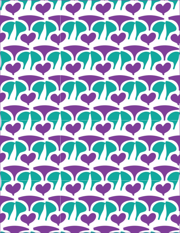
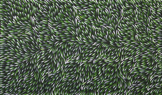
tern that was something that could be easily used as a background and simple to follow. The colors interact by using different shades of green to highlight the difference between them. I wanted a certain theme within it and wanted them to all be similar colors to each other. The values were relatively light, with the difference of the focal point being dark green. This added contour to my design and showed subtle differences.

For my organic pattern, I wanted something hand written, although I physically am not the best artist. I decided to draw different shapes and use colors that complimented each other well. I made one shape, the heart, recognizable but the rest were abstract, strictly organic and unreadable. With the colors, I only wanted two solid colors to make it simple and blend easily together when I used the pattern tool.Organic Pattern Because of the drastic contrast, It makes other shapes that are combined into other organic shapes. Overall, I enjoyed learning how to use the pattern tool and I know it will be useful for future projects or jobs.

Posted in Fall 2015 Archive (336) | Leave a comment

Design Blog #5: Pattern Design

Untitled

For my first organic visual I decided to go with a natural coral design pattern. This pattern is organic do to the ripple effect that is associated with a live coral and made by nature not by man. It is a free form pattern that can be associated with waves and ripples. Another factor that makes this pattern organic is the fact that there is no firm form to the shapes, there is no sharp structure like a square for example. One cool thing that I saw when I saw this shape was the similarity in the ripples but at the same time they had their differences, the pattern itself is not perfect per say. You can also tell its organic by the way that it looks texturized. 

seamless-geometric-op-art-pattern-19848618

For the second pattern I chose was the example of a geometric pattern, this is represented on how punctual and precise the shapes shown are. For example the squares shapes within other squares make it look unnatural, it is perfect and sharp. Also the lines make it look manmade, measures, to be exact. It looks ruled and geometric, symmetry, and on point. There is no irregularities, we can clearly see that it is shapes meant to be squares within squares but with a good amount of sharp lines within. Also we see that this specific pattern is an illusion. For me personally it gives me the feeling that i am going to puke vs, the organic one that gives me a sense of peace and relaxation.

Posted in Fall 2015 Archive (336) | Tagged | Leave a comment

Pattern Design: Michael Cassleman

Asante

Detail of hand-woven Asante (Ashante) ceremonial cloth featuring red and yellow (primary colors), green (secondary color, complementary to red), and black (neutral color and the darkest tone available).

The first pattern that I found is a ceremonial cloth that I believe is the more geometric of the two.  The pattern only uses straight lines, specific shapes, has a very simple symmetry, and repeats the exact same shames throughout the whole thing.  It has a very grid-like pattern and uses varying types of stripes.   There are no irregularities throughout the entire thing, and except for the color, it doesn’t resemble anything organic.  There is a lot of this yellowish-orange throughout the pattern, and is enhanced by the black background on specific parts of the pattern.  The other parts have red and green, but there is little contrast in value with this, as opposed to the yellow-orange/black.

Taizokai (Womb World) mandala, second half of ninth century.

Taizokai (Womb World) mandala, second half of ninth century.

The other pattern I found was a Taizokai mandala, which I believe to be the more organic of the two. Although the pattern has symmetry, there are far more irregularities. There dots and stripes, but they are made up of small images of people. There are lots of colors, and it appears that those that are the darkest in value make up the background.  The background colors (like the blue and black) make the greens, whites and reds really pop out.  The dots/figures certainly stand out against the background of the low-value colors.

Posted in Uncategorized | Leave a comment

Pattern Design Alex Weber

13e1e6c13e1d76591b04b646b8bb63ca

Andy Gilmore’s Geometric Pattern

For my geometric pattern I decided to visit nice.co. I go there often for inspiration and I thought it would be the perfect place to find some interesting patterns. The one to the left is done by Andy Gilmore and I love the colors and shapes he used to create this design. This design is geometric because it relies on sharp lines determined by value and color to create geometric shapes that are easily recognizable. The shapes do a great job of showing contrast through value. The area where the darkest shapes are hitting the lighter shapes is where my eye is originally drawn, but the places that seem to fade to black are easy on my eyes and help the design be softer to look at. If the image was just black and white shapes back and forth the piece would be far less interesting and a lot harder to look at. This design does a good job at staying flat, I think that figure-ground relationships can be a factor in this design, through shadows. However I don’t think that was what the artist was going for otherwise it would have been much more obvious.

5ee8d4d0162ffb350d5458aaaf0b1548

Elizabeth Olwen-10

As for the second piece I looked at I again visited niice and found a lot less designs. I thought this one had both a fun pattern and good color as well. The layout of the design seems more chaotic and detailed in comparison to the geometric pattern. This design is fairly flat and besides the background color the design seems to be 2D. The colors in the design go together well even though they do not follow the natural color palette the design does a good job of making the fun pattern that feels organic by the objects they used. The values of the colors are all fairly similar making the design easy to look at and allows the viewer to look at the whole of the design. The dots and simple lines the designer uses work well to create a simple organic object. The overall design leads your eyes well despite looking chaotic.

Posted in Fall 2015 Archive (336) | Leave a comment

Pattern Design: Anneleisce Holleman

This visual example by M.C. Escher was found on a website called Flyeschool and can be found here.

This visual example by M.C. Escher was found on a website called Flyeschool and can be found here.

My first visual example by M.C. Escher is geometric in my opinion because of it’s exact symmetry and hard lines and points which give it a very man-made/computer generated feel. It’s organizational architecture follows a grid like pattern and uses intersecting stripes/shapes to form it. By using the intersecting bats/demon like figures and angel like figures it appears tiled but in an irregular way. The value of these colors interact in an interesting and somewhat conflicting way. At first glance it might be difficult for the eye to choose one color to focus on. When you are focusing on just the gray/black part of the image it is very easy to identify all of the bat/demons but if you decide to focus on just the white part of the image the white angels become the easiest color to focus on. Optically it is a challenge to focus on both colors at the same time although they seem to present an equal balance between them making it hard to distinguish a specific ground or background.


This example  is by Gloria Petyarre - Bush Medicine Dreaming, 2008. And was found on Flyeschool here.

This example is by Gloria Petyarre – Bush Medicine Dreaming, 2008. And was found on Flyeschool here.

My second visual example would classify as organic due to it’s flowing figures and soft looking texture as well as earthy colors. Although it is indeed a pattern it does not follow a rigid structure like the previous example. It seems to flow freely and is asymmetrical. This uses more dot like organizational structure to form a grid that contributes to an overall system of shapes. It also does not appear to be tiled by is and irregular pattern. The colors used interact with the pattern to give it a feeling of movement like grass in the wind as it is organic in nature. Unlike the first example these colors work together to form the grid and do not necessarily diminish the value of any of the other colors and the lights and dark do not dominate the image because they are so interwoven. I also cannot identify a figure-ground relationship for this image because the figure/colors seem to blend together to make a common ground.

Posted in Fall 2015 Archive (336) | Leave a comment

Pattern Design: Ryan P Schimack

M.C. Escher

M.C. Escher

This picture is organic because it does indeed have a distinct pattern with the fish on bottom and the birds on top, but none of the lines are straight or geometric. Also, if you look closely you can see that the detail of the figures increases as you approach the sides of the image. The organizational architecture of this image is in a grid format because of the pattern of the fish & birds, and how they seem to fit into the outline of each figures image. The colors interact with the blacks & whites interchanging with each other, up until the point where they flip flop. The values in the colors go from light on top, and dark on bottom, to switching in the middle of the image. This image is also unique because in terms of figure-ground relationship this images background becomes the foreground, and vice-versa.

Rosemary Newson

Rosemary Newson

This picture is geometric because it does have a distinct pattern of half circle shapes alternating directions around the image with different hues of red and pink. Even though the lines are curved and not straight angles, the pattern of this image makes it geometric in nature. The organizational architecture of this image is in a grid pattern, because all the shapes keep repeating with the inner and outer facing half circles. The color interaction in this image compliments itself with the value of the light and dark hues of red and pink interchanging in the half circles. Figure-ground relationship doesn’t come into play as much in this image because all of the aspects of the image are in the foreground, there isn’t  much of a background to be found.

Posted in Fall 2015 Archive (336) | Leave a comment

Pattern Design: Maria Eckmann

This image was found on Pattern Foundry, which I found through the Resources tab on the class website. It is called Amources and is created by Thomas Brinkmann.

This image was found on Pattern Foundry, which I found through the Resources tab on the class website. It is called Amources and is created by Thomas Brinkmann.

This image is from Marimekko Textiles, which I found through the Resources tab on the class website. It is a Gerda HW cotton sateen fabric and is sold on the Marimekko website.

This image is from Marimekko Textiles, which I found through the Resources tab on the class website. It is a Gerda HW cotton sateen fabric and is sold on the Marimekko website.

I chose to analyze these two patterns. The one with the orange flower- like elements represents a more geometric pattern. The flower element that is repeated is made up of regular circles repeatedly circling another regular circle, which creates a symmetrical element. It is clear that the flower is created by a computer because all of the circles are exactly the same size, making the element regular and geometric. This pattern utilizes one isolated element with the same amount of space between each repeated element. This creates a grid because of the uniformity of the flowers, which then creates a larger texture. Color is utilized very conservatively because each element is the same color and the entire background is white. The orange flowers contrast against the white background, making the elements stand out. The orange has a dark value, while the white has a very light value, which also creates the contrast and has the viewer concentrate solely on the repeated flowers. By the artist only choosing to include two colors, it causes the viewer to appreciate the simplicity and uniformity of the pattern. Figure- ground relationship has a lot to do with pattern design because the color of the background can either take away or highlight the elements included in the pattern. In this case, the white background highlights the orange elements because the orange has much more value and stands out against white.

The image of the purple and blue flowers is my example of an organic pattern. The elements are the flowers, which include green stems. The flower and the stem are irregular and not one is the same shape. There are no straight angles, but there are curves that create a soft texture.  The flowers are more representative of a real life picture because the elements show irregularity between each one. The elements are still repeated over and over again making a pattern, even though there is overlapping and irregular spacing between them. The repeated principle is a purplish flower with a green stem. Color is used very creatively.  The petals are made up of irregularly shaped squares that are different colors, creating texture within the petals. The colors are different shades of purple, sometimes perceiving a blue color because the shade’s value is so dark. Purple and blue are right next to each other on the color wheel, therefore harmony is achieved and the mood of the elements is unified. The colors of the stems are different shades of green, sometimes more luminance than the other. This design choice creates a shadow effect that also creates the illusion that the stems are bending over each other. The black background contrasts against the green and purple just enough to highlight the bright parts of the stems and not take away from the elements themselves.

Posted in Fall 2015 Archive (336) | Leave a comment