
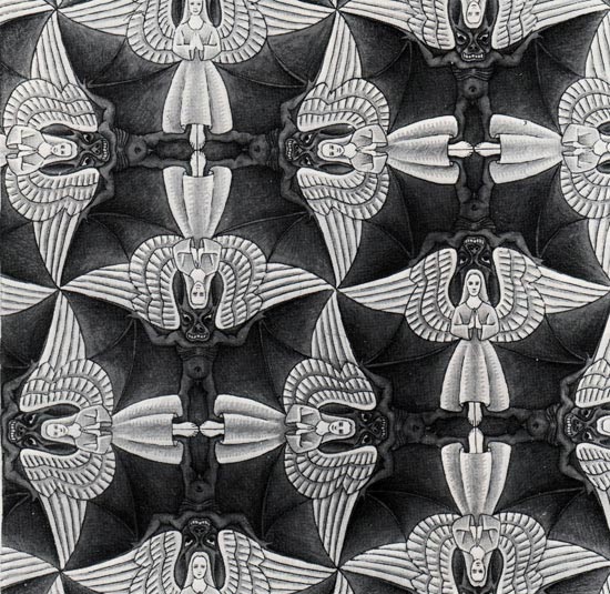
This visual example by M.C. Escher was found on a website called Flyeschool and can be found here.
My first visual example by M.C. Escher is geometric in my opinion because of it’s exact symmetry and hard lines and points which give it a very man-made/computer generated feel. It’s organizational architecture follows a grid like pattern and uses intersecting stripes/shapes to form it. By using the intersecting bats/demon like figures and angel like figures it appears tiled but in an irregular way. The value of these colors interact in an interesting and somewhat conflicting way. At first glance it might be difficult for the eye to choose one color to focus on. When you are focusing on just the gray/black part of the image it is very easy to identify all of the bat/demons but if you decide to focus on just the white part of the image the white angels become the easiest color to focus on. Optically it is a challenge to focus on both colors at the same time although they seem to present an equal balance between them making it hard to distinguish a specific ground or background.
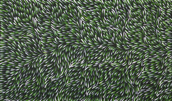
This example is by Gloria Petyarre – Bush Medicine Dreaming, 2008. And was found on Flyeschool here.
My second visual example would classify as organic due to it’s flowing figures and soft looking texture as well as earthy colors. Although it is indeed a pattern it does not follow a rigid structure like the previous example. It seems to flow freely and is asymmetrical. This uses more dot like organizational structure to form a grid that contributes to an overall system of shapes. It also does not appear to be tiled by is and irregular pattern. The colors used interact with the pattern to give it a feeling of movement like grass in the wind as it is organic in nature. Unlike the first example these colors work together to form the grid and do not necessarily diminish the value of any of the other colors and the lights and dark do not dominate the image because they are so interwoven. I also cannot identify a figure-ground relationship for this image because the figure/colors seem to blend together to make a common ground.
