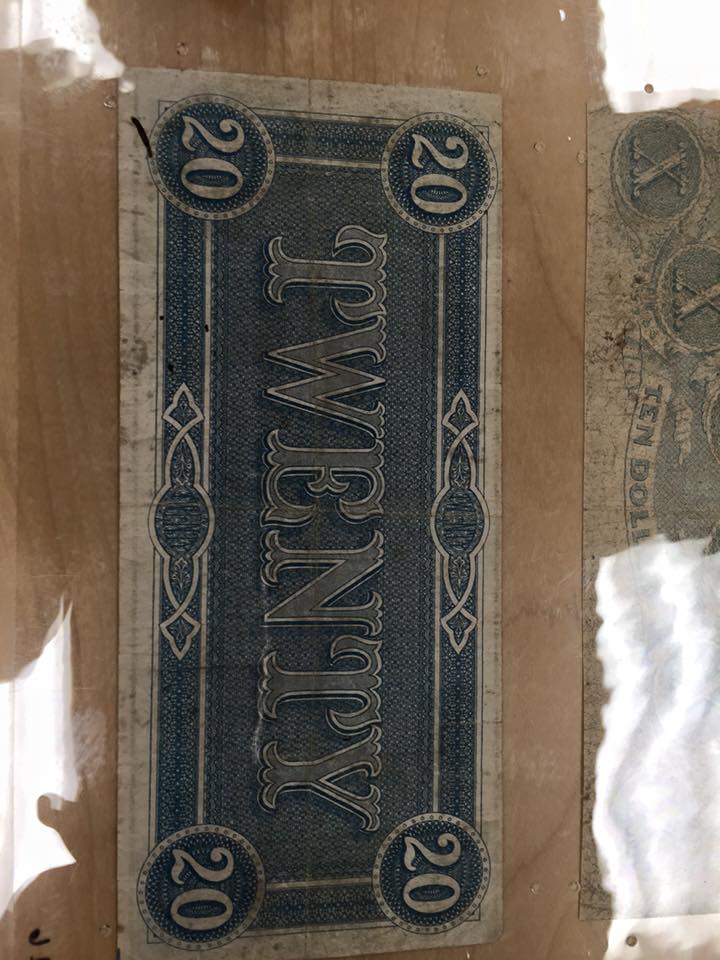
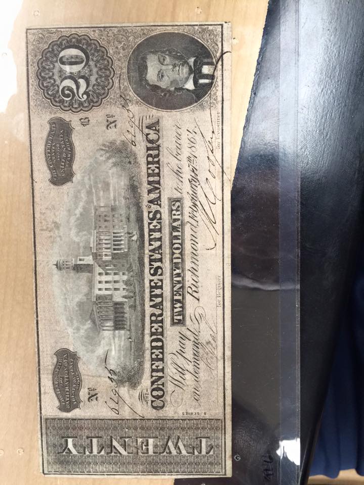
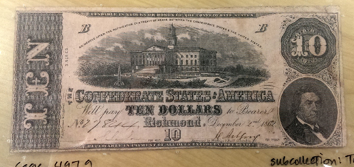
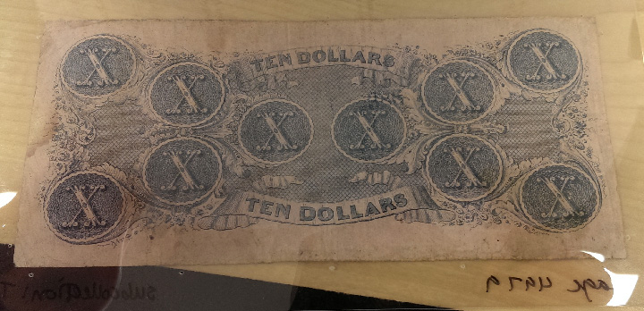
Artist: Luis Alves
This piece is part of his second installment of sketchbook collections. One of four pieces. Retrieved from website.
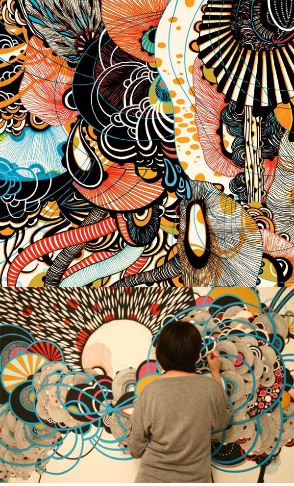
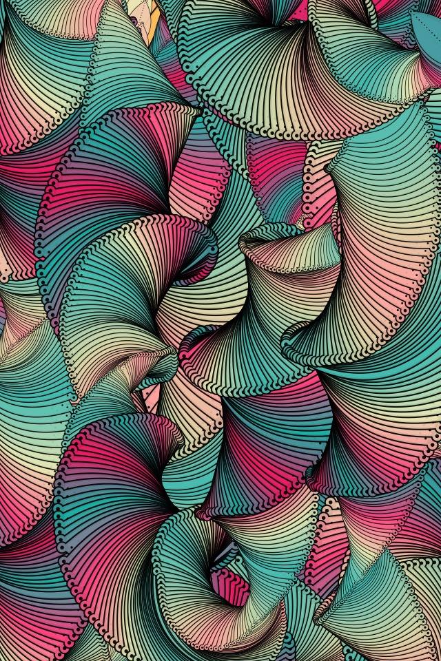
Patterns are unique to look at, they seem to be everywhere you look at, whether it be geometrically created or organically created. So check your own surroundings, you’ll see them. Now allow me talk about this piece that is on the left of your screen – let’s look at the complexity of it right away that comes off this piece. It is not what you would call geometric but inside I find this piece that Luis Alves made to have more of an organic pattern. Why do I say that – well I said when I introduced this piece, it is quite complex among all the curves surrounding the Frankenstein head. Now it doesn’t come out anything mathematical but rather natural. While looking at the pattern itself it does come along the idea of being tiled/repeated at the same time among each curl but also irregular. When it comes to irregularity, there are several different kind of patterns within the curls themselves from like dots, stripes, blobs and so on. Now with it being tiled/repeated at the same, the patterns within the curls do repeat each other among each curl and are all tiled among each other in a very irregular way. Lastly when it comes to Alves piece, the colors of a purple on top of pale-yellow background gives more of contrast among each other in a positive way that you can signify what is the Frankenstein head or the flower towards the top of the piece because it mainly the pale-yellow with a purple outline to help make it stand out.

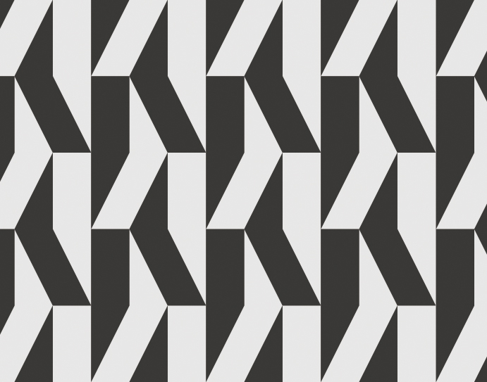
Sacred Geometry: Sacred geometry can explain everything. I’m talking about creation. Not just the creation of people, but the creation of all life everywhere. The creation of the galaxy. The creation of the entire universe. Gotten from website.
Now let’s look at pattern number two that I am very fascinated by and that I constantly see everyday. This is called the “Flower of Life” and it’s part this ideal of sacred geometry, so you named it this is my geometric pattern. Along this pattern itself, it is not overly complex nor is really natural – it is very mathematically drawn out all the time to get the perfect replication of what is know as the “Flower of Life”. Now look closely at the pattern itself, it is very repetitive when it comes to using circles to create this design. While having them tiled on top of each other to give it this very flower-like icon. Colors don’t seem to play a significant role in this pattern other than the idea of black and white to give it a figure-ground relationship.