Currency Design Anaylsis – Mely Barajas

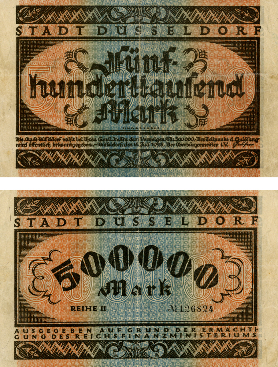
For the purpose of this blog post I chose to write about a Chinese bill. The first thing that I noticed was that since they had limited tools and paper their counterfeiting measures were not so great; therefore, they had to use other techniques to not have their money reproduced illegally.

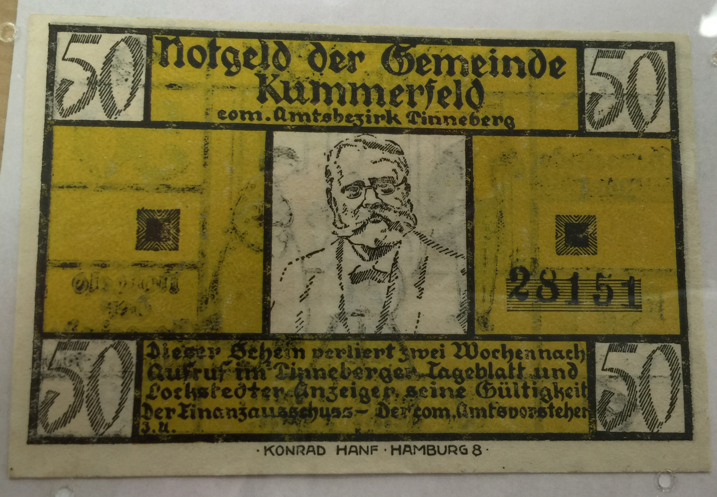
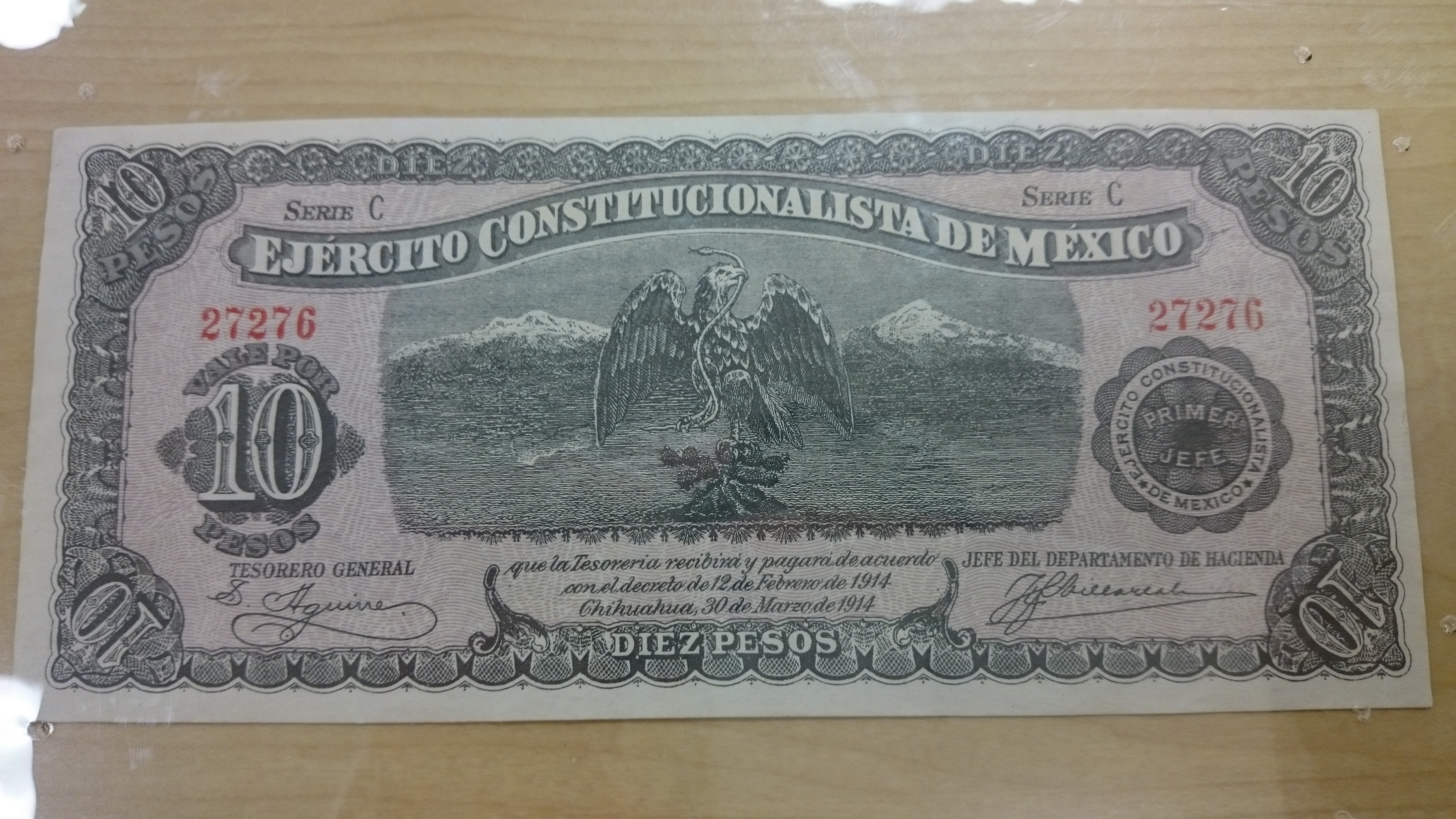
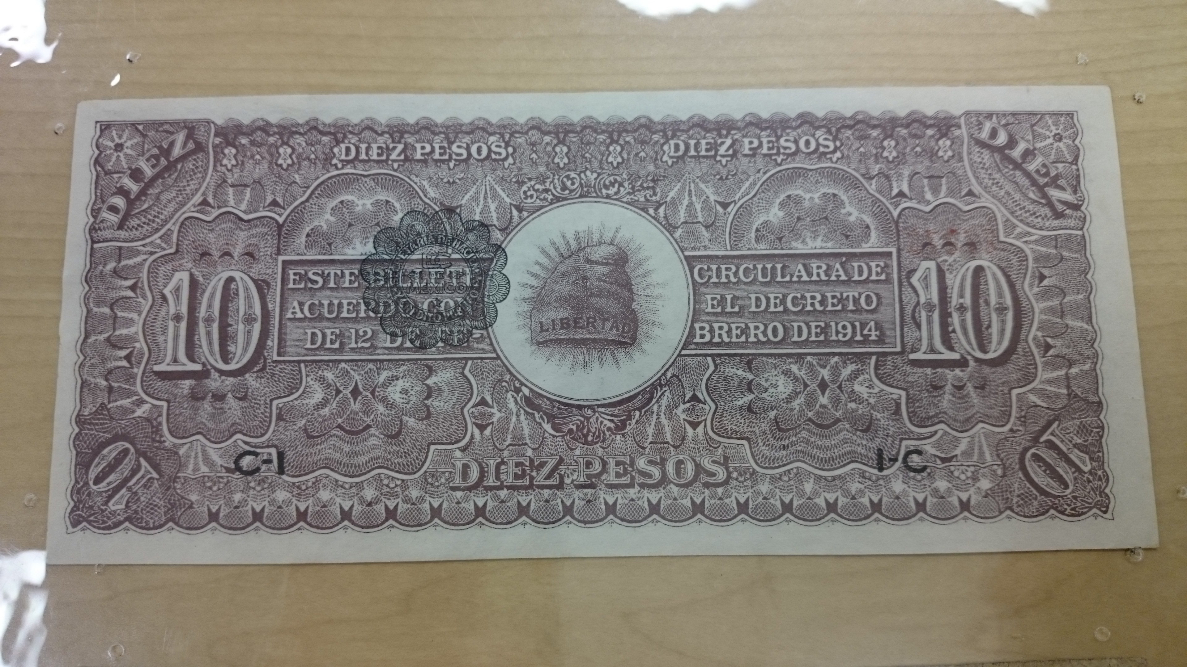
For example, the bill that I analyzed had various features that one could take as being “counterfeiting measures”. The people who created the bill, that I analyzed, used various colors, patterns and designs. Thin lines created a design along the border and throughout the bill. In some of the areas the overlapping of the lines created darker or more visible areas of color.

It may seem silly for the design patterns to be counterfeiting measures; however, we must keep in mind that back in the 1920’s the individual(s) who made this bill did not have the technology that we do today. Today I can create a figure in illustrator and use the pattern making tool to recreate it multiple times and it will only take a few clicks and adjustments to do so. Taking this into account that is why one of the reason why our bills have changed. For instance, like the new 100 dollar bill was recently changed to keep up with the access to technological advances that people have.

They also did layers upon layers on this bill. If you look closely you can see the colors of one design seeping through other colors and patterns that were later applied.

Furthermore, the color scheme is the first element that caught my eye because it was not working together in any way. The six or so colors did not seem to follow any analogous or complimentary color wheel. In my point of view they just worked with what they had and then colored the numbers and square designs in the back in red, so they would stand out.

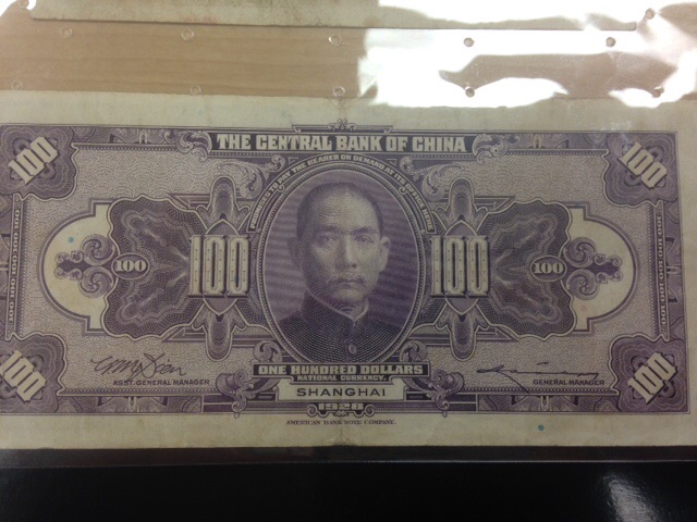
Last, but not least, like in any composition, typography is an important element in this bill. is an interesting aspect of the money for various reaso­ns. Only on the front side of this bill, I counted four different fonts. Apart from the inconsistency in fonts the text is an English, which is interesting considering it is a Chinese bill. Nevertheless, if you look closely you can see that the bill was made by an American factory which accounts for the text as well as the front of the bill being similar to an American bill.

Mely

Currency

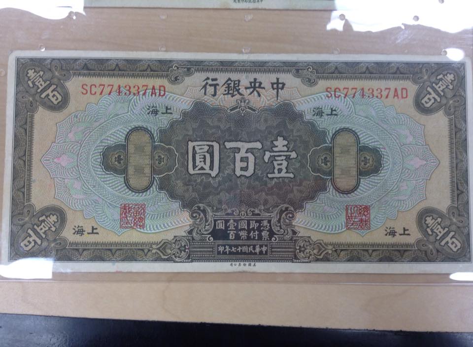
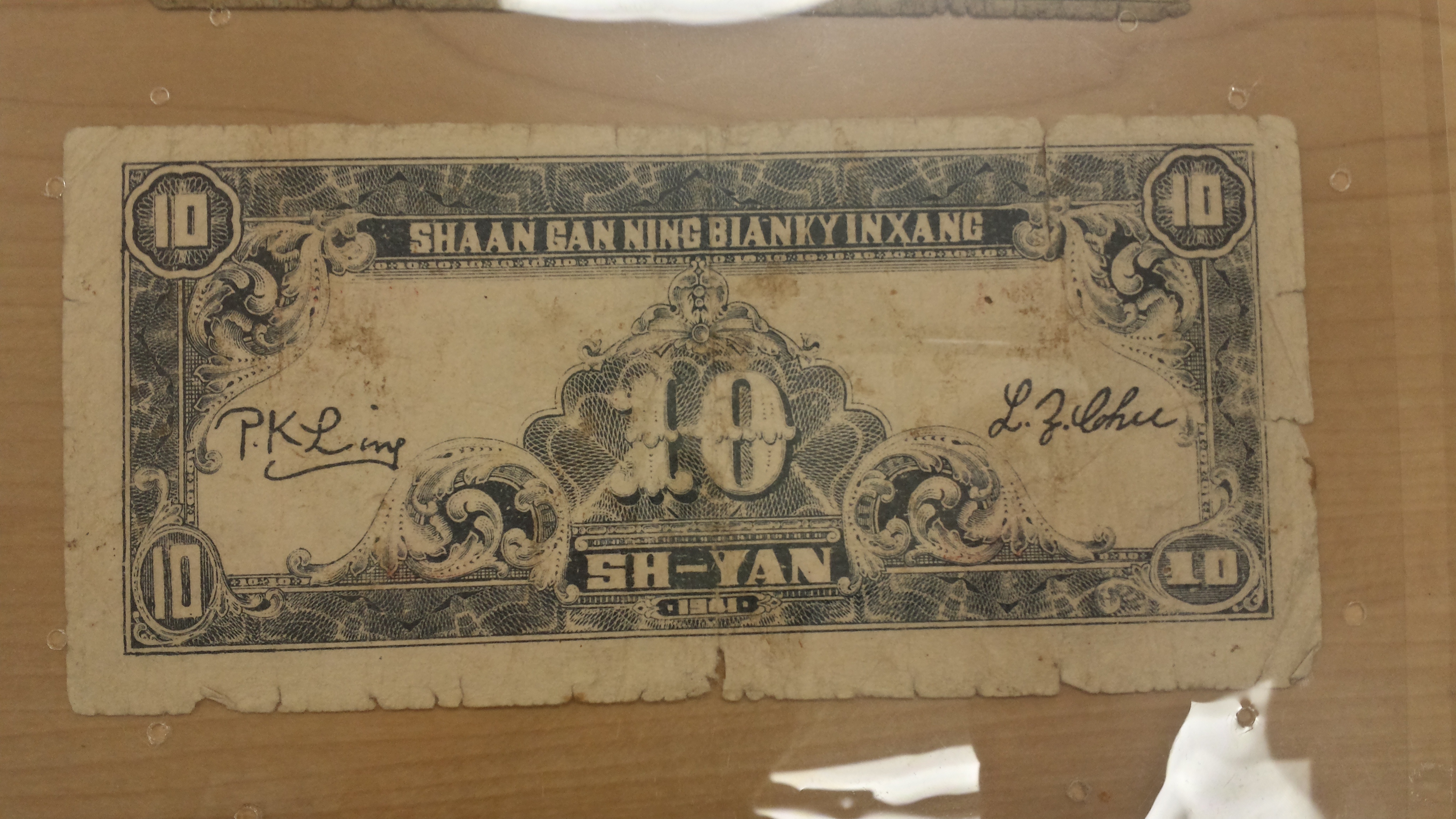
Chinese Bill Back Holland Terrell Library

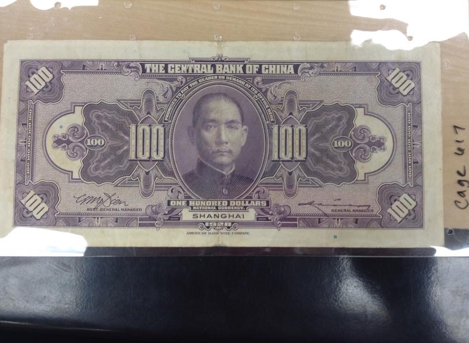
Chinese 100 bill Front Holland Terrell Library

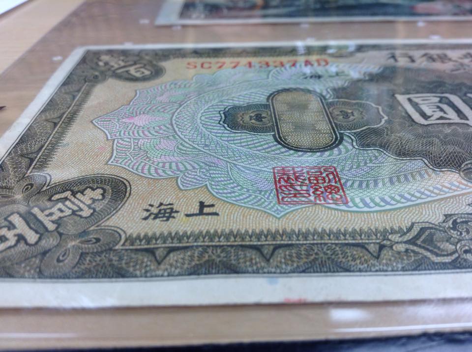
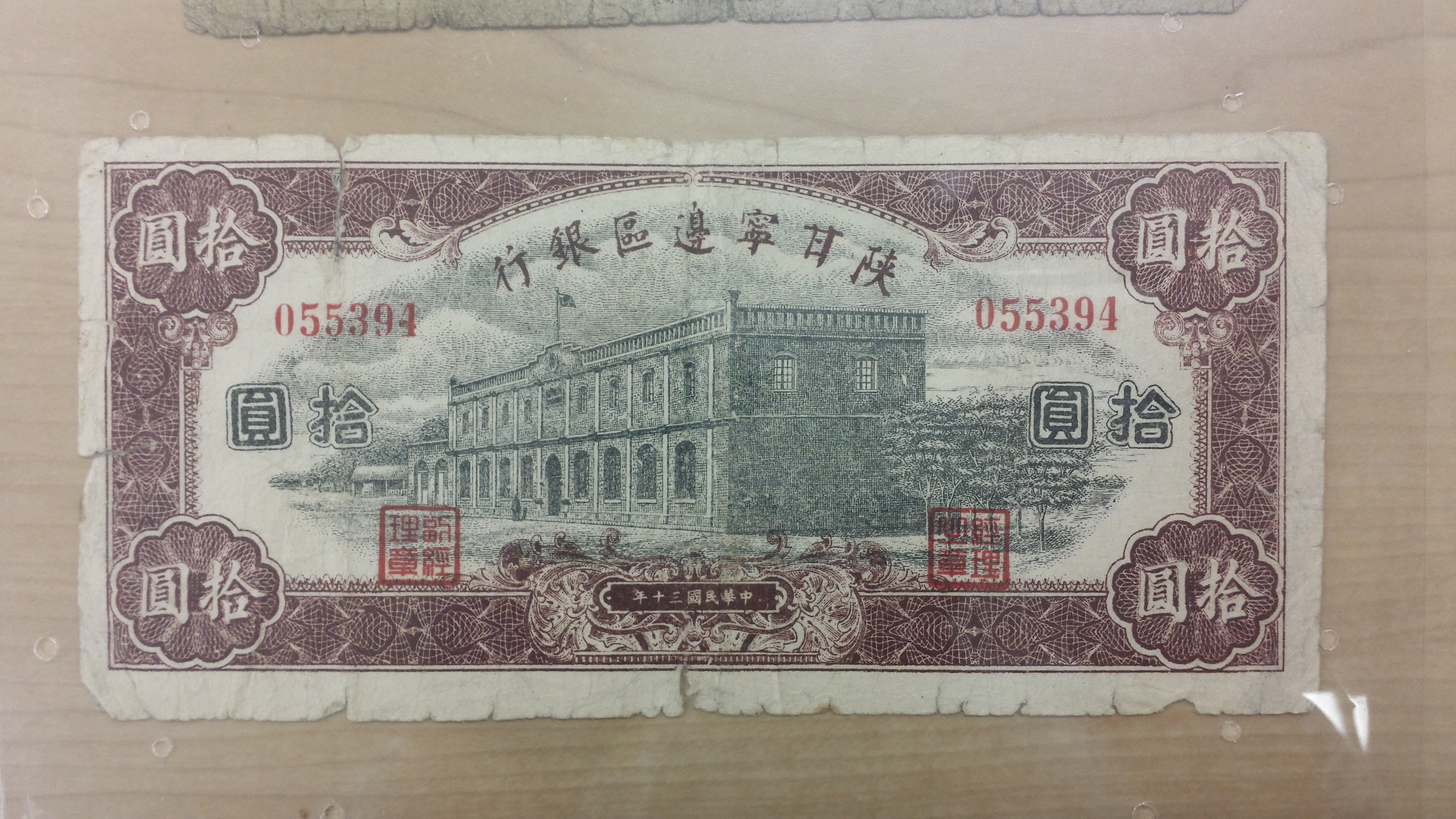
Close up Chinese Bill Holland Terrell Library

Posted in Fall 2015 Archive (338) | Leave a comment

Currency Design Analysis: Jack Dunwoody

Confederate era $100 grant

Confederate era $100 bond

The $100 Confederate bond struck me in terms of typography. Being of such high value, the typography is very ornate. The bond says “The Confederate States of America” across the top with very ornamental capital letters. The majority of the bond is covered in very stylized cursive text describing the terms of the bond. The cursive is so italicized that it is hard to read in some points. From a distance, the text almost reads as one big shape. My hand also serves as a reference to just how big this note was.

The front side of a Confederate era $10 bill

The front side of a Confederate era $10 bill

The back side of a Confederate era $10 bill

The back side of a Confederate era $10 bill

The color scheme of the D series confederate $10 note is fascinating to me. The bill uses red on one side and blue on the other, representing the colors in the Confederate flag. The front side uses primarily a red pattern of weaved lines with images in black black printed on top. The information the bill needs to display is all written in black to signify it’s importance. The back side of the bill only employs a blue color and much less information, only a ten is depicted in a few places. The stark contrast between the sides of the bill makes this note stand out among the rest.

An ancient Chinese note printed on cloth, most likely and ornamental gift of sorts

An ancient Chinese note printed on cloth, most likely and ornamental gift of sorts

The cloth Chinese note used a very detailed pattern in a black ink that appears to have been applied with a stamp. The middle of the bill shows a circle which I think is representing the world. Emanating out of the circle are two fleur de lis patterns with circular attachments to the central circle. The rest of the note shows what could be clouds or mountains, either way describing something high up. I think the combination of mountainous imagery and very ornate patterns printed on fabric rather than paper tells me this bill was made for a very prestigious person or purpose.

Posted in Fall 2015 Archive (338) | Leave a comment

Currency Design Analysis: Khiabett Contreras

German Colorful Money Donated by Ed Carver MASC in Holland-Terrell Libraries Front Side

German Colorful Money
Donated by Ed Carver
MASC in Holland-Terrell Libraries
Front Side

German Colorful Money Donated by Ed Carver MASC in Holland-Terrell Libraries Back Side

German Colorful Money
Donated by Ed Carver
MASC in Holland-Terrell Libraries
Back Side

The currency example I chose to analyze was from part of the Ed Carver, German Colorful Money collection. This money is from around 1900’s and was used primarily around the Black Forest. The imagery is composed of different icons and illustrations. In the back there is an illustration of what seems to be different situational scenarios. It is hard to say exactly what is going on but you can gather that it is every day scenes of perhaps life in the Black Forest. There are also icons that look like they contain: a grey heart, a black looking domino shape, and two shapes that look like rings.

The color of the bills I got to see is very bright and colorful, he images I took do not do justice to the bright yellow that the bills come in. The bill contains a scheme of yellow, black, grey, white, and a tint of newspaper brown. The colors could have picked because of its bright hues and the great black contrast against it. The typography looks like it is an old school english font. It is very bold and hard to read. The language on the bill looks like it is German but when I google translated a word it detected Maltese.

References and associations that these designs elements have are that they look like old confederate money. It also has a similarity with the headshot of a man something that US American money has. The bill also has cereal number some kind of tracking system and the US money has this same association. These are different from the ones I historically and culturally grew up with because the person on the bill is not in our US history therefore I do not know who he is and what he was known for.

Lastly the continuity between he front and the back side of the bills can be seen in the color scheme hat is so predominant. The other thing that ties it together is the typography that is seen on both sides of the bill. One last connection to note would the the layout of the bill, it is formed by lines that create different size squares and rectangles that give the bill consistency.

Posted in Fall 2015 Archive (338) | Leave a comment

Currency Design Analysis: Alden Paguada

Ten Mexican Pesos

Ten Mexican Pesos

This is a bill from Mexico in the denomination of 10. Reason why I chose this bill was because the front of the bill really looks like an American dollar.The Illustrations feel really modern-contemporary. The eagle represents a symbolic figure in the history of Mexico. We can see an eagle with a snake in its mouth, with mountains appearing in the background. As far as the image mode goes, the image portraits a real print, the image just feels like a real drawing. The background of the bill is very abstract, but very simplistic at the same time. Patterns on the bill are very consistent and abstract. It is not a full bleed print, but it fells very symmetrical. It is a little difficult to come up with a color scheme for the bill. If you look at it from a close distance, it looks pink but if you hold it far away from your eyes it looks green, like a dollar bill. The color scheme of this bill makes it look modern and realistic. Now, the back of the bill it’s completely different when it comes to color scheme. The bill is in red and the patterns and illustrations are very abstract. The text is very clean and readable. Letters are in capital letters and well balanced and in some ways this feature makes the letters the main focal point. All the texts are in Spanish, and this gives an even more authentic and unique feeling to the bill. The bill shows signs of consistency and continuity, yet the front and back of the bill are a little bit different. This is a nice design where pattern, imagery, and typography are consistent throughout the entire bill. Overall, the bill design feels really clean and organic.
DSC_0078

Posted in Fall 2015 Archive (338) | Tagged , , , | Leave a comment

Pattern Design: David Lee

For the patterns selected, The Golden Road is one what draws on the more organic pattern as it is representational of a head and the form itself is more freeform rather than geometric or calculated. The other cover is more geometric as it uses rectangles to represent books and does so by repeating the shape in a mannerism similar to that of a bookshelf.

Following up on the cover of Sloan’s novel, there is only use of one color which does a better job of representing the whole collection of books and not just focusing on different books if there were multiple colors of books. Using one color pushes the idea of a bookstore more so. Also, the repeating use of rectangles are done so in a grid-like fashion by creating boxes that fit a certain number of rectangles.

For Millner’s cover, it repeats the pattern in a point format by repeating heads in the same exact manner. However, due to the colors being used, they appear to be more of complimentary colors as well as near analogous colors in order to reveal that the head represents same but different. How every person feels unique but is really similar to others of their characteristics. The saturation of color in the design gives it a more old fashioned look as the colors seemed drained out and a bit dull.

Both the designs do a good job of representing the topic that they want to talk about and that is made effective through the use of purposeful design by pattern and color.

Posted in Fall 2015 Archive (336) | Leave a comment

Currency Design Analysis: Jeff Williams

Engraved 500,000 German Mark from the early 1920s.

Engraved 500,000 German Mark from the early 1920s.

I chose this 500,000 German Mark from the early 1920s.  The only imagery on this bill are icons and patterns. There aren’t any illustrations. The closest thing to illustrations would probably be the combination of icons but those still don’t really make up anything meaningful. I think the most prominent icon on the bill is the “crown” located on the top and bottom of both sides of the bill. There are also zig zag patterns on each side of the crown with a sort of floral icon on the edges. The floral icon looks like a single stalk of wheat. The first thought I had when I saw the zigzags is that they looked like a pattern made up of a stylized Schutzstaffel (SS) Nazi symbol. Compared to some other bills we looked at, this bill doesn’t have any illustrations. Some other bills include illustrations of people performing what look like daily tasks or they include something like locations or buildings. Those illustrations seem to represent the community where the bills were circulated. This bill has none of that. I think maybe the lack of illustrations sort of represent a more rigid society like Nazi Germany although Nazism hadn’t taken hold until later. The next pattern I noticed is the crosshatching in the corners of the center rectangle. It’s a basic cross hatch that helps frame the text in the rectangle. Within the rectangle, on both sides, “500,000” makes up part of the background pattern. Inside the digits there is a circle/swirly pattern. Surrounding the 500,000, the background pattern is made up of six-sided starts and pointed ovals.

The main colors of this bill are the blue and orange which were used to print the background pattern on both sides of the bill. The two colors are printed as a linear gradient. There is a gradation from orange to blue back to orange. Between the orange and blue there is a green tint that comes from the transition between the blue and orange.

From what I can tell the bill has four different typefaces. The typeface that makes up “Stadt Dusseldorf” is a pretty basic serif typeface. The black printed 500,000 is very bold. In each digit there are lines intersecting the sides. “Fünfhunderttausend mark” appears to be a German Gothic script. It is outlined. The “Mark” on the reverse side is the same script but is solid, instead of outlined. It’s interesting to note that the word fünfhunderttausend is one word yet it is hyphenated. Presumably this was done to help with the design. Having the four letters “fünf” and “Mark” above and below the hunderttausend balance the bill out. It would probably look a little wonky if Fünfhunderttausend was squeezed in there on one line.

Posted in Fall 2015 Archive (338) | Leave a comment

Currency Design Analysis – Stefan Lindeman

image image

The currency that I have selected here is an old bill from Shanghai printed by the Central Bank of China (although I believe it was printed in the United States for reasons I will state later). The currency is in the denomination of 100 and was printed in the 1860’s. I believe it was printed in the US because of the english style of imagery and image placement as well as the text on the front side of the bill. The denominations in the corners, the extremely complicated geometrical patterns (for counterfitting precautions most likely), and the face in an oval in the middle of the bill are all traditional things found on American currency. What really makes me think this though is the english lettering found on the bill that reads “The Central Bank of China” , ” One Hundred Dollars” and “Shanghai”. I tried to think of reasons why a Chinese bank in the 1860’s would use english lettering on the front of their bill and the main thing I could think of was it was printed in the US. There are even signatures on the bottom left and right sides of the bill which are also found on US Currency. The color scheme is very simple and things are very symmetrical on this bill and are fitted nicely by a rectangular pattern that encompasses all the information (images and type).

Now, on the back of the bill, this bank uses a more traditional asian esque feel. I am familiar with Japanese currency and this style resonates with me. The colors are what immediately makes me think this, it is a brown/tan color with a greenish tinge, this is found on many asian currency’s. In addition, the gold ovals on the left and right sides resemble old asian coins. There are more obvious signs of its asian trademarks such as the Chinese writing on the corners where the denominations were on the front of the bill as well as all the english text. It is essentially a copy of the front, but completely turning its once US/American feel into a Chinese one. This is where the bill both has continuity but at the same time is very different on each side. I feel like I am viewing two different bills from two different countries with their own styles. The only similarities in each side is really the formatting/plaecment of its text and symbols. Both have a geometric pattern on the inside and the text on the top and bottom middle as well as its rectangular outline.

Posted in Fall 2015 Archive (338) | Leave a comment

Currency Design Analysis: Jonathan Nunez

Chinese 10 yuan bill

Chinese 10 Yuan bill

Chinese 10 Yuan bill

The bill I chose to for this blog post is this Chinese bill. At first when I saw this bill it stood out because of the navy blue and the maroon color it has for its borders and how almost perfectly symmetrical the bill is. After I observed the bill a little closer I came to realize that this bill looks really familiar to a bill I’ve seen before but it wasn’t a Chinese bill, instead it was American bills.

U.S. 1 dollar bill

U.S. 1 dollar bill

When compared to an American bill both these bills have a bunch of similarities. For example the curve pattern used to make designs on the boarder Chinese bill is very similar to that of an American bill along with the numerical value of the bill on all four corners and on the center of the bill. Another similarity I found was the print image of a building that looks exactly like the printed buildings found on the back of the 5, 20, 50, and 100 dollar bills. Even the white outer boarder between the American bill and the Chinese bill are identical, which can mean that the U.S. had a lot of say on how the Chinese should make their bills or China like the U.S. bill and wanted to incorporate some of the western design into their own bills.

Posted in Fall 2015 Archive (338) | Leave a comment

Organic / Geometric, Abstraction / Representation: Michael Cassleman

Google's new logo as of 2015

Google’s new logo as of 2015

It should even but up for discussion that Google’s logo has been, and is currently, a geometric one. The logos use typeface exclusively, and have a very clean/neat look because of it.  The old new old logo uses a serif font, which almost gives it an organic feel (as compared to the sans serif) due to its irregularity.  Additionally, the lines that make up each letter are not a consistent width.  Slight irregularities and minor complexity are not enough to make the old logo appear to be truly organic though. The new logo has very symmetrical lines/curves; the “G” and “e” both look like they would create a perfect circle if the lines were to connect.  The consistency in line width also adds to the very plain and geometric aesthetic.

There is virtually no abstraction in the two logos.  It could be argued that the word “Google” has some abstract meaning that relates to what the company is, but the image itself doesn’t facilitate abstraction.  They are more representational than abstract.  Due to the logos only being colored typeface, they are just a representation of the company.  The logos are almost more of a visual representation of the company/search-engine, as people have associated the word with being a search-engine, than it being the title of the company/engine, but it still remains that the logos are more of a representation than an abstraction.

The only real differences that I see in the new logo, as opposed to the old, is that it has become more geometric and has a cleaner look.  This was probably the reason that the changes were made, as it has made the logo look more like a logo (as opposed to a colorful word).

The geometric and non-abstract aesthetic, with the primary colors, make the logo have a look akin to children’s toys e.g. building blocks.  Children play and are curious by nature.  Google is a search engine that allows people to explore the internet and play around, so I think that the theme suits Google perfectly.

When it comes to mediation, it’s hard to say, because the image does not really look like an image.  The first logo does look like a typeface that someone picked in some word-processing program, which shows a virtually no mediation. However, the new logo looks more like a drawing, which shows to me it has at least some amount of mediation.

Posted in Uncategorized | Leave a comment

Organic / Geometric, Abstraction / Representation: Maryssa Beare

Logo redesigns

Norwegian designers Heydays revamp KK Electronic’s face. Wanting to integrate KK’s desire to utilize simple means of wind energy into a simple but effective design, they transition into a less rigid look. ( Username “Armin”, Where the Wind Blows, 2015)

Of the two logos, the After Logo is more organic because of its less structured nature, or its less rigid composition, if you will. The Before is far more clean cut and geometric with the harder angles and strict symmetry.

In terms of the company name, the Before is a tad more representational because viewers can easily identify the KK in the logo. The After is only abstract because of the lateral bifurcation of the KK (but it can be recognized as KK).

In respect to what the company does, which is powering wind, I’d have to say that the After uses a bit of abstraction and mediation to be the more representative logo. The KK’s organic look makes it almost appear (or at least it did for me) that they are wind turbines, the spokes on the giant windmills. The Before addresses the company and its name; the who. The After addresses the what of the company, which is a bit more personal. That sounds counterintuitive, rather than focusing on its face with the Before logo, the After logo focuses on its mission and objective. Also shifting to an organic look from its previously geometric one also adds to the more personal and personable feel. Wind power is a growing industry and needs more appeal to the public, and so by implementing an organic, purpose-representing image really makes the After logo very effective.

Posted in Fall 2015 Archive (336) | Leave a comment