Print Versus Digital: Issaya Saleumsay

When I read “Understanding Comics” by Scott McCloud, it was really noticeable that it was a comic book from the start. But, I didn’t realize it was telling us about the life of comics and the way they have been changed over time. It’s also interesting that “comics” have been used over time and started in the BC era. I was really intrigued on the things I learned about the way people “bash” comic books or graphic novels as some would say. And it’s really interesting on how people say all these bad things when they use them all the time. A short phrase from the “Understanding Comics”, everyone uses comics and they don’t know it. Animations from short films or any animations at all, are a bunch of pictures or designs being moved slowly to create a short film. If you think about it, short films are comics without bubbled words by them and people actually saying them.

Reading McCloud’s web comics, was interesting and informative. He talks about how comics were started and when they were started and how they have changed over time. It’s like a shorter version of his book, “Understanding Comics”. It goes into detail about comics that the book doesn’t cover all the way.

Image result for understanding comics

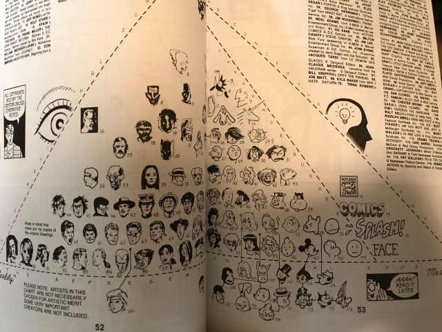
Part of the book: “Understanding Comics” Picture taken off of Google Images

If I were to write a comic book, it would be a short one or long one depending on the story line. But, I would have people read it from left to right and from up to down, just the way it is in America. I believe I would do it this way instead of the Japanese comics because I am from America and I live here. If I was in Japan, I would do it their way. The only reason I would do this, is because there is no reason I would want to make it difficult for people, but if I wanted to have fun, I might do it the other way.

Posted in Fall 2018 Archive (201) | Leave a comment

Print Versus Digital: Shengjie.wu

Print Versus Digital Shengjiewu.jpg

McCloud, S. (1994). Understanding comics. New York: Harper Perennial. P 52-53  (Universe of Comic)

Continue reading

Posted in Fall 2018 Archive (201) | Leave a comment

Color Interaction: Miranda Frasier

I chose this pattern because I love the use of color and the pattern style!

The colors within this pattern has great use of color! For example the red and yellow, red and blue, blue and green, among many other combinations. Each contrast of color makes them pop! Especially the red and yellow in my opinion. Each color is so different that they diminish each other. This pattern is extremely interesting because it used many different hues. There is blue, red, green, light blue, bright blue, and a lighter shade of yellow. While they are all different they all work together. I believe looking at the color wheel really helped in creating this pattern. Even though the color is all different the pattern remains the same. The most important thing of this pattern I believe is how some of the patterns look like stripes the red and yellow in the middle appear more as the yellow on top of the a red square. The value difference I see is a combination of dark colors mixed with lights. For example a dark red combined with a lighter yellow. It gives the pattern a bit of an interesting contrast in terms of color. But the colors also go together extremely well.  In terms of saturation the colors are very intense even though there are dark and light colors.

In terms analogous versus commentary colors there are a combination of colors since a lot of the colors on the color on the pattern.But while there are a combination of both analogous and complementary in terms of how the pattern works the colors being matched with each other are actually analogous. An example relating to the pattern is because green and blue are together as well yellow and red being put together within the stripes.

I do not see figure/ground playing a role in this pattern.

Posted in Fall 2018 Archive (336) | Leave a comment

Digital Collage: Brianna Esqueda

Collage calls for a uniquely different approach than, in my opinion, any other art form. While it is important to remember that many forms of art draw inspiration from other creators and mediums, collage would not exist without the presents of others works of art.

“Desert Head” Brianna Esqueda

For my collage, I selected to use a picture of a marble bust and placed it against the background of a desert. I used the clipping mask tool to construct the fish outline that were later filled with an image of the ocean. They are supposed to look as though they are swimming above his head, almost taunting him because he is stuck in the dry place.

I hope that when someone views my piece they initially have a sense of confusion; that the expression of the face comes across and is enhanced by the juxtaposition of a desert with flowing bits of ocean. I also wanted to play on the feeling of being disoriented. That feeling of seeing stars when you hit your head. I decided to show that with fish instead of, what is usually used, birds.

Aside from clipping mask, I also utilized the magnetic lasso tool. It was instrumental in precisely cutting around the outline of all the fish and the bust. I also think it is a fun tool to use because it allows you to have a lot of control over how you choose to cut an image.

Two elements of design that I feel are very prevalent in my collage are texture and contrast. I included two opposing substances, sand and water. Not only is there an inherent geographical contrast I also feel that sand is course and obviously different from the fluidity of water. And while the blue water and tan sand are drastically different from one another, neither one is incredibly different form the bust. The curly hair of the bust mimics the waves of the water, and the shadows of the sand mimics the indentation and contours of the face.

Personally, I do think that this collage could have been executed in a traditional cutting and gluing of paper way, but this assignment did help to familiarize me with tools in Photoshop. I can also say that not having made a collage since childhood, this assignment reminded me of how creating something new form something old can be a good creative exercise.

Posted in Fall 2018 Archive (201) | Leave a comment

Digital Collage: Zachary Larson

Curiosity: A project depicting the exciting and endless possibilities of space exploration.

The imagery used in my collage came from several different sources all linked on the WSU creative commons page. These sources include NASA Images, Flickr, and the New York Public Library. I chose these specific images because they all play as a piece in the overall message I portray through the collage. I utilized the old newspaper documents to illustrate how far humanity has come in its exploration of the world. From the discovery of a spherical planet to the invention of flight, a lot of time has elapsed to get to the technologies and discoveries we’re making now. The background image of the stars I chose specifically because it depicts the most recent discovery of a new solar system that we one day hope to explore. I chose the cartoon image of a rocket ship because I wanted to illustrate the excitement and wonder involved with space exploration and ultimately that we are only limited to our imagination.

There are a lot of elements embedded in my collage. For starters, the direction of my collage is quite oblique. All of my images are slanted one way or another suggesting chaos and excitement. The value of my project is focused on the white cluster of stars right of the page. the overall gradient of the page goes from a deep blue to a white where there is a possibility for new exploration. There is contrast between the material of my images. The styles of each image help to capture what their presence in the collage means.

If anything, I hope when someone looks at my collage they think ‘curiosity.’ There is so much humanity has yet to solve about the universe and space exploration would be a revolutionary step in learning more. I want my collage to speak history as well. There has been a lot of agonizing work and some brilliant minds that have brought us to the technological world we live in today and it is important to acknowledge those efforts. Beyond respect, there is a lot to learn from the patterns of human history. I would love for someone to look at my collage and realize how much opportunity there is in life. To travel to space would be an awing experience all on its own, but being a pioneer of a new solar system is mind-boggling to think about.

A few of the main tools I used for this project consisted of the Lasso, Magic Wand, and the Brush. The process began masking off my images so that I could precisely cut out the pieces without losing any of the images. I then took the Magic Wand tool and got a rough cut out of the shape I wanted. Once I had a rough shape I went back around and cleaned up the selection with the Brush tool. Once the selection was complete, I feathered the edges so that the cutouts didn’t look choppy and rather blended into one another. I also adjusted the opacity levels on a few of my layers to allow the viewer to see through to the layers behind one another. I think this technique helped to blend everything together.

Without Photoshop, this project would have been difficult to construct. I believe the transparency in my layers plays an important role in bringing the entire piece together. That being said, no, I would not have been able to construct this nondigitally. I was influenced by mainly digital media. The image of the newly discovered solar system I found on NASA’s homepage was a big part of my inspiration to do this project.

Posted in Fall 2018 Archive (201) | Leave a comment

Digital Collage: Emmalina Krist

My collage for Project 1, created with Adobe Photoshop. All photos taken by Emmalina Krist and Jozef Ignaczak, used with permission. Art created by Emmalina Krist.

The imagery used in this collage comes from photos that I have personally taken. I intended to show contrast of the false world, or imagination represented by the painting, and realism, which was represented by the photos. One element I felt excited about showing and led to my decision to choose this particular subject was the rough, heavily textured surface of the canvas and how the laying of the paint is influenced by this texture to further emphasize the contrast between the real and the “unreal.” I had also hoped the color and hue would give the piece a calm and pleasant atmosphere, as this collage was intended to visually represent a number of activities that I find soothing.

The painting shows a bridge in a fairly remote area of Titlow Park near Tacoma, Washington, which is where I grew up. I find walks in this area to be very relaxing, especially when I’m spending this time with my dog, whose image was also used. Painting is also a hobby that, especially recently, I find is an enjoyable way to relax while also expressing my feelings about things that I care about. Considering that these are activities that help me distance myself from reality a bit, I thought that it might be interesting to place realistic photos in an unrealistic space.

I used a variety of selection tools in Photoshop, notably the Quick Selection Tool for initial removal of background pixels for the smaller images. As this tool did not remove every unwanted piece from these photos, I used the Quick Mask Tool and a small brush to paint over the specific pixels that I wanted to remove. I found, however, that the images looked even more out-of-place than I had intended due to the sharp lines, so I redid the Quick Mask selection, but this time after altering the amount of feathering to higher setting so the images would blend with the painting a bit better. I also lowered the brightness on both images so that they are “silhouetted” by the light behind them. The hue was changed slightly on the image of my own figure, as the photo was taken in front of a red-orange sunset and would have, I felt, thrown off the visual balance in the piece. I also used the Quick Mask Tool on the painting’s layer to select areas that I would want to be shadowed in a way that I hoped would mimic the light source in the painting that filters through the trees from the top-left. Namely, these shadows are located below my dog’s image and my own. Instead of clearing the space in the way that I did the remove the excess pixels on the previous images, I lowered the brightness and increased the contrast of these areas to mimic shadows.

I feel that this collage was best constructed digitally; if I had used a cut and paste method, it would likely have ruined the painting, which I would have preferred not to do.

Posted in Fall 2018 Archive (201) | Leave a comment

Digital Collage: Wyatt Nevins

Imagine a world where planetary bodies aren’t designed to hold continents or oceans, but as a window to a further flung part of the galaxy. This was the thought that started this piece – a sky dotted with other skies, contained within massive, nearby celestial bodies. The next thought was who is viewing this sky, other than the intended audience. Maybe a world where the sky is a window to better things isn’t the best place to be. I wanted the viewer to feel dwarfed by the gigantic far away objects, but clo

download

Final Collage by Wyatt Nevins, October 2018

ser than in real life.

This collage attempts to combine the mundane and the surreal to create a place where the viewer feels not entirely out of place, but certainly not familiar. I got the images from google, searching both for the rustic and ancient as well as the cutting edge. Nasa photos provided the skies and copyright free documentary photos provided the stairs. For the woman, reaching towards the foreign skies, I found a copyright free silhouette and colored her in an off pink to add to the small, strange bits of the piece. The background was a rounded, fish eye lens photo as I thought it would put things just a little off center.

While this piece could have been made through practical methods, digital was certainly easier. Clipping masks are efficient and useful, allowing the user to rapidly change the tone and style of a piece. I didn’t want this piece to have a choppy, cut by scissors feel. I think I accomplished that, reaching an in-between of kitchen table and high quality professional work.

I learned how to use a bit of photoshop in high-school and that served me well for this project. I’m really fond of messing around in photoshop, as it allows to easily make interesting new images out of unrelated old ones.


Posted in Fall 2018 Archive (201) | Leave a comment

Technological Artifact: Christian Solovey


These CD’s are a great representation of a technological artifact that more specifically defines myself and in some parts my generation. I would like to consider myself as a massive lover of music; These CD’s represent just a small portion of my collection that began when I entered 8th grade. In the stack of CD’s not only lie plastic disks, but songs that bring me back to memories of high school; driving around with friends, feeling depressed and confused like most teenagers, and simply almost all of the emotions that come with be adolescent. I still attempt to purchase CD’S because of the joy and the time and effort that you see an artist put into an actual physical copy of their album. Besides the music – and me being artistic – I have always enjoyed flipping through the booklets in incased inside the CD cases, it helps me understand the feeling of the album or at least the feeling the artist had when they were creating the album.

However in more recent years, the increased access to music streaming and an aux chord in almost every car has limited buying CD’s to a raree hobby for me now. Nowadays I believe my IPhone/IPod is what I use to hold my massive music collection. Unlike my stack of CD’s I can store my 4000+ songs all on something that fits in my pocket. It’s easily accessible which is perfect for me, because I am constantly listening to music, searching for music, and sharing music with friends. I think the iPhone represents the goal of MAL in such that it shows what we can improve on in technology. The amount of plastic we save making less CDS and fitting them into something smaller than a CD case itself. CD’s were absolutely something that needed and continues to needed to be improved on in order to not only make technology better but also help keep our planet more sustainable. Personally, I will always wish music was only accessible with CD’S because holding something physical in your hand that has its own personality, sound, art, and something so personal to artists you look up to is just infinitely better than having the connection to an iPhone. There will always be more to music than just hearing it I believe that is what the iPhone is limited to for the most part.

Posted in Fall 2018 Archive (201) | Leave a comment

Color Interaction-Emily Deichmann

This pattern caught my eye because of the shapes, the contrast of colors and the general layout of the pattern. Within this pattern, the one color that contrasts the other colors is the bright red that outlines the circles. I think that the red is used mainly to diminish the tan-ish color that is in the shape of a smaller circle. I also think that the bright red is used to intensify the black inside of the red. In the photo, it appears that there are two different layers of the pattern. The bottom layer is the navy color with the tan circles, and the top layer is the black and red circle. The hue of the pattern seems to be more on the dark side rather than bright. The colors in this pattern are complementary with the shade of blue, red, and kind of a shade of yellow with the tan color. I think figure/ground plays a huge role in the color interaction. The blue and tan colors seem to be interacting with each other, and the black and red colors seem to be interacting with each other.

Posted in Fall 2018 Archive (336) | Leave a comment

Pattern – Hannah Talarico

This patter contains multiple patterns in colors, within one pattern, to make a much larger pattern. There are colors that fall under same color hues of pinks, and oranges. They all also fall under the same value, due to being under the same color schemes, and saturations. These colors also are considered to be in the same temperature, in regards of brightness and exposure of the color. These colors are complementary of each other due to them being near each other on the color wheel. The pattern also contains primary colors, which also complement each other. The figure does play a role in the color interaction we are seeing, because there is patterns with the colors that helps make the pattern more clear.

Posted in Fall 2018 Archive (336) | Leave a comment