Comics: Wyatt Nevins

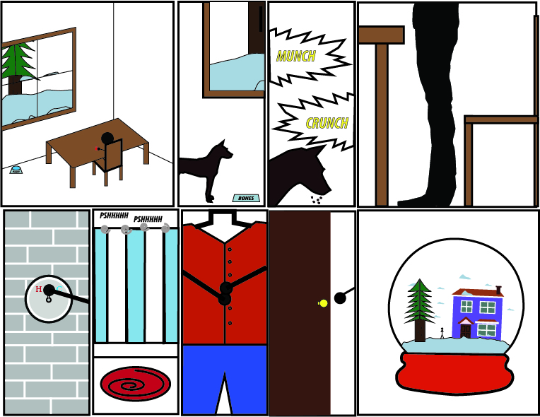
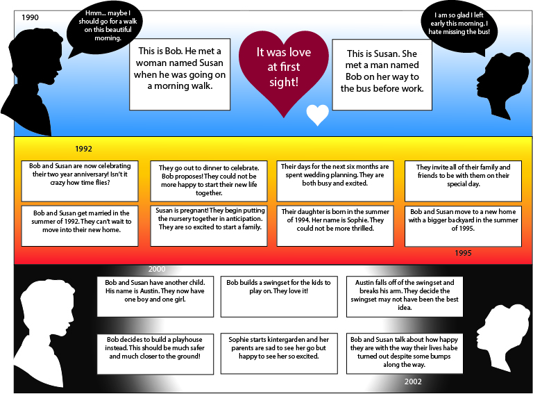
Everything’s Going to Be Okay is a study in time. I’ve always been interested in mediums utilizing techniques that are rare, such as comics focusing on a still image moving through time. Here by Richard McGuire leans on this a little. Following the same place throughout time from a “still camera” perspective, Here twists the familiar and safe comic book formula.

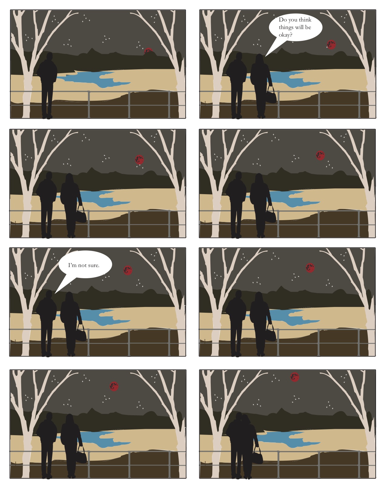
When I set out to make Everything’s Going to Be Okay I wanted to do something a little off kilter. One of my favorite tools in comics is a still image repeated across a page with character dialogue but no motion. McCloud said “By stripping down an image to its essential “meaning”, an artist can amplify that meaning in a way that realistic art can’t”. I wanted to communicate cold, quiet, and a long awkward silence where the characters search for what to say.

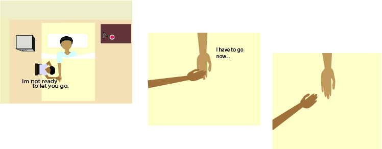
The moon was also an interesting part of the composition. I wanted to have something small to show that time was passing as well as something to show that everything isn’t as it should be. The red moon does both: drifting across the sky lethargically as the people talking watch. It also serves as a symbol for why they’re talking: something is wrong. Whether it’s the moon and it’s unusual color or something a little more personal is up to the viewer to interpret.

Communicating something like that without many words can be difficult. I drew inspiration from McCloud’s quote, trying to distill the image to it’s basic parts. I was hoping this starkness would communicate cold to the viewer. The leafless trees and the distant mountains also served to further this goal I also wanted to focus on using the image to communicate instead of with speech bubbles. Minimizing the amount of speech helps cultivate the quiet I was going for.

Everything’s Going to Be Okay

Print vs. digital is an interesting debate. I think there are legitimate advantages to both, though at the end of the day print feels more real. Some visual fidelity may be lost, a little crispness in the colors may go away, but I think it’s worth it. To hold a work in your hands, to feel it’s weight and worth is something that shouldn’t be discounted.

Everyone has had an uncomfortable conversation. Everyone has been outside on a cold night. I’m hoping that with this piece people are brought back to that moment, even if it’s just for a few seconds.

Posted in Fall 2018 Archive (201) | Leave a comment

Comics: Melody Huerta

According to Scott McCloud the definition of “juxtaposed pictorial and other images in deliberate sequence” (9). Following this definition I believe the comic that I created falls under that definition. What I tried to do was create images that could show movement frame to frame using dialogue to fill in the blanks with context. The example I provide is one of my favorite sequences because I think it shows what I was trying to do through out the comic perfectly. The deliberate sequence portion of the definition is definitely apparent in these three frames.

Comic By Melody Huerta

Sort of establishing where they are and then slowly zooming in and showing the movement between each frame, my hope was that this was something people could follow along with without having to say much. Another important part of project was the power of lines that McCloud speaks to, the way they are able to shape and structure but also create movement. Understanding lines was implemental to getting the look of my comic down. I first had to create all the line to get the structure that I wanted and then eventually I decided that the look of the comic was better suited without the outline of the objects. Another concept from McCoulds book is the idea of universal experiences, not that my comic specifically is a universal experience but that the facelessness of my characters could translate to anyone who reads it. For me the facial features were not as important as the interaction between people.

Comic By Melody Huerta

So I decided that keeping the faces blank and instead trying to show emotion through the actions of people and also using icons or universal imagery to show what they are feeling. For example in my comic I use tears instead of showing someone actually crying and also I use a word cloud above their head to show that they are overwhelmed about their moms passing. For my own comic I feel like color was really important to me, a lot of the example comics we read prior to starting to create our own projects color was something I definitely wanted to incorporate. My process included trying to learn the Illustrator software while trying to incorporate my own flair. In the end I came up with a end product that I feel would be best suited in a print format. But I do however see the benefit in being able to access comics online. For mine I felt that print was best because the feel and the color of the paper is something I wanted to incorporate into the feeling of my comic. Being able to follow along while looking down or over the comic is an experience that is best suited for a printing format. Overall I was most excited to have my work be moved from the screen that I was working on it for and see it be “complete” in print. It is definitely a different experience because in this case my work was not officially complete until i had it printed. Then it was more of an moment to have it handed to me and be able to have a tangible object showing the work I had done.

Posted in Fall 2018 Archive (201) | Leave a comment

Comics: Seth Muck

Una Adventura en Espacio is by all definitions, a comic. When it came to thinking of an idea I wanted to put on paper, I kept returning to Scott McCloud’s, Understanding Comics. The quote that I continued looking back at when creating this piece was,

Una ciencia-ficción clasíca.

“Juxtaposed pictorial and other images in deliberate sequence,” (McCloud 9). Formulating ideas was hard. I had to think about how my images would create a narrative that the reader could easily access and understand. Now, science-fiction is one of my favorite genres, and I wanted to create a single page comic strip that implemented all the elements that make science-fiction great. Scott McCloud talks a lot about Icons. One of the most common elements of Sci-fi is aliens. An icon that represents alien’s is often times a simple spaceship. While modern technology hasn’t allowed for inter-planetary travel, an alien race could be more advanced, allowing them to travel amongst the stars. The basic spaceship shape I used represents aliens and shows how this piece is a work of science-fiction.


As an English Major and Spanish Minor, I love looking at how words act as symbols, and what language means to an audience. I wanted to use short sentences, and not many ‘big’ words. I found the happy medium to be showing dialogue in a different language. The Spanish used in this piece is very basic, low level Spanish, but to an english reader, it becomes interesting and more complex. This Spanish language children’s comic found the happy medium between too basic, and too complex. This Comic is meant to be viewed in print format, and hopefully by children and young adults. I think because it is a quick easy read, the best format is on physical paper. I hope all my readers view this as a light comedic take on children’s science-fiction.


Posted in Fall 2018 Archive (201) | Leave a comment

Comics: Milo Larson

Comic by Milo Larson, 2018.

The collection of images I used to create this comic fits Scott McCloud’s definition, “juxtaposed pictorial and other images in deliberate sequence”. My comic is considered juxtaposed because of how the images are placed side-by-side to connect the frames. Within my work I used a variety of images and colors to illustrate the comics message. I intentionally placed these frames in a specific order to ensure the audience could follow the story of my comic from beginning to end. In some parts of my comic I used images that related to each other which had to be placed side by side to complete a segment within the story line.

The use of closure had a major impact on various parts of my comic. Closure allows the audience to connect what is occurring between the frames. For example, because I used an image of a person sitting in a chair in the first frame, the audience can understand that the fourth frame is of a person getting up out of a chair instead of a miscellaneous image of a person standing next to a chair. To connect the last image to the rest of the story, readers of my comic had to use closure to understand that a person is getting ready for their day and stepping outside. I also utilized different frame sizes to emphasize certain aspects of my comic. In my action sequence I used smaller frames to show that they are connected and in the first and last frames of my comic I used larger frames because they are the images with the most detail. I also made sure to pay attention to detail so the readers can better understand the story. The window in the first image matches the view from the window in the last frame. Another time I payed close attention to detail was when I presented the dog bowl and name in the first frame to carry over into the second frame.

Overall, I feel that my comic could fit well in both print and digital. The whole image could be laid out on one page within a book or could be read by scrolling down on a website. The chronological order of the frames could be easily read as a view scrolls down between the two rows of images. The variety of colors may also be better presented in a digital format rather than a print format.

Posted in Fall 2018 Archive (201) | Leave a comment

Comics: Emily Burns

One of Scott McCloud’s concepts that inspired my comic is the “moment-to-moment” transaction (70). When I was reading McCloud’s book this concept stood out to me because of the small difference in the slides, but big effect it has. I chose to use this

My Final Comic

technique in my first two slides. All of my slides lead up to the girl in my comic running out the door because she is late. This supports McCloud’s definition of comics and how my slides are deliberately in sequence and are juxtaposed pictorials. Another concept I used in my comic was the “subject-to-subject” technique (70). On my last slide, I wanted to have a different view point of the girl’s bedroom but I didn’t want to show he actually running out the door. I wanted the viewer to interpret the comic without explicitly being shown what happened. In McCloud’s book, he played around with different and interesting boarders. I decided to make a boarder around my main slides and add clocks and cars all around. I thought this made my comic more interesting and different. I tried to keep the text and speech bubbles to a minimum. I wanted the pictorials to speak for themselves. However, I think the text I included made the comic more relatable. Originally, I wanted to have my comic be printed. However, when I think about the future of comic I believe that it will be online. Online comics are relatively a new thing. However, most everything is becoming digitalized. I think this would make the comic more accessible to the public, which is why I chose to not print my comic. This persuaded me to make my comic be read online. I want the viewer to view my comic as a story. I chose this topic because waking up late is often a common thing that happens to me.

Posted in Fall 2018 Archive (201) | Leave a comment

Comics: Ashley Cole

Comic by Ashley Cole, 2018.

I have worked really hard on my comic in order to make sure that it would fit Scott McCloud’s definition of comics. The ideas of both juxtaposition and sequencing have proved themselves to be very important throughout the process of creating a comic that makes sense. When I made a first draft of my comic, I used color to try to indicate a change in time. This made sense to me because I am the one that came up with it; however, people who were viewing my comic had a hard time interpreting this. I quickly realized that I needed to make my comic more accessible to my viewers rather than just to myself. Because of this, I added a lot more text into my comic in order to help the progression of events make sense. I am so happy that I got the feedback I did because my comic is a lot better as a result. I however did keep the color sequence in my comic because it is being used to juxtapose each frame with one another. The comic starts out very happy with lighter colors and as time progresses, the colors turn much darker to signify that the characters are going through a hard time.

As I was revising my comic, I referred back to chapter 4 of Understanding Comics. In this chapter, Scott McCloud discusses the importance of time and the way that it is framed in a comic. Re-reading this chapter made me realize that my comic was spaced out over much too large of a period of time. He says in his book that each frame should represent the equivalent of one second. This is what inspired me to completely change the text of my comic and I think that the overall story is a lot better as a result. My previous comic was more of a direct message to my audience while the new one is an actual story.

I originally thought that I wanted my comic to be viewed on the web; however, throughout the course of completing this project I have actually changed my mind. I want my comic to be something tangible that people can actually hold in their hands. I think that physically holding something is a really important part of interpreting it. I also really hope that people are able to interpret my comic somewhat easily. The progression of events is fairly standard for a married couple and this is why the characters are portrayed as silhouettes. They could be anyone. This allows readers to read the story while also envisioning their own characters. I also used color to not only signify the passing of time, but also the season in which the sets of events occurred. The color gradients signify the progression of the timeline. I hope that my viewers recognize this as well.

Posted in Fall 2018 Archive (201) | Leave a comment

Comics: Rachel Lentz

“Step” by Rachel Lentz

Blog 5: Comics

The comic I have created, “Step”, follows Scott McCloud’s definition of a comic as it is a series of images in deliberate sequence. McCloud’s book Understanding Comics tells its readers how versatile and expansive comics can be. They present an art for that is neither pure pictures or pure writing, but instead a mixture of the two. In my comic I thought it best to combine the aspects of writing and pictures nearly evenly, to make a story that forms something completely unexpected when they are put together. The pictures and dialogue could possibly work alone yet when put together make a story that invites a reader into a new world. The dialogue references the old children’s rhyme of “Step on a line”, which is a rhyme that most people have grown up hearing about stepping on things and their consequences. While a fun childhood tune, as with many old songs, it has a cautionary side too. The pictures in this comic give life to a physical blob that represent the fears the “Step” rhyme of childhood seems to impress. The duality of these thing does as Scot McCloud describes, exploring how comics show and tell readers what is going on. This type of duality goes on into further aspects of life. Recent technology has made it possible to represent media in print and on the web. As such creators get to make artistic choices into how they want their work represented. Not only are writing and pictures combining to make new meaning, new mediums combine and change meaning as well. Offering works in print or on the web (or both) has its pros and cons. By presenting art on the web, layout can be changed to change reader experience. However, each website may download differently so how a reader consumes this media may be affected. In print the work is set in stone and reader experience is largely going to be the same, this structure allows for specific meaning to be conveyed. Print is limiting in access and restrictions on page size and amount can play a part into design concepts however. Each has its own benefits and downfalls. For this comic I wanted to create something that can be easily viewed on a screen. Access would be broader and a scrolling style of reading that cannot be achieved in print would be used to view is. This is so as it would slow readers down and add to the suspense of the story being told. The details in the work would be examined closely and more meaning taken from it.

Posted in Fall 2018 Archive (201) | Leave a comment

Comics: Deyanira Tovar-Moreno

Tovar-Deyanira-project-02

JPEG of Comic by Deyanira Tovar-Moreno, 2018.

For my comic project, I wanted to portray an issue which has swept America by storm, which is, homelessness. I wanted to depict the concept of homelessness from the perspective of a homeless person because I wanted my viewers to change their point of view and challenge stereotypes regarding homelessness. Furthermore, my project fits Scott McCloud’s definition of comics because my storyline entails contrasting illustrations which were aligned to depict my narration.

Moreover, I used several specific concepts which were communicated throughout Scott McCloud’s book to come up with the idea on how I wanted to illustrate and explain my conception. First, I needed to address how I would choose to depict the characters and scenes within my comic. I decided to use traditional cartoon characters after learning from Scott McCloud’s book that cartoon illustrations flow easily through the conceptual territory that is between panels.

Next, within each specific panel, I needed to decide what types of transitions I would use to accurately narrate my comic, while ensuring that the reader could clearly understand events and time which occurred during and in between my panels. Furthermore, for most of my panels, I used action to action transitions, which transport us through time and space from panel to panel. However, to better the understanding of other panels, I used aspect to aspect transitions which bypass time and sets a wandering eye on different aspects of a place.

Lastly, my comic fits Scott McCloud’s definition of comics because the of the manner in which I used transitions to illustrate time passing. According to Scott McCloud, to create the depiction of time passing, the composition of the picture is joined by the composition of change, drama, and memory, which I did.

I believe that my specific comic is better understood through print due to the importance of text over the illustrations featured. In other words, my cartoon illustrations were simplified because they do not need to be detailed for the viewer to understand what is happening. Moreover, the text bubbles are the main source for my viewer to understand what is happening in each panel, and therefore, it is not as necessary for my comic to be digitally viewed as it would be for comics with illustrations which are vital to the understanding of the comic, and would therefore be better understood using digital tools such as the zoom in and out features.


Posted in Fall 2018 Archive (201), Uncategorized | Leave a comment

Comics: Jaclyn Erickson

For my comic i decided to focus on having halloween incorporated into my theme due to the holidays being right around the corner! I believe my project fixed the Scott McCloud’s juxtaposed idea because each of my images are placed to be read in a specific order. If read otherwise the sequences would not make sense. While reading and understanding McCloud novel of comics, it gives you a sense of understanding and relation even if the user or creator has never made a comic before.

My comic i believed both would work, print as well as online but print seemed more fit for the style and design of the comic. It is a very childish comic but still keeps inline with the overall purpose. Being a brand new student to illustrator i personally did not get along well at all. As i was creating my comic there were multiple scene where i felt the scene could of been either more realistic or just better looking overall but when i tired there outcome was much worse than having some of the scenes more plain. This bothered me a ton as i was trying to make my comic images all flow nicely with one another, i watched video after video trying to create a more life-like or realistic pumpkin but the outcomes never felt right with the comic and seemed almost out of place. So, i kept the much more basic images of the pumpkins and council people. Although multiple of my images in my comic are a more basic image, i think it still works well with the overall images.I think the idea of how a simple shape and idea can create an entire story is the whole point behind Scott McClouds novel. 

erickson-jaclyn-project-02-high-res

Posted in Fall 2018 Archive (201) | Leave a comment

Comics: Aidan Aumell

My comic that I made for my adobe illustrator project is a perfect example of Scott McCloud definition of what a comic is. “Juxtaposed pictorial and other images in a deliberate sequence,” my main goal of this comic was to incorporate time throughout the images. I mostly wanted to do this because the plot of my story required time to make it flow better. The comics with the car was a perfect example where I wanted time to be one of the main focuses of the sequence. By adding “ 5 minutes later” it gives the reader a sense that the images are in chronological order as well as matching the surroundings with the previous comics. It also gives the reader the effect of moving your eyes quickly throughout this section of the comic which was one of my main desires of this part. As I read the understanding comics book I noticed him including time in the top right corner which I really liked. It makes the reader, read a lot quicker and turns reading a comic book into reading a picture book. Throughout the book Scott talks about how symbols and imagery have a great deal of meaning to average humans when they get a first glance at it. That’s how I wanted readers to reader my comic, to realize the time and to make direct connections with imagery on each artboard. That is how I read most of the comics we were shown in class, and I think in my option that Is one of the best ways to make a comic. By producing a comic in this fashion, I believe the best way to read the comic is in a hard paper copy format because the reader’s eyes move easier and quicker throughout the comics which is my desired effect I’m going for.

Click here for Comic

Posted in Fall 2018 Archive (201), Uncategorized | Leave a comment