
Comic by Milo Larson, 2018.
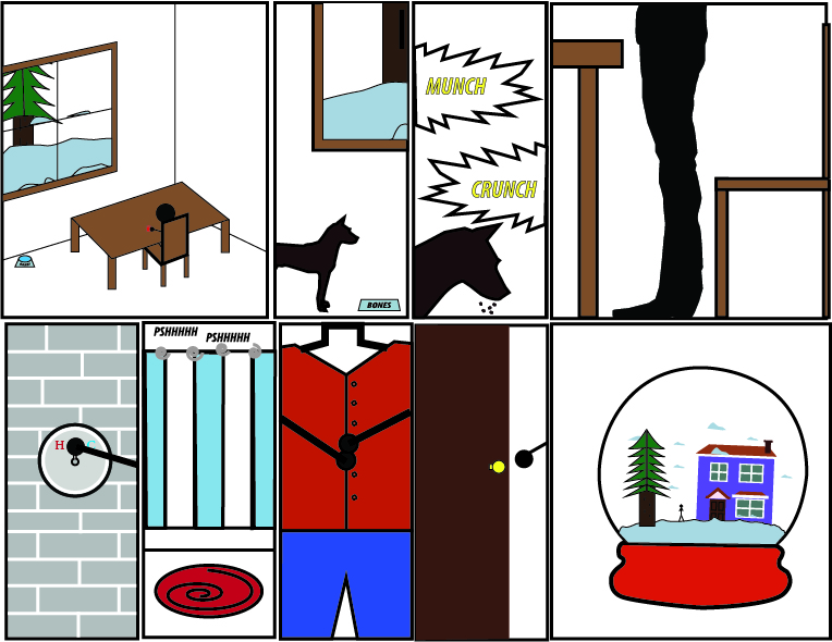
The collection of images I used to create this comic fits Scott McCloud’s definition, “juxtaposed pictorial and other images in deliberate sequence”. My comic is considered juxtaposed because of how the images are placed side-by-side to connect the frames. Within my work I used a variety of images and colors to illustrate the comics message. I intentionally placed these frames in a specific order to ensure the audience could follow the story of my comic from beginning to end. In some parts of my comic I used images that related to each other which had to be placed side by side to complete a segment within the story line.
The use of closure had a major impact on various parts of my comic. Closure allows the audience to connect what is occurring between the frames. For example, because I used an image of a person sitting in a chair in the first frame, the audience can understand that the fourth frame is of a person getting up out of a chair instead of a miscellaneous image of a person standing next to a chair. To connect the last image to the rest of the story, readers of my comic had to use closure to understand that a person is getting ready for their day and stepping outside. I also utilized different frame sizes to emphasize certain aspects of my comic. In my action sequence I used smaller frames to show that they are connected and in the first and last frames of my comic I used larger frames because they are the images with the most detail. I also made sure to pay attention to detail so the readers can better understand the story. The window in the first image matches the view from the window in the last frame. Another time I payed close attention to detail was when I presented the dog bowl and name in the first frame to carry over into the second frame.
Overall, I feel that my comic could fit well in both print and digital. The whole image could be laid out on one page within a book or could be read by scrolling down on a website. The chronological order of the frames could be easily read as a view scrolls down between the two rows of images. The variety of colors may also be better presented in a digital format rather than a print format.
