
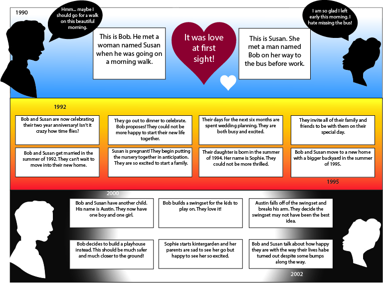
Comic by Ashley Cole, 2018.
I have worked really hard on my comic in order to make sure that it would fit Scott McCloud’s definition of comics. The ideas of both juxtaposition and sequencing have proved themselves to be very important throughout the process of creating a comic that makes sense. When I made a first draft of my comic, I used color to try to indicate a change in time. This made sense to me because I am the one that came up with it; however, people who were viewing my comic had a hard time interpreting this. I quickly realized that I needed to make my comic more accessible to my viewers rather than just to myself. Because of this, I added a lot more text into my comic in order to help the progression of events make sense. I am so happy that I got the feedback I did because my comic is a lot better as a result. I however did keep the color sequence in my comic because it is being used to juxtapose each frame with one another. The comic starts out very happy with lighter colors and as time progresses, the colors turn much darker to signify that the characters are going through a hard time.
As I was revising my comic, I referred back to chapter 4 of Understanding Comics. In this chapter, Scott McCloud discusses the importance of time and the way that it is framed in a comic. Re-reading this chapter made me realize that my comic was spaced out over much too large of a period of time. He says in his book that each frame should represent the equivalent of one second. This is what inspired me to completely change the text of my comic and I think that the overall story is a lot better as a result. My previous comic was more of a direct message to my audience while the new one is an actual story.
I originally thought that I wanted my comic to be viewed on the web; however, throughout the course of completing this project I have actually changed my mind. I want my comic to be something tangible that people can actually hold in their hands. I think that physically holding something is a really important part of interpreting it. I also really hope that people are able to interpret my comic somewhat easily. The progression of events is fairly standard for a married couple and this is why the characters are portrayed as silhouettes. They could be anyone. This allows readers to read the story while also envisioning their own characters. I also used color to not only signify the passing of time, but also the season in which the sets of events occurred. The color gradients signify the progression of the timeline. I hope that my viewers recognize this as well.
