Design elements and principles are the basics that make up what art and design are. Included in this is comics, or Graphics Novels, such as our class readings, “Understanding Comics” by Scott McCloud. As an artist, Scott McCloud is very intentional in the way in which he creates the images to portray exactly what he wants. He does this by using design elements and principle, which can individually be defined by John Lovett. Lovett, describing what each of the elements and principle look like and how they intertwine with one another.
In Understanding Comics, each and every page can be analyzed and contains at least 1 design principle or element, but most likely has many more, as design principles are used in terms of elements. To keep it simple, I will analyze “Understanding Comics,” paged 118-119. As this is the beginning of the chapter, McCloud poses the question of “can emotions be made visible?” He then goes on to illustrate many panels of sketches that show specific emotions that are done so by combining elements and principles in an intentional way.
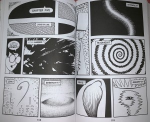
Scott McCloud’s “Understanding Comics”, 118-119.
The first design element that I will point out is shape. Shape is shown on pages 118 and 119 in multiple ways. Each panel shows a different shape, as McCloud is suggesting emotions that go along with them. The one that stands out to me is the bottom, right panel on page 119. This would be considered an abstract shape. This, as McCloud suggests might provoke the emotion of anxiety, which goes along with Lovett, as he states in the reading that a shape like this might stand for ‘dangerous’, ‘unpredictable’, or ‘aggressive’
I will now look at the design principle of contrast. Simply put, Lovett states that contrast “is the juxtaposition of opposing elements,” such as color (orange and blue), texture (smooth and rough), etc. This is shown in Understanding Comics by the way in which McCloud uses all black and white (tonal difference) to make his work stand out and easily understandable.
Finally, I will look at the design principle of dominance, otherwise known to me as ‘emphasis’ or ‘hierarchy.’ Explained by Lovett, Dominance is created by intentionally using elements such as line, direction, color, texture, etc. in a way to create a focal point or sense of hierarchy. On page 119, McCloud creates a panel filled with a spiral/radial shape. The way in which McCloud places this spiral panel in the center of the page, with a fairly larch panel size makes it a focal point in the spread, the eye goes straight to it.
Each of these design elements and principles build the foundations of what we know as art. It also provides foundations for the artists of graphic novels to build upon to provoke emotion in their juxtaposed sequences.

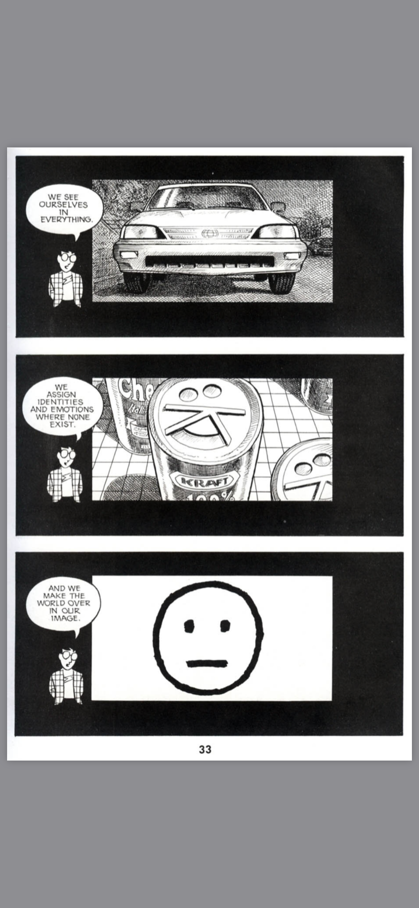

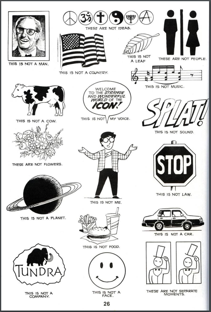
 One design element that this page in Scott McCloud’s book Understanding Comics: The Invisible Art is gradation. Although McCloud doesn’t do it in the traditional way of shading a portion of the image dark to light or light to dark, McCloud gets this gradation by the distance of his lines. He plays with the distance between his lines in the background of the image which gives the image a dark section when the lines are close and light when they are far apart. Another design element this page demonstrates is contrast. You see this mainly with the 3rd to last and last panel of the page. Both these panels place a light object with a dark background this allows for the image that McCloud is trying to draw more emphasis on the panel giving it more importance in the panel it is located in. The two dark panels are also contrasted from all the other panels on the page because of there dark background compared to the light background of the other panels making it the first thing you see on the page. The last design element displayed on this page is space. This is best displayed in the first two panels. In the first panel he decides to make the icon of the face very large compared to his typical character model which adds meaning to what Scott McCloud is saying in the panel. The second panel is a good example of the design element of space because of the placement of the icon in the panel which is the dead center again adding to the importance of the icon, and showing it is the focus of the panel and and what he is talking about.