
The layout of this page of Scott McCloud’s Understanding Comics is an effective design specifically in shape, value, and size. My initial impression of the page is that is very balanced, especially in terms of the icon placements. The locations of each image make the page overall symmetrical. The shapes of each image, although are not directly symmetrical in terms of horizontal location, still remain very balances.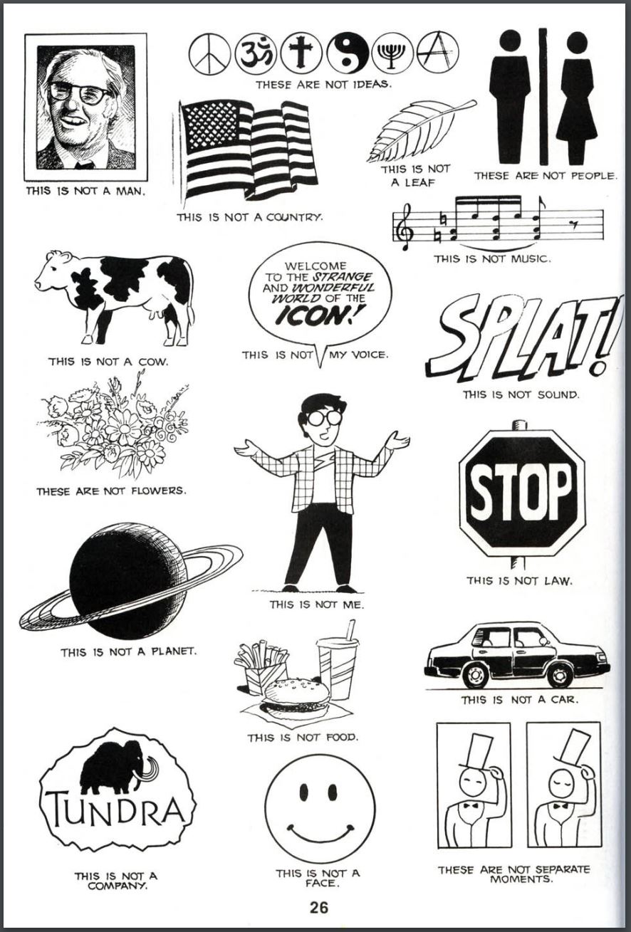 For example, the man in the top left and the two-panel comic in the bottom right are in completely different corners of the page but seem to balance each other out due to square/rectangular shape that they both have. Also, the planet and stop sign, although not directly in-line horizontally, seem to balance each other out because of the round nature of both images. This page our of the book also explores different types of values in terms of the darkness and lightness of images from the shading. The man in the top left is drawn with light strokes and carries a lot of depth to it whereas the smiley face at the bottom is just black and white, with a more 2-dimensional appearance to it. The size of all the images is relatively the same besides the images in the middle top. I appreciated this aspect of using some different sizes of imagery because it added some more contrast to the page while still keeping the page balanced. I think if only one image took the place for the three at the top, the page would look a little bit too balanced. The fact that there are more icons concentrated at the top is something that drew my eye but it wasn’t that much of a distraction.
OFFICE HOURS
Tues and Thurs, 4:05-5:00pm, Avery 479 (office) or Avery 105 (lab)
EMAIL: kristin.carlson@wsu.edu for an appointment
Blog Posts
- 201 Blog
- Archives
- Fall 2014 Archive (336)
- Fall 2014 Archive (338)
- Fall 2015 Archive (336)
- Fall 2015 Archive (338)
- Fall 2016 Archive (336)
- Fall 2017 Archive (336)
- Fall 2017 Archive (336)
- Fall 2018 Archive (201)
- Fall 2018 Archive (336)
- Fall 2019 Archive (201 Blog)
- Spring 2016 Archive (336)
- Spring 2017 Archive (336)
- Spring 2018 Archive (336)
- Sample Posts by Students
- Sample Posts by Your Professor
- Uncategorized
