Putting it all together: Edgar Martinez

“Breakfast” A story about breakfast at 4:30 AM

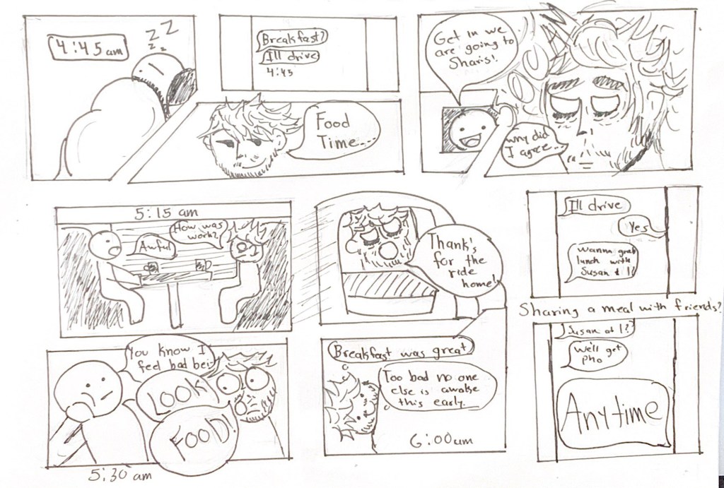
When we were tasked to create a comic about our own individuality I was stumped. This is a question that always stops me in my tracks as I never know what makes me well me, I often overthink it and want to do something amazing yet it’s always the simple things make me who I am. I decided to write a comic about two things that I love, food and friends and putting them together a meal with friends.

Idea/ Purpose

I wanted to create a comic that showed just how important my friends are to me and my love for food. At first I wasn’t convinced with this idea as it didn’t seem as grandiose as what other people might make and in comparison might be simple and not unique to me. But as I started creating the panels for my comic I slowly started pouring more of myself into this comic and by the time that I had finished draft of the comic I was proud of what I had created and felt that It was a part of me. I wanted this comic to show just how passionate and willing I am to eat a meal with friends, no matter where or when.

Form

The form that I chose was a comic as it was what we needed to pick. I knew that with this comic I wanted to be more creative with the use of the panels and not just stick to the traditional squares that I had used in my previous comics. I wanted to have the clear lines to make the comic panels well defined but the actual contents of the comic slightly rough and sketchy as I love that style.

Idiom

The genre or idiom that I wanted to go for what a short story that is based off my personal experience. I wanted to make a light hearted novel that wasn’t serious at all and having a cartoon feel. I really liked the idea of making the character in different styles to break the sense of continuity. As I am a person who likes to break with continuity and go with the flow of things.

Structure

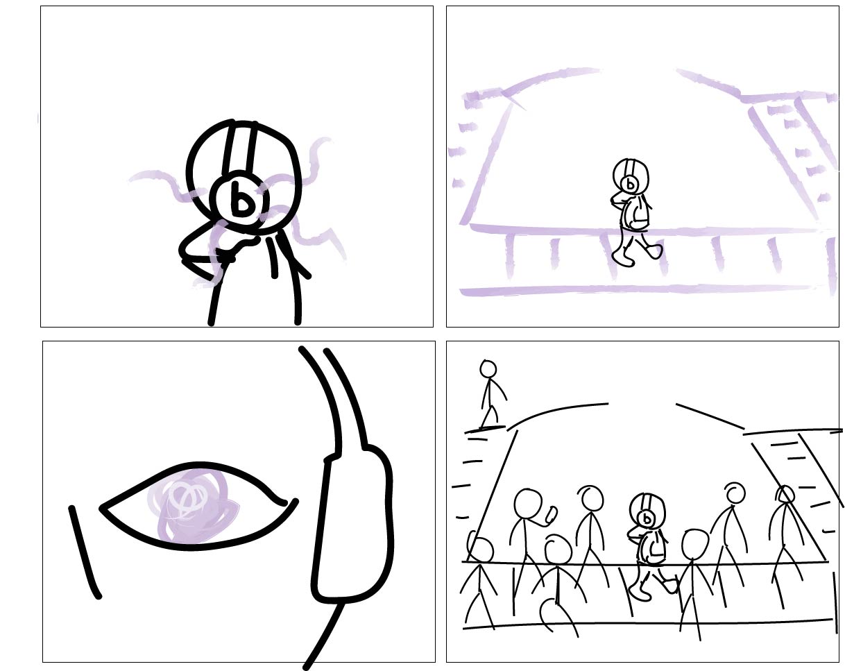
I wanted to leave out unnecessary scenes in order to fit the whole story in the comic. Similarly to my first comic I wanted some panels to transition to different scenes while other scenes just transitioned to the same setting just a further in time similar to my second comic. I used to think that comic panels had to have a gap between the panels but as I worked and created these comics that notion began to breakdown and by the time I was working on the third comic I wanted to use those gaps in a creative way so I decided to use text in those gaps and even use words as a gap between panels.

Craft

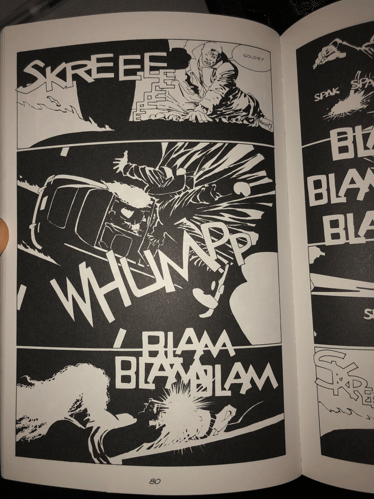
I was working with paper and pencil in order to create the draft of the comic. I love using pencil as it allows for rough and sketchy looks that I absolutely love and wanted to include in my comic. I always thought that this sketchy look would not make for a good comic as the art would just seem messy and lazy. But when we looked at graphic novels in the CDSC I found a graphic novel that was entirely made of these messy sketches. It was at that moment that I knew that it could be done, so I wanted to make that style the focus of this comic.

Surface

To finish the comic I just went over it with pen in order to add depth. Most of the process went into the creation of the rough draft.

The Final Comic

This comic was more ambitious as I finally discarded the notion that there is a “right” and “wrong” way of creating a comic. I wanted to create something that I only I could create and by the time the comic was done I was truly proud of the work that went into it. I wanted to have fun shaped panels and I didn’t worry about the spacing and making sure the layout was a traditional layout. The focus of the comic isn’t about structure just how I tend to avoid structure and value freedom in a way the randomness of life. This was the first time that I was able to create something without feeling like I had to do it right. It was my comic, my comic about me and what I created isn’t right or wrong but it is me. I also wanted to include dialogue and characters. The previous comics I created I was afraid of having speech bubbles in the comic as I was afraid I would not have enough space. The reason this comic is my most ambitious is because I created it without limiting myself, I wasn’t bounded by the idea of right and wrong and I hope in the future all my creations will be like this.


Posted in 201 Blog, Putting It All Together, Sample Posts by Students | Leave a comment

Putting it all Together: Rachel Fox

Rachel Fox May 2020

My final weekly comic about putting it all together incompasses what art means to me. The comic briefly describes how I define art as a universal expression of who you are and how you feel. I don’t think art can be confined to any one medium and can even be through cooking or singing. While I am growing progressively more tired of this quarantine and stay at home order I am trying to think of all of the positives that may sprout from this odd historical event. My favorite thing that I have come up with is the rebirth of art and hobbies. It seems that people stopped doing arts and crafts at home, they didn’t feel good at it, or have enough time to commit to creativity. But now that people are trapped in their homes, art is coming back. More people are blogging, sewing, painting, drawing, and dancing because it’s fun and they enjoy it, self expression is coming back through common arts. While it’s possible that after that world starts spinning again people will put their embroidery hoops down there will still be an art boom that will come from this stay at home time. 

My idea for the comic was to create a visual of all the things that people are doing with their time at home. Its form is the comic that has been created in illustrator using a specific time frame and gutters. Its idiom is that it’s a narrative comic the character is not the speaker but rather the narrator. I chose the structure of this comic in a very specific way. I had previously been working in 6 panels in a very linear and non creative layout. In attempt to raise the bar in my work I changed the size of the boxes that carry less weight and made 1 large box contain four time frames rather than using the space of 4 boxes. I put a large amount of focus in color line and balance in this comic. I made the first panel attempt to have a psychedelic feel by having colorful rings emanate out from art objects. I created this texture by taking the circle tool and then the curvature tool to create the shapes and make them unique. In the next panel I mostly just used the shape creator tool and the curvature tool to make the shapes and for the blanket I used the gradient tool. I chose these colors and gradients because they match the colors and flow in the first panel. For the third panel I wanted to use some more visual language and by creating a ghost and saying ghost town it creates an element of word dependence. For the longest panel I used time frames by having one person do their different activities of the day in the same panel. I used the text broken up above their heads to show a variance in time. I chose the colors and the font of my comic by their natural and happy feel. I have used this font in a previous comic and am choosing to reuse it for this one because It holds the right feel. I chose to capitalize all the words because it gives an omnipicent tone. Lastly the colors fit both the realistic and upbeat quality that I wanted this comic to have. 

This comic was much more ambitious than my last two comics. I typically use much less colors and lines. I used the paintbrush tool as a main tool in this comic to be able to give detail and thinner lines. My past comics took me around 3 hours a piece to complete but from sketching out to completion for this comic I took a day and a half. I am much more proud of this piece that I have been of past ones because there is more depth, meaning, and detail in this comic. 

Posted in 201 Blog, Putting It All Together | Leave a comment

Putting It All Together: Luis Trejo

Week 15 Comic By Luis Trejo

After reading chapter seven from Scott McCloud, I began to brainstorm what I wanted to portray in the comic for the week. The idea that I had when creating the comic was to express what happens in my mind when I listen to music. I wanted to link music to imagination, showing what I see in my own eyes when I listen to it. There is not a second in the day that I am not listing to music and I showcase that in the comic. I want the viewer to be able to enter my imagination throughout the strip and connect to the power that music has. Music can be used as a way of isolation, in doing so it keeps the listener calm.

To create the comic, I used Adobe Illustrator. The first thing I did was use the rectangle tool to create the boarders that I wanted to shape out the panels. I then created another layer and used the unique style to create the comic. I started the first panel off with a close shot of a person listening to music. I chose the color black because I wanted it to symbolize reality and purple symbolizes imagination. I used a different type of style for the purple and wrapped it around the headphones to make it look like aura. The next panel is the same person walking on a cross walk except the entire background is created in their imagination. Everything is imaginary except for the person that is listening to music.

In the following panel, there is another close on the eye of the person that is listening to music. I changed the color of the eye to the same color of their imagination. The reasoning behind this is to find to the reader that everything that is purple in the scene is what the person that is listening to music is envisioning. Then in the final panel of the comic, the reader is finally introduced to reality and views what is going on around the person that is listening to music. The cross walk is crowded with people that are coming and going. Meanwhile the person that is listening to music is lost in their own imagination. The music is isolating them from rest of the crowed, placing them their own imagination. Even though they are still physical present in the crowd of people.

For the previews comics that I have created for the class, I felt that they only have one meaning and one way of looking at them. While in this comic I wanted to challenge that and leave the meaning behind the comic up to interpretation of the reader. I did not want to take a stand on if listening to music in public could be a bad thing or a good thing, so instead I just showed the power that music can have on people. It can be used as a way of isolation while also keeping you calm and motivated.

Posted in 201 Blog, Putting It All Together | Leave a comment

Graphic Novel Review:Maria Alvarez

Suicide Squad, Vol. 2: Basiliask Rising by Adam Glass and art by Fernando Dagnino

The comic book I chose is Suicide Squad, Vol. 2: Basiliask Rising by Adam Glass and art done by Fernando Dagnino. This comic book is about a supervillian team and the remaining of the members have a mission to get rid of Amanda Waller. While also looking into the Kooey Kooey Kooey island because it has telepathic powers and it wants to declare war on Earth. The suicide squad find out that they have a traitor and then are attacked by the members of Onslaught and then Onslaught kills Modem and captures Rock, Havana, and Waller. Then the Justice Society of America joins the Suicide Squad to get them back. But they are too late to save Havana who is Amanda Waller’s daughter. The iconography for this comic are evil heroes. People with costumes on but the colors are dark to show that they are bad. Some pages are just one colors and different shades of it.

I think the artist wanted to show emotion with only using once color because in Scott McCloud’s book “Understanding Comics” he talks about artists using different ways to show emotions and hidden feelings. Especially in his chapter, “Living in Line” he talks about sensual response and I think that the characters are showing their emotions, but the color tells us or guides us how we should feel. When using red, it should make us angry and when the artist uses light colors like blue, it is when we should feel calm. But of course not all the pages are just on color. If there are different characters in one page, then the main ones or the bigger scenes are in full color while the other things are all done with values of one color. I also noticed the the text bubbles are mostly white but there are some that are in bright colors and I think that is showing importance and showing emotion to what the characters are saying.

Posted in 201 Blog, Graphic Novel Review | Leave a comment

Graphic Novel Review: Malvin Malai-Harrison

The graphic novel that I read was “Sin City: The Hard Goodbye” by Frank Miller. This graphic novel is the first in a whole series of Sin City books. The story follows protagonist named Marvin through throughout the city as he investigates the death of his lover “Goldie” that was mysteriously murdered in the middle of the night while he was laying next to her. He awakes and finds her lifeless body next to him. Very soon after, he hears dozens of policemen heading up the stairs to arrest him. Barely having enough time get dressed, he bursts out of the window while dodging bullets that fly right past him. He lands on a nearby building and escapes. The whole time, he’s narrating to himself trying to put the pieces together as he scales building after building. He realizes that he’s been set-up by unknown forces for the crime and vows to find whoever is behind Goldie’s death. Finding her mysterious murderer becomes his resolve for doing whatever it takes to uncover the truth; and by his future actions, he truly meant it. Determined to find her killer, he uncovers an elaborate, disturbing scheme full of corruption, crime, and death. He uncovers the truth about some of the biggest players in Sin City.

In Scott McCloud’s “Understanding Comics”, his chapter “living in line” he discusses the importance of emotion and sensual response and how comic artists can invoke these types of responses within the reader. Frank Miller relies heavily on this principle throughout the entirety of the book and he does this in multiple ways. First, is his stylistic choice of composing the entirety of the story in purely black and white. Black and white is the greatest contrast that exists. When used effectively, it can produce various emotions such as hope, isolation, loneliness, tension, etc. and Frank Miller continuously found ways to explore this throughout his novel.

His use of background, line type, alignment, and contrast can be seen in these different scenes to invoke different emotional responses within the reader:

The important thing to note is that while the entire story is depicted in black and white, it’s still able to capture the feel and atmosphere of Sin City. Miller is never afraid to take up an entire page, full-bleed just to get the point/feel of the environment across. Marvin is a lonely character that struggles with his own mental health. Many people are afraid of him–for good reason, of course. This coupled with his violent history and complex character qualities can be very challenging to illustrate and Miller does it perfectly. As Marvin traverses through various obstacles and uncovers more from the story, it feels as if we the reader are glimpsing into his life and what it feel like to be in his shoes.

Posted in 201 Blog, Graphic Novel Review | Leave a comment

Weekly Blog: Show and Tell: Jon Preng

For my “Show and Tell” comic, I decided to create a visual that was about my favorite sport, basketball. I used interdependent combinations throughout my work. For instance, in the first frame, I show that the person shoots the ball with 3.1 seconds left. However, the audience does not know if that was the last shot of the game since I did not include words in the same frame. However, in the next frame, I make it clear that the basket was made and there was no time left on the clock.

Another combination that I used from Scott McCloud’s example is “picture specific.” On page 153, I believe my work is similar to the example shown. They are both sporting moments with the same results of succeeding. McCloud’s example was bowling and mine was basketball.

For this comic, I only used a few tools, which were the shape tools, text and the color/fill. It was a quick process since my comic is simple and not too complex. Some techniques I used included copy & paste, 3D lettering and using the rectangle tool to make the panels.

Referring back to chapter three in McCloud’s “Understanding Comics,” the type of closure that is in my comic is action to action since the transitions relate to my subject with distinct progression.

Posted in Show and Tell | Leave a comment

Weekly Blog: Living in Line: Jon Preng

In my week 13 blog about “Living in Line,” I decided to create a visual that represented the current pandemic we’re facing, along with the types of people. I believe there are individuals who take it serious and those who take it lightly.

I used line in many ways to display the emotion and attitude. For example, in the second panel, I used different types of word bubbles instead of keeping them all the same. Shortly after, I used lines in the background of the figures talking to represent their tone. On the left, the lines are straight for a calm and quiet mood. On the other hand, the lines on the right are more exaggerated. Eventually the figure that was calm went from peaceful to angry since people are no cooperating. I could have left the hourglass by itself, but I decided to add lines to emphasize that the process has been going on for a long time period. I think it worked great with the text as well.

The tools I used were the paint brush, text tool and shape tools. Some techniques that I used were copy & paste, 3D lettering and using the rectangle tool to create panels. I also used the rectangle tool in different sizes and lengths to create a city skyline. Throughout my comic, there are space between panels except for the middle. I wanted to represent that it was a single scene of a conversation. I decided not to use color to focus on the goal of using strictly line as a way to determine the story.

Posted in Living in Line | Leave a comment

Graphic Novel Review: Jon Preng

The graphic novel that I read was “Poppies of Iraq” by Brigette Findalky and her husband, Lewis Trondheim. Right off the bat, I found it interesting how a married couple wrote an autobiography together. Findakly wrote most of the story while her husband did a lot of the artwork. Poppies of Iraq is about the life of Brigitte Finadakly, who explains her life growing up in Iraq and France. I enjoyed the novel as it was interesting and educational as well.

The artwork in Poppies of Iraq is cartoonish and colorful. I think the purpose for this is to make it more relatable for the audience. For example, in Scott McCloud’s “Understanding Comics,” he mentions that people can relate more to the story when the artwork is simple and not too complex. Something I found unique was that the story did not have actual frames within the art. However, it was still easy to depict different frames since there was enough spacing to not feel cluttered.

Thinking about McCloud’s “Living in Line” chapter, Poppies of Iraq use line to depict emotion and tone of the “frames.” For example, the dead soldiers in the image have eyes in the shape an “X” to represent that they are dead. Throughout the novel, I believe the artwork is similar to the calm and reason lines that McCloud displays on page 124. Another thing I noticed was that the frames and panel lines in the story are “savage and deadly,” as McCloud showed on page 127. Lastly, another topic in the chapter that I connected to Poppies of Iraq is the use of symbols. There are flags shown multiple times in Poppies of Iraq.

Posted in Graphic Novel Review | Leave a comment

Weekly Blog: Living In Line: Maria Alvarez

Comic done on Illustrator by Maria Alvarez

I wanted to pick a topic where I could show different emotions through my comic. In this comic you can see the emotions; scared, surprised, and confusion. The invisible sense would be distress and panic because of the context.

I did this comic in Illustrator and I used the curvature tool to make the fire because it has some curves to it. I also used the shape tool to make the head and the line segment tool divide the page using guides and rulers. I also used the paint brush to create the body and the face features. I also used it to draw the tress with different brush sizes. In the last picture I used a thinner brush size to make the burned out trees look more sad and that is also why I chose not to draw more detail. It made more sense to leave the ending picture with less detail to show that the fire left practically nothing. I used a thicker brush size on the face expression because I wanted the reader to be able to tell what emotions they were feeling since there are no words. Drawing with a brush is a more difficult for me but I think it makes the drawings accurate. I did have trouble drawing the fire because I couldn’t make straight lines and it actually took me awhile since I wanted to add different colors right next to each other.

I like that the order in this comic can go anyway because it can be read from left to right or from top to bottom. Either way, I think both tell a story. This comic does show time because there are green tress in the beginning and then at the end the tress are all burned out which shows that the fire took awhile in order for the trees to end up all black with no leaves.

Posted in 201 Blog, Living in Line | Leave a comment

Weekly Blog: Show and Tell: Edgar Martinez

Feeling Like I am Being Watched

The show and tell chapter was really eye opening when It came to the concepts that it introduced and explored. It might sound dumb but I never really saw the connection between words and the images on a comic and it was this chapter that finally opened my eyes and allowed me to see the connection. This class has taught me many things about literature and comics and when I think that I understand the comics I learn more.

When I was coming up with the idea for this comic I wanted to create a story first and use the comic as a supplement to my story and use the visuals and speech bubbles to further enhance the story. In order to do that I picked a short experience that I had and would benefit from having it in comic form and I built up from that idea. I used picture and word specific techniques in order to achieve my goal. I wanted each panel to match the text that would accompany it and wanted to avoid having the panels not match my story. I mainly focused on word specific as my purpose was to have the words be the focus of the comic.

Learning from my previous comic I once again used sharp and defined lines with my pen to make them defined. This time I decided to use pencil and not go over with it in pen in order to create a shadowy look for the shadows. I thought that the pencil wouldn’t show up as strongly as I wished but when I scanned it I saw that the pencil had the desired effect. It was slightly washed out but it was present and it looked better than the paper. This time I took a more chronological take on the panels with each panel taking place after the other panel.

Posted in 201 Blog, Show and Tell | Leave a comment