
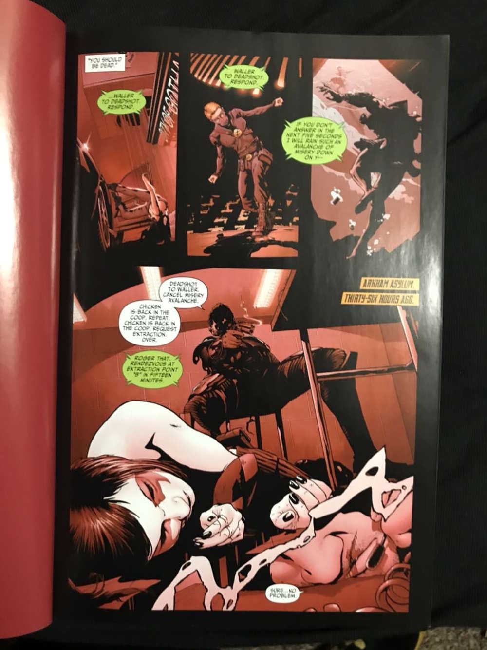
The comic book I chose is Suicide Squad, Vol. 2: Basiliask Rising by Adam Glass and art done by Fernando Dagnino. This comic book is about a supervillian team and the remaining of the members have a mission to get rid of Amanda Waller. While also looking into the Kooey Kooey Kooey island because it has telepathic powers and it wants to declare war on Earth. The suicide squad find out that they have a traitor and then are attacked by the members of Onslaught and then Onslaught kills Modem and captures Rock, Havana, and Waller. Then the Justice Society of America joins the Suicide Squad to get them back. But they are too late to save Havana who is Amanda Waller’s daughter. The iconography for this comic are evil heroes. People with costumes on but the colors are dark to show that they are bad. Some pages are just one colors and different shades of it.
I think the artist wanted to show emotion with only using once color because in Scott McCloud’s book “Understanding Comics” he talks about artists using different ways to show emotions and hidden feelings. Especially in his chapter, “Living in Line” he talks about sensual response and I think that the characters are showing their emotions, but the color tells us or guides us how we should feel. When using red, it should make us angry and when the artist uses light colors like blue, it is when we should feel calm. But of course not all the pages are just on color. If there are different characters in one page, then the main ones or the bigger scenes are in full color while the other things are all done with values of one color. I also noticed the the text bubbles are mostly white but there are some that are in bright colors and I think that is showing importance and showing emotion to what the characters are saying.
