Closure and Time Frames Erin Rockwood

This is a scene in Here There be Gerblins
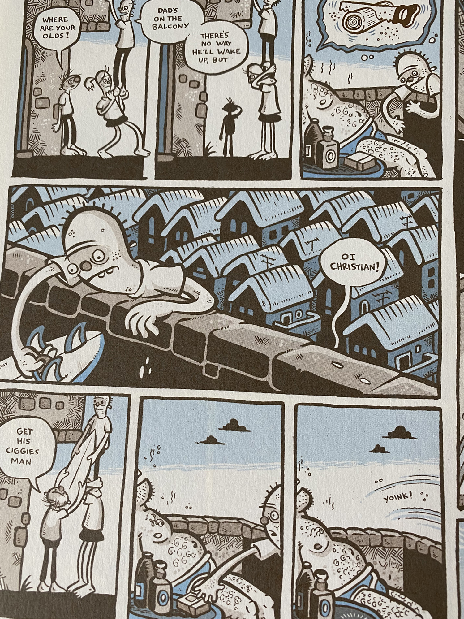
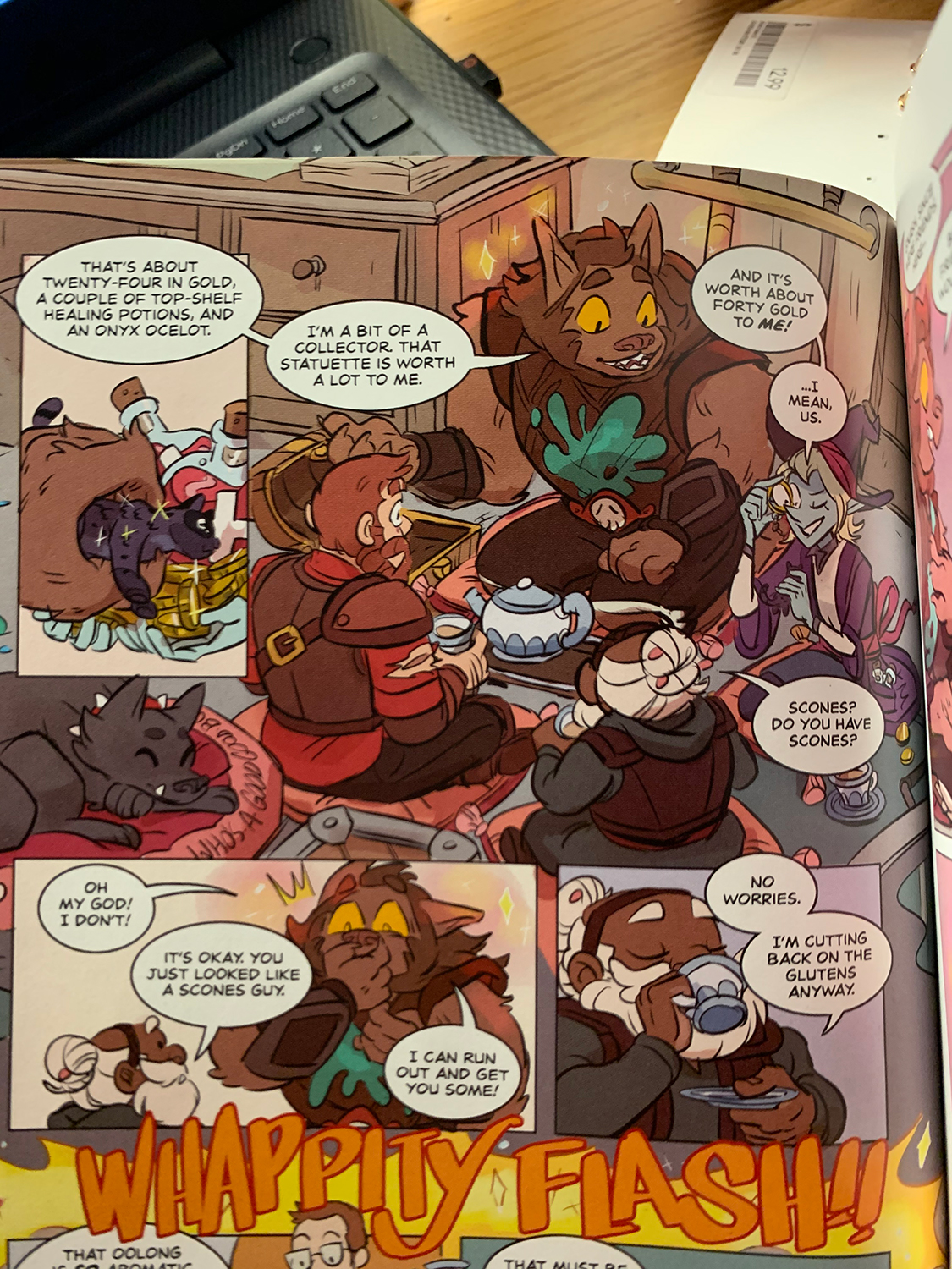
where there is a cool representation
of aspect to aspect closure. (Clint Mcelroy, Griffin
Mcelroy, Justin Mcelroy, Travis Mcelroy, and Carey
Pietsch, Here There be Gerblins, 2018, pg 60)

The graphic novel that I chose is the first edition in The Adventure Zone series, Here There be Gerblins. The scene that I chose that I thought showed a cool representation of closure was this scene where the characters are having a conversation after a battle. This scene shows aspect to aspect closure. It is one scene but the frames close in on certain characters or images in the scene. It shows this in a cool way because you can see the rest of the scene behind some of the frames, It bleeds into the whole page as it goes on. The aspect to aspect closure makes this scene better because it makes it more peaceful, this is the moment in the story where the characters catch a break in between battles and level up. This closure helps this suspended between action feeling this scene is supposed to give.

This travel montage makes a cool time
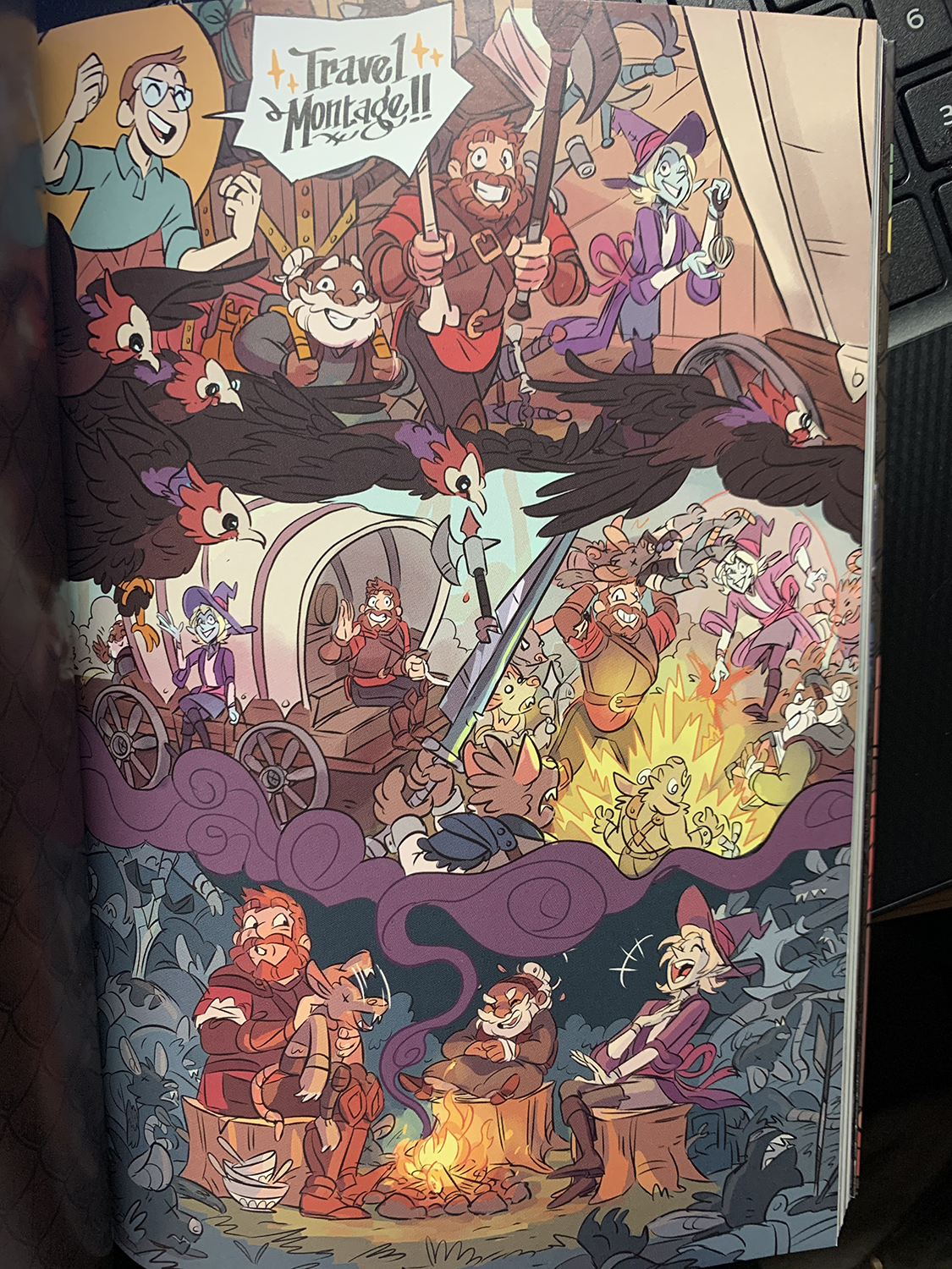
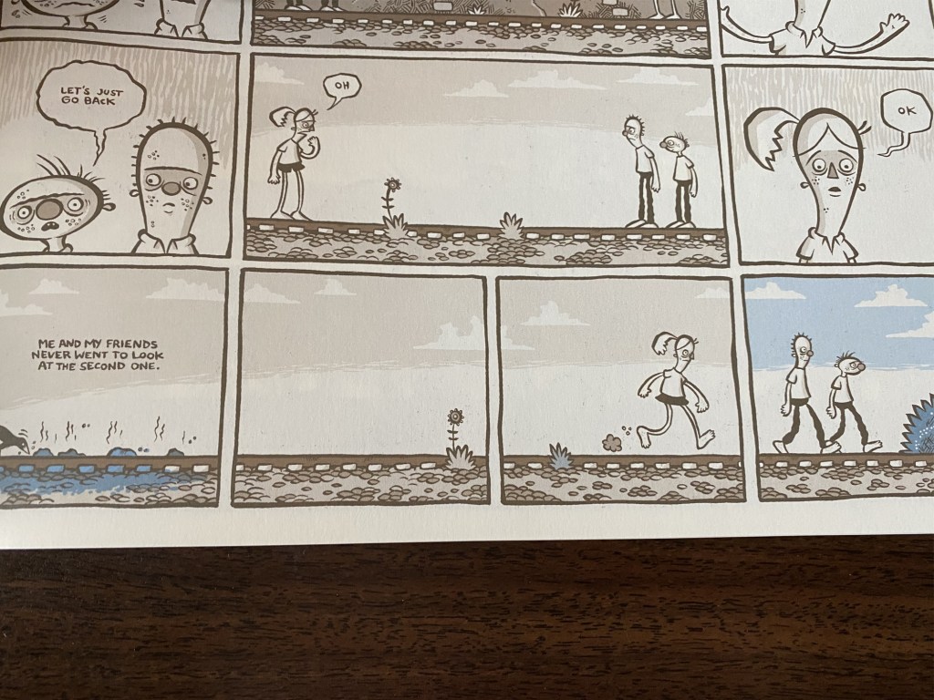
frame moment in this book.(Clint Mcelroy, Griffin
Mcelroy, JustinMcelroy, Travis Mcelroy, and Carey
Pietsch,Here There be Gerblins, 2018, pg 83)

The second image I chose shows a cool and interesting take on time frames because the whole page is trying to represent a montage with the characters. The way the artist tried to show this montage is by bleeding each scene together, Like how in a movie each scene jumps from one to another and ties in in the end. In the podcast that inspired this series, they do a lot of these moments where they explain even a week of time over a few words to conserve time. Both the podcast and the graphic novel break the 4th wall many times, and this is also shown in the characters eyes on the reader in this scene. There is technically 4 panels in this scene, but they blend together with what is meant to be the equivalent of screen wipes, with birds or smoke.

Posted in 201 Blog, Closure & Time Frames | Leave a comment

Closure and Time Frames: Daniel Blanchard

For our fourth blog post, we were asked to go to the WSU libraries and find a graphic novel that appeals to us and one we can use to examine and gain knowledge out of. After doing some research and looking around I was able to find a novel that looked very intriguing. “Blue” by Pat Grant is the name of this novel, it is a story about the childhood of kids off the shores of Australia on a mission to figure out why old boats are washing up onto the banks. just upon opening the book and scanning through it, the artwork and frames are what pulled me in, with the subtle blues throughout the novel it is satisfying to look at.

But for this blog I am supposed to find examples of closures and time frames in the novel I picked, it did not take long to find some examples. For my example of closure in this book, I found a page that was connected by the same scenario but divided into different actions. Christian, the character that is being lifted in order to steal a surfboard from his father makes multiple attempts to climb up. These scenes also show Christians’ father and his lifestyle, showing that he is most likely passed out due to drinking. But the main scene that I want to focus on is the last two panels, the closing panel leaves you wondering what happened next. As Christian grabs the cigarettes, the following panel shows a motion of some sort that has the text “yoink!” this leaves the viewer curious. Did Christian fall? Is it the motion of him snatching the cigarettes? or could it mean something else? This I feel is a strong example of closure and by noticing these in graphic novels it helps you think more in-depth about what it is you are reading and the meaning behind each scene.

We were also asked to find interesting examples of time frames in our graphic novels and examine them and explain how as a viewer they help us interpret scenarios. For this graphic novel, I found a very interesting example, Christian and his friends are walking along a railroad but as the panels progress they are all connected. because even though these are 4 panels split, all 4 of them are connected because it is the same time period. PatGrant helps show this better by showing one of the characters running to catch up to the other two characters. This is a very eye-grabbing tactic that many graphic novels use, it is fun to look at and adds variety to the panels and the storytelling.

Posted in 201 Blog, Closure & Time Frames, Uncategorized | Leave a comment

Closure and Time Frames: Luis Trejo

I have decided to read the graphic novel, Bone 1: Out from Boneville. This is the first of many volumes of the main character named Bone and his adventures. I remember seeing many people at my elementary and middle school check out Bone books from the library and I never got around to read one myself. Skimming through it, I really enjoy the art form and It looks to have a good story line with many characters.

, Bone 1: Out from Boneville pg 7.

One example of closure that I found early in the book is on page seven. This page starts off at the top panel where you can see that there is a large swarm of what appears to be grasshoppers. As the panels continue going down, you can see every moment that is going by as the characters are running way from the swarm of grasshoppers. The swarm continues to get closer and closer until they are surrounded by the swarm of grasshoppers on the last panel on the bottom right of the page.

Bone 1: Out from Boneville pg 14.

One interesting example of time frames that require the viewer to interpret is on page fourteen. This page starts off in pitch black darkness where the main character wakes up from a dream. In the following panel it appears that someone that is hidden in the darkness is talking to him and he believes it to be one of his friends that he hasn’t seen in a while. The person who was hiding in the darkness then asks bone for a match to light his cigarette, when he pulls out a match and sets it on fire, the fire laminates the small area that they were talking and instead of seeing his friend he sees a dragons face reaching for the match to light the cigarette. There is a black panel that follows and the final panel on the pages has a speech bubble that has “AAAH!”. There is nothing that shows you what happened after he lit the cigarette for the dragon, it is up to the viewer for interpretation.

Posted in 201 Blog, Closure & Time Frames | Leave a comment

Closure and Time Frames: Shira Feinberg

After careful consideration as to which graphic novel I will read for this class, I ended up choosing “Maus 2”. Throughout my k-12 education, I learned about the Holocaust and got the chance to read “Maus 1”. This sparked my interest t want to continue to read the series, however I prefer reading non-fiction novels over any sort of graphic novel. With that said, “Maus 2” is a non-fiction graphic novel and I want to learn more about what happened to the author’s father, in the sequel.

An example of aspect to aspect from Chapter One, page 14 of Art Spiegelman’s graphic novel Maus 2: A Survivor’s Tale and Here My Troubles Began.

Art Spiegelman, the author of “Maus 2: A Survivor’s Tale and Here My Troubles Began,” uses several closure methods throughout the novel. An example of this closure is aspect to aspect which is seen when we see the mice driving away and, in the car, (Art Spiegelman, page 14).

An example of subject to subject from Chapter One, page 24 of Art Spiegelman’s graphic novel Maus 2: A Survivor’s Tale and Here My Troubles Began.

Another example of closure that is seen in “Maus 2” is subject to subject when the main character asks his father what happened when they arrived to be separated and the father has a flashback to when the cat (Nazi) told them what to do (Art Spiegelman, page 24).

An example of scene to scene from Chapter One, page 36 of Art Spiegelman’s graphic novel Maus 2: A Survivor’s Tale and Here My Troubles Began.

Furthermore, the author uses scene to scene to go back and forth between Art’s conversation with his father and his father’s story telling of what has happened to him during his time in the concentration camp (Art Spiegelman, page 36).

An example of time frames from Chapter One, page 25 of Art Spiegelman’s graphic novel Maus 2: A Survivor’s Tale and Here My Troubles Began.

Art Spiegelman doesn’t just use closure methods to inform the reader of what is happening. He also uses time frame complexities to have the reader question the meaning of time and how Art’s father sees what has happened to him as something that he is reliving by speaking about it (Art Spiegelman, page 25). This is seen when Art and his father talk and the reader doesn’t read from left to right and down, but rather left then down then right and down.

Overall, Art Spiegelman uses several techniques to further emphasis the information he is trying to convey. Above are just a few examples of different techniques that he uses, but Spiegelman uses so many more techniques. Another thing to note, is that some of my examples may be interpreted into several closure types.

Posted in 201 Blog, Closure & Time Frames | Leave a comment

Closure and Time Frames: Kirk Brown

I chose a Marvel comic, G.I. Joe An All American Hero Volume 5, for this blog entry. The first image I found was an example of action-to-action closure. In the story the chief of police is jumping in front of a missile to save a family trapped in their car. We know this is action-to-action because in the first panel we see the chief of police yelling “I won’t permit it” as he leaps in front of the missile. The next panel illustrates an explosion creating the word “BOOM” as we see the chief of police take the blow. This all together creates an example of action-to-action closure.

G.I. Joe An All American Hero Volume 5, page 60.

The next photo shows an example of time frames. Both the panel with the letter and the one with the yellow man have very abstract representations. Up until this point in the story we are not aware of the character in the yellow. This has left the viewer to have to interpret what type of character is being introduced. We don’t know what history and placement this character holds in the novel. Another part of the final panel that creates confusion is the characters background. This makes it hard to interpret if this was from the future, past or present time in the story.

Time frame example from page 26 in G.I. Joe An All American Hero.
Posted in 201 Blog, Closure & Time Frames | Leave a comment

Closure and Time Frames: Jennifer Engelke

For blog post number 4, I chose to read the graphic novel Maus I: My Father Bleeds History by Art Spiegelman. The novel tells the story of the main character’s father’s life. He tells stories about falling in love with the main character’s mother, and what life was like under Hitler. The illustrator and author, Art Spiegelman uses mice as his characters, while his nazi characters are cats. This creates a dynamic of enemy and allies within the two animals. 

Two panels which show closure and scene-to-scene from Chapter 2 Page 33 from Maus I: My Father Bleeds History by Art Spiegelman.

Closure is when the viewer has to mentally fill in gaps between two panels. This can be seen on page 33 of the novel. Scene-to-scene closure is apparent here. The first panel on the page reads with the father in view, another mouse is telling them about their cousin and what is going on in Germany. The next panel we see is the nazi cats in Germany, which we understand is going on at the same time the mice are discussing. Scene-to-scene we can see two events that are taking place at the same time except in different locations. This type of panels also requires closure from the reader. The reader has to understand that these are both occurring at the same time. The right panel is what the mouse’s cousin is currently experiencing, while the other mice who are not in Germany are not. 

Example which displays time frames from Page 6 from Art Spiegelman’s Maus I: My Father Bleeds History.

Panel from which continues the concept of time frames from page 6 to page 11 in chapter 1 of Maus I: My Father Bleeds History by Art Spiegelman.

One example of time frames is printed within the first couple of pages in the book. Before the first chapter even starts we view a page of the main character as a child. The character falls and scrapes his knee, then, later on, converses with his dad who is in the front of his home. As the page is flipped we see the table of contents followed by the beginning of chapter 1. The main character has grown up and is now visiting his dad once again, except now he is an adult. The reader must assume that many years have passed. Time Frames are a concept within comics where the reader has to participate in understanding details in which are not given. In this case, the reader has to participate and comprehend the years that took place within these two frames. The boy is no longer a child but is a man. This requires years of growth which the viewer must create in their own mind without seeing it down on paper. 

Posted in 201 Blog, Closure & Time Frames, Uncategorized | Leave a comment

Final Digital Comic Collage by Daylon Hicks

undefined

This project was tough for me because it was hard for me to find items to scan because for the items I bring to college, I don’t have too much of. The reason for this is because I am a minimalist and I only bring items that have true meaning in my life. My original plan with this blog post was to talk about the items I chose and why I decided to choose them, but I wanted to start on a different approach. Lynda Barry’s What It Is, I noticed that the object that popped out the most was octopuses in the illustrations. I felt like she featured octopuses in her illustrations because she wanted to hook the reader in a different approach. I really liked that idea and decided to grasp it. My original thought for this project is to make it relative about me and I decided to keep on with that same idea. I knew I wanted to involve high jump because high jump is essentially the main reason why I am at Washington State University. High jump made an impact on my life and I can only thank my family for helping me get that far. I wanted to feature the Golden Gate Bridge because California is where I’m from. The next plan I wanted to do for this project is make me jump over Golden Gate Bridge. The reason for this is to show my creativity and how the two topics of high jump and my hometown in California align together. The vinyl from James Blake album “the Colour in Anything” was important for me to feature because it is an album that impacted me throughout high school and even now in college.The important thing I wanted to feature is layers for my pictures. Starting off this project was tough to add especially with the Golden Gate Bridge because I wanted to make my pictures as visible as possible. For this project, I found that clipping masking was a very helpful tool to use. For my WSU ID, I had information I did not want to feature so adding that on helped achieve the goal of me adding my ID easier. I believe that my project fits into Scott McCloud’s definition of a comic; “Juxtaposed pictorial and other images in deliberate sequence, intended to convey information and/or to produce an aesthetic response in the viewer” (McCloud pg. 9). The best example for this is bring up my bib from my collegiate track meet. It provides the reader with detail showing that I am a track athlete and providing how far it took me to get to this level. To be honest, this project was long and stressful because of how long the process took. I struggled in the beginning because as I stated in the beginning sentence, I did not bring too much stuff with me for college and the stuff that I had, I did not want to use for this project because it provided no meaning. At the end of this project however, I felt proud of my work. I felt like I represented myself in that image and the things that I scanned also helped describe who I am. This project was the first time that I used Photoshop ever and I did receive help to make sure this project was from my vision.

Posted in 201 Blog, Final Digital Comic Collage | Leave a comment

Final Digital Comic Collage: Maddy West

Comic by Maddy West, March 2020.

When creating my comic, I knew that I wanted to create something that really represented me and who I am as an individual. Throughout my life, my mom has regularly made memory boxes that focus on specific years in my life. These are filled with everything from school work and crafts to pictures. While I do not have access to one of these boxes at school, I have access to a lot of the items that I know I would put into a box. What I ultimately put together fits into McCloud’s definition of a comic because it is images of things deliberately put together to look like someone pulled things out of a box and spread them out to look at them. By providing context with the words “My Memory Box” the whole comic takes on a new meaning to the viewer, making it clear that all of the pieces in it mean something to the owner (me). By knowing this information, the images convey a sense of nostalgia and memory to the audience. I think that both McCloud and Lynda Barry helped me think about my work the most because they both placed strong emphasis on how the written word can impact the way a comic is perceived. If I took off the words “My Memory Box” I think the entire meaning of the comic would become really unclear. I also really liked Barry’s style of comic, where she just stacked things on top of each other, added lots of texture, and mostly worked in the collage style. This inspired my actual creation of my comic. When picking out the different items that I wanted to use in my comic, I focused on things that could add both texture but also had strong personal meaning to me. While I was held back by the fact that I only have the items that I have at school, I was still able to easily find things that have important meaning to me. There are some cutouts from my favorite coloring book, which I use to relax after crazy times during my life. These helped bring a pattern to the background of the comic. I left them uncolored because the colored ones were kind of distracting, and I mainly wanted the coloring patterns to fade to the background. I included some passes that I have kept from this year. The first was from the AC Slater concert that occurred at the beginning of the year, which was the first time I was an acting executive member with the Student Entertainment Board. The other was from the Klay Thompson basketball game. Sports are a really big part of my life here at WSU, so it was important for me to include an aspect of this in my comic. Both of these have the cool aspect of the lanyards, which I was sure to include in my scans. I also have some pictures that mean a lot to me as they have important people in them. I included a cutout from a card my grandma got me, which I liked because it added both texture (from the jewels) and personal meaning (as our family name is Peacock). I also have a sticker from the SEB, which I liked because there is texture from the tear of the paper. It has a lot of personal meaning, along with the business card because both relate to my Student Entertainment Board job which is really important to me and definitely defines who I am as a person. I used only three words in my comic because I felt that it made the comic the most clear that way. I picked a simple font that was in all black because I wanted the words to add to the story of the pictures, not distract from it. I just allowed the words to fit into the space that the images had left on the page.

This is not my first time using Photoshop but my previous experience is fairly limited. I am a communications major, and I had to take a class called COM210, which helps teach students how to use a variety of technology. In this class, the 2 week section for Photoshop was the only time that I used Photoshop before. Because of this, despite my previous experience, pretty much everything that we learned (past the very basics of operating the system) was new to me. I think that the most useful tools that we learned were the clipping masks and the quick mask mode. I knew nothing about masks before we started so learning how to be able to individually edit pictures and then bring them all together (without losing my edits) was super beneficial. I used these skills to be able to cut out my scans, from their backgrounds, and also to make sure that I got all the details of the scan in. Things like the lanyards (and the twisting parts) were made super easily by the masks. The most confusing part about all of these things was the details. Making sure that I clicked the right buttons in the right order to get to the right end goal was honestly the hardest aspect of learning Photoshop for me. A lot of times, I had to go back and figure out what order I needed to go in so that I did not mess anything up. After I did this a few times, it became significantly easier. I am surprised by how much I liked composing in the digital environment. I thought that I would feel held back by my lack of abilities to do what I wanted, but after watching the tutorials and just playing around, I found that I had more skills than I originally thought that I did. Being able to compose digitally also gave me a lot of power over the final product and the quality of the product that working in person would not allow me to do. All of the images were clear, focused, and super easy to manipulate. I also liked how easy it was to fix my mistakes! Being able to go back and see no repercussions for making a cut wrong or changing my mind about the size of something is a powerful tool that I didn’t realize I liked having a lot, but now that I know, it will be hard to go back.

Posted in 201 Blog, Final Digital Comic Collage | Leave a comment

Final Digital Comic Collage: Bryce Ames

Collage comic by Bryce Ames, February 2020

My creative motivations came from working with the first piece that was an aluminum cutout and was the springboard for my idea of using the texture of this metal to be seen as armor. The aesthetic experience I was looking to create and convey to the audience was that of a foreign landscape with beings that are both familiar and not. All while looming in the distance there appears to be a planetoid that is expelling a crystal structure that seems to act as the planets “ocean”. Off to one side you see what you wish to believe is a familiar shape of a “quarter?” that is the size of a dinner plate.
One aesthetic that I wanted to be sure to convey was that of definition in terms of utilizing the different layers to allow the layers to overlap. This was achieved via slits cut out of the original images and then the object that was to be placed was sandwiched in between the different layers. The different textures that i had implemented such as the aluminum and the crystal background allowed for the segway into the larger crystals in the foreground.

I believe My collage comic fits in with Scott McCloud’s definition “Juxtaposed pictorial and other images in deliberate sequence, intended to convey information and/or to produce an aesthetic response in the viewer”. In terms that the collage draws an audience’s vision towards objects that continue to appear as continue to look on. Another meaning is that the collage is a combinational work of images that were deliberately placed in a very specific and finite order to provide both enough information to the viewer that they can gather the essence of the story that the overall piece is attempting to convey. 

I had used more over the visual mode over the other modes as for me the visual mode allows for the viewer to engage more with their imagination. However as I continued on with the collage i discovered that i even added the linguistic with the “icebreaker” on the ball in the foreground giving the reader a semi direction that they can use to interpret with the surroundings.

This is my first time producing a product from scratch. I have learned a lot during this project such as layer masks. Before this I would always just use the eraser tool to clean images with the risk of erasing the wrong portion and not being able to go back because I had run out of history in the edits. By using this method I have been able to save countless efforts from failing. Another tool that was new to me and That i had found very useful was the ability to clip layers to become filters and effects. This was a big help in adding textures to the images while as to not loose the original texture.
I really love composing in a digital environment, because it allows me to correct mistakes at a much cleaner level than that of in real life. Another reason is that I am able to make precision working such as making perfect curves and cuts at the flick of a wrist.

Posted in 201 Blog, Final Digital Comic Collage | Leave a comment

Final Digital Comic Collage

Digital Comic by Diana Alonso

My comic fits into the Scott McCloud’s definition of a comic because it shows a set of images that I use to try and describe myself, which would cover the part in Scott McCloud’s definition of “conveying information”. My hope for this comic was to share a little bit of myself with images that represent me. The readings and class discussions we had in class inspired me to think about different ideas that can help get the viewer to think more in depth about what my comic may represent, versus the actual meaning behind the comic. The materials I used help me make meaning through my collage process by each having a different meaning behind it. For example, the name tag I used as the center of attention for my collage was made in a workshop that was meant for women of color. This workshop help us understand how to navigate in a place where we are the minority, and how we can use our voice to help ourselves and others. The only word I used was my name. I decided to only use my name because I feel like since the collage was about myself, it helped to only use my name as a way to bring attention to the main focus in my collage, which was me.

To begin with, I had a really hard time trying to come up with a theme or topic for my comic. I feel like I couldn’t find the materials necessary for my collage which caused me to take longer than I should have. Before turning in my final comic collage, I was working on a different one, but I did not feel satisfied with my work, so I decided to start a new one. This collage was also not what I expected since I decided to change it last minute, but I think it has a better meaning than the first one. Since I had never used Photoshop, I struggled so much trying to use the tools. Although I kept going back to the tutorials for help, it was just so confusing when I would accidentally press something or do something that I didn’t know how to fix. My favorite part about making this collage was using the brush to erase or add parts to an image. I enjoyed working in a digital environment, even though I faced a lot of challenges.

Posted in 201 Blog, Final Digital Comic Collage | Leave a comment