Organic / Geometric and Abstraction / Representation – Sean Jones

New Logo for Olive Garden
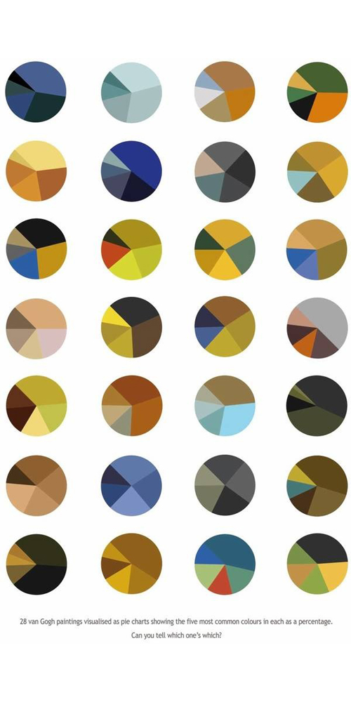
The new Olive Garden logo is a good representation of a company trying to go in a new direction.  Other than the obvious logo change, they are also inputting large aesthetic changes to the decor and way of function to the remaining Olive Garden Restaurants.  In this visual representation however,  it is clearly pointed out that they are trying to go to a less rustic look.  One could call it a more abstract look just because of the new logos’ lack of nostalgia and old world Italia nature.  For starters there is no “sign” the text is posted upon, which already makes look less .  Another noticeable element of this new logo is how the olive branches are turned into graphic instead of drawing which gives it a whole new geometric look.  Also instead of the letter looking like swooping handwriting, it is obviously typeface that is manipulated slightly just to add excitement.  Overall it is a solid move for the massive restaurant chain.  Modernizing the label to give it a more geometric, abstract and clean look is what the logo industry is moving towards, especially in the restaurant business.  Another detail worth noticing is the changing of the words “Italian Restaurant” to “Italian Kitchen.”  This is intriguing because it seems as though Italian Kitchen would come off as more “homey” or “old timey”, like their organic first logo, however they went in that direction for the new logo.  Not sure what the idea behind that was but, it still ties in with simple modern font.  In conclusion, Olive Garden changed their logo for a more streamlined, modern and simple look.
Posted in Fall 2014 Archive (336) | Tagged | Leave a comment

Organic / Geometric and Abstraction / Representation : Susan Cannarella

Nerf: Toy Company Redesigned by The Soup Group for Super Soaker Redesigned for repackaging. http://www.underconsideration.com/brandnew/archives/new_logo_and_packaging_for_super_soaker_by_soup_group.php

This logo was redesigned for the company Nerf; a toy brand that is iconically known for vast array of nerf guns. This logo was for their water guns called the “Super Soaker”. They had released the product with the old logo for awhile and decided to redesign it for new packaging. The old logo was very plain. It was italicized and had a bit of a wavey organic form to the “S”s from Super Soaker with two contrasting colors. The reason I say that the “S”s are organic forms because they are soft edged and flow more without harsh edges and sharp lines like the bend in the “E” or “U” have. Compare it to the new logo; the logo looks more active and exciting. We can see right off the bat that there is this organic shape of a “C” or portion of a circle that envelops the text of “Super Soaker”. The “C” circular portion that sweeps under the word “Soaker” could be an abstract representation of a wave to emphasize the product being water themed. I argue that it could be seen as an abstract representation because the swooping line looks like a wave that is coming up. This is also used for other water gun products that Nerf sells, so it leads me to believe that the swooping motion of the line is a wave. The text is also organically shaped because of the irregular curvature to the text. Not only the “S” have a wavey organic shape to it, but the rest of the text follows that same wavey motion. Because the colors Blue and Orange contrast each other, when we look at the word “Super” it draws our attention to the word “Nerf” in the corner since the white text and shape is percentage-wise at least half of the image. The whole logo looks to be in motion because of how the curves of the text and the organic shape seems to be very active. This plays off with how it relates to the company because Nerf products are meant to be played with other people while being very active, in motion, and fast pace games. The colors orange and blue are very represent the company Nerf perfectly because those are the colors of the company. The old logo was blue and red, which didn’t have as strong of a connection to the company as the new logo creates.

Posted in Uncategorized | Leave a comment

Small Multiples – Katie Tufts

https://www.tumblr.com/search/small+multiples 28 Pie Charts Showing the 5 Most Common Colors in Van Gogh's Paintings

https://www.tumblr.com/search/small+multiples
28 Pie Charts Showing the 5 Most Common Colors in Van Gogh’s Paintings

The caption of this image says “28 Van Gogh paintings visualized as pie charts showing the five most common colors in each as in percentage.” I chose this image because I believe it 100% relates to data bountiful. This image compares 28 Van Gogh paintings by the color used in each of them. By placing these small multiples in this arrangement it really allows the viewer to compare the colors that were used in each of the paintings. It also shows the changes he made in color from painting to painting. Maybe the two blue ones at the top left were painted one after the other. This happens to also show the scope in time each painting was made. Having the paintings laid out in this format gives the viewers a different perspective. The image is also visually stimulating, I didn’t see it as a bunch of small pie charts, I saw circles of color with some sort of 3D element added to them. That’s what made me more drawn to it once I read the caption. This would be really boring data to look at if it were written down, but adding this creative spin to it makes it a real success.

According to Tufte, small multiples will do a few things, on being “change of data, not changes in data frames”. The circles stay in the same shape and order creating implied columns and rows which means it is really only using one mode to portray the information. Besides the small caption on the bottom, this image lacks words and numbers which almost make it more interesting. The simple look then has the viewer appreciate the story behind the colorful circles and lets their imagination wonder about which painting is which just by identifying them by their top five most used colors.

Posted in Uncategorized | Leave a comment

Small Multiples – Brian Tomsovic

Custom sprite sheets are a hobby of sorts for some. A sprite sheet is a series of characters, usually the same character or a series of characters in different poses. Their original use was for video games, so that the animations of a single 2d character could be stored in a single file. Over time fans of video games would be able to pull those sprite sheets out of the game, and as those sprite sheets became available, fans would create their own. These new sprite sheets range from near direct copies, or mild redesigns of characters straight from the game to unique characters designed from the ground up, often though landing in the middle, recolors and modifications to existing characters intended to create unique characters in the same style.

Fan_Art_Sprite_Sheet_by_erimiris

This is an example created by deviant art user Erimeris. He took designs (this one appears to be borrowed from one of the Pokemon titles) and redesigned the characters after his favorite comic book characters. (and a couple from wicked) Looking at the top half of the image (Batman, Robin and everyone above them) The artist was able to illustrate the answer to the question, “What would batman be like in the style of Pokemon?”

In Envisioning Information, Tufte talks about how small multiples can provide a “scope of alternatives”. In this case the artist shows what multiple characters, who may not otherwise be seen alongside each other would look like, without having to recreate the entirety of Gotham City. The “constancy of design” that Tufte talks about comes not from internal consistencies, in this particular case, but by using a style that speaks to a particular community. This style speaks directly to the type of people who would most appreciate the work.

Posted in Fall 2014 Archive (338) | Tagged , | Leave a comment

Small Multiples – Danielle Clement

Small multiples, “reveal all at once, a scope of alternatives, a range of options” (68). They are multivariate and data bountiful, they visually enforce comparisons of change, and direct towards the important information at hand. (67) This example is a great example of “data bountiful” visualization using small multiples, a term exercised in Edward Tufte’s Envisioning Information. This Infographic communicates facts and statistics about U.S. Military personnel, including active duty and reserves.

This piece does an excellent job of incorporating text, visual, and quantitative elements. A cool teal-blue color with a light gray accent is the palette used through the entire Infographic; this consistency allows the eyes to flow to the critical parts of information. The color scheme shows a wide range of data and utilizes alternating colors to highlight the targeted information for each section, specifically showing the range of minimum to maximum values. The use of this color scheme allows for a simple and concise layout to present the information given. The repetition of both color and graph elements throughout the Infographic, brings forward the differentiation between information and also separates and layers the data. Everything is labeled and sequenced in a straightforward manner, allowing readers to make comparisons at a glance. The Infographic is separated into horizontal rows through the use of thin gray lines implementing a stylized order, and also uses white space to highlight each element within. These divisions are not disruptive, but not quite silent either.

This piece utilizes ratios and 8 different graphs to present information such as a bar graph, circle graph, line graph, etc. Through the use of unique visual graphs, this piece catches the eye as well as directing it to the desired information. I especially like the graph at the bottom which depicts the ’Military casualties by conflict’, I think the use of the overlapping circles is straightforward and shows the contrast between the two numbers being represented well. The dates, percentages, and other descriptive, pertinent information have a light gray typeface and are carefully placed under the data to not distract from the data, but serve as a subsidiary aspect.

At the top of this piece there is a good example of using text as image. In the ‘Who Serves’ category the number ‘2,266,883’ is placed in a large typeface and utilizes quite a bit of space, enough to catch the eye and serve as a plane element within the Infographic.  This is also a good example of using a qualitative element within to catch the eye and influence the reader with factual evidence. Another great example of using a qualitative element is the use of ratios within this piece. The entire presentation of data within this Infographic is very visual and highlights the weight of each graphical object’s importance.

by-the-numbers-todays-military_50290b85eba32_w1500

Hurt, Alyson, Erica Ryan, and JoElla Straley. By The Numbers: Today’s Military. Digital image. Www.NPR.org. NPR, 3 July 2011. Web. 15 Sept. 2014. <http://www.npr.org/2011/07/03/137536111/by-the-numbers-todays-military&gt;.

Posted in Fall 2014 Archive (338) | Tagged , | Leave a comment

Small Multiples- Shannon Heric

This is a tennis analytical data chart of a tennis match done by Damien Demaj. He is a cartographic product engineer at ESRI. In his work he has multiple ways of charting data, but in particular this graphic chart shows the Gold Metal tennis match in the London Olympics between Andy Murray and Roger Federer’s shot sequence. The last three courts are the most important because they are the placements of Andy Murray’s last three winning shots.The design is fluent throughout with the tennis courts all being the same size and are in order of the shot sequence. As Edward Tufte explains “data bountiful” he talks about how a multitude of data can be explained with one composition that is collective. Small multiples are used to show overlapping tennis ball shots from the two players in a series of common basemaps. Color is very important to show the difference between the shots won for each player. The background is black and the two players are distinguished by thick colored lines of lime green representing forehand shots and blue representing backhand shots. Comparison between similar events are occurring from the placement of the ball and where the player started off when taking the shot and this can be seen in one eye span showing player strategy. Range of data shows a multitude of elements and in this particular graphic the different styles of lines represent, Murray forehand winning shot position, Murray backhand winning shot position, ball bounce, Murray forehand winning shot, Murray backhand winning shot, Murray’s movement, Federer’s movement and stroke pattern. The relationship between the text and the image is the connection between the image graphics and the information explaining the graphic at the bottom right. Silent methods of placement are used well in this graphic because of the fluent same white space in between the different sequenced boxes.

Damien Demaj Federer vs. Murray Gold Medal Match Analytic Graphic http://www.sloansportsconference.com/?p=8387

Damien Demaj Federer vs. Murray Gold Medal Match Analytic Graphic http://www.sloansportsconference.com/?p=8387

Posted in Fall 2014 Archive (338) | Tagged , | Leave a comment

Small Multiples – Karen Marten

How Much 1$  Used to Get You

How Much 1$ Used to Get You

This graph used to describe the difference in the buying power of a dollar in the past vs. the present, has both successful data representation of small/multiples and also some not so successful representation of the data. While this example from pinterest is text-heavy, the small multiples are still apparent throughout the infographic. The most obvious small/multiples being represented are the orange boxes that are “cut” in half to compare the past years and the present years, and the repeated price tag-looking signs that state the year that is being examined.

As Tufte claimed, the small contrasting color used for the green price tag draws attention to the different years, which is an important aspect of this graph because it is one of the two consistent variables that is being tracked.

However, the size and most importantly, the length of the infographic as a whole cause problems with its success, if only in certain situations. For example, Tufte claims that to be a successful comparison, the map must be viewable within the scope of the eye span. So, if this image were printed or viewed on a very large screen instead of viewed via my 15-inch computer, the comparisons would be deemed successful.

The white dashed line used to separate the past and present comparisons is small enough not to be distracting from the information. Also, the star shape images behind each visualization of items for a dollar was a nice way to enhance the multiples being viewed.

Another issue I have with this depiction of small multiples is the separation tactics. The two columns, left being the past and the right being the present, could have used the silent method to display the changes. The text in the margins should have been left out (it is superfluous anyways), and the space separating each row could have been reduced using the silent method of separation. Then the eye would respond to the graph better and could be viewed smaller or at a further distance thus, better displaying the “change in data, not changes in data frames.”

Posted in Uncategorized | Leave a comment

Small Multiples – Lauren Turner

small-multiplesThe data bountiful visualization using small multiples I found was a info graphic about the cost of owning a pet. As Tufte stated in the readings, comparisons must be enforced in the scope of an eye span. In this instance, the visualization I chose is successful. The comparisons between various costs of owning dogs and cats is clearly shown in a manner that makes comparisons straightforward and quick.  Tufte also spoke about the struggle between maintenance of context and enforcement of comparison. Because detail is crucial, patterns are a smart way to keep information organized. Juxtaposing the hierarchy of text and image/visuals is important as well. This info graphic did a good job of differentiating between text, information, and image. I also found it helpful that they also included a pattern of lines drawn towards images so as not to confuse the viewer. Also, because of how this visualization was set up, the implicit grid between dog and cat makes it easy to find which cost is being discussed. What I dislike about this ad is the takeover of the images over the text. The countless vibrant colors distract the viewer from the information at hand. I think limited but focused color would have been more effective in order to get a reader to focus more on the information than the photographs. Tufte also spoke about how there are multiple forms to display evidence. However, no matter what, evidence is information so it is the designer’s task to make the reader (above all) understand the materials at hand and to appraise their relevance. With my visualization I believe this was a success – a reader can quickly and easily understand the concept of the design and apply it to the question of whether it is more expensive to own a cat or dog in the first year of ownership. This small multiples info graphic also employed multimodal techniques for displaying the information. They used verbal, visual, and quantitative information. Though it is not horrible, I believe the unification of text and image could be improved. While the text doesn’t necessarily confuse the viewer, it doesn’t do anything in particular to assist in the understanding of the content. I believe the designer focused mainly on the photographs in this project than the unification of text and image. This author did tightly integrate relevant text with the relevant image so as not to confuse the reader with misleading information. In this small multiples design, the words to not necessarily decorate the illustrations; it is mostly the opposite. The words in this design are not themselves intensely visual but viewing the pictures without the text still clearly gives clues to the content. I believe the text in this visualization are too similar (especially in text weight) and more data separation should be done in proportion to their relevance/importance. Quickly, Tufte also in the reading discusses the difference between implied grid lines versus disruptive divisions used in graphs and grids. He talks about how locations can be signaled just as effectively with silent methods of pairing information.

Posted in Uncategorized | Leave a comment

Small Multiples – Kelsey Johnson

This infographic I found (via Pinterest) compares the daily routines of various historically creative people.  Each person has their own circle with their routine circling a photograph of them.  Because this is information regarding schedules and time of day, the circles represent a clock.  Each type of activity throughout the day is categorized and color coded, and a key is provided for how to read the clock and explains what activity each color corresponds to.

Using Tufte’s criteria, this example clearly demonstrates the concept of small multiples.  All of the information is within the eye span of the viewer and each piece of information is shown in the same format throughout the graphic – small circular photos of the subject surrounded by a clock-like graph containing the important data.

As far as the design of these small multiples and the graphic overall, it fits the criteria fairly well.  As stated by Tufte, there is an “effectiveness and elegance of small spots of intense, saturated color for carrying information.”  The graphic is mostly black and white with a light gray background, and uses color only for the information being communicated.  This makes the important part of the graphic stand out with contrast and states its purpose explicitly.

The use of text could use improvement.  The sans-serif font is appropriate for the content and design.  It is easy to read the larger text in the image.  However, there is a lot of smaller text that is not so easy to read.  Looking closer, the small pieces of text placed around the circle share a few facts about the person or a particular part of their routine.  Although these bits of information are interesting, I don’t think they add to importance of the focus of the graphic.  Looking at it from a normal distance, the tiny text becomes distracting blocks that disrupt the streamline look of the entire design.

There is framing in between the multiples, but it is made of very thin lines that are a slightly darker gray than the background and does not seem too disruptive.  Because the circles are placed on a grid already, I do not think the framing is needed.  It is probably there to divide all of the small text and keep it contained with its corresponding information in order to avoid confusion.  If that unnecessary text and framing were eliminated, this design would be extremely successful.

Posted in Fall 2014 Archive (338) | Tagged , | Leave a comment

Small Multiples – Melissa Tsitsis

I chose this infographic, which depicts the evolution of television because I believe that it exemplifies the concept of small multiples well. According to the readings by Edward Tufte, “small multiple designs, multivariate and data bountiful, answer directly by visually enforcing comparisons of changes, of the differences among objects, of the scope of alternatives.” That being said, small multiples are like a series of frames that present imagery along with text and numbers in order to create a unified visual that is informative as well as being visually appealing. This graphic does a good job at accomplishing this because the background is solid and therefore, it is not distracting.

This graphic is data bountiful because there is a clear hierarchy throughout the information that is being presented, which establishes change in data. One way that hierarchy is established is through typography. The year in which the television set was introduced is the most prominent of all of the information because it is the largest text and also because it is white and has the most contrast with the background of this infographic. The brand of the television is also included in smaller text and a darker color so this tells me that it is not as important to the evolution of the television, but is relevant because there are many different brands out there and also helps this visual become more informative. Another way that change of data is established is through spacing, which is a silent method of creating a division in information because there are no physical lines or frames separating one year from another. This is done successfully because there is an equal amount of space between every frame (to the left and right) of each set of information that is being presented. The designer of this also included illustrations of the television for every year so that the evolution of the physical characteristics of the television is apparent.

There is a clear flow to the infographic and which makes it is easy to compare each television especially when they are next to each other, but also when they’re on different rows and columns from one another.

Posted in Fall 2014 Archive (338) | Tagged , | Leave a comment