
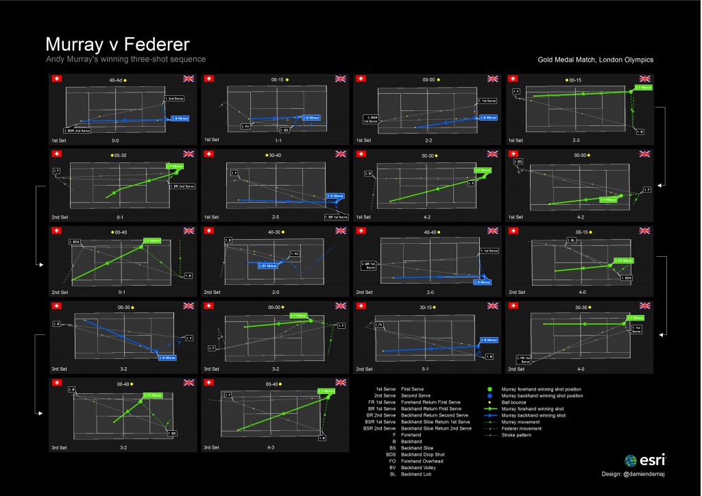
This is a tennis analytical data chart of a tennis match done by Damien Demaj. He is a cartographic product engineer at ESRI. In his work he has multiple ways of charting data, but in particular this graphic chart shows the Gold Metal tennis match in the London Olympics between Andy Murray and Roger Federer’s shot sequence. The last three courts are the most important because they are the placements of Andy Murray’s last three winning shots.The design is fluent throughout with the tennis courts all being the same size and are in order of the shot sequence. As Edward Tufte explains “data bountiful” he talks about how a multitude of data can be explained with one composition that is collective. Small multiples are used to show overlapping tennis ball shots from the two players in a series of common basemaps. Color is very important to show the difference between the shots won for each player. The background is black and the two players are distinguished by thick colored lines of lime green representing forehand shots and blue representing backhand shots. Comparison between similar events are occurring from the placement of the ball and where the player started off when taking the shot and this can be seen in one eye span showing player strategy. Range of data shows a multitude of elements and in this particular graphic the different styles of lines represent, Murray forehand winning shot position, Murray backhand winning shot position, ball bounce, Murray forehand winning shot, Murray backhand winning shot, Murray’s movement, Federer’s movement and stroke pattern. The relationship between the text and the image is the connection between the image graphics and the information explaining the graphic at the bottom right. Silent methods of placement are used well in this graphic because of the fluent same white space in between the different sequenced boxes.
Damien Demaj Federer vs. Murray Gold Medal Match Analytic Graphic http://www.sloansportsconference.com/?p=8387
