Small Multiples – Jenna Hayden

A comic titled, Hillary Rodham Clinton by Steven Weissman. Taken from the WTD website.

A comic titled, Hillary Rodham Clinton by Steven Weissman. Taken from the WTD website.

This is a comic by Steven Weissman titled Hillary Rodham Clinton. This comic is a combination of illustrations and words that convey the principles that Tufte wrote about. Tufte wrote about the importance of successfully using words, numbers and images together. The comic is a combination of a few small multiples that come together to tell one story.  The illustration alone tells a more ambiguous story, a woman burying something dead, while with the addition of text tells a more detailed story, Hilary Clinton burying her (dead) Presidential opponents. This is an example of successful word-image integration that Tufte refers to. Words without the images or vice versa in this case would not relay as much information but combined, it is clear story that is “data bountiful.”

While the framing sizes of the small multiples are all the same size, the illustrations carry your eye in the direction of the story through the movements of Hilary. Weissman conveys the story successfully through the “data rather than the data-containers.” Even though the color in this comic is not emphasized, having only used shades of yellow, blue, red and black, it’s the way the frames become darker as well, that helps distinguish order.

Posted in Fall 2014 Archive (338) | Tagged , , | Leave a comment

Small Multiples- Sandra Albertson

This is my small multiple example by Andrew Gelman. The point of his graphic is to demonstrate who wants school vouchers. Found at http://www.andrewgelman.com.

smallmultiples1-1

In this week’s reading by Edward Tufte, we learned a bit about the history of putting word and text together in a composition and how effective it can be. Tufte discussed graphics that were “data bountiful” meaning that much could be observed and learned through one collective composition. One very successful form of such a thing is a format called “small multiples“. This often includes a variety of “options” being offered at once in some kind of visual display. One theme is often repeated in multiple ways so that we see that different things are happening to the same main object. In my example, the United States is used over and over so that you can use comparison to see the difference from country to country. As Tufte said, comparisons must take place within one eyespan, or all on the same page so that the comparisons are clear. My small multiple image includes information about American support of school vouchers based on location, income, religion, and race. This is definitely a large range of data that is all encompassed into one solid graphic. It successfully uses text and image together to get the desired message across. There is nothing but white space in between each U.S. depiction, so I would say that silent methods are used. I think this is the most effective in the situation since the outline of each country and the white space is division enough. Each image of the United States is the same as the last but small changes in color, in correspondence with text, make all images of the U.S. mean something entirely different. As stated in the reading, “for a wide range of problems in data presentation, small multiples are the best design solution”. It is clear to me that small multiples were the best, and maybe the only way, to display so much information such as my voucher graphic. There are so many intersecting factors that any other form would be nearly impossible.

Posted in Fall 2014 Archive (338) | Tagged , | Leave a comment

Small Multiples – Amy Koller

Althougsantas-helpers-besth my example might not be a traditional graph, I still feel like it represents the essence of what Tufte was saying about small multiples. In this infographic, it shows us the difference between men and women when it comes to shopping for Christmas.This specific small multiple gives a scope of alternatives. The word/image relationship is demonstrated very well in this image. Not only do I have a good stance on the information being represented, but I have some pictures to go along with the statistics. It also give us the statistics that we need, but it also shows the difference in when people shop and goes over a broad section of time (4 months).

I find it to be a good example of data bountiful due to the fact that it’s visually enforcing comparison between men and women. Although it may not be as simplified as some of the examples that Tufte gave, I still find that it gives a well balanced range of data. This specific graphic demonstrates disruptive divisions over silent methods in my opinion. The image clearly has a distinct division between the two subjects being presented. As with silent method, it would be more subtle. You can tell which graph represents women and men due to both color and image. Therefore, there is a lot of segregation happening.

Posted in Fall 2014 Archive (338) | Tagged , | Leave a comment

Small Multiples – Lisa Gaviglio

Delta Boeing 737-800 Safety Cards from Airways

This safety pamphlet depicts the proper procedures required of passengers on Delta Boeing 737-800 flights. This range of bountiful data is multimodal with its inclusion of images, numbers and words, all used to emphasize safety steps in a clear and concise manner. There is a clear unification of numbers and images happening in most of the small multiples. Those images have a number in the upper left hand corner signifying the order that they go in creating a comparison over time. You have to compare image 1 with image 2 in order to detect a change, and so on until the numbers run out. That constant comparison is how you can tell the small multiples are changing, teaching you something new.

The images change from small multiple to small multiple, but the color palette seems to stay the same with blue, white, purple, grey, and yellow. The major color change that exists is when red is used to draw attention to something or give it negative connotations. There are images with red circles and a slash through them signifying a difference. That you are not supposed to do whatever the image is depicting. Another example of color drawing attention to differences is in the bottom two pictures in the middle of the pamphlet. Both of these images have the same plane, but the color of what they have landed on is different. The green is for land and the blue is for water, highlighting the different procedures that should be followed while the plane stays the same.

There is a lot of segregation happening in this pamphlet with the use of two greyish colored boxes, one covering most of the page, and the other a small banner at the top. The one at the top depicts what you are not allowed to do on the plane as well as what has to take place for you to exit the plane. It is more of an overall summary or visual title. The larger bottom box sections off the main chunk of information containing lots of smaller multiples that show step by step instructions. These two grey boxes are connected to one another because they are depicting information in the same way, but the content is different enough that it needs to be separated. In a way, these two boxes are drawing comparisons to a text with a title and a body of information that would be seen in an all verbal article.

Disruptive divisions can be found all over this pamphlet instead of silent grids. Each box is separated from the grey background by a white border. Even the black number in the corner is sectioned off by a white box. In the case of this safety pamphlet I believe that the clear division of small multiples is necessary to deliver the information effectively. Each image needs to be seen separately and within one eye span in order to help people make effective and possibly lifesaving comparisons. The fact that the corner of the white borders are rounded helps to make that divisions a little less harsh and disruptive.

There is very little text/words utilized in this image, other than to highlight the nonsmoking policy, clearly signaling the exits, and listing what would warrant getting off of the plane. This tells me that information is important enough that the designers did not want to rely on images alone, but rather have them work together in a multimodal design. Overall, I think that this image does a good job illustrating the different principles that Tufte talks about in his books.

Posted in Fall 2014 Archive (338) | Tagged , , , , | Leave a comment

Small Multiples – Hannah Croskrey

After reading Edward Tufte’s text about small multiples I found this infographic, Sugargram, explaining how much sugar there is in certain things we consume. All throughout this visual we see words, numbers, and graphics. These all seem to bring some sort of information in their own ways. Tufte talks about the importance of these three elements and using them properly. This visual is effective yet a little busy. There are many pieces of information to take in from each of the small multiples. Instead of seeing the information as a whole in each box, our eye has to bounce around from one corner to the next to gather all of the information. We are not able to view this whole graphic in one glance which is important. The sugar cubes in the boxes are a very intriguing element in this visual and draw the viewers eye because of the big contrast from the brown background to the white cubes. The words could be simplified by just putting “1 Banana” instead of “Banana (1 of ’em)” or whatever item is being used for demonstration. The viewer is, however, able to gather the needed information in each rectangle.

Edward Tufte’s description of the divisions between information was interesting to me and something to which I had not given much thought. I found myself liking the small multiples that did not use disruptive divisions because they flowed better and were successful enough not to need these harsh lines separating information. The divisions between the small multiples use disruptive divisions rather than more silent methods. However, with so much information, the reader needs these divisions to be able to tell what words and numbers go with what graphics. If there were fewer facts then it would probably be more effective to use a silent method which causes the visual to become more reader friendly. Overall this visual is fairly simple to understand and follow, but might be more effective if simplified.

Posted in Fall 2014 Archive (338) | Tagged , | Leave a comment

Small Multiples – Sample Post by Kristin Becker

2-page spread from Craig Thompson's graphic novel Goodbye, Chunky Rice (pgs. 58-59, Top Shelf Productions, 1999)

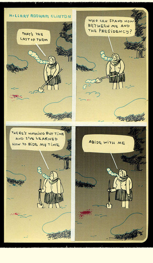
2-page spread from Craig Thompson’s graphic novel Goodbye, Chunky Rice (pgs. 58-59, Top Shelf Productions, 1999)

This 2-page spread from Craig Thompson’s graphic novel Goodbye, Chunky Rice demonstrates many of the issues regarding small multiples and words, numbers, and images—together raised by Edward Tufte. Over the course of 120 pages, the graphic novel uses small multiples (a series of frames we are accustomed to seeing when reading comics) to convey a complex story involving multiple characters and locations (so it is indeed bountiful with data, aka information). In this sequence (pgs. 58-59), the arrangement of visual information within separate frames, as well as the overall relationship of the frames to one another, does an excellent job of enforcing comparison, difference and scope, building a complex and beautiful narrative. The two larger image frames at the beginning and end of the double-page spread allow the viewer/reader to make a comparison and therefore to understand the location of the turtle character within a wider environment, as well as a more intimate one: When you compare the last image to the first you understand that the turtle is on the deck of the ship, which is in turn floating at night on a vast and lonely expanse of water. Additionally, the specific sequence of smaller frames tells a story, or gives insight into a scope of time: The viewer is easily able to compare the frames to one another to understand the actions and thoughts of the turtle as he rummages in his bag, attempts to read his compass, and then is distracted by the dinner bell. The artist/author succeeds in providing larger context while also telling many details, all within one eyespan, which is one of Tufte’s main conditions for a successful small multiples visualization.

Tufte also says that small mutiples should emphasize “change of data, not changes in data frames”. Though the scale changes in the frames of Goodbye, Chunky Rice are noticeable, they are in service of the information. Arguably, the author would not be able to convey as complex a story if he did not utilize the various frame sizes. The presentation adds even more visual understanding when one of the larger frames merges and overlaps with content from a smaller frame at the top right corner of the spread: The ship’s bell tower continues from the larger frame below and also inhabits the smaller frame, while the combined verbal/visual representation of the ringing bell (DING, DING, DING) connects the reader to the narrative of the turtle which is approaching from the left side of the page. The frame divisions in this graphic novel may not be silent, but they are certainly not disruptive.

Finally, it is important to note that the graphic novel uses multiple modes to communicate its story, and it does so with excellent word-image integration. As noted above, the verbal presentation of the words DING DING DING DING are also highly visual: They connect three separate frames of the story and they are hand-drawn using large letters which seem visually connected to the sound of loud, ringing bell. In contrast, the cursive text at the bottom of the same page has a more timid visual presence, telling us the meaning of the bell signal (cognitive meaning), but also communicating the turtle character’s uncertainty (optical meaning). As Tufte notes, word-image integration tends to happen more naturally in items like comics and sketchbooks, where all elements are drawn/written by hand.

Posted in Fall 2014 Archive (338), Sample Posts by Your Professor | Tagged , | Leave a comment