
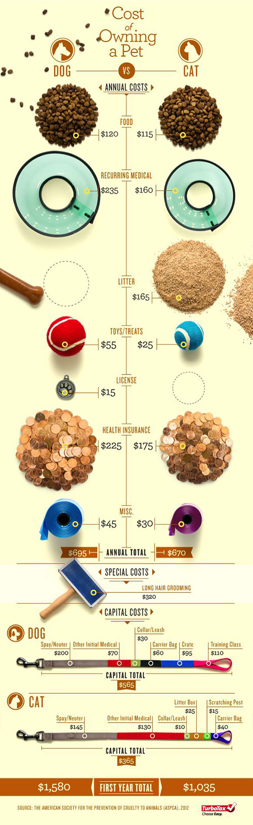
 The data bountiful visualization using small multiples I found was a info graphic about the cost of owning a pet. As Tufte stated in the readings, comparisons must be enforced in the scope of an eye span. In this instance, the visualization I chose is successful. The comparisons between various costs of owning dogs and cats is clearly shown in a manner that makes comparisons straightforward and quick. Tufte also spoke about the struggle between maintenance of context and enforcement of comparison. Because detail is crucial, patterns are a smart way to keep information organized. Juxtaposing the hierarchy of text and image/visuals is important as well. This info graphic did a good job of differentiating between text, information, and image. I also found it helpful that they also included a pattern of lines drawn towards images so as not to confuse the viewer. Also, because of how this visualization was set up, the implicit grid between dog and cat makes it easy to find which cost is being discussed. What I dislike about this ad is the takeover of the images over the text. The countless vibrant colors distract the viewer from the information at hand. I think limited but focused color would have been more effective in order to get a reader to focus more on the information than the photographs. Tufte also spoke about how there are multiple forms to display evidence. However, no matter what, evidence is information so it is the designer’s task to make the reader (above all) understand the materials at hand and to appraise their relevance. With my visualization I believe this was a success – a reader can quickly and easily understand the concept of the design and apply it to the question of whether it is more expensive to own a cat or dog in the first year of ownership. This small multiples info graphic also employed multimodal techniques for displaying the information. They used verbal, visual, and quantitative information. Though it is not horrible, I believe the unification of text and image could be improved. While the text doesn’t necessarily confuse the viewer, it doesn’t do anything in particular to assist in the understanding of the content. I believe the designer focused mainly on the photographs in this project than the unification of text and image. This author did tightly integrate relevant text with the relevant image so as not to confuse the reader with misleading information. In this small multiples design, the words to not necessarily decorate the illustrations; it is mostly the opposite. The words in this design are not themselves intensely visual but viewing the pictures without the text still clearly gives clues to the content. I believe the text in this visualization are too similar (especially in text weight) and more data separation should be done in proportion to their relevance/importance. Quickly, Tufte also in the reading discusses the difference between implied grid lines versus disruptive divisions used in graphs and grids. He talks about how locations can be signaled just as effectively with silent methods of pairing information.
OFFICE HOURS
Tues and Thurs, 4:05-5:00pm, Avery 479 (office) or Avery 105 (lab)
EMAIL: kristin.carlson@wsu.edu for an appointment
Blog Posts
- 201 Blog
- Archives
- Fall 2014 Archive (336)
- Fall 2014 Archive (338)
- Fall 2015 Archive (336)
- Fall 2015 Archive (338)
- Fall 2016 Archive (336)
- Fall 2017 Archive (336)
- Fall 2017 Archive (336)
- Fall 2018 Archive (201)
- Fall 2018 Archive (336)
- Fall 2019 Archive (201 Blog)
- Spring 2016 Archive (336)
- Spring 2017 Archive (336)
- Spring 2018 Archive (336)
- Sample Posts by Students
- Sample Posts by Your Professor
- Uncategorized
