Alphabet Design – Marci Hohner

Screen Shot 2014-10-23 at 11.26.35 AMI am using a chapter from a book called “Meditations from the Mat”, that is about living mindfully and at peace with yourself and those around you. It exemplifies the characteristics of the culture of Buddhism and simplicity which I am excited to use to inspire my typeface. Some things I want to exemplify in my typeface are simplicity, structure, but not hard hitting, consistency, and airy.

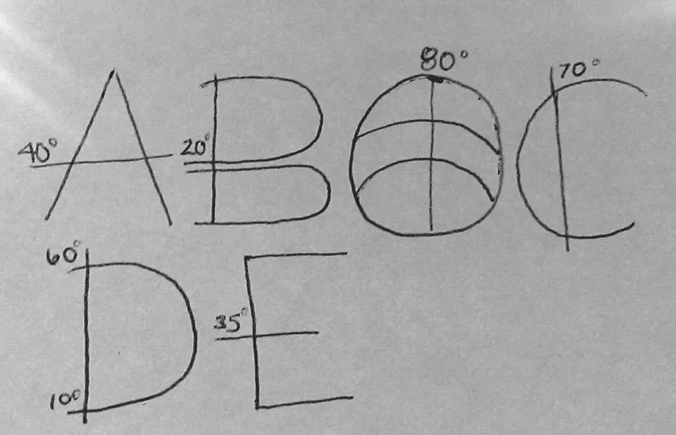
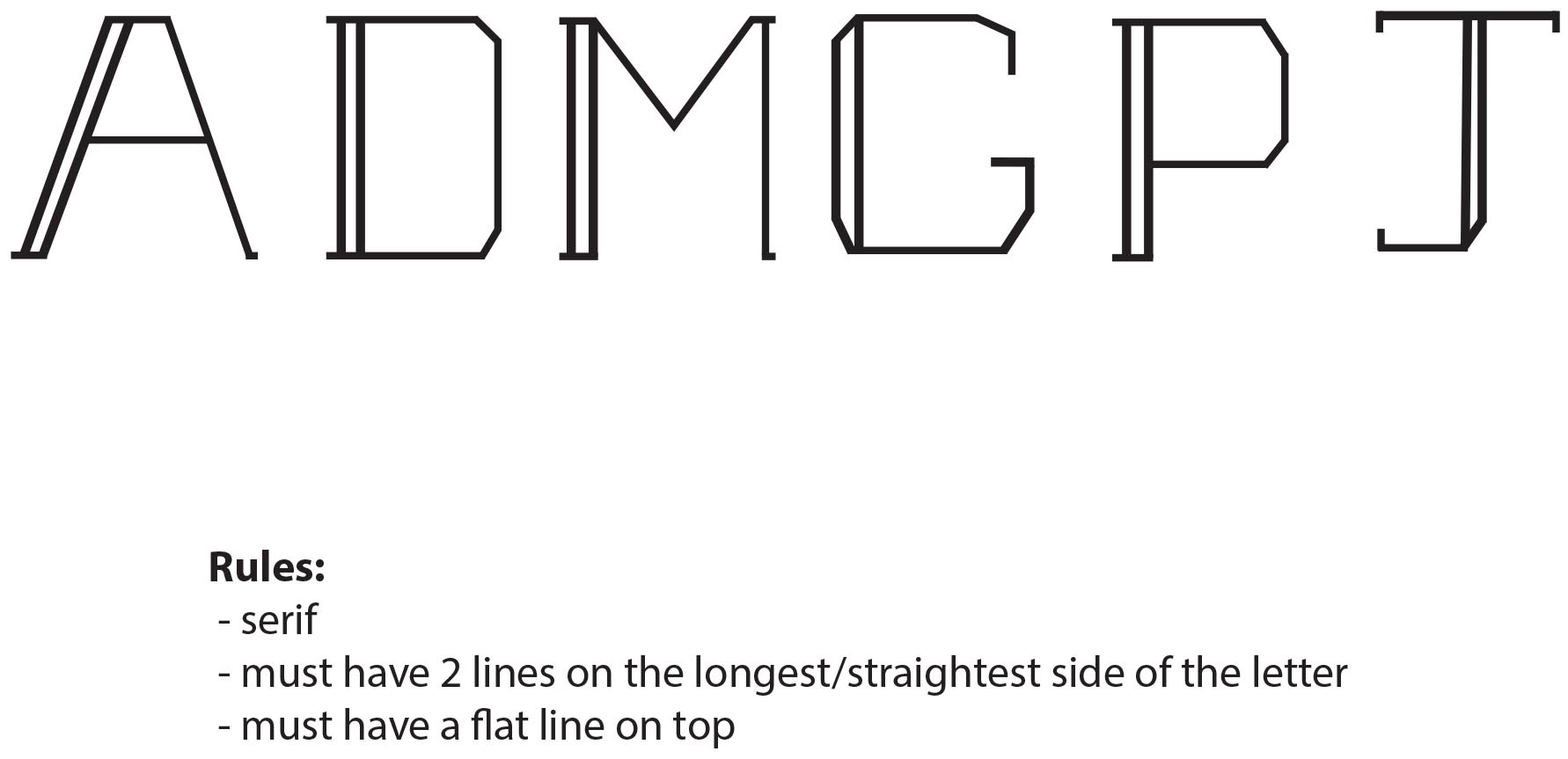
A few rules I will abide by are A 6 by 3 modular grid

The x height will be 1/2 of the ascender

A consistent stroke (no contrast in line weight)

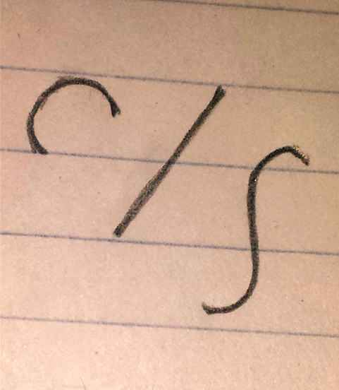
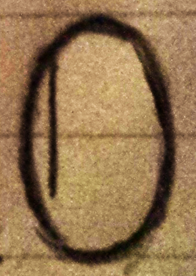
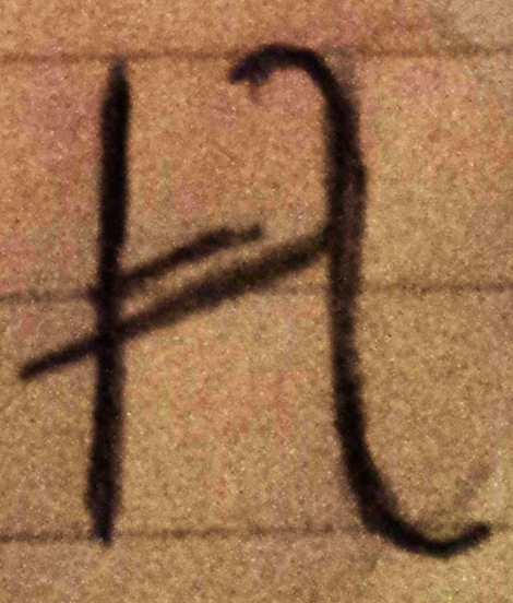
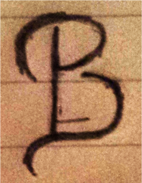
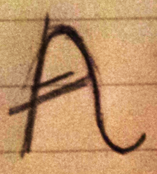
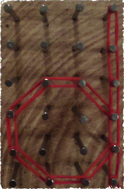
This was my original concept, which I may still work from. However I found while working with it that I want to do something more materials based and unique, and will fiddle with that idea this weekend to have a final idea of what I will be working with for this next project.

Posted in Fall 2014 Archive (338) | Tagged | 1 Comment

Alphabet Design – Katie Tufts

I plan to use the Modular Method to create my alphabet for this next project. Based on the description from the packet I am most drawn to this method because of the use of the grid. My mind creates better with some structure and I believe the grids will help me make each letter even, symmetrical and of similar shape and size. A fixed element I might choose could be using only one line to create each letter to make the mood of the typeface I want. This element with the added grid structure will make sure each letter follows the same theme and look and will flow well together when made into a sentence. For another class I was asked to do this same thing and create an alphabet. I used the one line element when making the letters and for this assignment I want to do something similar but more refined and more emotion relating to the text. I will probably use more than one line to create this new alphabet but I think that the thin condensed lines will be something I incorporate into my new design because I like the way it looks and feels when I read through it and it seems like a similar font would be used when writing letters. Because my text is in the form of a letter I want my alphabet to look like it was written for a letter, so maybe I’ll make it look more like handwriting. Another way I could take this new alphabet is something similar to a typewriter because in the book I believe he gets a typewriter and starts writing some of his letters with itch typography

Posted in Uncategorized | 1 Comment

Alphabet Design- Sandra Albertson

Sandra Albertson Typeface

Sandra Albertson Typeface

Inspiration for my typeface comes from a story called, “The Star Thrower” where one small man makes a big difference. The story takes place on a beach and has a very heartwarming message so I want to use a typeface that will represent that. I decided to go with a modular typeface that I created on illustrator. The font uses a 6×2 grid where the ascenders and descenders have a max height of 4. I am using lowercase letters and I wanted to keep the x height of the letters fairly small so that the ascenders/descenders appear longer and make the font more delicate looking. My goal is to make the font universal and peaceful so that it truly captures the essence of the story. The letters like “o” are wider than they are tall which is something that I feel contributes to the font’s success. I didn’t want a tall, skinny font but rather a solid skinny one. I kept the lines of my letters pretty thin to keep them looking delicate. Some parts of the letters are slightly thicker as well to create contrast within the font and add more interest. As you can see, on letters like “p”, the line is not closed but left open. I thought that this would make the typeface feel more handwritten and add to the “friendliness” of the text. Overall, my typeface is very clean and feels complete. I wanted a typeface that was small but mighty and I think it does a great job of demonstrating the feeling of my selected story.

Posted in Fall 2014 Archive (338) | Tagged | 1 Comment

Alphabet Design – Evan Matthews

My text is from a CNN article about Elon Musk and his privatizing of rockets and building it into an industry since NASA stopped the production of space shuttles. Elon musk is an engineer and has created Tesla, electric cars. He is very technological and intrigued by space.

I decided to make an alphabet with inspiration from BattleStar Galactica text I saw. My text is about Space and technology so I wanted a text to somewhat resemble the futuristic and space feel.

alphabet design by Evan Matthews

alphabet design by Evan Matthews

Some rules I had for when designing some of the letters were:

– The letters must have serifs

-Letters must have a space (white line) throughout the letter except on letters with descenders/ascenders that will only have the space through the descender/ascender.

-Letters without descender and ascender must have an “opening” much like how the “o” where the letter does not connect.

– Have also decided after posting this that would like the letters to have a more square feeling so the curve in the p would be more similar to that of the o, same with goes for the h.


Posted in Fall 2014 Archive (338) | Tagged | 1 Comment

Alphabet Design – Lisa Gaviglio

These are just rough sketches since I am traveling and don’t have access to the adobe programs.

I am creating a modular font that will be in all capitals. The goal of this font is to combined modern and old style text to bring alive an old romanticized view of adventure. My text is from a Sherlock Holmes story, The Memoirs of Sherlock Holmes, as it follows Sherlock and Watson deciding to travel to Dartmoor to investigate a murder. The text incorporates the elements of adventure, travel, and maps that I want to include in my modular font. The rules for my font are as follows:

1. Each letterform will contain no contrast in its lines. They will all be thin lines like on the latitude and longitude lines of a map, relating it back to the mood and idea of the text. (No contrast= modern)

2. In at least one place on a letterform where the thin lines overlap, there will be a small number representing a degree like on a map. Beyond the thin lines these degrees will help signal the fact that the letters are also depicting map qualities. These extended lines will also act similar to serifs on some of the letters brining in that old style/vintage feel (an example of this would be B and D).

3. There should be plenty of white space (ground) to indicate a large vastness of space like on a map.

Hopefully these rules/characteristics will come together and create a text that looks like it was derived from the lines of a map brining about a sense of adventure.

Posted in Fall 2014 Archive (338) | Tagged | 1 Comment

Alphabet Design – Amy Koller

Typeface

Alphabet by Amy Koller

To be honest, I’m not completely sure what I want to do for my alphabet yet. However, I decided to try out at least one design for the time being. For my text I wanted to use a Christmas song. When I browse through Christmas designs, I usually see serif fonts or fancy cursive letters. I thought that I should make something more original and do a block sans-serif alphabet that looks like it’s lit up. With my song, I think of festivities and lights which is what gave me the idea to put the circles inside the block letters.  I’m using a Modular Method with this alphabet that I’m currently experimenting with. With that in mind, I decided to make my rules as follow.

1. Use the grid system to make sure my alphabet is evenly distributed and organized.

2. Have a high cap height.

3. Make the letters have the same height (here it’s about 1″ by 1″).

4. Use smaller circles evenly throughout the typeface to create unity and to brighten up the alphabet.

Some other designs I have considered is burning letters into wood and using magazine paper to create letters. I’m still exploring different design possibilities and might update my rules.

Posted in Fall 2014 Archive (338), Uncategorized | Tagged | 1 Comment

Alphabet Design – Danielle Clement

Modular Typography draft 1

For my alphabet design, I wanted to create something that was simple, yet still had character. The rules I set for my design are 1. the letters will all be in a serif typeface, 2. each letter must have 2 lines on the longest/straightest side of the letter, and 3. each letter must have a flat top. I have designed six letters, trying to use letters that have straight edges, and letters that typically have more curved features. The letters D, G, P, and J all consist of both straight edges and curves. I chose to do these letters first to show how my a rules can apply to all letters within the alphabet. The letters must also fit into a 1″ x 1″ box–to ensure this, I went into “view” and clicked “show grid” as also turned on the ruler tool. The letters I have designed are quite thin, but I think by adding a double line on one side of each letter helps provide contrast between the elements of each letter. If you look at the letters A and M, you can see how I implemented rule #3. Instead of having pointed tops on these letters, I added a small line to create a flat top. I think this letter design is fairly modern and would work well as for text in a headline. I am excited to continue working on this design and finish creating the rest of the alphabet!

Posted in Fall 2014 Archive (338), Uncategorized | Tagged | 1 Comment

Alphabet Design – Kelsey Johnson

The text I chose to inspire my alphabet’s design is a paragraph from the novel The Beautiful and Damned by F. Scott Fitzgerald.  The novel is set in New York in the 1920’s, and the passage is describing a night scene in the city.  I wanted my typeface to show characteristics of the city (buildings, architecture) as well as the 20’s Art Deco style.  The text has a graceful, romantic tone to it that I want it to reflect as well.

fontsketch_Units

Chosen basic building blocks

To build the typeface, I will be using a modular method, with a module of 4 by 3 units.  I want the letters to be slender and tall like the skyscrapers of New York.  The typeface will have a high x height to add to the overall height of the letters.  I am using three basic units to build the letters, a half circle, a straight line and a curved, s-shaped line.  Details like high, slanted cross bars, decorative smaller lines inside the letters and flourishes that create serifs give the proud and flamboyant style of the Art Deco movement.  So far, I have chosen to build capital letters.  Depending on how those go, I am thinking about lower case letters as well.


fontsketch_O fontsketch_H fontsketch_B fontsketch_A

Posted in Fall 2014 Archive (338) | Tagged | 1 Comment

Alphabet Design – Hannah Croskrey

My alphabet design follows a materials-based method as well as a modular method. I am using thread wrapped around nails that are nailed into a board. The nails are in a sort of grid that creates the modular part of the alphabet while the string and nails create the materials. After creating the letters I put them into illustrator and then image trace them. This keeps their organic feel but also gives them structure. The rules for this alphabet are that each letter that has a curve should be as curved as possible while wrapping around the nails. The x height is 4 nails high and the cap height is 6 nails high. Each part of the letter should be two strings thick, not just on one side of the nail, and when possible not overlapped. If the letter needs to be taller than the x height then it should reach all the way to the cap height. This typeface fits the text I chose because it looks very nostalgic and homemade. I want to use an old Christmas carol for my text and I think that the red thread on the wood looks very festive and cozy. This typeface will make a great headline with its blocky look.

Here is an “a”, a “d”, and an “n”.

letter a

letter a by: Hannah Croskrey

letter d

letter d by: Hannah Croskrey

letter n

letter n by: Hannah Croskrey


Posted in Fall 2014 Archive (338) | Tagged | 1 Comment

Helvetica- Andrew Sears

FullSizeRender

For the evo logo I believe that the designer chose to use the Helvetica typeface because of its simplicity and also the neutral feeling that it puts off. Evo is a company that sells casual clothing and also athletic gear that is required for all sorts of action sports. The company is also deals in art, movie venues, and travel services. Because the company is involved in so many different things it would make sense for them to use a neutral typeface for their logo, and Helvetica provides that simple and unbiased look. Within the logo it is clear that the designer wanted the name of the company to be obvious. The scale of the text is large enough that it makes up half of the entire logo. The scale of the text shows that in the hierarchy of the design the name of the company is equally as important as the purely visual part of the logo. Within the evo logo the text is also used to help create a very balanced design. The lines and crown on top of the text are completely balanced and the use of the Helvetica text below allowed the designer to continue that sense of balance. The “v” in the center is naturally equal on both sides, but the “e” and “o” are not. However, the designer made them seem equal by using an “e” that is basically completely round. The type classification for the Helvetica typeface is Neo-grotesque sans-serif. There is only one type family used in the evo design and it is either regular or bold.

Posted in Fall 2014 Archive (336) | Tagged | Leave a comment