
These are just rough sketches since I am traveling and don’t have access to the adobe programs.
I am creating a modular font that will be in all capitals. The goal of this font is to combined modern and old style text to bring alive an old romanticized view of adventure. My text is from a Sherlock Holmes story, The Memoirs of Sherlock Holmes, as it follows Sherlock and Watson deciding to travel to Dartmoor to investigate a murder. The text incorporates the elements of adventure, travel, and maps that I want to include in my modular font. The rules for my font are as follows:
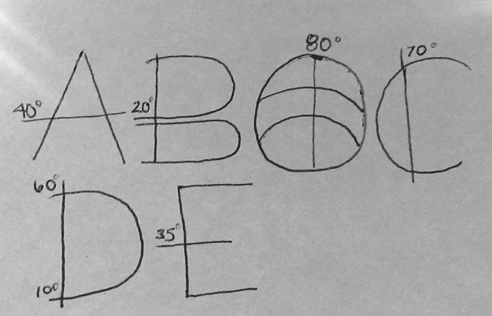
1. Each letterform will contain no contrast in its lines. They will all be thin lines like on the latitude and longitude lines of a map, relating it back to the mood and idea of the text. (No contrast= modern)
2. In at least one place on a letterform where the thin lines overlap, there will be a small number representing a degree like on a map. Beyond the thin lines these degrees will help signal the fact that the letters are also depicting map qualities. These extended lines will also act similar to serifs on some of the letters brining in that old style/vintage feel (an example of this would be B and D).
3. There should be plenty of white space (ground) to indicate a large vastness of space like on a map.
Hopefully these rules/characteristics will come together and create a text that looks like it was derived from the lines of a map brining about a sense of adventure.

Lisa: Why does no contrast = modern? I do see why evenness of line is needed to evoke latitude and longitude. How do you decide where you will put the numbers/degrees? Is it purely based on what looks good visually? Does this change depending on how the letters are combined with one another? (That could get tricky later when you implement the letters.) How do you decide when lines are paired close together, as in the B? Is family unity (a consistent visual impression) undermined by the suggestion of 3D space on the letter O? Consider these questions and refine your rules and print them for Tuesday’s class.
LikeLike