Graphic Novel Review: Rachel Fox

“Zen Comics.” Zen Comics, by Ioanna Salajan, C.E. Tuttle Co., 1978, pp. 35

The graphic novel that I chose to read for this project was a small book called Zen comics. There is no story or plot of this book but rather it is a small collection of 1 page comics that all have a message of peace or zen. The book is by Ioanna Salajan and was published in 1974 and has a buddhist zen theme. Typically I find books like this soothing because they bring out appreciation for the little things in life like the power of nature and that happiness is within. This book has been a perfect read for this crazy time. When I would start to go stir crazy from being stuck inside due to quarantine it was great to be able to pick up the book and read something that was humorous and laced with a positive message. 

The iconography and art work in the book is a good use of the linework discussed in Mcclouds Living in lines chapter. The robes of the characters are always flowy and sweeping with a wide brush that gives a look specific to this book and the backgrounds and textures use a minimalistic quality to create a sense of peace and nature rather than lines that look nervous or tense. Even the typography chosen is thinner and handwritten in appearance that gives the comic a more relaxed feeling than what I typically find in comic books. The example that I have selected shows a good example of what the theme of the book is like as well as what the artwork is like. The positive message and minimalist yet realistic art form flows together to create a very strong theme for this book. Occasionally I find the art style and the message of a comic can clash with each other but this book is a good example of unity between the two elements. 

Posted in 201 Blog, Graphic Novel Review | Leave a comment

Graphic Novel Review: Haydyn Wallender

Hello, friends! Welcome back after this crazy month of stress, mess and chaos. I hope all of your lives are going okay.

Last time I posted on this blog, we were discussing my love and passion for English-literature-turned-into-comics, like Matt Wagner’s “Grendel”, the comic that I chose to read for inspiration and plot. Let me tell you, it was not at all like I was expecting.

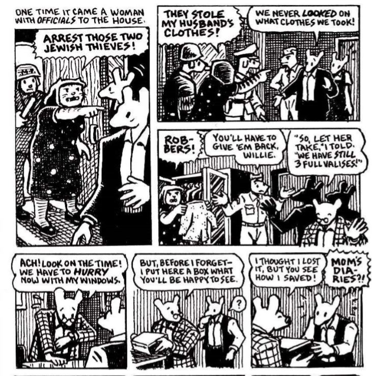
Wagner puts spins on this book that I never would have thought of in a creative element. His use of lines, specific color, iconography and storytelling combine for a compelling read. I read it straight for two hours. I. Could. Not. Put. It. Down. Grendel, as I mentioned before, is the demon from Hell that Beowulf is supposed to slay in order to save King Hrothgar of Denmark and his people. This epic poem is long, filled with exciting adventures at every turn (at least, it is if you’re an English major). One of the things that I love that Wagner incorporated was a different plot for Grendel. Making him the main character, Wagner goes through each section for different parts of Grendel’s life: how be became Grendel, who his lover was, why he became an author by day and killer by night, and how a little orphan girl puts the rainbow in this dark knight’s life. The way that he crafted the story by withholding some information to his readers only to reveal it later (known as exposition for my non-creative writing friends) and the way he incorporated pictures to enhance his view of Grendel completely amazes me. I love this version SO MUCH MORE than the one in Beowulf.

Okay, on to why I think he chose this specific genre of iconography. Like Scott McCloud mentions in his book, people who create portraits that are more realistic focus on the drawing of the picture and how it was done, rather than the story element that is supposed to accompany the images. With this in mind, Wagner does an excellent job

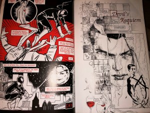
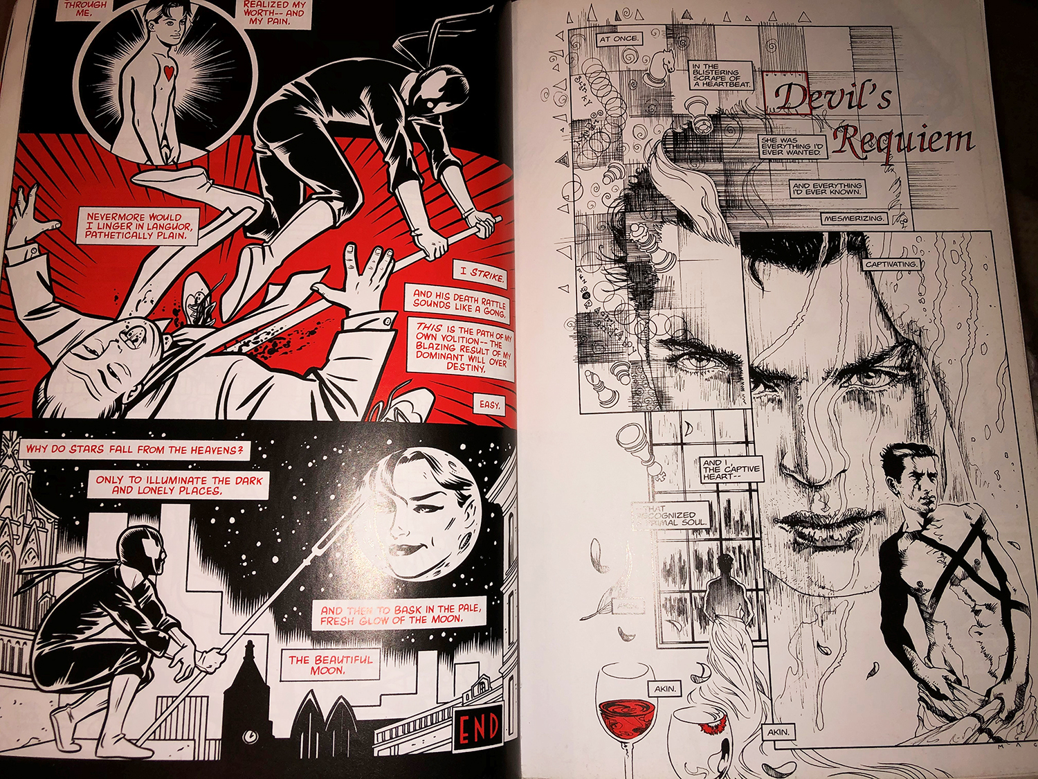
Matt Wagner’s Grendel, Dark Horse Comics Inc., 2000, pp. 28-29.

of taking the portraits of people, but not in too much detail (I would classify his drawing/creative medium as a balance between cartoon and realistic – see McCloud’s drawing on page 31 for reference). I think he chose to do this because he didn’t want to spend too much time on drawing the characters, nor as much time on the storyline. He wanted the flow to be effortless and easy for readers.

That being said, when I mentioned lines earlier, I was of course referring to the most recent chapter we read of McCloud’s book, chapter 7. In it, he talks about how lines and backgrounds hold their own weight. That could not be more true for this comic. Each part of this novel has a section that varies in line thickness, shade and tone. By tone, I mean the difference of a thin line that looks like it was created with light pencil strokes and a thin line that was created with black ink. This is similar for the three colors he uses consistently: black, white, and red. Each color has its own gradients in certain parts, and Wagner’s effectiveness of color and lines make each section of the comic unique. For a more in-depth look, please see the attached image above (which happened to have exactly what I was describing on the SAME PAGES BACK TO BACK. Wagner’s a genius). Sometimes his drawing style preference will change from more abstract to more realistic, depending on the scene and content. He will also switch out from word specific frames to picture specific frames, which is something that I found to be useful as a reader to follow along with his thoughts.

Honestly, I could spend hours deciphering this book and what I think Wagner’s creative intentions and expressions were meant to convey. However, I will leave it at this: If you have a chance to pick up this book, please do so. It is worth your time and energy.

Stay safe and healthy out there, little loves.

Posted in 201 Blog, Graphic Novel Review | Leave a comment

Graphic Novel Review: Luis Trejo

The comic book that I read was “Bone: Out From Boneville” by Jeff Smith. This is the first book in a series of nine adventure books. The story consists of three cousins that moved away from their hometown because one of the cousins wanted to become rich. The book starts off with them roaming in the desert and they eventually become separated in the desert. Rat creatures that live in the desert plot on kidnapping them and eventually killing them. They eventually find people that live in the valley, they become friends with many and get them to help them to survive the plotting of the rat creatures.

Bone 1: Out from Boneville Graphic Novel by Jeff Smith pg.14

Scott McCloud’s “Understanding Comics” chapter “Living in Line” talked about all the types of iconography that are commonly used when people create comics, and I noticed that many examples that he used were also used throughout “Bone: Out From Boneville”. The iconography in the comic book was warm and gentle. There were many symbols that were used throughout the book that thoughts and emotions. There were also many sounds that were in a strictly visual medium. The book also used color to set the mood for the panel throughout the entirety of the comic. For example, they would use pitch black panels to represent a dark cave and build up excitement because the characters as well as the reader has no idea where the character is moving and what surrounds them.

The visuals in the comic book were simplistic and had a very clean and finished look. I believe that the author decided to create this type of visual for the comic book because the characters have a very simplistic look, that makes it easy for the readers to relate to them. The use of color also makes the book more enjoyable and desirable for the readers to read. Overall, I enjoyed reading this book and would recommend other to read it as well.

Posted in 201 Blog, Graphic Novel Review | Leave a comment

Graphic Novel Review: Anna Davenport

The graphic novel that I am choosing to write about is A Wrinkle in Time. I did my blog post 4 on this one as well. I chose this one because I really liked the way that the artist did the drawings. I had a hard time finding a graphic novel that I was interested in reading but I really did enjoy this one. The story is about a young girl Meg, that goes on an adventure with her childhood friend, Calvin and her brother Charles to rescue her father who is stuck in a different world. The girl gets help from multiple made-up characters such as Mrs. Whatsit who helps them throughout the adventure. They go through multiple worlds that have different quests through different worlds. This graphic novel also has a movie and I am not sure what one was made first. However, since this was written for an older group of kids and the information that is in the book is a bit more complex the author used more of a realistic look where there are details. Here I have a example from the book that represensts the artwork that thte artist did.

A screenshot from a Wrinkle in Time By Hope Larson

As you can see the artwork that Hope used was more detailed than a lot of other cartoons that we see. Even though it is mostly in blues whites and blacks we can tell very well the emotions and can identify who each character is. In McClouds book that we are reading called Understanding comics, he mentions that when you are doing comic there are more developed characters and less developed characters. For example, his character is less developed in that it does not look exactly like him but you can still tell who he is. I think that this graphic novel is a bit more towards the detailed side because there are hair details and face details on the characters. Another thing that we can see in this screenshot that relates to the reading we had this week is that we can tell emotions through the artwork. In chapter five McCloud gives many examples of how an emotion can be shown through art. The place that I think that Hope Larson does this is when Meg is embarrassed by her mother and you can see the emotion on her face through the lines on her cheeks. Even though there are not the traditional red cheeks through the lines we can infer her emotion.

Posted in 201 Blog, Graphic Novel Review | Leave a comment

Graphic Novel Review: Shira Feinberg

After searching for a graphic novel, I stumbled upon “Maus 2” by Art Spiegelman. The story begins with Art going over to his father’s place and complaining about how his friends don’t want to hangout and then Art’s father mentions how you don’t know if they are real friend until they are locked up with almost no food water and need to sleep in one area, which is mentioned in “Understanding Comics” chapter 6 “Living in Line” as it shows problems that come with age and how Art may have a smaller issue of his friends not wanting to meet up but Art’s father who doesn’t have a lot of friends tells his son how it is not a big issue. This is a gate was into the novel about Art hearing his father’s over viewing experience in the Holocaust. It constantly jumps back and forth from the present and the past. The story, therefore, takes place in New York city (where they currently live) and Poland (where Art’s father was before and during the Holocaust). The story outlines how Art’s father became a soldier then becomes a prisoner, just to find out that once he is released that his hometown has been captured by Germany. Luckily, he was able to sneak into his hometown, just to be captured again during the Holocaust. Overall, the story discusses Art’s fathers’ story about before the Holocaust and during the Holocaust, along with a bit of their life in New York, many years after the Holocaust.

To help convey the difference in ethnicity, Art made Jewish people to be mice and German people to be cats. This helped show how Jewish people were considered to be less than the German people as cats eat mice, or in terms of the Holocaust, they put them in camps. Furthermore, every time he shows the Jewish people (during the Holocaust), he shows them working hard, in pain, and in prison clothes.

Maus 2 by Art Spiegelman

As I mentioned in my first blog post about this novel, Art Spiegelman uses several concepts to help with the story, some of them are aspect to aspect, scene to scene, and subject to subject. A very important concept in this book is scene to scene, as Art constantly jumps from the past to the present and back. This is scene in the image as Art’s father is being yelled at for being Jewish and to be arrested and then later, we go back to the present where Art’s father talks to him. Furthermore, we observe that Art does not use color in his graphic novel, at all. This helps the reader put more focus on the words and graphics, such that Art’s message is understood more and in greater depth. He also uses different patterns to help create depth perception and different things, such as the cat’s dress, the different suits, the door, the walls, and more. Furthermore, we notice that the people, or animals, have simple faces, compared to the background, thus put emphasis on the characters and what they are saying.

Posted in 201 Blog, Graphic Novel Review | Leave a comment

Northwest Alternative Comics: Anna Davenport

paul-chadwick-cover-concrete-10-1986-sm

I was not able to participate by going to the museum and seeing the works of art in real life. Therefore, I look at the pieces online. I really enjoyed looking at this piece by Paul Chadwick because of the colors used and how it made me feel peaceful. some elements of design that I noticed in this piece was first the color that the artist used. The hues of yellow and orange make for a piece that feels calm and organized. The next thing that I noticed was the design element of texture. Even though the piece uses a simple variation of colors the texture that the artist creates makes the piece more interesting to look at. Next, we can see the lines that are creating the “light” that is pointed at the monster looking shape this adds both lines and direction leading your eyes where to look. After, I noticed the direction of the light I noticed that the face of the being also has his eyes pointed back up in that direction creating invisible lines that are more inferred. A principle of design that I saw was that even though there is one main focus the direction of the lines helps your eye move around the piece thus creating a feeling of balance. When we talk about unity I think that this painting would fall under the active aggressive subject. I think this is because the definition from our readings is painting with an active aggressive subject that would work better with a dominant oblique direction, course, rough texture, and angular lines. This painting has a dominant direction from the eyes and the lines of light coming down. It also has course rough texture from the paint or digital strokes that the author used. One thing that I don’t feel this piece had was a contrast. Since the colors are all in the same family on the color wheel and there is only one main focus in the peuce I feel that the author did not hit this principle of design. Another principle was harmony. This was a big element that I saw because of the colors and strokes that the artist used. It was a visually satisfying piece that I enjoyed thinking about in terms of elements and principles of designs. The way that the author helps with my interpretation of the comic is not really clear to me. Since I don’t know the time frame that this happens in or the closure of the comic I’m not sure what I am supposed to get from the comic. One thing that I thought was interesting was that even though it was a peaceful piece and there was good harmony I still got the feeling of being alone and isolated. However, I am not one hundred percent sure what the comic author wanted us to get from this.

Posted in 201 Blog, Closure & Time Frames | Leave a comment

Northwest Alternative Comics: Maria Alvarez

mita-mahato-unidentified-feeling-object-2012

I really liked this image because it was simple and it is very creative. It reminds me of a shooting star or a falling star but instead it’s a heart. For me it symbolizes a broken heart. I think the harmony help show what is happening in the comic. The direction of the pictures is a little confusing because the first three pictures down are similar, so it reads down but then the trees and leave on the other side don’t read down, because the images are on all the squares. The balance between the images makes it easier to understand what is going on this comic. Well it helps me understand it better and make my own meaning. The repetition with the heart is showing that the heart is falling and it helps make a story in this artwork.

Posted in 201 Blog, Northwest Alternative Comics | Leave a comment

Northwest Alternative Comics: Nick Caton

Comic by Peter Bagge

The comic I chose that I liked was this comic by Peter Bagge. I liked this comic because it is old and had a lot of vulgar language you wouldn’t see today. I think it shows how people used to create their comics back in the day before people were so sensitive and when things were funnier. Other than this I like how he created each character differently. I think each character shows their personality through how they were drawn. Some elements I noticed used are contrast, value, and size. I think he uses contrast well because the whole comic is black and white. I also think this artist uses value very well. He uses value very well in his characters and the background of the frames. You can tell how he uses value when you look at the hair of the characters, some are straight black and some are lighter but still using black pen. Lastly I think he uses size very well. He uses size when it comes to the characters of the comic and their surroundings. I think it is important to use size when you are creating art or comics because you nee things to be proportional when dealing with people and their surroundings. I really enjoyed this comic, it was funny and a classic comic I could understand and read easily.

Posted in Uncategorized | Leave a comment

Northwest Alternative comics: Henry Igwala

Survivor Tales by David Lasky

The comic I chose to write about was “Survivor Tales: Eye over Houston”, by David Lasky. I enjoyed this comic because it was entertaining, informing and based off a true story.

In Lasky’s comic, I was able to find elements from John Lovett’s website. Some elements present in the comic were value, texture, size, shape, and line. The comic only used black and white with varying shades of grey to help create contrast. The elements and principles that I have learned did change my interpretation. The understanding of texture and value helps me build a visualization of how an object would feel like if I were to touch it in real life.

One example of time frame being used in the comic is when they showed a couple of buildings in the rain. As time went by, the rain got more intense, and it was illustrated by adding more value and texture to the rain and buildings. This helped build a sense of time lapse throughout the comic.

Posted in 201 Blog, Northwest Alternative Comics | Leave a comment

Closure and Time Frames: Nick Caton

Picture from Graphic Novel “Last Look” by Charles Burns

I picked the graphic novel Last Look by Charles Burns. When I was looking for a book this one stood out to me because of the colors used and the amount of detail put into each frame. I think this scene shows a very good scene to scene closure. In the first frame the character is looking around and finds a crack in a wall. The next frame he has found a whole other room/ area where he is. I think that the author shows the transition very well because when he shows the character looking through the crack you don’t know what he will find. The next frame shows what was through the crack when it was up to the readers imagination to think of what he could possibly find.

Picture from Graphic Novel “Last Look” by Charles Burns

When I was looking for time frames i came upon this page in the book. I think this series of frames is a perfect example of time frames. It calls for serious reader viewership to figure out one, how to read the series of frames, and two, what exactly is going on through these frames. When I was looking for an example in this book it was hard to find one at first because most of the novel is pretty straight forward about how you read the frames. This was the first page I saw in the book that I didn’t understand very well because the frames are different than the others with text boxes in between frames and also each frame seems different. I thought this page was a perfect example of time frames in a comic or graphic novel.

Posted in 201 Blog, Closure & Time Frames | Leave a comment