
POINT, LINE, PLANE:
Point, Line and Plane the fundamental building blocks for design. All three of these factors together combine as a perfect synergy that builds relationships to each other to form visually enticing textures and patterns. These three aspects, together can depict light, shadow and volume which ultimately makes the enticing images we recognize today. With only one aspect, the image wouldn’t be as dynamic as if there was depth or created shadows from these manipulating aspects. With a simple line, which crates depth makes an image go from 2-dimensional to 3 dimensional in just a glance.
A point marks a position in space, a visible dot. Dots can be from one of the most irrelevant shapes but can create a whole image. For example, in photographs there are many tiny points all working together to make up an image, when you zoom out a little, the image looks pixilated and grainy. The point can play some perceptual jokes on the mind. The points can work together to make out an image. Or be a focal point of one, on a bigger scale.
A line is an infinite series of points, a connection between two points. It can be used as a positive mark or in a negative gap or shadowing. Lines occur in many weights of thick, thin and texture. Lines in typographic sense are implied and sometimes drawn. The white space beneath this sentence is considered an implied line. The space between it senses a form of organization and direction. Lines can be applied to almost every object, organic and not. With curved and straight lines, it is the biggest necessity while creating visually enticing work.
A plane is lines closing to form a flat surface extending in height and width. Planes can be parallel to a picture source or skew into space. Overall it is a space where lines close and are filled with dimension and shadow.
The photo I chose below has all three aspects of point, line and plane. Every ‘box’ corner has a point that connects each other into lines, that eventually gets filled into planes. Some of these boxes have more dimension and textures than the others because of the line usage and the thickness of the planes that are being exemplified.
photo: Graphic Design The New Basics by Ellen Lupton and J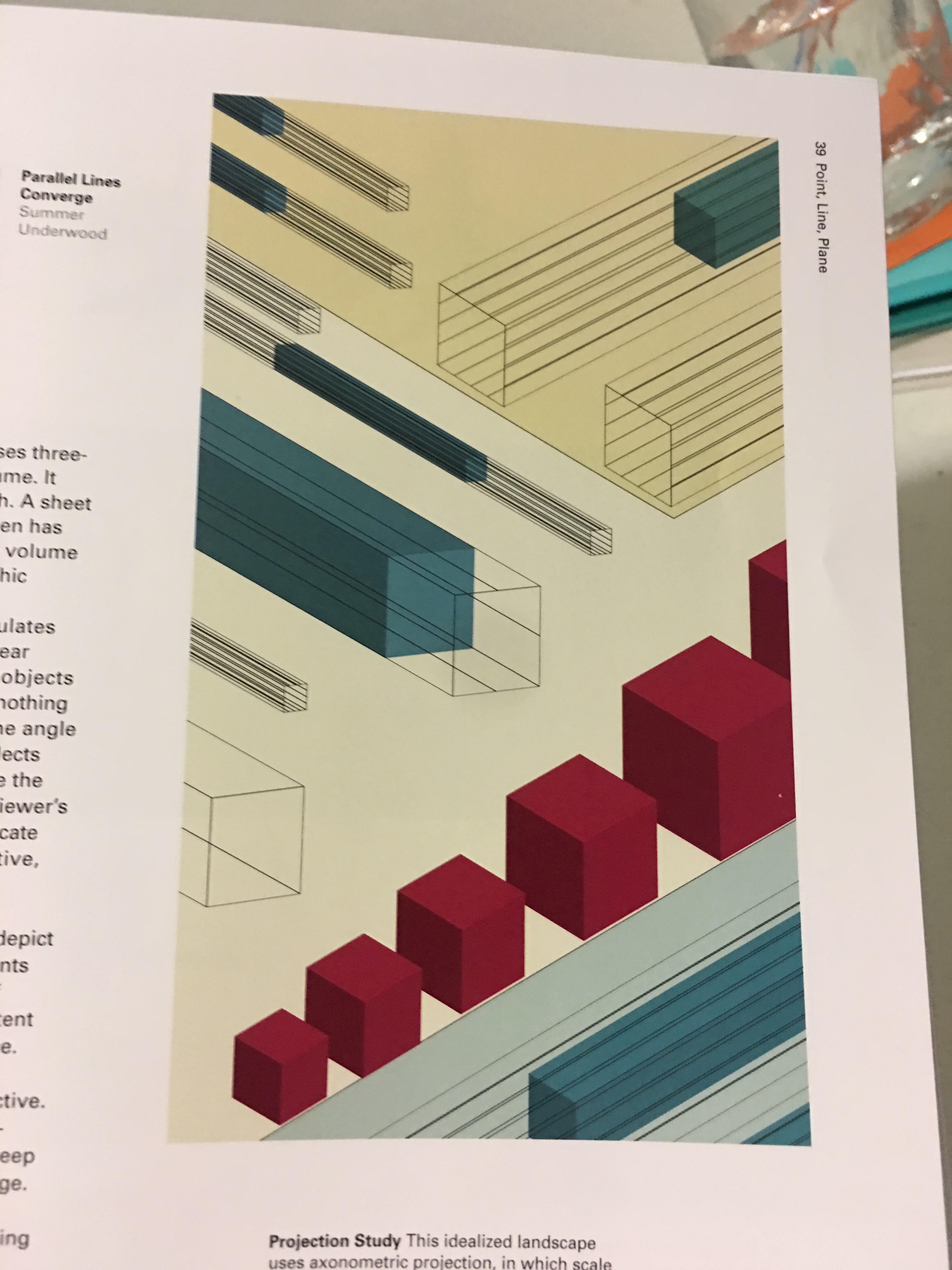 ennifer Cole Phillips


