Formstorming: Andrese Collins

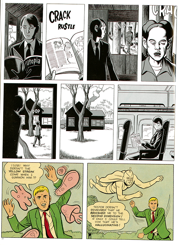
Formstorming is the aesthetics of visual intelligence. Its the strengths we use and the paths we must go through in order to generate, critique, reevaluate and finalize our pieces of art. When generating and designing a new piece of art its valued and suggested to first brainstorm within the mind before the computer to get the best authentic ideas.

Throughout most of the book, “What It Is” by Lynda Barry, Barry uses “go-to” like characters to help form her art such as small and big animal critters, aquatic creatures and ghost like monsters. She not only uses animal characters but also various miscellaneous items like stamps, food, clothing, etc. Barry expresses the use of formstorming many ways by implicating new and different elements and backgrounds in each an every page. Each page contains dialogue that is printed out in more than two different fonts giving the reader impressions of different tones or attitudes. It shows the value of expressing anything your own way, the way that talks to you but also speaks louder to others.

fullsizerender-jpg

Page 41 of What It Is By Lynda Barry

Notice that on page 41, Barry draws a cat, monkey, octopus, fish and ghost-like character as the animals present. Throughout the page there is multiple boxes of dialogue with multiple font styles such as cursive, times new roman, bubble letters and more. See that there is no frame nor border equipped in the picture allowing the image to bleed on the page.

The benefits of engaging in formstorming are universal. When formstorming you can produce something that you never expected to develop and it might just stick to you in the long run. Formstorming is the gate way to conquering any barriers or doubts that we may have in our ability to draw or make “art” and can keep you open to trying something new.


Posted in Spring 2017 Archive (336) | Leave a comment

Scale (Teenage Mutant Ninja Turtles (2011) #1 page 14)

I selected this image that I scanned from a TMNT comic to represent what I understand as scale.  The top box of this comic is a perfect representation as the villain is scaled very large to give off the affect that he is much closer to us, and the opposite for Raphael, Leonardo, Michelangelo, and Donatello as they are scaled way down to appear farther back in the distance from us.  This strategy is the most popular aspect of scale as every cartoonist / graphic novelist scales to give depth or distance between objects.  A great example of this in the real world is those photos people take where someone who is very close to the camera appears to be holding a person in their hand while in reality the person is just perfectly aligned and very far back from the other person.  There are a lot of visual tricks that can be pulled of with scale that imply depth.  I would also say that it is subjective depending on the persons interest, if its a photo of me with a volcano in the background I may scale myself up so I look comparative or as important as the backdrop of the photo.

Posted in Spring 2017 Archive (336) | Leave a comment

Scale: Hak Do

20170119_105634

“The Fixer: A Story From Sarajevo” by Joe Sacco

In “The Fixer: A Story From Sarajevo” by Joe Sacco he exemplifies many examples of scale and how it’s used. Scale can be objective, subjective, relative, have depth, or have contrast. In this page in Sacco’s comic scale shows depth especially where the small frames are of the man smoking a cigarette. It shows the importance and seriousness of the content that’s being shown. That’s one of the important parts in scale, it usually shows the audience what is the most important and what they should be focusing on in the frame. If an object is bigger it is more important than when an object is smaller. In other cases smaller object around bigger objects create depth. It also shows relativity and contrast. Such as in the first frame of this page. You see that the first two men are bigger than the three men in the background. However, the two men in the very back are the only one’s talking to each other. The scale of how big the other men are surrounding the smaller two gives the illusion of a tunnel and at the end of the tunnel are the two men which shows that they are the main focus and the illusion of the tunnel is made through the contrast and relativity of the scale of the other men around them. As for scale causing movement, the two frames in the second frame have a man with his face scaled bigger with his mouth in the center as the focal point. They are placed in a way around objects that are a lot smaller that it creates a movement of the eye from point to point. And that makes it look like frame two is the background of the two smaller frames, yet the object in the smaller frames are bigger.


Posted in Spring 2017 Archive (336), Uncategorized | Leave a comment

Scale: Tre Bobo

smile039_web.jpg

Page from Graphic Novel Smile by Raina Telgemeier

The idea of Scale to a graphic designer is a very useful skill to implement into a design. In Graphic Design: The New Basics defines scale as the size that objects are in relation to the design as a whole. Scale can be objective, which refers to the actual size it has in relation to the real life object, or it can be subjective which refers to the object in relation to objects around it.  Scale can add or decrease importance to certain objects when looked at relatively from other objects. Scale can add depth to a design by making objects smaller in scale and contrasting it with objects bigger in scale to make the illusion of a 3-dimensional space through forced perspective.

In my example given above you can see how scale is used throughout the page. In the first frame you can see a smaller version of the same girl in the background. The artist used this technique of framing to illustrate that this is a photo of her. In the first frame at the bottom of the page you can see scale being used between the dentist, the girl, and the nurse to show depth in the scene, with the dentist being in the foreground and the girl in the chair and the nurse, both smaller in scale slightly, look to be behind him.

Posted in Spring 2017 Archive (336), Uncategorized | Leave a comment

Scaling: Cora Kline


scaling-little-nemojpg

Little Nemo 1905-1914 by Winsor McCay, pg 240

The comic from Little Nemo deals with scaling in several different ways.  Initially the flowers they’re going to explore are tiny on the page, the reader can barely register them. Then on the fourth panel, they’re larger, and about the same size they would be in real life. This creates the illusion that the characters are close to them.  However, in the very next panel we see the character’s ship among the flowers and the “actual” flower size is larger than a person.


The moon itself is also cropped.  In the first panel the moon can fit almost entirely in the panel. The next panel, we see only about one quarter of the moon. The panel after that shows the moon taking up the entire bottom but the curve is much more gentle than in the previous panels. This progression shows the moon getting closer to the characters and, in turn, the readers.

Throughout every panel that features the characters, they stay about the same size. However, when contrasting the characters with the objects around them as well as the size of the panels, the characters seem either smaller or larger. In the second, fourth, and sixth panels, the characters are approximately one half the height of the panel. However, in panels seven through nine, the characters only take up one third to one quarter of the panel, even though their literal printed height is about the same size as before. With more space around the characters, the characters seem smaller.

Posted in Spring 2017 Archive (336), Uncategorized | Leave a comment

Scale: Aaron Scofield

Scale Image.jpg

Page 14 from Daniel Clowes’ graphic novel, David Boring

In their book Graphic Design: The New Basics, Ellen Lupton and Jennifer Cole Phillips discuss the term scale, and how it can be considered either an objective or subjective term. When we’re thinking about a scale in objective terms, we’re referring to the actual dimensions of an object in relation to another surrounding object. A scale in subjective terms is when humans compare an object’s size to themselves. For example, in the middle left frame of the image above, you can see that there is a person standing next to a tree. That person is very small compared to the tree and if that person were to compare how big the tree is to himself, then he would look at the tree as this big object because that is how humans compare themselves to other objects subjectively. People can go inside small rooms and then think about the scale of one of those small rooms compared to another massive building that they have been in before. An example of an objective scale from the image above would be to look at the tree in relation to the size of the house. The house is a lot bigger in comparison to the tree and takes up a lot more space in the frame, but the tree is taller than the house, it is just very skinny. Page fourteen from Clowes’ David Boring shows how scale can be relative. In the top two frames on the left, the book that the man is holding looks a lot bigger than the book in the middle right frame because of the elements surrounding the book. In the top middle frame, the book is practically the only thing in the frame besides text and the book takes up a lot of the frame because it is zoomed in. Then when you look at the book in the middle right frame, it looks a lot smaller because we are comparing it to the objects around it like the bus, window, seat, and the man that is holding the book. You can have the same object in two different pictures but one object can appear a lot larger or smaller than the other object because of the elements surrounding the objects in each of the pictures. When you see larger objects in relation with surrounding smaller objects that could even be the same object, we call this a contrast in scale. A contrast in scale can add depth or movement to an object depending on the scale and placement of the object. All of these terms create meaning within an image and make the image more visually appealing. A good example of depth in the image above is when you look at the book all alone and up close in one image and then see the book farther away with objects around it that give the frame depth as a whole.

Posted in Spring 2017 Archive (336) | Leave a comment

Test Post

CraigThompson_GoodbyeChunky

2-page spread from Craig Thompson‘s graphic novel Goodbye, Chunky Rice (pgs. 58-59, Top Shelf Productions, 1999)

This spread from the graphic novel “Goodbye, Chunky Rice” by Craig Thompson shows many of the powerful and complex design options offered by the concept of framing: The individual parts of the comic strip are each frames, and some of them are delineated by a thin black border. However, a frame can also be implied in more subtle ways. It is especially interesting how these pages draw attention to the idea of frames within frames: Some of the frames fill a whole page, reminding me that a page and its edges are a sort of invisible frame that I might take for granted. On the top left I see the setting for all the action depicted very clearly: A small boat is floating in a vast ocean and the sun is setting over the water. The smaller frames beneath this image are literally placed inside the larger frame, so I infer that the turtle looking in his bag and at his stopwatch is taking place on the deck of the ship. An even cleverer shift occurs on the right page, where the third small frame, showing the words “DING DING DING”, is also part of the larger frame below, which shows the deck of the ship. Finally, another small frame on the lower right introduces a new element, a bottle, which is presumably floating in the ocean. The frames with frames and the shifts in scale of the frame sizes makes this comic more visually interesting and adds to the potential complexity of the meaning it offers.

Posted in Spring 2017 Archive (336) | Leave a comment

Scale: Jasmin Negrete

img_3577

Page 196 of Lynda Barry’s graphic novel “What it is”

According to Ellen Lupton and Jennifer C. Phillips, in their book Graphic Design:The New Basic, the term scale can be used both objectively or subjectively. When a scale is  objective, this is referring to the physical dimensions of an object compared to its surroundings. However,  when a scale is subjective, this is referring to a persons impression of what the size of the object is. In Lynda Barry’s, graphic novel What It Is there are a variety of scales being used, to emphasis certain details in the story. On page 196, of Barry’s graphic novel, one can see the various scale proportions being used throughout the page in the text, as well as in the two images. Throughout this page some text is bigger and bolder while others are smaller and smoother, this can be seen as an example of how scale can be relative.The contrast between the different types of text on the page creates a contrast of scale throughout the page making the design more visually interesting. By looking at the image we can assume that maybe this is the handwriting of different people, since each text looks different both in its features and in its scale. On this page some text is made bold, the design makes it seems as if the person writing this pressed down harder on their pen to emphasis these words. For example the text on this page that says “Today is Monday May 8 2006” seems to be made thicker and more emphasized then most of the text on the page. The difference in the proportions in this text adds depth to the meaning behind it.


Posted in Spring 2017 Archive (336) | Leave a comment

Scale: Cesar Rubio

img-013

First page of ctrl by Richard McGuire, from Chris Ware’s compilation McSweeney’s quarterly concern. No. 13 page 186.

Scale is subjective when it refers to one’s impression of an object’s size. Scale is objective when it refers to the physical size of any object or the relationship of size between something and its depiction.

This first page of ctrl by Richard McGuire is an excellent example of the concept of scale being used effectively. At first sight, it might not seem that the equally size panels in a 4×4 would make good use of the concept, it is a pretty standard layout in terms of framing and such. Focusing on the last four panels, one can see each sequential panel depicts the subject smaller and smaller. This is done to give the effect of zooming out. It is almost cinematic in nature.

Up until panel 12, leaves are easily discernable. But in panel 13 the leaves blend into a single yellow shape. A change of scale is immediately noticed.

This effective use of scale adds movement and depth to rather flat and simple shapes.


Posted in Spring 2017 Archive (336) | Leave a comment

Framing: Jasper Barbosa-Rodríguez


The vessel that encapsulates artistic treasures, or the window into a universe unlike our own, frames are anything you can make of them, and they all communicate a meaning of some form from their creator to their audience. “A frame can mark off a space with just a few points,” according to our reading in Lupton and Cole Phillips’ Graphic Design: The New Basics (125). And it’s true. Our computer screen is a frame; our eyebrows are often considered the “frame” of our eyes; there are, of course, the classic frames for paintings and photographs made from wood or metal, and so on.

Pages 12 and 13 of Goodbye, Chunky Rice by Craig Thompson

Pages 12 and 13 of Goodbye, Chunky Rice by Craig Thompson

There’s also the nuance given to us by implied frames, which we can easily detect  just as w,ell as deliberate frames. One such example is clearly seen in page 13 from the graphic novel by Craig Thompson Goodbye, Chunky Rice. Here we see an innovative use of framing by the series of framed images ended with the omission of an image, implying that the candle in the preceding graphic is blown out and there is nothing but darkness.

This is a great use of implied framing, because of the mere fact you decipher that the filled-in space is almost another image, even though it appears to be piece of the framing in the rest of the graphic novel sequence.Within the same layout we see from the first image shown a shell, subsequently followed by another image of Dandele holding the same shell. In the first image it appears to be large, until it is compared with her hand holding it. We know that this shell in fact is not that large due to cropping of the image for emphasis. This nuance is employed further throughout the graphic novel effectively and is just one of the innovative ways Thompson utilizes frames and scaling in formstorming ways.


Posted in Spring 2017 Archive (336) | Leave a comment