Invisible Emotion: Elora Buschini

582cb520-90c8-41cf-ac0a-a4581854a8b9.jpeg

Sacred Profane; interdependent

f3cd8c06-7974-457a-a3bb-25f8a0fac48b.jpeg

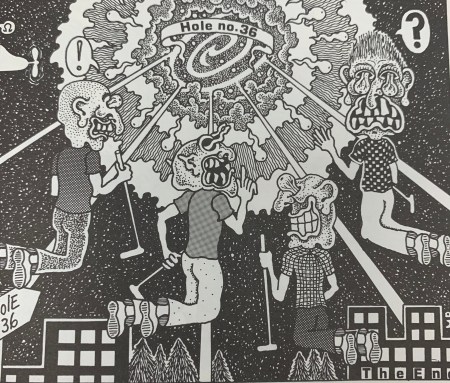
Crazy Men Deluxe; duo specific or montage

92d0d02d-3660-44dd-b434-0620f6f1a3b7.jpeg

Sacred Profane; using lines to represent movement


I chose this first image of Sacred Profane because of the way the words were correlating with the imagery. As readers we wouldn’t interpenetrate the man patting the kid on the head if the words were not there. As readers we could see that and think he was removing his hat, hitting him or maybe even blessing him. By having the words pat pat there made it very simple and easy for readers to know what was supposed to be happening. In the background of the same image you can see a car and the sounds the car is supposed to be making, this is helpful for readers because it helps them to know that the car is hectic scene. This is a good example of interdependence because the pat on the head would not translate the same without the imagery or words. The other image from Sacred Profane has a good example of how lines can represent movement. The lines were used to show wind gust, smoke, reflections and even light. Although it is just lines the way it translates into out brains is showing movement and textures. The third image I picked out is from Crazy Men Deluxe. I chose this image because of how literal it is. The comic referred to a “Hole no. 36” and the hole is literally labeled as hole number 36. So even though I would be able to infer that the hole they are going into is the one they’re talking about, but its dumb down even more and is labeled. This could be used as an example for duo specific since the words represent the same thing as the imagery, it could also be seen as an example of montage since the words are used as a part of the picture.

Posted in Fall 2019 Archive (201 Blog), Uncategorized | Leave a comment

Invisible Emotion: Joseph Alonso

Comic made by Kevin Eastman and Peter Laird, 1984.

This image is form the second issue of the original Teenage Mutant Ninja Turtles comic series, made by Kevin Brooks Eastman and Peter Laird.  This image both conveys emotion and interdependency.  Though at times the turtles’ emotions are hard to discern due to the art style, you can usually tell what they are feeling due to the curvature of their mouths and their body language.  It is especially hard to tell with Splinter, though that is due to his mostly dark colors and his stern disposition.  You can tell that Leonardo is feeling confident due to his crossed arms and slightly upturned mouth, similarly with Donatello, though he is holding his staff to help identify him.  Raphael is mildly annoyed, and you can tell this by his hands being hooked in his belt, along with the slight frown on his face.  Michelangelo is being friendly due to his wave and smile.

This image also displays interdependency due to the nature of this scene and the art style.  If you took away the words, you would be able to tell that it is some sort if introduction to who’s who, but the nature of the art style and colors does not help discern which turtle is which.  You would only be able to pick out Donatello with his staff, the others’ weapons are not visible, and their bandanna colors are not visible either.  if it was just the words, it would be obvious that this is an introduction, but you would not be able to put a face to the name without the foreknowledge that you are reading a TMNT comic.  Although, this image could also be seen as being duo-specific.

Posted in Fall 2019 Archive (201 Blog) | Leave a comment

Invisible Emotion: Bobby Brown

An excerpt from City: A Narrative Portfolio by Will Eisner.

After reading chapter 5 of Scott McCloud’s Understanding Comics, I have a better understanding of how much line can effect the overall work and the way a reader interprets it. McCloud talks about how line can represent emotions such as anger, joy, serenity, tension, intimacy, madness, pride, anxiety, or how it can serve as senses such as loud, rank, cold, quiet, sour, warm, etc. During class on Tuesday, we visited the MASC in order to find examples of line in a text. I chose my piece to represent McClouds definition of line, because of the way all the lines are drawn in the same direction in the background. The way the skyline of buildings are all drawn in a vertical direction invokes the emotion of a dreary landscape for me, since it seems all the large buildings look the same. The idea of drawing in a vertical or horizontal direction is seen throughout the rest of this composition, and I believe the choices to draw like that work well to bring the entire piece together.

An excerpt from the Golden Legend, a collection of hagiographies by Blessed Jacobus de Varagine.

The other part of our McCloud reading had us look into the idea of interdependence when it comes to text and illustrations working hand in hand to invoke an idea or emotion that is otherwise impossible without the accompanying component. I spent a good amount of time walking around the examples that were laid out in the MASC, and I eventually chose this example simply because of it’s historical significance and the fact that I’m unable to read Latin. The illustration depicts Saint George standing with a group of people, and then in the next frame he is being stoned by those same people. If the text was written in English, then I’m confident the accompanying visual would work well with it.

Posted in Fall 2019 Archive (201 Blog) | Leave a comment

Invisible Emotion: Jake Bailey

Page from “I Saw It” by Keiji Nakazawa

The example I used for line if from “I Saw It” by Keiji Nakazawa and the picture I am referencing is of the people right after the bomb hits. The lines in this that relate to McClouds examples are the ones used to create the melting people as they still show human shapes but can invoke so much anger, fear, and overall negative feelings. The lines seem soft as it is of people meting but are cold and sour for the real reason why they seem like that. The emotion I feel from seeing these images is pure sadness because this is a first hand drawn experience of probably one of the most horrific events in human history and to see it depicted like that with the melting lines is hard to see.

Page Family from City: A Narrative Portfolio by Will Eisner

The example I used for the Show and Tell is from City: A Narrative Portfolio by Will Eisner specifically the section titled Family. This example is interdependent because it follows the idea that words or pictures alone doesn’t make the page make sense but all together is when everything just works.Just the picture you can try and understand it but once you add the words seen in the left margin you can use those to make more sense of the drawing and what it means. The man and the woman normally would be seen as just that but with the words and the title you can understand that they are family, same with everyone else in the drawing,

Posted in Fall 2019 Archive (201 Blog) | Leave a comment

Invisible Emotion: Matthew Mollet

Crazy Men Comix

McCloud explains that that interdependent comics need both an image and text to convey their meaning. This short scene from “Crazy Men Comix” shows an evil man (Terrible Fred) being turned into a beast by a sorcerer. While the artwork might convey this, the short description through the dialog shows exactly what happened.

Batman Cat

This scene is an example of line quality that conveys emotion. McCloud that line can show a range of emotions, and this comic shows a characters emotions shift through multiple scenes. As the character thinks about the events in the story, his emotions turn from surprise to anxiety when he thinks more about the situation. The line moves from a bewildered expression to bead of sweat pouring down the characters face.

Posted in Uncategorized | Leave a comment

Invisible Emotion: Mareenah Galang

After visiting the Manuscripts, Archives, and Special Collections (MASC), I found many fascinating comics and texts that really stood out to me. There were several examples of the use of lines, as well as photo/word combinations. 

Illustration from A Pisgah-sight of Palestine by Thomas Fuller

In Chapter 5 of Understanding Comics, Scott McCloud explains how the use of line quality can convey certain emotions or meaning. In a Pisgah-sight of Palestine, by Thomas Fuller, the illustrations are made up of tiny lines to create detail and evoke emotion. If one looks closely, every little detail is actually made up of multiple little lines/hash marks in order to create an effect (mimicking a shadow, creating texture in clothing). In one of the illustrations, there are multiple swirled lines joined together to mimic a fire. Due to the curves of the lines, it gives off the feeling of movement. In the illustration above the fire, there seems to be a cloud of dust or smoke. It has similar swirled lines as the fire, and one can feel the stressful movement of the smoke. 

Illustration in Raw by Art Spiegelman

In Chapter 6 of Understanding Comics, Scott McCloud explains how both words and pictures can do so much to tell a story, especially when they are interdependent. When a combination of words and pictures are interdependent, they convey a certain meaning that neither one could convey just on their own. In Raw, a magazine by Art Spiegelman, there is an image of two vehicles driving on a street. The vehicles look like they are heading towards each other. In addition, there is text above the cars that imply a loud sound, as if the cars were breaking. With both of these examples combined, one can infer that the vehicles cannot stop in time and are about the crash into each other. Without the text, it just looks like the cars are driving normally on the street.

Posted in Fall 2019 Archive (201 Blog) | Leave a comment

Invisible Emotion: Janet okeago

RAW edited By Art Spiegelman AND Francoise

In chapter 5 of Scotts McCloud book he gives some  examples of how the artist conveys” the invisible realm of sense of emotions” by using lines that can be seen by the viewer as loud, rank, cold, quiet, sour, warm and also explains how it can show anger, joy, serenity, tension, intimacy, madness, pride and anxiety. During my class on Tuesday we visited MASC  where we were able to see examples of different comic books and i took a picture of some that were interesting, one of them illustrates duo specific where both words and pictures send essentially the same message. One of the pictures show the clock tower strikes more times than required and we can see the guys communicating through the phone, the line quality has immediate effect on the viewer since it warm as explained in the book.

RAW By Art Spiegelman And Francoise

The other picture that i found interesting has more to do with being intermediate where Scott McCloud gives the definition where words and pictures go hand in hand to convey an idea that neither could convey alone. With this example of comic that i viewed in MASC i realized it can convey many different things including the line quality which is loud and some intimacy. We can also see the lines behind the picture and on one part we see one guy stretching his hand to say hello while the other guy complements his cow boy hat. With this it kind of we are not sure of how nice the hat is unless the two guys are just commenting on how it looks to him. It is soo interesting how this comic inter-plates the conversation between the characters in some way we can identify not much is said on these part since the actions portray the message they are conveying to the audience.


Posted in Fall 2019 Archive (201 Blog) | Leave a comment

Invisible Emotion: Keanna Maki

Family By Will Eisner

In the picture show, I definitely believe that it conveys emotion to a reader in many ways. From the graphics and even what is shown in the graphic helps provide those emotional implications. This piece was made from the artist Will Eisner who has other drawings that appear to have the same type of style. In them specifically, we see illustration based around life in a city. For the graphic I chose, it is called “Family” and includes an image that shows a couple outside their apartments flirting with each other while in the background, you may see families gathered on steps hanging out. You may even see people inside their homes if you look closer. I think it is important to address the setting of this image. Especially, since it is what keeps the story the image is trying to tell unique. A viewer can recognize that the time setting for this illustration may date back in the past sometime. We can determine that from the characters clothing. Also, we can see that in the background, the area looks more run down which shows us that this image is portraying people in some kind of impoverishment due to their characters clothing and the actions that are being portrayed. I could be totally wrong about this image. I think if we take a step back, we can see that this image could have been what it is like living in the city. If anything, we could say that these families and people shown live in a low-income area, but what keeps them together is the amount of interaction they have with each other. It is interesting that I could get all of these ideas from the illustration the author made due to the obvious emotions that were portrayed. This is apparent throughout the whole graphic.

Cecil C. Addle by Ray Collins

The next piece I want to address is called Cecil C. Addle, by the artist Ray Collins, who shows a great example an interdependent word/picture combo. This is sort of a comedic comic where we see a conversation between a duck dressed up in human clothing and an older man both having a conversation with each other. Normally, we would not see that happening in real life. In this case, it is what makes this comic it’s own piece. In the image, we see that this duck wakes the old man up and has a conversation with him about energy problems. Of course, this piece has to have some kind of irony to it. Especially, within the text that is being shared. I would say that this comic is interdependent, because without the words, this comic would be a silly graphic comic about a man and a duck, that is it. There would be no context. With the words, we are able to see that there is a reason for both characters and their interaction. That works the same way with the words. If there was no images attached, I think viewers wouldn’t quite understand the concept the author is trying to give off.

Posted in Fall 2019 Archive (201 Blog) | Leave a comment

Invisible Emotion: Patrick Istvan

For the expressions through line quality I chose to examine a comic book

Bat Man Vs Cat Man DC comic cover

cover from the comic Batman vs Catman. What attracted me to this cover is how everything on the cover is to show hostility and a sinister defiance towards Batman. The emphasis on defiance is done with a claw mark which lines are not even, crude, and jagged in order to emphasise the “cat”-ness of catman while scratching out the more straight, symmetrical, and established looking “Bat” from Batman.  The word “Bat” is even seemingly replaced crudely by the word “Cat” which has a somewhat spray painted quality to it. It gives allot more context to the sinister look on catmans face. Where if the sinister looking face was by itself, it would not be enough to give context as to who this man is and what his relation to Batman is.

In Crazy Men Comix by Michael Roden the pictures and story lines are so random and chaotic that it would be very difficult to deduce a relation without the wordings that provide context. Roden even puts labels in one of the scenes so that the reader knows who is Horrible Harold and who is Morti. This

Crazy Men Comix by Michael Roden

is a more obvious example of interdependence between words and image. Morti is too small in the picture and the idea that he is dwarfed by the “mental parasite” that is Horrible Harrold within his own mind could not be portrayed  from the leading of the previouse panels where morti seems normal sized. The Crazy Men Comix are generally very chaotic and almost random. Textual context is key in gaining some kind of continuity from panel to panel.

Posted in Fall 2019 Archive (201 Blog), Sample Posts by Students | Leave a comment

Invisible Emotion: Bruno Signorelli

Page from Crazy Man on Vacation

This comic book is a great example of how line can have an effect on a reader. The entire comic book really does this well, and the emotion I believe it is able to make the reader feel the most is unsettling and chaotic. It is able to do this by the use of having very detailed random figures being used to fill the background of the pages. It makes every page feel chaotic by just how much there is on it, and it is also unsettling because of how these images are contrasted with the subject of the crazy man, whose already unsettling on it own. I chose this page specifically because of the image of the house which uses a different type of line work then the rest of the panel, which makes everything else look even more chaotic and unsettling because of just how normal the house looks.   

Page from I Saw It by Keiji Nakazawe

The combination of words on this page is an example of interdependent because both the image and words are needed to display the message that the author is going for. If it was just the image you wouldn’t be able to get any of the deeper meaning that the page has to say, but with just the words you wouldn’t get the same impact that the ending has because it would take away the connection it has to the subject which is himself, and you wouldn’t get the same sense of this is just the beginning of  the journey that the images are able to do.

Posted in Fall 2019 Archive (201 Blog) | Leave a comment