
For the expressions through line quality I chose to examine a comic book
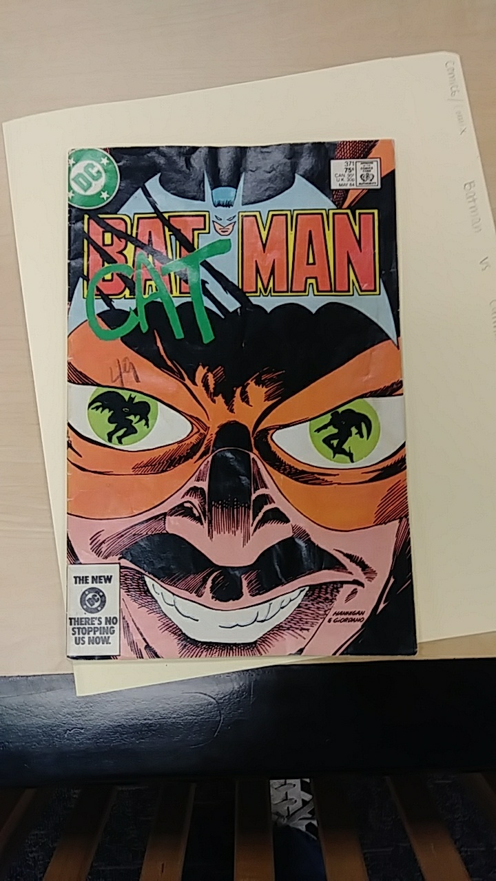
Bat Man Vs Cat Man DC comic cover
cover from the comic Batman vs Catman. What attracted me to this cover is how everything on the cover is to show hostility and a sinister defiance towards Batman. The emphasis on defiance is done with a claw mark which lines are not even, crude, and jagged in order to emphasise the “cat”-ness of catman while scratching out the more straight, symmetrical, and established looking “Bat” from Batman. The word “Bat” is even seemingly replaced crudely by the word “Cat” which has a somewhat spray painted quality to it. It gives allot more context to the sinister look on catmans face. Where if the sinister looking face was by itself, it would not be enough to give context as to who this man is and what his relation to Batman is.
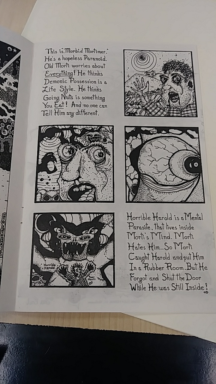
In Crazy Men Comix by Michael Roden the pictures and story lines are so random and chaotic that it would be very difficult to deduce a relation without the wordings that provide context. Roden even puts labels in one of the scenes so that the reader knows who is Horrible Harold and who is Morti. This
Crazy Men Comix by Michael Roden
is a more obvious example of interdependence between words and image. Morti is too small in the picture and the idea that he is dwarfed by the “mental parasite” that is Horrible Harrold within his own mind could not be portrayed from the leading of the previouse panels where morti seems normal sized. The Crazy Men Comix are generally very chaotic and almost random. Textual context is key in gaining some kind of continuity from panel to panel.
