
Don’t insert your comic as one big image, but insert as separate rows (one jpg file for each row). This way, the viewer can click to see each row at a bigger size (as long as Link to: Media File is selected in the media editor):
Don’t insert your comic as one big image, but insert as separate rows (one jpg file for each row). This way, the viewer can click to see each row at a bigger size (as long as Link to: Media File is selected in the media editor):
If you insert each frame individually, it will be hard to control positioning. See what happens when you resize your browser window, or look at on a small screen, like a phone (This WordPress template is not responsive, so the frames just get cropped out when you make the browser window too small to show both frames in the top row). See Web Comic Demo 2 for a better option.

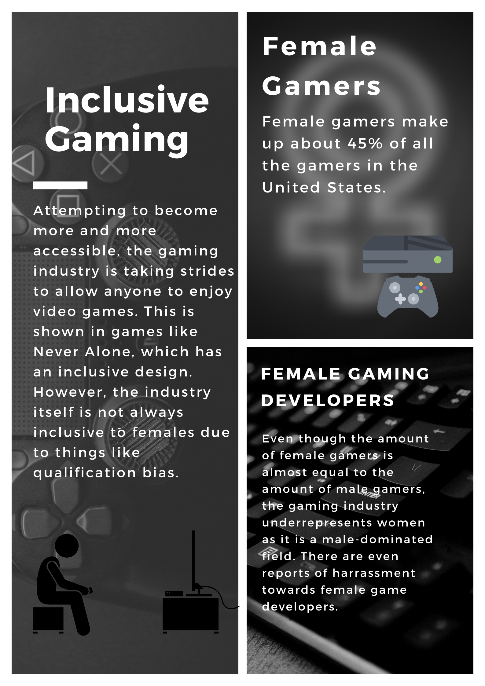
Inclusive Gaming
For Digital Reflection 2, I wanted to make a more informational poster, which provides insight to the gaming industry. I created this poster about Inclusive Gaming using the Canva app. My poster attempts to connect the three course concepts of inclusive game design, diversity in gaming, and qualification bias. The video game Never Alone inspired me because I wanted to represent one of the accessible features of the game in this poster. Like the game, this poster had a grayscale color pallet, which means that color blind people will have the same experience with the poster (or game) as someone without color blindness. Similarly, Never Alone has fairly basic graphics and a grayscale color pallet in an attempt to make the game accessible to more types of people. Another aspect of gaming that I wanted to explore in this project is diversity in gaming, both in the consumers and producers of games. What I found was that females make up more of the demographic of gamers than I previously thought. I assumed that at most about a third of gamers are female, but it turns out that 45% of gamers in the United States are females. This is surprising to me because the underrepresentation/misrepresentation of women in video games made me think that females would be less interested in the medium. However, where the issue of women being underrepresented/misrepresented in video games comes from is that there are not enough female video game developers. This is also where the last course concept comes in, which is qualification bias. Video game development has been a historically male-dominated field and it has been very hard for women to breakthrough in this industry. Unfortunately, female game developers have reported issues of harassment in the workplace simply because they are female. Weirdly, gaming is both very diverse and not diverse enough at the same time. There are enough female gamers for positive depictions of women in a video game to be successful. However, there might not be enough female game developers to create an accurate, positive representation of women in video games, so they are still misrepresented, with oversexualization as an example.
Increasing diversity in video games can only be a good thing. It would result in video games being created more passionately and targeted toward specific audiences, so they could get exactly what they want out of the game. The same goes for increasing accessibility. In either case, increasing diversity or accessibility, the video game industry would benefit because it would result in a larger player base. A larger player base then leads to lots of benefits, from more market competition, to more types of video games.
Works Cited:
https://mediakix.com/blog/female-gamer-statistics-demographics/
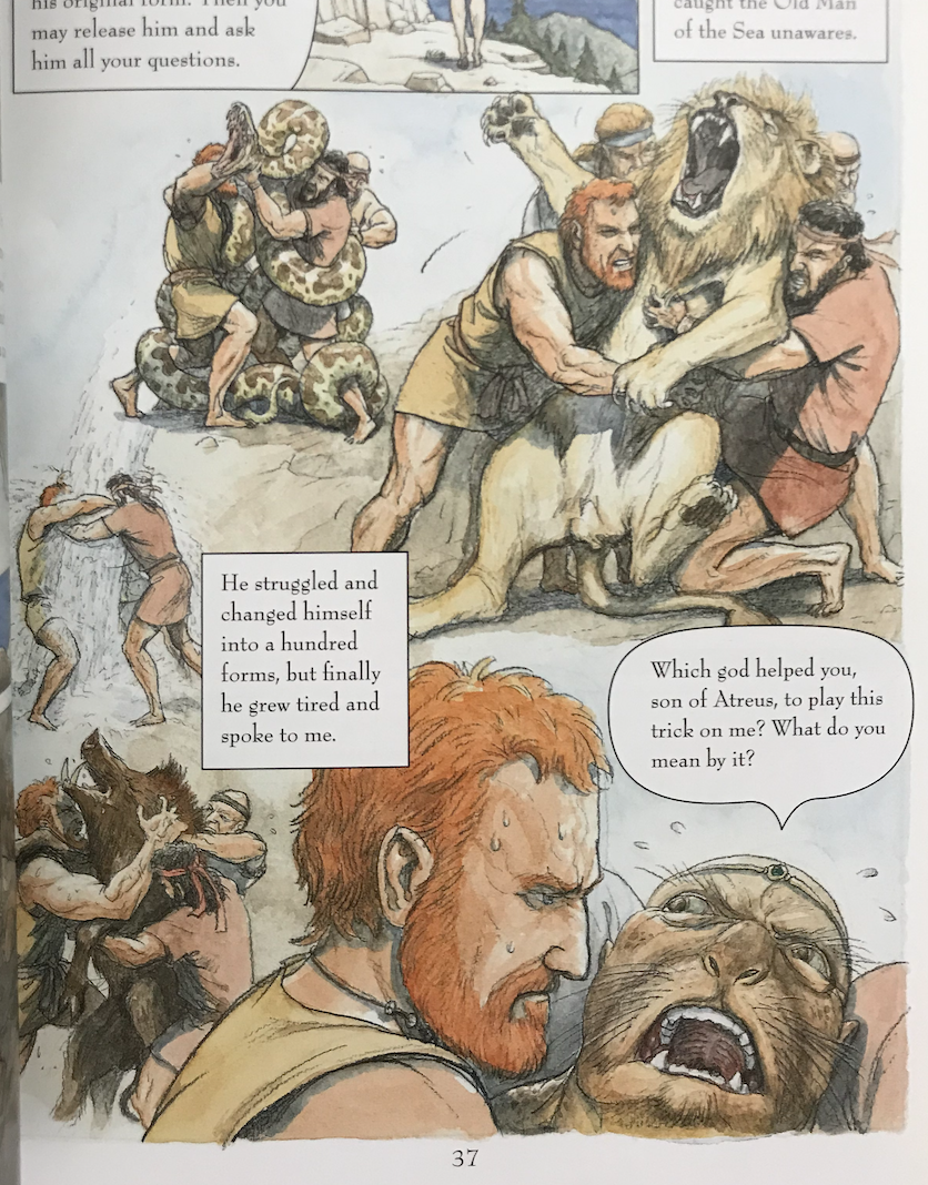
Page 37 of Hinds’ “The Odyssey.”
The Graphic Novel I chose to read for this assignment was Gareth Hinds’ “The Odyssey: a Graphic Novel.” This novel was published in 2010 and was based off of the original poem, “The Odyssey” by Homer. The Graphic Novel follows the 10 year journey Odysseus takes to get home after the Trojan War; along the way he is faced with giants, sirens, and the wrath of the gods as he strives to return before suitors take his wife’s hand. The graphic novel takes on a very detailed iconographic style, each panel highly detailed, though still not hyper-realistic, in a similar fashion to artworks produced during the time the Odyssey was originally written. Some things that Hinds employs in this novel include the use of interesting closures. One
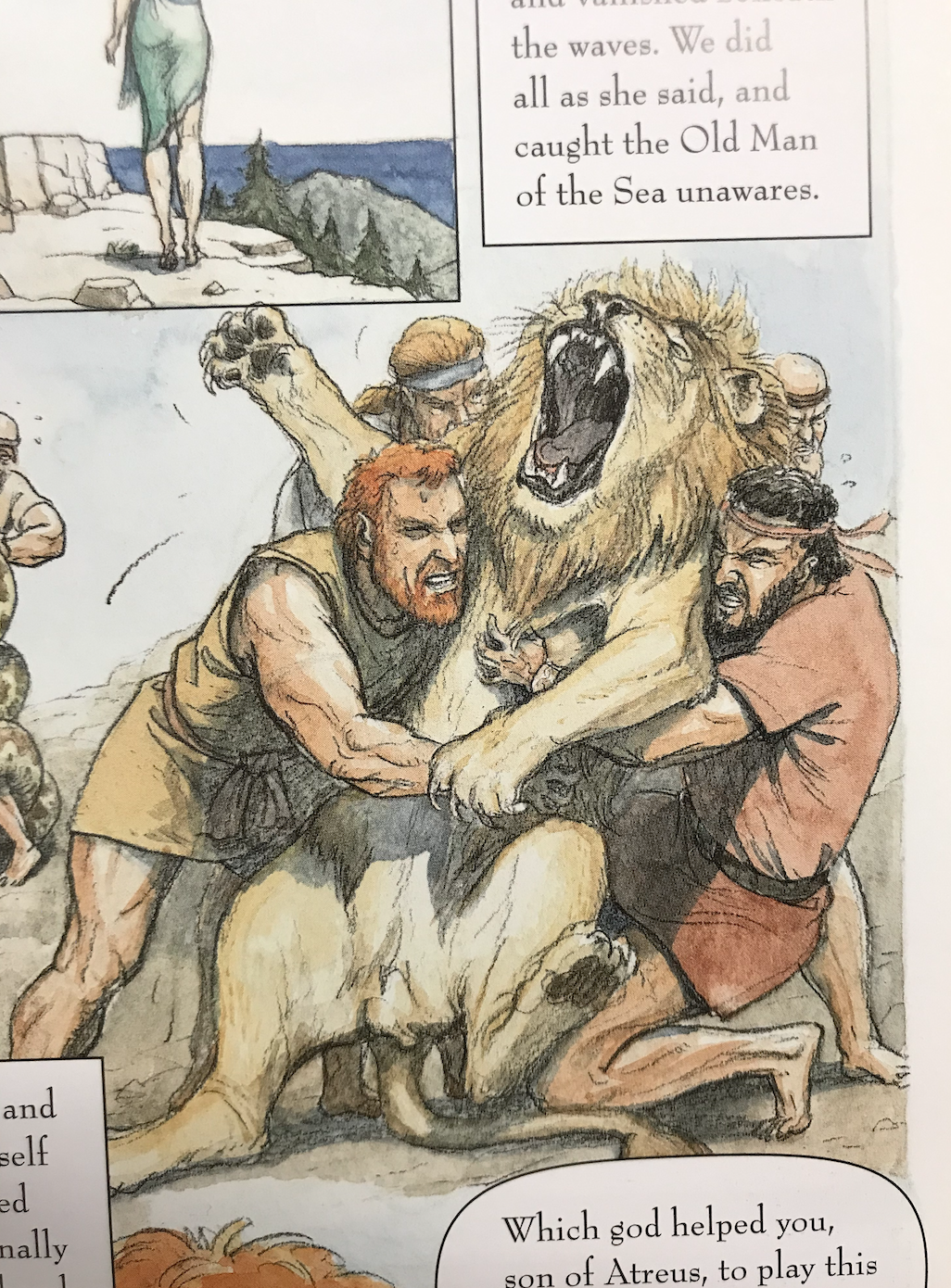
Page 37 of Hinds’ “The Odyssey.” Close up to show iconography.
such instance is on page 37 where the entire page does not have panels, however, there is a clear passage of time between each fight. The reader is prompted to come up with their own order for these events, however, it does read from left to right like most novels, making it easier to interpret.
Alongside this physical novel, I also read Scott McCloud’s “The Right Number,” a graphic novel about the life of a man trying to find his soulmate through an algorithmic approach at telephone numbers. There were many differences to reading a novel on paper versus
Scott McCloud’s “The Right Number: Part One.”
digitally, one being that the digital format, in my opinion, required more user interaction. McCloud’s graphic novel required the user to click or tap the center of the comic, arrow below it, or page number in order to progress through the story while Hinds’ novel, given its size (around 11 inches in height), only required me to turn the pages every so often. I felt as though there was more room for different
Scott McCloud’s “The Right Number: Part One.”
uses of closure and the passage of time in McCloud’s novel, as there was an element of animation involved. The panels, each one inside the other, required me to view them one at a time and some transitions left much to be interpreted. For instance, a transition from the characters to a cityscape. Given the text, the reader knows there was a large gap in time between these two frames, however, what happens between them is up to the reader.
The graphic novel that I chose to read for October was Bone: Out From Boneville By Jeff Smith. I chose to do this graphic novel because I really like how the characters look and the style as well. The story starts off with three white cartoonish, “bone” characters. One of the characters got kicked out of town because nobody liked him and the two other characters help him get out of town. Fone Bone is the main character and we follow him through most of the story. He gets separated from his friends after a locust swarm pushes him off a cliff and he is separated from his friends. He then finds a valley where he thinks his friends are and looks for them. He meets a bug named Ted who tells him about Thorn, who is a woman that might know where is friends are. As Fone Bone is looking for his friends he meets a dragon and this dragon follows him around and protects him from the rat creatures. The rat creatures and the dragon have some kind of agreement in the valley on territory or something and the rat creatures want to start a war. Fone Bone then meets Thorn, who is a beautiful woman that Fone falls in love with, and Thorn takes him to her home and takes care of him. We then see one of Fone’s friends Phoney Bone, who was the one who got kicked out of Boneville, and he meets Thorn’s Grandma in the valley and she takes him to Thorn and Fone and Phoney meet up. Phoney goes off by himself and finds a town where he meets up with the third character, Smiley Bone, who is working as a bartender in the town. Then, there is an attack on Thorn’s home from the rat creatures and the dragon saves them and Fone makes it to the town and meets up with Smiley and Phoney.

Page 18, Bone: Out From Boneville, Jeff Smith
The iconography was very interesting to me. The main character is a sort of simple design being all white, compared to a different character, Thorn, who is drawn more realistically and with more detail. All of the backgrounds and creatures are drawn in great detail and are more in depth, while the three bone characters are all very simple and they stand out. Scott McCloud talks about how using a very detailed backgrounds with simple characters is something that comic books artists do and that is highlighted on this page here where Fone Bone discovers the valley.

Somnivore found at http://scottmccloud.com/1-webcomics/mi/mi-20/mi-20.html
I think when I looked at the web comics I found myself interacting a lot more with the comics, especially Scott McCloud’s web comic. One comic that I found particularly interesting was Somnivore. I found this comic interesting because there were multiple ways that the comic could be read. If you just read vertically down then you still get an interesting story and if you read left to right you also get a story and the stories make sense. The last panel in the comic should always be read because it makes the story, no matter how you read it make sense because it is connecting the previous panels to the dream. In this example I read it vertically from the center of the comic and the story makes sense when you read it in this way. I enjoyed that I could zoom in to see this specific example on the web page and ignore the other panels on the page. This connects to how Scott McCloud’s ideas on what assumptions the audience makes when they read a comic and how using web comics can create new and interesting ways to read comics.

I made the comic into a clock shape. Instead of reading left to right, the reader views the coming clockwise starting on the lightest color to the darkest, which is at the top of the image.
I think I could have made it a little more clear that it’s a clock, with maybe hands or space in between the different sections. Right now it just looks like a gradient.
I put several reoccurring pool toys and characters in the image. I made it that way so people wouldn’t think that they’re all different people. I kept a pretty simple color scheme between the image. This helped with the visual consistency the same shapes guided the eye.
I also copied and pasted several of the people to keep consistency. I wanted to slow down the pacing a little bit, and by doing that i think it was effective.
I also added the difference in colors to signify changing time. It starts at 1 PM, with bright blue water. The further that I went, the darker I made the water. People naturally look at the brightest part of the image, so people would be drawn to the bright blue first.
I decided to not include space in between frames. I wanted it to be pretty fast paced, so I kind of let the color bleed into the frames. I used mostly scene to scene closure because it matched up with the clock theme.
I did not use any words. I wanted to tell the story completely through images to encourage the viewer to interpret it on their own, sort of as a murder mystery style.
I think the comic describes the passage of time well. Once you get that it’s a clock, I think it shares it’s message effectively. I think that it is inventive because it’s hard to convey time through comics, and I did so in a different way than I’ve ever seen. It’s very literal but it also asks the reader to kind of solve a riddle.
This was my first time using Illustrator. I learned a lot that was new, including how to manually draw things by hand. I learned how to make live art, which I used for most of the project.
I used a really simplistic style partly because of my limitations with the software, and partly because I wanted the image to be clear. The lines were all pretty soft and squiggly. This might have led viewers to take the project less seriously than they would have. It was easier to make squiggly lines than solid straight lines in my opinion. I also couldn’t figure out how to use the pen tool as effectively as I could have.
I was limited by my software slightly. I couldn’t figure out how to make live art for a while, so that really slowed down the process.
The pen tool was the most helpful. I used it to section off the lines in the circle, along with using the rotate tool to section up the circle evenly as possible.

A comic about insomnia and the sweet embrace of slumber. Comic by Min Kim, November 2019
When creating my comic, I wondered how to create an interesting layout that challenged the typical top-to-bottom expectation. To achieve this, I set the background with a large borderless panel in which the comic was shaped around. In addition, it challenges the reader to alternate reading from left-to-right to a top-to-bottom sequence and back so that the reader must concentrate more on how the comic is read directionally. When thinking about closure, I ended the comic with my character slowly closing her eyes and although it can be expected that she fell asleep, it is not explicitly shown and can be left up to the reader to decided what happens after (if she is trying to sleep, just resting her eyes, and so on). Throughout my comic, I guide the viewer through the passage of time my comic describes. One can understand which panel comes next in my comic by seeing the obvious actions-to-action sequences, movement-to-movement, and scene-to-scene of which panel comes next. For instance, my comic begins with someone seemingly asleep, then as her eyes open (movement-to-movement) and still laying down, she looks at her phone but later is seen sitting up and feeling unhappy because she cannot sleep (scene-to-scene) or for any other reason the reader may interpret. This strategy is inventive because although certain actions and movements are explicitly shown, in the entirety of the comic, one does not know whether it happened in a matter of minutes of hours on end. It is up to the reader to interpret how much time has passed between the change in transitions.

This Comic Poster is called “Online Dating”, by Bailey Tompkins, and was created at Washington State University in DTC 201, October 31st 2019
My comic challenged the readers normal left to right and top to bottom expectations by not having clear textboxes on every scene showing the reading which event happened first and which ones were to follow. However, I was able to guide the reader through my comic by adding linguistics such as “a few months later…” and then setting the scene like booking airfare and then the next scene was an airplane. I also helped guide the reader by keeping familiar objects from previous scene in the next scene, for example, the cell phones were used in the first scene and transferred over into the second scene and the suitcase was used in the third scene and transferred over to the fourth scene. There are two obvious types of closure that are being presented in this comic. One is Action-to-Action and I think this because the individual scenes are not happening at the same time but are occurring in sequential order and at different locations. The other type of closure is Subject-to-Subject because the two characters are talking at the same period of time but in different locations. I used the linguistics mode in my comic to make the message of my story clearer to the reader. The images and words of my comic work together as additive in the sense that the words elaborate on the images. Overall, I think my comic conveys a good sense of passage of time because it utilizes time frames, linguistics, and spatial mode to tell the tale of a love story that covers the time period of many months in just five short scenes.
This was my first-time using Illustrator. I felt familiar with the tools because they were similar to Photoshop which I am more proficient in, but overall it was all very new to me. The biggest thing I learned how to do was make all my own art from scratch rather than getting clip art and ect from the internet or scanning objects. This was definitely a challenge for me but I eventually got the hang of it. Drawing by hand is not my best skill, but I do enjoy editing on Photoshop so
it was interesting to learn what I could do by combining the two. I used many different shapes in my illustration in order to make the people in my comics. I used ovals for bodies, planes and text bubbles, and I used squares for clothes, time frames, and phones. The style in which I made lines and shapes were overall very simplistic and according to Scott McCloud’s “Living in Line” chapter, I would suggest that the simplicity of my shapes brings creativity to the reader because it allows them to develop a sense of personality for these characters rather than me choosing the personality for them if I drew a more complex and detailed character. Although my characters were more simplistic because of my skill limitation on Illustrator, I think it worked out to my benefit. The most beneficial tool from the tutorials was definitely learning how to copy my work by pressing “alt” and dragging my image. This saved me so much time and struggle. It may seem like such small hack but I had no idea how to do it until I watched the tutorial on it!
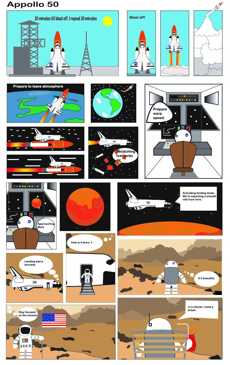
This is my comic titled “Appollo 50” about a mission to Mars
I was inspired by the graphic novel that I checked out from the Owen library. I love sci fi and as soon as I started brainstorming and making my pre sketch, the first Idea that popped into my head was space themed. The artwork and plot of my story was a more realistic sci fi scenario. I designed the rocket ship, the astronaut, and other elements of my work to represent a modern day space theme rather than something way in the future. However the mission was sending the astronaut to Mars, which gives it a slightly futuristic theme to the comic. This project challenged us to use innovative ways to communicate passage of time and sequence. To respond to that I avoided the traditional English ways of always sequencing my panels from top to bottom and left to right. First of all, I did have a lot of sequences read from top to bottom and left to right. However, I used a mix of both throughout the comic sequence to make the story more interesting. On the contrary, I did add panels that seemed out of place in accordance to the traditional left to right top to bottom sequence. For example, the second sequence of my comic starts with the spaceship leaving the atmosphere and moves to a zoomed out view of it. It then moves to a scene that shows the interior of the spaceship. The other three panels are in line with this scene and they show the spaceship zooming through space and then detaching the fuel tanks. It’s not obvious that the interior scene is the third sequence in this panel because it looks out of place almost like it should come last in this sequence. Despite looking out of place at first glance, the reader can read this sequence correctly through dialogue and it makes the comic more interesting. After all, this is a story about traveling to Mars which isn’t a 30 minute drive. So as a result, I had to use a high level of closure. Some sequences are action to action, but most of my comic can be defined as scene to scene. There’s a lot of time going by and only 11 by 17 inches. I couldn’t document a long journey to space. Rather I chose scene to scene to show a big jump in space and time. I did use words throughout my comic as an additive combination. They weren’t essential, but they give the reader a little more context. Overall, my comic is innovative because it describes the passage of a long period of time in a short and easy to read comic. The scene to scene closures allows the reader to know what’s going on, but it avoids being too repetitive by staying away from all the story being a long and boring space journey.

This sequence shows a unique structure that challenges the standard of left to right.
Using Illustrator was a lot of fun and it allowed the project to have a lot of creative freedom. I am familiar with Illustrator because I took a graphic design class throughout high school; However, I retained a lot of information through the tutorials and it felt good to review. One thing I learned was clipping masks, which was a very useful tool that allowed me to zoom in on frames to give a different perspective. I would say the most useful tools for me were the pen tool, and the clipping mask tool. These tools allowed me to create backgrounds and transform them to better fit a scene. Also, I used the pen tool to draw many of the important pieces in my comic such as the rocket ship and the astronaut. The Iconography I used was pretty simple. Though detailed and somewhat realistic I definitely went for a simplistic approach in my line work. I used a lot of loud lines and quiet lines. Some of the panels are meant to give the viewer a sense of madness due to the nature of outer space and the danger involved. Some scenes like the final one were meant to give the viewer a feeling of peace and tranquility.
Phuc Tran’s Final Poster Comic
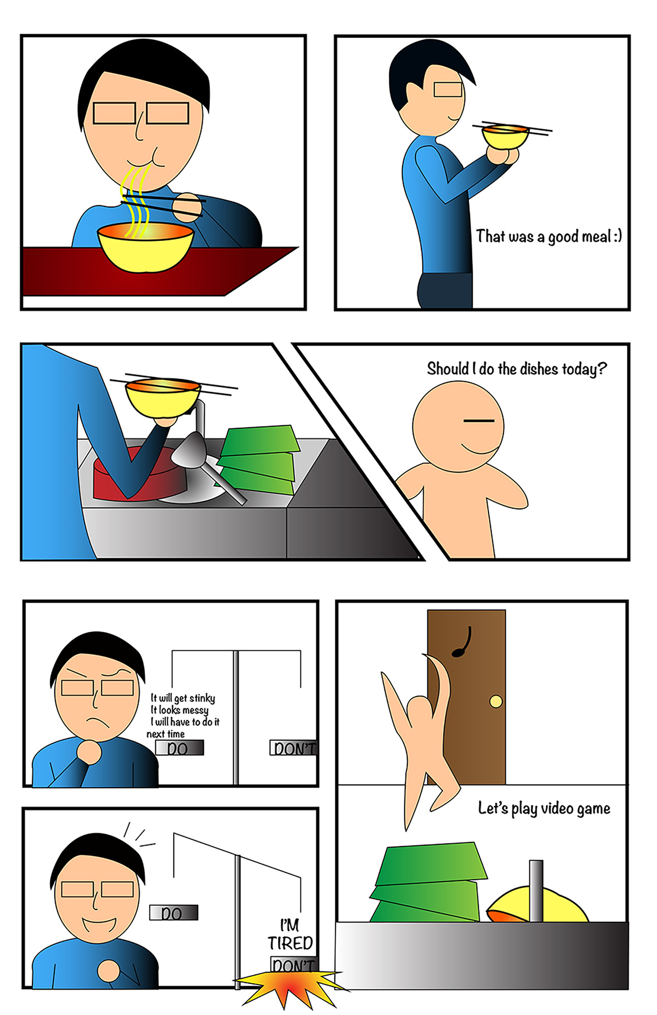
They said an attractive man is one who can make fun of himself, so I took that advice and that is how I come up with the idea for this project. I believe my comic follows the rules of left-to-right, top-to-bottom accurately that the readers can follow it easily. The first to second frame is an action-to-action as the character moved to a different action which is bringing the bowl to the sink after he finish eating. Another example is from frame 6 to 7, an aspect-to-aspect as it change the angle and focus in a different object. From the character to the sink. That is the reason why I minimized the character since he is far away and not the object I want the reader to focus on. The linguistic mode I used in the comic is mostly the character’s dialog, they are mostly addictive as the words are not necessary explain fully the images. But in frame 6 and 7 I believe they are more interdependent since they are the character reasoning and it is required the audience to read in order to understand that part. Overall, my comic describes the passage of time in a logical way. In frame 6 and 7 it may needs a little bit of time for the reader to read but the whole thinking process should takes the character in a flash. The scale is also a representation of a person’s decision which I believed is an understandable and inventive strategy.
This is not my first time using illustrator, I studied about it in COM210 and played with it sometimes. Object masking is what I learned from this project and it is very useful for making comic. For the iconographic, I used the scale and minimized the character at some part like the eyes but still leaving the eyebrows and mouth so we can tell what is his expression. Personally, I want to make more complicated drawings but Illustrator is more about minimalism and simplistic so that is a limitation for me. The tool that I used the most is pen tool, I used it to create most of the shapes which is very useful when it automatically filled the shape for me. The gradient is another tool I like, it creates the fade in color which makes the overall project look much more interesting.
