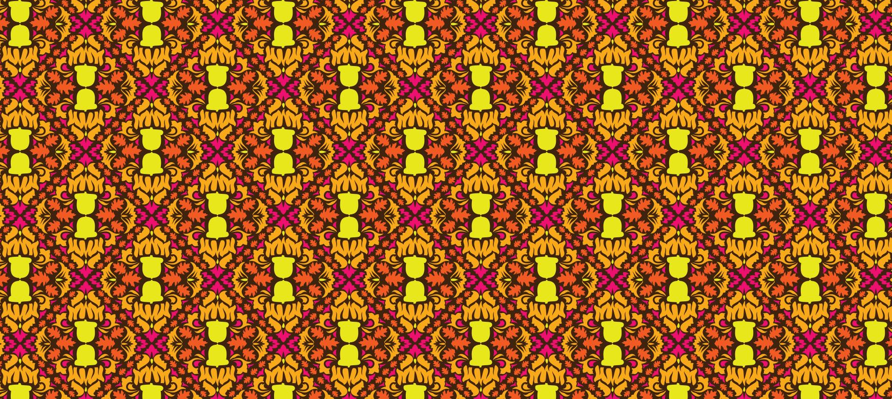
Pattern Design and Color Interaction- Marci Hohner

I found both of these pIMG_8957atterns in my closet, one is a dress from Brandy Melville, and the other are yoga pants from LuluLemon. First, my geometric design (right), is the dress. This pattern is pretty random, and could almost be perceived as organic, however when you step away and take a larger look, the repeats, obvious lines, and repetition in a grid form make it clear that it is geometric. It pretty prevalently features both dots and lines, and many of the groups of dots form implied lines. The color interaction is very strong as well, and really makes it a beautiful pattern. It is mainly red, yellow, white and black, but shades of the colors that make them work in a harmonious way rather than the vibrations that complements give off. In many parts of the pattern the same objects repeat themselves, on a different foreground, which is another reason I specifically chose this pattern. It was really interesting to compare the red and white squiggly like pattern displayed on the black versus presented on the white, it looks entirely different and takes a moment to even realize that it is indeed the same object/shape.


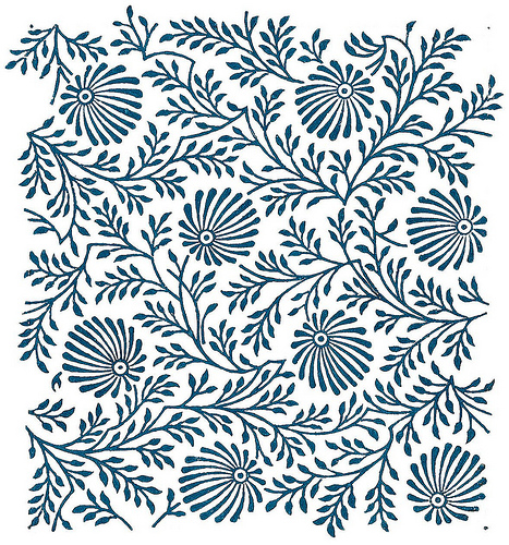
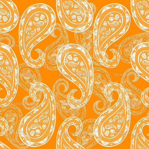
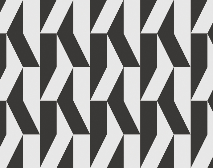
The second pattern I chose is extremely organic, and was found on my favorite pair of yoga pants. It is clearly repeating shapes, but there is no sense of end or repeat. The space between the primary marks is filled with random line squiggles and doodles

Scan that seem to seam the entire pattern together endlessly. It is solely two colors, a foreground and a background. The white on gray is intriguing because it encourages the negative space of the gray to be more noticeable than another color combination may do, and the fine details of the pattern are clearly distinguishable defining the intricate shapes.

Posted in Fall 2014 Archive (338) | Tagged , | Leave a comment

Pattern Design and Color Interaction

Geometric

The first pattern I chose was a simple, geometric pattern. It’s simple and though some of the lines used to create the pattern are organic, the repeated sequence is extremely symmetrical and therefore creates a very geometric shape. The minimal complexity in the repeated pattern makes it easier to notice the geometric nature of the design. The organizational architecture I can identify in this pattern includes dots, lines, and grids. The pattern is repeated and the negative space in between the pattern creates static lines. The patterns itself catch my eye as their own dots within the diagonal grid. Though the color scheme in this pattern is limited, the sharp contrast between the saturated red and the white  make it obvious to the viewer that the pattern acts as the foreground and the white as the background. The temperature of the red interacting with the white, as opposed to a cooler color like blue or green, makes these differences  even more apparent. The red enhances the symmetry of the pattern while diminishing the white – whose sole purpose seems to only be to act as a background for this powerful, bold, strong red color. However, the white’s relationship with the red does serve to empower the red through contrast. Geometric


Organic

The second pattern I chose was a minimalist, organic pattern. The reason I chose this pattern was because it challenged me at first to decide whether or not it was organic or geometric. At first glance it looked to me that it had the potential to be geometric. However, through closer examination I saw that the pattern was not tiled or repeated, it had a sense of randomness because the interaction within the elements of the design aren’t always the same (between the larger, more circular objects, and the lines that make up branch-like forms). In  this pattern I can identify dots within the random pattern as well as irregular lines that make up the rest of the design. This design, if it were to be printed in a larger fashion would be considered tiled as right now it seems fairly irregular and is not repetitive/repeated within this thumbnail. The cool hue of the pattern makes the design appear very calm and smooth. The dark value of the blue pattern makes the pattern appear as positive space against a white background which acts as the negative space of the design. The darker value of the blue in comparison to the white enhances the power of the pattern and reinforces the idea that it is, in fact, the foreground of the textile. Because of how dark the value is of the blue, it suggests there is no significant relationship between the white and blue, only to show that they are very different and contrasted colors, making sure the viewer knows that the focal point of the design is in fact the pattern. However, the cool temperature of the color chosen for the design does make for a more analogous and harmonious pattern. The same would not be able to be said if the color picked had a very bright, saturated, orange which would seem more chaotic and interrupted. Organic

Posted in Fall 2014 Archive (338) | Tagged , | Leave a comment

Pattern

GEOMETRIC

“Jade” by Jade Meneguel http://thepatternlibrary.com/#jade

The first pattern that I chose to analyze is called “Jade” this pattern is geometric because it contains dots, implied vertical and horizontal lines which create a grid structure. Within the pattern, there happens to be smaller and larger dots created from whitespace based off of the relationship between 4 of the dots in proximity together. There are two standard orientations: vertical and horizontal which help in creating the implied lines as the horizontal-pointing dots share the same row and the vertical-oriented dots share the same lie within columns. Because of the desaturated tertiary colors within the pattern, each dot (which is made up of a number of colors) blends well with all of the other dots while also creating white space dots which are more easily recognizable and one can see how each of the negative space dots relate with eachother, specifically as implied diagonal lines.

ORGANIC

http://thepatternlibrary.com/#flowers

“Flowers” by Debora Sayuri.

I chose this pattern as my organic sample because i was intrigued with how such similar elements within a pattern can produce inconsistency and an organic feel. The fact that the three primary color are used, along with their saturated and desaturated selves makes it hard for one particular element to stand above another as each of the colors is equally as attention-grabbing. The contrast in color along with the architecture of the pattern create organic qualities. For example, it is hard for one to point out lines, dots, or grids because each element overlaps or is overlapped by another, prohibiting the appearance of implied lines. The fact that each element and its clone are not placed perfectly side-by-side or perfectly vertical supports this claim. This makes it difficult for a viewer to connect the elements to how they are placed in order to understand the architecture and relationship within the pattern.

Posted in Uncategorized | Leave a comment

Pattern Design and Color Interaction – Katie Tufts

Geometric Pattern http://society6.com/ Found on Tumblr, Pattern by Mrs. Opossum

Geometric Pattern http://society6.com/ Found on Tumblr, Pattern by Mrs. Opossum

I searched Tumblr for “organic patterns” and “geometric patterns” and searched for quite a while until I felt I found the best two fitting patterns. There were many to choose from but these two stood out to me the most. I chose the black and white image as the organic pattern because it feels more irregular to me. It’s hard to define where the pattern starts or ends. The drawing inside the pattern is black on a white background. These flower-like images overlap each other creating more abstract lines crossing paths. This pattern would look completely different if it were in color, I think it would defeat the purpose of the flowers overlapping each other and being transparent. I am interested to see what it could look like if it were made in color and then compare it to the black and white. The second image I chose as the geometric pattern. I saw columns repeated in this pattern and lines in a row. The zig zag lines manage to create the lines and columns although each little rectangle is a different color. There isn’t an obvious color pattern but the same color scheme is used throughout. These colors are very saturated and bright and some pop more than others. The hues range in temperature and are mixed around in the pattern. The darker hues that are more saturated stand out more than the light pinks and light greens. Because the colors are so saturated and bold, they really stand out against the white background. Also since they are repeated next to each other they create the solid bold white lines in between the pattern. This helps define these columns as a pattern.

Posted in Uncategorized | Leave a comment

Pattern Design and Color Interaction- Sandra Albertson

After browsing through a large collection of widely varying patterns, I settled on one geometric pattern and one organic pattern that I thought successfully used a variety of design elements. First off, I found this blue and green geometric pattern which I thought did a great job of using lines and dots to form a grid. Each neutral colored line overlaps with another to create new points and an actual grid formation. The entire piece is composed of lines that change directions, coming in contact with one another and creating new designs. Some might call this an iconic pattern since the lines form green stars. Or, you could see the star as the center of a “flower” that has blue petals. I appreciate the use of blue and green because it is my favorite analogous color scheme. Both the blue and green are of a fairly high saturation and vibrancy which causes the colors to vibrate a bit more. I wonder if the pattern would be more visually pleasing if the colors were desaturated a bit or if they had a shade to them.

For my organic pattern, I chose this orange and white piece that uses repeated curvy, drop-like shapes, filled with detail. I found while looking through patterns that my favorites were ones that simply used one main color with white. I find the simplicity to be most captivating and white provides a nice contrast to any color. This pattern uses orange with different values of white. The larger shapes in the foreground are more of an opaque white while the ones in the background are more translucent. This adds a certain depth quality to the pattern which I enjoy. I admire how so much detail and interest is created with two simple colors. Although at first glance this pattern may not appear to be in grid formation, if you look closely at the alignment of shapes you can see the structure. The four outermost largest shapes line up to create a square and all other shapes fall under the same pattern.

Posted in Fall 2014 Archive (338) | Tagged , | Leave a comment

Geometric and Organic Patterns

moroccan print

This Moroccan themed navy pattern is geometrically contrived. You can see that the repeated shape is a square with a diamond in the center and three smaller squares marking the outer edges. What is most interesting about this image (found on Society6, see below, by Micklyn)  is the color interaction. While the repetition in terms of the pattern lines is obvious, the color behind it gives the pattern an organic twist because the color is not repeated in this specific picture. The isolated forms or dots create a sort of grid, but the grid is not as obvious as it would be without the varying contrast of the navy tint in what reads as the ground. There is not sense of depth in the pattern because the shapes are repeated in two seperated sizes and on a clearly defined grid.

PANDAS pattern

The linear form in this fabric pattern “Pile of Pandas” (found on Etsy, see bottom for link, by Kyotocollection) is hard to decipher at first. After some time of looking at it I realized that the image is a rectangle and in this portion of the pattern it is vertically mirroring itself. The fact that the shapes are organic in nature and the pattern is created using recognizable imagery enhances the organic qualities because it draws the eyes away from the repetition and towards the figures. Also, the negative space (white) is completely utilized in this panda pattern and the lack of seemingly empty space simply overwhelms the eyes into seeing a picture rather than a pattern. Just by including shapes that are not rigid, the pattern is given depth and a sense of movement. The black and desaturated white is essential to portraying the images as recognizable. It might be difficult to understand if the pandas were black and orange or brown.

Image One: Worn and Faded Navy Denim Moroccan pattern in grey blue and white

By: Micklyn

http://society6.com/micklyn/worn–faded-navy-denim-moroccan-pattern-in-grey-blue–white_print#1=2

Image Two: “Pile of Pandas”

By:  Kyotocollection

https://www.etsy.com/listing/156415820/tenugui-japanese-fabric-pile-of-pandas?utm_source=Pinterest&utm_medium=PageTools&utm_campaign=Share

Posted in Uncategorized | Leave a comment

Pattern Design and Color Interaction – Amy Koller

"Leather Nunchuck" - Claudio Gugleiri

“Leather Nunchuck” – Claudio Gugleiri http://thepatternlibrary.com/#leather-nunchuck

Geometric

This pattern is identifiable as geometric because you can identify that pattern that is being repeated throughout the picture. This one is a little tricky to identify whether it is a line, dot, or grid. But if you look closely, you can see that it represents  line. I find the color combination in the very intriguing. Not only did the artist use primary colors, but they also combined desaturated versions of these primary colors to go along with it. Because of this tactic, the colors are complementary. I want to say the value of composition is high due to the yellow, but when I look closer I find that the blues cool the pattern down a bit in which the value would be lowered as well. Therefore the image evens itself out a bit by combining warm and cool tones. I think the artist did a good job at considering what types of hues would come together to make an appealing illustration.

"Asteriods" - Sanja Kusturica http://thepatternlibrary.com/#asteroids

“Asteriods” – Sanja Kusturica
http://thepatternlibrary.com/#asteroids

 Organic

This image is organic because although you could say that it has dots in it, it’s harder to define and is less straightforward. The pattern seems to be more random and less straightforward compared to the Geometric pattern. By looking at this, I wouldn’t immediately realize that this is a pattern. But, when you look more closely you can see that the pattern can duplicate itself.

When considering the colors, the artist used a variety of different hues and saturations. My eye is drawn immediately to the yellow and then moves over to the red and blue. Therefore, this pattern uses the primary colors that are complementary. There is also desaturated reds and blues in the picture that makes the primary colors stand out even more. The temperature in this pattern is mainly cool due to the fact that most of the colors are blue and green. The value in this image is low because it does have a cooler tone and has a combination of red as well. I think the artist made an interesting move by creating a pattern this organic and colorful, but still maintaining the quality for it to repeat.

Posted in Fall 2014 Archive (338) | Tagged , | Leave a comment

Pattern Design and Color Interaction – Lisa Gaviglio

Neon Autumn by Dailey Crafton from The Amazing Pattern Library

Geometric

This pattern is geometric because there is a visible pattern of lines and dots that make up a grid. The tile is repeated in a diamond shape running vertically and horizontally. Each tile in this pattern can be seen as a dot, and is clearly separated by lines. These lines are made up of small dots in the shape of leaves.

It seems that the colors chosen for this pattern are all warmer super saturated colors. There is yellow, dark and light orange, brown, and pink. In terms of line, these colors help to accentuate it by having the small orange leaves contrasted against a dark brown background. Since the orange color is more intense than the brown it stands out and helps to create that line bordering all the dots that makes the grid. In the center of the tile there are two very saturated yellow bells that immediately draw the eye away from the lighter orange of the pattern. The pink that is also creating dots stands out because it too has a very high intensity and saturation. In this particular pattern the darkest color brown tends to recede and the yellow, pink, and then orange stand out more (in that order).


Special Delivery by Matt Delbridge from The Amazing Pattern Library

Organic

This second pattern can be considered organic because it is irregular and cannot easily be seen. There are so many stamps at varying sizes and colors that the eye becomes overwhelmed and trying to look at all the little details, missing the repeating pattern.

The pattern is made up of lots of small multiples in the form of stamps. They are all individual dots that can string together maybe four at a time to create a line/stripe. However, there are so many stamp sizes that the lines cannot continue for very long. There are also lines in the border of the stamps that really help separate them from the background as well as from the surrounding stamps. The tiles used seem rather large creating that sense of irregularity and the fact that it seems to overlap on the right side helps as well.

There are many colors in this pattern, but they all seem to be tertiary colors (red orange, yellow green, blue green, purple blue). The colors in most of the stamps seem to have a tint to them making their value lighter. The background is also a very light color (green? brown?) which allows the pattern to achieve a sense of harmony between the stamps and the color they are placed upon. This allows the eye to easily look upon the pattern and flow through it making it seem more organic.  Overall the temperature of this piece seems to be cooler because the colors are all tints.

Posted in Fall 2014 Archive (338) | Tagged , | Leave a comment

Figure/Ground and Framing – Melissa Tsitsis

This pattern that I chose to evaluate for this blog seems to be made up of the letter “S.” When I originally looked at it there were two of the same patterns that were next to each other. The one on the left seems to be composed of these shapes that create the illusion of the letter “S.” I also think that since the white negative space does not have a strong contrast with the seafoam green (which is a tint of green since there is a lot of white present in the green) positive space. This blends the circular and triangular shapes that create the illusion of the letter “S”. Also, this pattern is tiled in a way that there is a little extra space on the edges. This causes the circular and triangular shapes to not completely match up which enhances my eye to see the letter “S” throughout the pattern.

Whereas, in the other pattern there is a stronger contrast between the desatuarated green and desatuarted purple, this makes it apparent that this pattern is organized in a grid. Therefore, this pattern is more geometric and is composed of circles and triangular shapes that alternate direction in every other column. This pattern also seems to be tiled with no extra space along the edges of the pattern so the circles on the boarder match up perfectly because there is no space when the pattern is tiled they overlap perfectly so that the pattern is consistent when it is tiled and creates circular and triangular forms.

Posted in Fall 2014 Archive (338) | Tagged , | Leave a comment

Pattern Design and Color Interaction- Shannon Heric

The first pattern I chose was from society6.com called FLAMINGoS by Monika Strigel. This pattern is organic compared to geometric. The flamingos are separated at all different levels in the pattern, are tilted in different angles and are facing left and right but not in a particular order. The pattern does not have any form of grid or strips and looks pretty random making it an organic pattern. The pattern feels tiled even when it is an irregular form because there are the same flamingos spaced out in four parts of the pattern. The colors used to differentiate the flamingos are analogous with some with low values next to flamingos with high values alongside saturated colors. The background is white making the high saturation colors pop out more to be enhanced and the low pink values blend in more and be diminished.

Karel Martens/ Book Cover Design/ https://www.patternfoundry.com/patterns/duo

Karel Martens/ Book Cover Design/ https://www.patternfoundry.com/patterns/duo

The second pattern I chose was from patternfoundry.com called Duo by Karel Martens. This pattern is a geometric black and white pattern. The geometric forms of rectangles and triangles in multiple even lines make up the geometric stripe pattern 3-d form. The alternating black and white geometric forms appear to be repeated because they are evenly spaced with hard lines and black and white contrasts distinguishing the separation of the geometric forms. As said from Lupton and Phillips, “ As a grid takes shape, it subverts the identity of the separate elements in favor of a larger texture.” This grid takes smaller elements and brings them together to make an overall 3-d texture because of the angles and color choice. Working with black and white can make the black stand out more or the white it depends how one looks at this texture because the way the geometric shapes are positioned.


Posted in Fall 2014 Archive (338) | Tagged , | Leave a comment