Geometric
The first pattern I chose was a simple, geometric pattern. It’s simple and though some of the lines used to create the pattern are organic, the repeated sequence is extremely symmetrical and therefore creates a very geometric shape. The minimal complexity in the repeated pattern makes it easier to notice the geometric nature of the design. The organizational architecture I can identify in this pattern includes dots, lines, and grids. The pattern is repeated and the negative space in between the pattern creates static lines. The patterns itself catch my eye as their own dots within the diagonal grid. Though the color scheme in this pattern is limited, the sharp contrast between the saturated red and the white make it obvious to the viewer that the pattern acts as the foreground and the white as the background. The temperature of the red interacting with the white, as opposed to a cooler color like blue or green, makes these differences even more apparent. The red enhances the symmetry of the pattern while diminishing the white – whose sole purpose seems to only be to act as a background for this powerful, bold, strong red color. However, the white’s relationship with the red does serve to empower the red through contrast. 
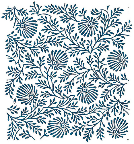
Organic
The second pattern I chose was a minimalist, organic pattern. The reason I chose this pattern was because it challenged me at first to decide whether or not it was organic or geometric. At first glance it looked to me that it had the potential to be geometric. However, through closer examination I saw that the pattern was not tiled or repeated, it had a sense of randomness because the interaction within the elements of the design aren’t always the same (between the larger, more circular objects, and the lines that make up branch-like forms). In this pattern I can identify dots within the random pattern as well as irregular lines that make up the rest of the design. This design, if it were to be printed in a larger fashion would be considered tiled as right now it seems fairly irregular and is not repetitive/repeated within this thumbnail. The cool hue of the pattern makes the design appear very calm and smooth. The dark value of the blue pattern makes the pattern appear as positive space against a white background which acts as the negative space of the design. The darker value of the blue in comparison to the white enhances the power of the pattern and reinforces the idea that it is, in fact, the foreground of the textile. Because of how dark the value is of the blue, it suggests there is no significant relationship between the white and blue, only to show that they are very different and contrasted colors, making sure the viewer knows that the focal point of the design is in fact the pattern. However, the cool temperature of the color chosen for the design does make for a more analogous and harmonious pattern. The same would not be able to be said if the color picked had a very bright, saturated, orange which would seem more chaotic and interrupted.