Typeface Anatomy – Danielle Clement

Capture2 
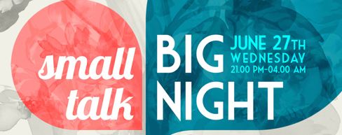
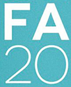
(Scroll down to bottom to see whole poster)

This event poster is a great example of typography. It utilizes two very different typefaces to express meaning through type–a multiple-family mix.  The first typeface, the one used for “small talk”, is a very casual cursive or almost handwritten font. It is a humanist sans serif typeface with a small x-height and cap height. Overall, I would say this this typeface is more condensed together, as there is little different between the cap height and x-height of the letters.

The second typeface used for “Big Night” and the small details listed next to it, are set in a geometric sans serif font which is set in all capital letters. The cap height is much taller compared to the previous typeface, and the x-height is relatively low. In this typeface, the stem on each letter is more elongated, the ascenders on the “H” letters are also more elongated compared to the cap height. You can see how the x-height is located much lower than a basic typeface in retrospect to the cap height especially well when looking at the letters “E” and the crossbar in the letter “A”.

This typographical poster uses both of these fonts well to make text into image. These typefaces correlate with the messages they are trying to tell. The “small talk” typeface has a short cap height and is in a casual cursive/handwritten typeface, which helps emphasize that fact that the event is casual and welcoming to women. The “big night” & details typeface has a long cap height and a shorter x-height which helps emphasize the importance of the event. It is more of a modern typeface and makes me think of something entertaining and cutting edge. It might be silly, but when I read the text I see it screaming at me “BIIIIG NIIIIGHT” in an announcer voice. Mixing these very different typefaces has worked well in this poster to emphasize specific details and create a certain feeling or emotion with each piece of text–these typefaces are telling the audience how to perceive the details.

Posted in Fall 2014 Archive (338) | Tagged , | Leave a comment

Typeface Anatomy – Lisa Gaviglio

The Psychopath Test by Jon Ronson

I chose to analyze the book cover for The Psychopath Test by Jon Ronson. From the first glance you can see this cover is all about contrast with the divide down the middle, marking one half as yellow and the other as white. That contrast continues into the typography with the use of serif and san serif fonts. The left side uses the black serif font with all the letters reaching the same cap height removing the usual need for an x height. There are also no ascenders or descenders present with the text taking on a very uniform look. It appears to be in all capitals which usually means something is important. It would say that it is a more transitional serif with sharper letters and a higher contrast between thick and thin lines. With words such as test and Jon you can see the use of italics as well creating some subtle contrast within the left side itself. The use of this traditional font in correlation with the title would suggest that the left side is the normal side, the non-psychopath side that serves to enhance just how crazy the right side is. If this were a scientific experiment it would be the constant that all the other variables were measured against.  In relation to the title and what one can imagine the book to be about, the use of the plain black serif font seems to be appropriate. It gives a calming and professional effect. All very normal.

When mixing typefaces you want to create some contrast and using both a serif and sans serif font is a good way to do that. The right half of this book cover solely uses sans serif fonts but in different ways. The title of the book and the authors name uses a sans serif that is all chopped up creating that feeling of chaos that one might image a psychopath to cause or to feel.  The middle text uses a simple sans serif that all have the same cap height just like on the left side helping to tie the two of them together. It also seems to be a traditional sans serif font with its uniform upright letters. Using a sans serif and distorting it are appropriate uses of typography for what seems to be the more chaotic psychopathic side of the cover. It gives off a certain tension and contrast that would be lost if the serif font had continued throughout the whole cover.

Overall this typography does a good job separating the two sides but also uniting them at the same time. As far as unity goes the sans serifs with “the” (at the top), “A journey through the madness industry” (middle) and the extra text at the bottom help to join the two sides together. The fact that the serif font has the same cap height helps to create that transition over into sans serif fonts more smoothly like in the title. If it hadn’t appeared to be in all caps then the contrast in the title might have been too overwhelming. From my point of view this typography did a very good job at interpreting the title of the book.

Posted in Fall 2014 Archive (338) | Tagged , | Leave a comment

Typeface Anatomy- Shannon Heric

In the Black Swan movie poster the main headline type is at the bottom of the page. The red typeface goes well with the elegant and mysterious poster for the movie. The anatomy of the typeface has an even baseline with wide spaced out lettering in between each letter form. The x-height in this typeface is the same as the cap height because all of the letters are upper case. The set width is not proportionate to the cap height. The long slender upper case letters ad a sense of cleanness. There are no serifs and this makes the font more geometric. In the c the bowl of the curve is so deep and proportionately curved like a circle it adds depth. All of the bowls are not the same which makes the font more dynamic and have smooth contrasts between letters. The ligature of the A’s are pointed and have sharp crisp points with the cross bars as small triangles rather than straight across bars. Along with the pointed ligatures, the bottom points of the W and the points on the N are pointed just like the A. In the S in swan the S’s spine is very slightly curved showing gradual movement. With all of the anatomy in the Black Swan typeface it shows that the typeface is correct for the content. This movie poster is minimalistic and representational of the movie it is displaying and it fits with the content and feeling of the story. The movie is an intense ballet story representing a ballerina who is supposed to be a black swan which represents sensuality and slyness. This remake of a movie poster uses the correct font representing slyness with the large spaces in between the letters and the sharp points.

Posted in Fall 2014 Archive (338) | Tagged , | Leave a comment

Typeface Anatomy – Amy Koller

broccoli

New York Times Magazine – Arem Duplessis and Gail Bichler

I found this to be a particularly interesting example. The different line weight and organization of the typography was two of the things that caught my eye. Also, due to the fact that the font is not straight cut, it makes the magazine name stand out even more. The typeface is mainly decorative, but you can argue that the magazine uses sans-serif as well. I found it interesting that the artist decided to use bold fonts with thin typography underneath it. This gives an emphasis to the main titles and articles in the magazine.

broccoli-2
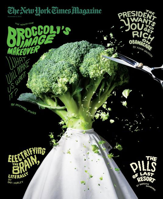
Since the image is very organic looking due to the nature of the broccoli, I feel as though the font reflects that as well. Vertical scaling was used slightly in this font as you can see by the letters being slightly stretched upwards. In addition to this, the artist decided to use all caps for the cover. Normally this wouldn’t work for the whole image, but due to the contrast of bold and thin, I think it looks well put together. The width of the main titles are much thicker than the subtitles, which is another attribute to the typography. The hierarchical order of the cover is also very strong. The way the main title hangs over the broccoli initially draws the reader’s eye to that spot and then moves it down to the other titles.

This font is a great representation for the main subject of the magazine. Not only does the typefaces blend in together, but they compliment each other to create an appealing design that will cause the readers to wonder what is inside the magazine.

Posted in Fall 2014 Archive (338) | Tagged , | Leave a comment

Typeface Anatomy- Sandra Albertson

When browsing through movie posters, magazine covers, and more, I came across this event poster created by artist Sui Tin Sung. I found that this poster very successfully uses typeface techniques to capture the eye. There were many things that stood out about this poster to me, but the first and foremost is clearly the title. The words “CAMP FAIR” take up a huge portion of the poster and I believe that the scale of the words is one of the main things that draws us to it. Also, the text is written in all CAPS which is an effective way of making words stand out even more. It seems that the words camp, fair, and 2012 are all different sizes but their widths are the same so that each word takes up the same amount of space. This does a great job of making the poster look clean and organized. As you can see, 2012 is not in bold like the rest of the title, and I think this is because knowing what the event is, is more important than knowing the year it takes place. By not making 2012 bold, it puts things in their proper hierarchical order. The contrast between the thicker “CAMP FAIR” and the thin “2as012″ make a nice contrast and further emphasize the importance of the title. I also appreciate the use of a sanserif font, since it contributes to the simple, modern theme of the poster. The only text that is not sanserif is the “Liberty University” part at the top of the poster, which looks right and makes sense to me since serif fonts look more official for labeling a University. Overall, I found that Sung did a great job using typeface to get her point across and demonstrate the importance of different matters.

Posted in Fall 2014 Archive (338) | Tagged , | Leave a comment

Typeface Anatomy – Hannah Croskrey

This is a magazine cover for Better Homes and Gardens. I chose a Christmas issue because I love Christmas and am super excited for it although it is a ways away. I thought that the use of type on this cover was very well thought out. There is not too much type distracting from the rest of the cover, but instead, just enough for the viewer to know the magazine title as well as what to expect on the inside. The large, bold, white text catches the viewers eye and instantly draws them in. I chose to look at the subtitle on the magazine because I found its purpose to be more interesting than just the title. We always expect a title, but sometimes it is the other text that we are really looking for and in this example, that text is very clear and visible.

The creators of this cover chose to use a contrasting font for the subtitle. The magazine’s title uses a transitional serif style, while the subtitle uses transitional sans serif. The subtitle is also in all lowercase characters. Both the b and t have overhangs that go just below the baseline. The g’s extends below the baseline with its curvy descender. The ascenders are not very long and compared to other typefaces. The counter of the b is very small. This typeface has a heavy stroke weight which makes it very visible to the viewer. The size is very large compared to other text on the cover which also makes it stand out. This particular use seems to be a bold version of the typeface. If used as more than a subtitle, say for a whole paragraph, the reader would have more trouble reading it, but as just a short title, the viewer can easily key in on it and read it. 

As stated before, I think this typeface is appropriate for this content because it contrasts with the title of the magazine as the title uses a typeface with serifs and this one is a san serif. Its boldness also helps it to stand out to the viewer.

Posted in Fall 2014 Archive (338) | Tagged , | Leave a comment

Pattern Design and Color Interaction

http://www.superbwallpapers.com/digital-art/floral-pattern-21930/

Geometric

This pattern is a geometric pattern. It uses dots as the pattern with a brick by column grid format. The colors through the pattern change but stick to a similar color scheme. The dots even make diagonal lines with the grid formation that they are in. This pattern makes use of tertiary, secondary and primary colors in its color scheme.

Organic

this is an example of an organic pattern. There is nothing that is repeating and similar. The objects are not geometric in any sort and are random. It gives the pattern are more real feel than a pattern that is made with geometric figures. This pattern utilizes a black and white approach however and is not making using of tertiary, primary, or secondary colors.

Posted in Uncategorized | Leave a comment

Pattern Design and Color Interaction – Brian Tomsovic

I thought the best idea for an example of an organic pattern would be Camo, there are a lot of different types of Camo, so below is just one example.

Wm._Lamb_Son_Bird_Camo

from: http://wmlambandson.com/products/fabric-on-the-wing-camo

What drew me to this example was that they used birds to create the image instead of just random blobs, but it keeps the random appearance necessary to make it function properly. It feels very random, but you can tell if you look across the top and bottom that if it were tiled it would tile seamlessly. (from left to right there is a big orange bird, a small orange bird, a big brown bird, a brown bird’s wing tip, and so on) The colors are all fairly low temperature, and low saturation and analogous, they are intended to not draw the attention, even the contrasting values of the colors are used such that they reduce the ability for something to stand out which is usually the opposite purpose of contrast. This pattern does a very good job of hiding any semblance of structure while still having an even feel to it. As Camo, it’s job is to mimic organic surroundings, and as such any sense of rigid structure would work against it’s purpose.


For a more geometric pattern, I found this simple pattern:

seamless-geometric-patterns-01

from: http://www.vectortiles.com/seamless-geometric-patterns/

Pretty much the opposite of my other example, this pattern has a very rigid structure. The grid is very easy to see since the individual pieces create obvious squares, and the straight lines of the shapes also create really obvious lines. The reason I picked this one was because of the way the color creates almost a 3d effect. By having the darker value colors in the bottom right, that gives us a direction where the light source is coming from (the idea of shadow is what’s giving us depth here) but it isn’t until we consider the different hue of the bottom left half that we see the 4 triangles as 4 distinct sides to a pyramid shaped object. In fact this method works so well that unless you  deliberately try to, it’s hard for our eyes to see anything other than repeating squares, despite the fact that a strong recoloring could make the squares hard to see all together.

Posted in Fall 2014 Archive (338) | Tagged , | Leave a comment

Pattern Design and Color Interaction- Jenna Hayden

The first pattern I chose was from patternfoundry.com by Ryan Gander named Mitim. This pattern is geometric with a white and red pattern. The colors in this pattern do not change, instead all of the small squares are red and the background is white, which focuses the attention on the red squares. The small red squares are considered to be dots, and these dots make a linear path as described in the reading by Lupton and Phillips. The dots, smaller elements, link together visually to create a line. The dots and strips however do not form a grid. The dots and the lines are then tiled to make the pattern. The pattern is not randomly repeated instead it is a regular, recognizable (square) imagery in rows which is another reason why this is a geometric pattern, not an organic pattern.

The second pattern I chose was found on society6.com by Adam Turnbull named Happy Holidays No.2. This pattern is an organic pattern with the organic shapes being human outlines. There are five different kinds of human outlines that make up the pattern. Although these illustrations are recognizable forms, they may seem to be used in an irregular way, but at closer look, they are being repeated horizontally. The use of color in this pattern is very prominent. The use of color in this pattern creates depth and space. The background color being yellow forms a pattern in itself because of the negative space. There are also smaller shapes that appear to be in the background more compared to the human figures, which are placed seemingly random. Each figure in the pattern has a different color sweater, and because you can see the color being repeated, it is easier to identify the pattern as a whole.

Posted in Fall 2014 Archive (338) | Tagged , | Leave a comment

Blog Post #2: Pattern Design & Color Interaction

This is an example of a geometric pattern. It uses triangles, a basic geometric shape to complete the pattern. The pattern is very straightforward and is tiled. The pattern utilizes two different textured triangles to create the pattern, one with stipled dots and the other forming smaller teal-blue and salmon colored triangles within. One triangle pattern is placed and the other is reflected vertically and set next to the previous, and so on. The two colors used create a nice contrast, as the two are complimentary colors. The salmon color engages the eye first and creates a focal point within the pattern sequence.

This next pattern that I found, represents an organic pattern. This pattern uses a floral patterns, alternating between a few flower and leaf combinations. The red, yellow, and green colors all compliment each other well while providing good contrast. The flower combinations are rotated and turned different ways throughout the pattern, which make it organic. It is apparent that this is a pattern, but it is subtle and seamless in the ways in which it repeats itself.

Posted in Fall 2014 Archive (338) | Tagged , | Leave a comment