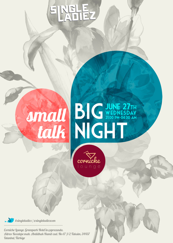
 (Scroll down to bottom to see whole poster)
This event poster is a great example of typography. It utilizes two very different typefaces to express meaning through type–a multiple-family mix. The first typeface, the one used for “small talk”, is a very casual cursive or almost handwritten font. It is a humanist sans serif typeface with a small x-height and cap height. Overall, I would say this this typeface is more condensed together, as there is little different between the cap height and x-height of the letters.
The second typeface used for “Big Night” and the small details listed next to it, are set in a geometric sans serif font which is set in all capital letters. The cap height is much taller compared to the previous typeface, and the x-height is relatively low. In this typeface, the stem on each letter is more elongated, the ascenders on the “H” letters are also more elongated compared to the cap height. You can see how the x-height is located much lower than a basic typeface in retrospect to the cap height especially well when looking at the letters “E” and the crossbar in the letter “A”.
This typographical poster uses both of these fonts well to make text into image. These typefaces correlate with the messages they are trying to tell. The “small talk” typeface has a short cap height and is in a casual cursive/handwritten typeface, which helps emphasize that fact that the event is casual and welcoming to women. The “big night” & details typeface has a long cap height and a shorter x-height which helps emphasize the importance of the event. It is more of a modern typeface and makes me think of something entertaining and cutting edge. It might be silly, but when I read the text I see it screaming at me “BIIIIG NIIIIGHT” in an announcer voice. Mixing these very different typefaces has worked well in this poster to emphasize specific details and create a certain feeling or emotion with each piece of text–these typefaces are telling the audience how to perceive the details.

Ugur Sayan. Istanbul, Turkey. https://www.behance.net/gallery/Single-Ladiez-event-poster/5233055
