
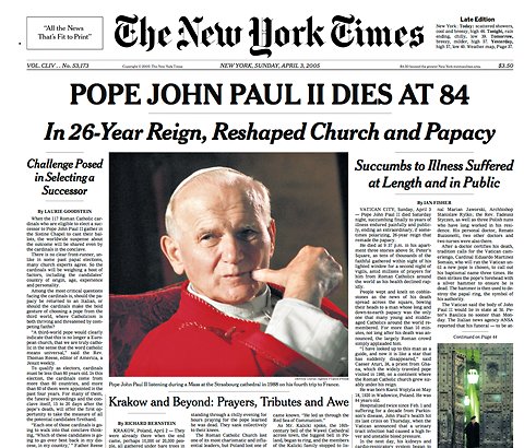
New York Times Newspaper Cover: graphics8.nytimes.com
The New York Times has been a typeface that has always stood out to me and stands out more than anything on the newspaper itself. The font is different in that it is not a font that is used commonly. The reason for this is that the newspaper utilizes relatively simple fonts for articles and headlines so The New York Times will be distinguished and catches attention.
New York Times title : gutenberg.org
The space between the x-height and the cap height is very small throughout the text. The letters sit on a line but it is somewhat hard to distinguish what the line is because of the serifs and the the odd descender and ascenders. The typeface also seems to have a bold and italic form to it. There is a major overhang from where the letters curve for each of the letters. The scale throughout the typeface remains unchanged.To me the typeface has a humanist style or old style for classification of font.
