Student Broadside Critique – Karen Marten


"Daffodils" by William Wordsworth Design by Melissa

“Daffodils” by William Wordsworth
Design by Melissa

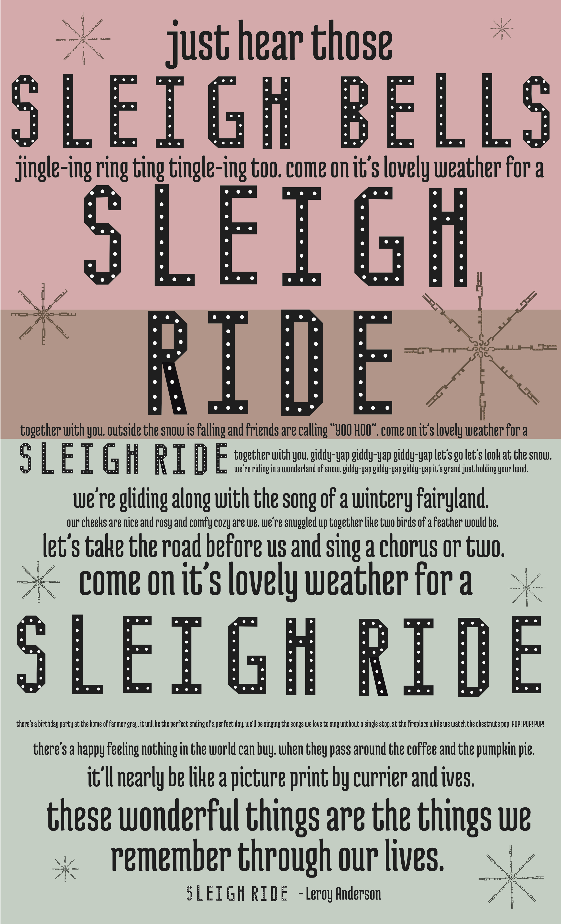
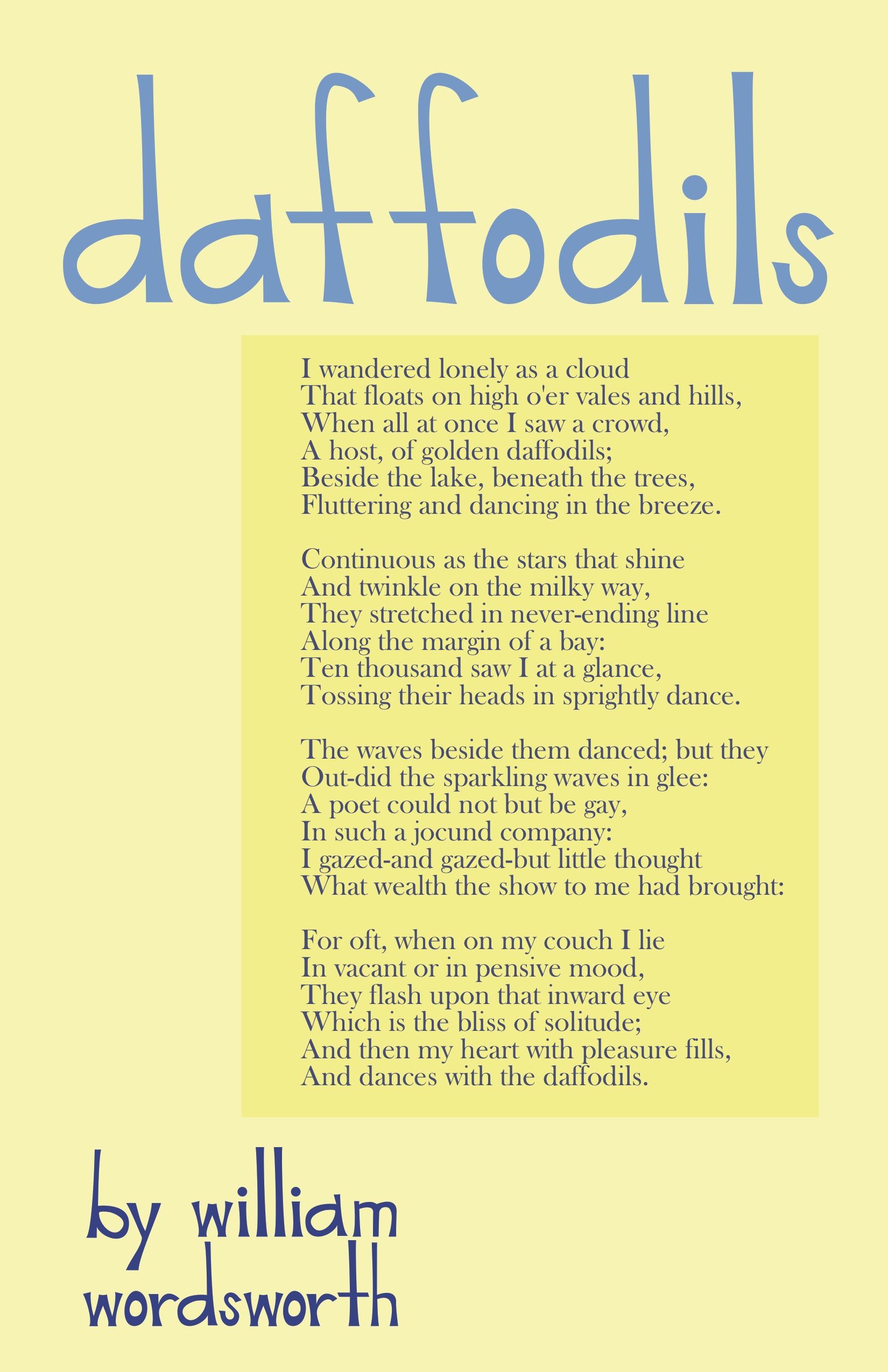
The design of this broadside by Melissa brings a sense of playfulness and warmth to the poem by William Wordsworth. The poem is about a field of daffodils and the way the narrator remembers the daffodils as happy beings dancing in a never-ending field. The mood of the text is cheery, uplifting and reminiscent, in a sense that a grown person gains contentment when remembering a specific event.

The bright yellow color is representative of the yellow daffodils as well as being known as a “happy” color, which references the mood of the poem. The complementary blue color that Melissa is using for the title and her hand-made font makes the broadside colors intriguing. The blue may also be representative of the narrator commenting on his frame of mind right before seeing the daffodils, when he describes himself as, “wander[ing] lonely as a cloud” the blue looks like the hue of the sky on a sunny day.

The size of the print would work better if the body text were larger, bolder or in someway easier to read. When close up, the text is not very hard to read but seeing the same font in the same size, for multiple paragraphs can make people want to skip over portions of the poem. The visual hierarchy in order from most eye catching to least goes: title, author and then body. In theory the idea of using the hand generated font seems like a good idea, but because the font is so large in scale compared to the body, it detracts from the focus of the poem.

The body could visually relate to the title and author more if the large portion of text was a more playful and organic font. Although the display level text does relate to the text because the long stems look similar to the long thick stems of daffodils, using a readable yet youthful digital font may have united the body and headlines more. On the other hand, I could see that using a basic, serious font for the body working since the poem is about a grown person remembering pleasant past times. The poem is serious but happy and illustrating that contrast in textual juxtaposition would be kind of difficult if both fonts were playful.

The complementary colors attract my attention from a distance. The size of the title is a good size, so that even far away the playful font draws me in and makes me wonder what the poster is about. It was a good idea to place a darker yellow text box around the main body is helpful to create space within the broadside, but I think a larger size would be better and more engaging to onlookers. Leaving some negative space around the body of the text is also helpful to readers especially since there is a lot of small text used. The alignment of the text being on the left hand side while the body is positioned in the middle is visually interesting, but I wonder if it would be more eye catching keeping the text with the box on the left hand side. Keeping the original line breaks of the poem may have been important to preserve the original feeling of the poem, but offering viewers more space with tracking or leading may help readers to not be overwhelmed by the amount of text to read.

Posted in Fall 2014 Archive (338) | Tagged | Leave a comment

Student Broadside Critique – Lauren Turner

This text is a Christmas carol (a song often sung to spread the spirit of Christmas during the holiday season) entitled “It’s The Most Wonderful Time of the Year”. The mood that is being conveyed is happy, cheerful, and artistic. It is casual while still remaining structured graphically. From far away, it appears calm, easy, INVITING. The broadside attracts my attention from a distance because at first, the cool, calm, color of the background which strongly invites me in closer to observe it. As I approach the broadside, I start to notice there is similarity between the framed background and the typeface incorporated into the title of the piece.

Designed by Hannah Croskrey

Designed by Hannah Croskrey

Because of this the broadside holds my attention as I come closer and closer to it. I am intrigued by the contrast of the typefaces chosen in the title. The cold, harsh, bold, black typeface in the title intrigues my eye. However, the typeface Hannah has created is thin and colorful. Despite this, I feel they work harmoniously together because of their geometric nature. They are both free of organic curves. The softer angles of the typeface Hannah created compliment the word it is spelling out: “wonderful”. I believe this makes the broadside very strong, especially up close when it is legible.

The large part of the broadside that is most eye-catching (especially at a distance) is the blurred illustration-like close up imagery of the typeface Hannah created. I love how this ties into her typeface and the title. I think it adds to what might be a broadside that doesn’t give enough credit to her created typeface, and makes it more than just a font that is part of the title. I am curious as to if someone not in this class, knowing what she did to create her typeface hands-on, would understand the connection between the graphic background she created to frame her text and typeface. I like how her text is illustrative (though subtle) in regards to what her text is about. We talked earlier in the semester about how elements or components of her text remind us of the Christmas season/holiday. The red, for obvious reasons, as well as the wood and nails having correlation to Santa’s workshop and making toys. Maybe how from a distance the nails in the typeface appear like lights which are obviously crucial to the holiday season. Also the simple matching colors of the typefaces of the actual text along with parts of the title unify the text and make it stand out (but not too much) against the background. The title is still the focal point while the text is small and understated. I think her hierarchy of her entire broadside works extremely well with drawing people in from far away as well as working to keep people engaged up close.

The chosen type styles are definitely appropriate for the text. The type style used for display level text could be a bit bigger, however, I understand for the paper proportion she chose why she decided to use the size she did for her title/display level text. The typeface she created and employed for her display level text was appropriate, especially with her use of eye-grabbing color and distinct character. But, when seeing the broadside from a distance it can be tough to make out the typeface Hannah created at the display level text. However you can make out the other display level text she employed as it is thicker and bolder.

The type style used for the main text seemed very appropriate. It is a serif, more formal type style which seems more classic and traditional which definitely compliments her text. It is very easy to read and there was no hyphenation issues. The only aspect of I don’t understand is the way in which it was decided to capitalize, not capitalize, and when to create a line break as it seems a little bit uneven. From a short distance however, the body of the text seems to have a great shape. It was only when I was up close that I began to question these things (i.e. some lines being over short). In regards to her type style for her text, I love overall its integration still with her typeface because of her chosen background. Her digital typefaces she chose to use still are blended with the background image of her created typeface so that even though she doesn’t use it often in her broadside, it is still prevalent and connected to her entire text. I also like how you can’t tell until you step up closer how the text that is not red is actually a very deep, dark, olive green. This means the entire text is either red and green which are obviously Christmas colors. This means the viewer might have more context for what they are reading once they actually START reading and notice the text is dark green instead of black. I appreciate how she still employed the two very prominent colors of Christmas without hitting the reader over the head with it and making it appear very cliché and generic.

I wish this broadside could be a bit bigger or larger. From far away it is hard to catch my attention. I believe she used the proportions of the 11×17 wisely and effectively. However, the size of her typefaces utilized in her title are hard to see or notice from far away. It is the image of her background (still technically her typeface) that draws me in from afar. I feel if she were to blow up her broadside just a bit larger in order to make her text size larger while keeping the same proportions, I feel her broadside would be more effective from a distance. I like the framing of her text, especially the leading between her typefaces in the title of her text. The leading in her main text is effective as well as it is large enough that even though the type is small, it is still legible, easy, and natural to read and follow the text. I think the tracking of the last four letters in the word ‘wonderful’ could be adjusted to be closer together. I also like her marking of sections are separated by a line space. I think it breaks up her text nicely and evenly in chunks of the song (even though I am not quite sure how she decided when to break). I like the center alignment of her text and how it complements the framing on the page. It reminds me of how I would view a carol book if I was a carol singer singing this song. The letterspacing of the “it’s the most” and “time of the year” in the title of this broadside I like because it balances out the boldness of the letters and also appears like it is almost mounting the principal point in the title which to me is the illustrative typeface.

Posted in Fall 2014 Archive (338) | Tagged | Leave a comment

Student Broadside Critique- Shannon Heric


Evan Matthews Broadside

Evan Matthews Broadside

After reading and observing Evans broadside I get the feeling he is trying to show of futuristic and space exploration. The text is an excerpt from an article about how Elon Musk has been working to advance technology to create a self sustaining colony on Mars and the ways he is working through it. Futuristic technology advancement into space travel is the meaning being portrayed by the text. The font Evan design as the display level text is very geometric and slanted   and the body of the text is set up with a different bold space age font. These elements help give off the mood of being desolate and futuristic.

Understanding the visual hierarchy presented by the broadside, I can see that the use of text placement and size shows what is more important to the viewer. This broadside attracts my eye from a distance because of the large display level type at the top in a white contrasting color to the rest of the dark composition. The main character of the article is enlarged the most within the title of the article and the rest of the tittle is smaller on two lines at the height of the type of the main character. From a far the title is the only thing that captures my attention because the body text is all the same font weight with slight distinctions of paragraphs with indentations. Looking at the broadside close up I was interested to read what the text was because the visual element was fluid throughout.

The chosen type styles are appropriate for the text as display level and for the type style. The display level is more of a decorative text that holds more meaning because if the sharp edges of the same width, long rectangular geometric type. This type of font would not be very legible when put into a large body of text like the excerpt from the article. The display level type is balancing on the line between decorative and modular because of the rectangular rounded, bold, italic style. The running text lines are very long which make it slightly difficult to follow the next line. The orientation of the running text is set up in four pretty even paragraphs but are very long sentences spanning across the whole page. A conceptual reason of why this is hard to read would be the dark gray and black running type are similar so the eye blends the text and the background together.

The spacial aspects of the type in relation to the mood, visual hierarchy, and chosen type styles have an important factor of the overall design of the broadside. The size and scale of the text at the top doesn’t leave much room for white space to naturally frame the title like how the author is frame with white space. In the running text the alignment is flush left with an indentation indicating a new paragraph. This flush left makes the text easier to read but the long lines are distracting for readability. The line spacing, leading, of the running text is very condensed and close. The letter spacing, tracking, is also very close together making the paragraphs seem more dense and tense which help convey the mood of technological advancement.

Some other decisions made that factor into the overall composition of the final broadside that work well are the choices of color and texture. The darker gray background with a thick black border are very suffocating and desolate which to me are adjectives I associate with space because you can’t breathe without oxygen in space and it is very quite. The use of positive and negative space could have been portrayed better by breaking up the text into multiple columns and creating more negative space since it was a larger amount of text. Overall this broadside was well designed and it gave off the correct feeling the text gave.

Posted in Fall 2014 Archive (338) | Tagged | Leave a comment

Student Broadside Critique – Amy Koller

Sandra used the text “The Star Thrower” for her broadside. This text is about a boy who is throwing starfish back into the ocean to save them from the heat of the sun. When an older man came up to the boy and told him that he was making no difference due to the short distance he was throwing them, the boy smiled and threw one farther into the ocean. He then replied with “It made a difference to that one”. With the whole story based around a beach setting, Sandra used an ocean display to put behind her typeface. In addition to this, she made the words go along what looked like to be waves. Therefore, it made a terrific visual example of the ocean. Not only was it visually appealing, but the words were still easy to read as well. Making this broadside an overall terrific composition. It gave off the mood of relaxation due to the hues of blue and the watercolor-like appearance. It also made me have a desire to go vacation on the beach and watch the waves roll in.

The Star Thrower - Broadside by Sandra Albertson

The Star Thrower – Broadside by Sandra Albertson

It’s easy to say that the visual hierarchy in this broadside is both the title and the author’s name. Since the title is on top, it’s the first thing the reader sees. Not only is it the first thing they see, but the font is bigger and more unique than the rest of the text. The same can be said for the author’s name. After reading through the story, one would naturally want to know who wrote it. Therefore, putting the author’s name at the bottom and in the same unique font as the title, it makes the whole broadside flow together. In addition to the title and author, Sandra decided to bold some words that were more important in the story. “Starfish” and “Old man” are just two examples. She seemed to highlight the words that were more important to the story. She also made them in all caps and a serif font, which stood out from the rest of the story that is not in caps and in a sans-serif font. By doing this, the reader is more drawn to these specific words, which help understand the story that is being told.

When looking at this broadside from a distance, my eyes are immediately drawn to the title. But when I work my way down and see the words aren’t in a straight line, I am intrigued and want to go up closer to the broadside to see what it says. Even though I see the title, the display of the main text is what would entice me to go in and read more. After approaching the broadside, it still kept my attention. My eyes wondered from letter to letter as I followed the “waves” of words. Even though there aren’t may “big parts” of the text, it still is stimulating due to the title and author with the larger texts and the mix of bolder serif fonts (which I mentioned earlier).

I think the type styles for this text are appropriate. The alphabet that Sandra made is very subtle and relaxing, which reminds me of a beach and the sand. I think the fact that she used a sans-serif font is also appropriate for the title since it usually gives off a more casual vibe. I also think by trowing in a serif “the” in the title was appropriate as well. Although the text takes place on the beach, it is still a story and therefore needs something like a serif font to make it look more professional. There’s something about serif fonts that scream books and old stories to me. She also did a nice job incorporating both sans-serif and serif fonts into the main bulk of the text. It’s easy on the eyes and isn’t too distracting. Since she made the sentences go in a wave pattern, she would have needed to use more simple fonts, or it would have been too much to look at (not to mention it would have taken away from her designed alphabet). The text of the story is easy to read because of this. I was able to follow along easily and was not distracted by the way the text was displayed. That’s a very hard thing to do, and I think Sandra pulled it off beautifully. The lines stretch almost to the end of the page, which i think goes along nicely with her background. If the lines were shorter, then I probably would have had a hard time following the story and would have gotten lost in the text. The line spacing is fairly even, even though the way she displays the sentences are not traditional. The letter spacing is also even throughout the text. Even while examining her  title, I could see that the letters were spaced in accordance with one another. Kerning is the same as the tracking. Even and precise throughout. You can tell what the beginning of a paragraph is since she had indents throughout the text. The indents were noticeable, but subtle enough to not disrupt the wave-like display.

The broadside has a texture of water due to the fact that she used a good amount of blues that all blend in together. This also helped create positive and negative space. The blue colors being the positive space, and the lack of color at the top of the page being the negative space. By doing this, she was able to make the title stand out more. Also, by adding a lighter blue to the bottom, the author’s name stands out too. This creates an equal balance of colors and does a great job highlighting the important parts of the broadside. Overall, I really enjoyed viewing this design. The mix of colors, style of text, and the waves of sentences made me feel as though I was in the story myself.

Posted in Fall 2014 Archive (338) | Tagged | Leave a comment

Student Broadside Critique – Katie Tufts

Jack's Broadside

This is a broadside made by Jack of a piece by Edgar Allen Poe called A Dream Within A Dream. This poem is about the difference between a dream and reality and not being able to tell which state you’re in. It’s also about not being able to grasp a single moment, like grains of sand slipping through fingers. It questions life being one big illusion, wondering if you’re living in a dream or real life. The mood of this poem is very mysterious, I believe that because the question that is repeated makes the readers sit and wonder, “Is all that we see or seem but a dream within a dream?” Also because of the style that the poem was written the readers might have to slow down to fully understand what they are reading.

The hierarchy of this broadside has about five different levels. First I see the font in the middle “is but a dream within a dream” then next I see the font at the bottom, which says “but a dream within a dream?” Both of these sentences are the same except for one word, which leads me to believe this must be the title of this text. Then my eyes are brought to the top where the author and title name are, then finally I start to read the main body text. From a distance my eyes are definitely drawn to the large type in the center of the page, “is but a dream within a dream,” but that is the only readable sentence from far away.

The type that was chosen to accompany the large type has a similar look and feel to it. Both typefaces have forms of serifs as well as similar x-heights. The type used for the main body text I can tell was picked probably to go with the time in which the poem was written. The tracking of this type is very close together which makes some of the words hard to read making it difficult to keep my attention when reading through it. There is a good length of each sentence in the main text. This helps reading the poem down the page and makes it quick to the point. The text being center aligned is also kind of distracting to the eye when reading but I think goes well with the overall layout of the broadside.

I find the different sections of the broadside interesting. The poem seems to be split in half by just making one sentence extremely larger than all the rest. It almost makes it seem like the poem is supposed to be read in two separate parts/paragraphs. When thinking about what the poem is talking about it makes me think that the first paragraph is describing what could be the dream and the bottom paragraph could be describing reality. I think that by creating these different sections, the broadside was given some sort of shape and also gave it a more balanced look.


Posted in Fall 2014 Archive (338), Uncategorized | Tagged | Leave a comment

Student Broadside Critique- Marci Hohner

I am critiquing Jacob Oster’s broadside entitled “Paying Homage to two Skiing Legends”.

typeface final  1.2 copy

The text is about two skiiers whom passed away in a skiing accident. It reads slightly like an obituary, paying their condolences to the lost, but with a more celebratory-of-life type vibe. It is from an online article, not sure where, but you can tell from the format of short paragraphs and suggestion to view the video below. It gives an overview of their influence on the sport, and the situation of their death (“both perished last week in an avalanche accident when they were swept down several hundred metres while climbing a couloir on Monte San Lorenzo Chile”), then goes into personal profiles of each skiier. The mood of the text is sad, but happy in the light of the great lives being discussed.  The text ends with a quote from one of the two “You can choose to see a friend’s death as something tragic, or something beautiful. You can choose to believe what you like on what happens after death. You can choose to create whichever reality you like. So then create a reality you like!”, and a final concluding sentence on the accident.

The mood of the broadside reflects well the message and mood of the text. The color (a purple-blue), is somewhere between warm and cool. It is definitely relatable to skiing, and is already an association I have in my head. The peaks on the actual letterforms is really cool, I think they have been used extremely effectively to create the typeface. They represent aspects of skiing that doesn’t necessarily scream “SKI” or “SNOW” at you. The geometric modular grid is also effective, it gives the shapes depth and slopes like a mountain would have.

The hierarchy in this broadside primarily comes from the contrast between the large lettering of the title VS the small typeface that the actual excerpt of type is in, though there is a tad more contrast within that. The title is in the upper right hand corner, and the main text is within a background design (patterned geometric shapes like those that make up the letter forms) on the bottom left. The placement of these two things is balancing, and successful. The title is clear, and the background of the main text shows not only consistency but the relation between the title and text. Within the text there are a few variants, “JP Auclair” and “Andreas”, the names of the skiiers- are both bolded. I think this was a successful move to put some emphasis on them, however the boldness makes me think of a hyper link or something done in an online article (as we know it is) and moves my mind away from the broadside and to the way the type would look on a white screen. There is also some contrast in the last paragraph, when the write discusses the quote from one of the skiiers. I think like before, the emphasis on these words is important, however the typeface chosen seems out of place with the design of the rest of the piece. I think it could have been done more effectively with use of space and size.

The broadside is very intriguing from both afar and up close, I was drawn to it early on due to the use of color and variants of the hue. Also as I said before I think the layout is effective because of the balanced feel, which also drew my attention. From afar the small type isn’t super noticeable, mostly because you are consumed by the larger type. So once you are closer that draws your attention in, and I think that is a very successful aspect of this particular broadside.

Screen Shot 2014-11-18 at 2.26.01 PMThe typeface chosen for the excerpt seems to fit  the piece well, but I found the combination of font, color, and layout a bit difficult to read. The line breaks seem to be a part of why it is difficult to read, but on another note I like the way they break the line of lighter purple that is beneath them as background, and the white pops on the peaks of medium purple coming off of the design. (I included a picture to the right because that was difficult to describe). I think this puts emphasis on the diagonal line that is representative of the “ski slope” and is important.

I think that the paper size is very appropriate for this design, and it looks almost like a cool ad that you would see around, only it contains more context that may be unexpected in this type of design. I think the sizing is very appropriate for this particular design and type, however if this had been taken a different route with the design I think it could also be presented successfully on a smaller handheld piece of paper (to be more formally and intimately read due to the lives being discussed). But I really like the route taken by Jacob to do something other than that, and think the layout, color, and typeface he designed effectively work to present this type that, like the broadside, isn’t extremely traditional in discussing death, but celebrating it.

Posted in Fall 2014 Archive (338), Uncategorized | Tagged | Leave a comment

Student Broadside Critique- Sandra Albertson

Amy Koller's Broadside

Amy Koller’s Broadside PDF

The broadside that I was chosen to critique is Amy Koller’s of the song “Sleigh Ride”. At first glance, the broadside is very visually appealing and balanced. All of the text is centered throughout and feels organized. The words “sleigh bells” and “sleigh ride” are written in Amy’s designed font, which I feel was very successful. Amy’s typeface is the one that sticks out the most to me and gives the broadside a sense of identity. Having the typeface all capital letters helps capture attention as well and makes the broadside work from a distance. The letter spacing in “sleigh ride” is somewhat large which helps it work as display level text. There is one other typeface used for the rest of the poster and I think it does a great job of complimenting the designed font. The size of type varies much throughout the poster, and it seems to go from small to large, leading up to “sleigh ride”. As you read through the broadside from top to bottom, the different font sizes seem to work well with the song. Sleigh ride is written five times on the poster and each time is at a different size or position. This pattern gives the broadside a sense of unity. The second largest text pieces are “come on it’s lovely weather for a” and “these wonderful things are the things we remember through our lives”. These might be second in hierarchical order because they are important parts of the song that add a lot of feeling and therefore should be easy to read. Line spacing feels fairly normal throughout, but some lines are closer together than others. I wonder if the designer did this on purpose or if everything is supposed to be even.

Photo of Broadside on Ivory Paper

Photo of Broadside on Ivory Paper

There are two colors used in the broadside and they seem to be translucent red and green. Then there is a rectangle in the middle where they overlap and make a brown-ish color. The brown color somewhat encompasses the word “RIDE” and makes it stand out more. When the actual broadside was printed on ivory paper, the red color turns into more of an orange, which slightly confuses the Christmas color scheme. I am not sure that faded colors are the best choice for such a cheery subject and maybe she could use a more saturated red so that it still appears red on ivory paper. I do enjoy the choice of ivory paper because it adds an old-timey Christmas feel to the song as opposed to being printed on clean white paper. There are also subtle snowflake designs along the sides of the poster, filling in space and keeping things balanced. I think the snowflakes do a great job of contributing to the theme as well as concluding the overall design. The type seems to be carefully chosen and arranged in order to embody the spirit of the text. Without the snowflake designs, a similar message would get across, but the snowflakes make it more obviously holiday related. Overall, Amy uses a sort of typographic poetry to capture the essence of “Sleigh Ride” and I think she did a wonderful job.

Posted in Fall 2014 Archive (338) | Tagged | Leave a comment

Student Broadside Critique–Jacob Oster

Typeface Project Broadside Final 2

Designed by Marci Hohner

1) What is the text about and what mood is being conveyed?

2) How do you understand the visual hierarchy presented by the broadside?

  • Does the broadside attract your attention from a distance? Why or why not?
  • Does the broadside keep your attention once you approach it? Why or why not?
  • How do smaller parts relate to larger parts?

3) Are the chosen type styles appropriate for the text?

  • Does the type style used for display level text seem appropriate?
  • Does the type style used for running text seem appropriate? Is it easy to read? Are lines overly long or short? Is there excessive hyphenation? Have special characters/glyphs been appropriately replaced? (If it’s hard to read, is there a conceptual reason?)

4) Make sure to consider spatial aspects of type in relation to questions above:

  • Size/scale
  • Alignment
  • Line spacing (leading)
  • Letterspacing (tracking)
  • Kerning
  • Marking of sections/paragraphs

5) Do any other design decisions affect your interpretation? (Such as paper size/proportion, color, texture, layering, balance, use of positive/negative space)

Mood

The text, “The Eight Pillars of Yoga”, is about the eight pillars, or limbs, of yoga which together “outline a plan for living that flows from action to knowledge to liberation.” Each paragraph talk about different limbs and how the are “the spokes in the wheel” of enlightenment. This instantly creates a feeling of fullness and completion.

The mood that the text alone immediately creates is spirituality. The journey from dark to light that is spoken about in the text lends to this feeling and also contributes a feeling of transition or change.

Hierarchy

There is absolutely visual hierarchy within the broadside, however it is used non-traditionally. Rather than leading the viewer from top to bottom as traditional broadsides, newspapers, and other generic prints do with large titles and smaller paragraph text, Marci doesn’t have a top-centered title but the title is immersed within the text and spread out among the whole broadside. This lends to the idea of change as the title changes weight, darkness, and horizontal/vertical position. I am especially attracted by the the word “Yoga”–recognizable and relatable–as it is also the largest and most prominent part of the broadside.

The actual literary portion of the broadside leads you through each of the pillars in yoga which, as a whole, lends to one’s personal enlightenment–suggesting transition. This transition is further suggested by the title “the eight pillars of yoga”. The first three words are center aligned and at the top of the broadside, colored light grey and carrying light line weight. the next part “of” is the same shade of grey but larger, sharing the same line weight. This is all overshadowed by the larger, darker, heavier part of the title “yoga”

The fact that the word “yoga” is positioned behind the last paragraph and stands out the most is due to the fact that one must practice all 8 pillars of yoga, thus actually reading through the whole broadside to have a well-rounded understanding of ALL the pillars.

Text

Marci’s display level text is appropriate as it immediately looks and feels light, natural, and unique. The fact that she uses dots and rounded shapes in the bowls makes each letter feel natural, balanced, and happy. The dots and shapes almost give the letters humanistic qualities like eyes and smiles, contributing to the overall natural, healing feeling that is produced by the broadside.

The type style used for the running text, is an old style type which gives the text a long-lasting and trusted feel. The fact that the older-feeling running text is much smaller than the larger, happier, more natural-feeling display text allows for both text styles to live in harmony while contributing to the old-to-new, dark-to-light, nature of the text.

The line spacing for the running text is consistent throughout which sets a steady, easy-to-read pace for this portion of text. The justified quality of the text creates flow while going from line-to-line is easy due to the small type size and type box. All other aspects of the type anatomy such as kerning, tracking and paragraphs create an enclosed, nicely-spaced piece of text.

Other Design Decisions

The way in which the broadside was produced–on special paper and not digitally                 printed–continues with the natural tone already set by the other elements of the broadside. The fact that the content in the broadside is constrained to the middle and far away for the physical edge draws the distant viewer in while containing ones eye and their attention for the intimate viewer.

Posted in Fall 2014 Archive (338), Uncategorized | Tagged | Leave a comment

Student Broadside Critique – Danielle Clement

I have been paired with Brian for this broadside critique.

Designed by Brian DTC 338.02

Designed by Brian
DTC 338.02

1. The text is an excerpt from The Eberron Campaign Setting by Keith Baker. It is a guide to the fictional game, Dungeons and Dragons. The text discusses the first level ‘Infusion List’ and lists off the enhancements, skills, magic, and weapons that are available and provides a description of each and the bonus that come with. The mood of this text is more serious, appealing to fighting and violence and the magical qualities the game possesses.

2. The Broadside uses visual hierarchy to draw in the eye. The first thing my eye saw was the text reading ‘Artificer’ in Brian’s custom designed typeface. Although it is placed at 90 degrees to the left, it is set at a large size and utilizes quite a bit of space. Brian’s custom designed typeface provides contrast from the rest of the broadside, as it is the biggest element within it. The next element I was drawn to was the ‘Infusion List’ title, which is also in Brian’s custom designed typeface, placed in a smaller size, but still big enough to stand as a title. Next I see the ‘First Level:’ text which stands as a subtitle and introduces the first level of enhancements weapons, and magical powers. Brian does a good job at using visual hierarchy and this is apparent through his use of the same typeface in different sizes. He uses a large, dark typeface for each subsection, such as ‘Armor Enhancement, Lesser:, or ‘Energy Alteration’. Underneath he uses a light weight version of the same typeface for the description of each. By placing these two versions of the same typeface together, Brian creates great contrast.

I would say this broadside needs more oomph to catch my attention. Although he utilizes visual hierarchy well within the page, it does not grab my attention and looks rather plain. I think using color would benefit his design.

3. As I discussed before, I agree with Brian’s display typeface choice. I think it is good that he found a typeface with different versions and he modified them to work for his chosen text. I would say the descriptions for each subsection are a little light and are hard to read from a distance. Maybe he could play around with this by adding a stroke.

4. I have already discussed the size/scale and marking of sections above. I would say he could work on the leading (line spacing). Personally, I would put more of a space after each section and its description to use white space as an assumed line break. This would help to break up the text and would provide more of an optimal reading setting. I like the tracking (letter spacing) settings he used, especially in the subsection texts. It gives enough space to stand as a title or plane, but does not make it harder to read.

5. I definitely think that Brian could have used color in his design. Maybe he could have used colors that reflected the book and game? I think that would help to tie in the whole concept, as well as attract the eye to the broadside. I looked at a picture of the book and it was filled with lots of color and texture. If he included some of those elements in the background, people who play the game and have read the book would recognize the same theme used and would probably be attracted to it more! To me, it looks more like a handout than a broadside poster, but with a few adjustments, such as color and texture, I think the whole concept could be enhanced.

Posted in Fall 2014 Archive (338) | Tagged | Leave a comment

Broadside — Jacob Oster

Total Immersion. “The text is an image and the image is a text.” This describes a situation in which the work does not exist in the same way if only the language is reproduced. Traditional roles of writer and designer are defied.

IMG_0691

The Broadside I chose to analyze, “Racism Kills”, is a great example of total immersion as the text alone, ” Racism Workshop March 9 and 10…Racism Kills” alone seems incomplete and frankly weak in terms of the underlying message. The picture of a black man chained, and pierced with an American flag gets down to the core of the workshop while including imagery that suggests racism happens to all types of blacks (as the man is halfway in shadow which has an afro and a more Black Panther-like fist pose, while still chained). The striking image absolutely compliments the text and completely elevates the message and passion involved in what the broadside is trying to get at– attending a racism workshop and, consequently, ending racism in America.

Posted in Fall 2014 Archive (338) | Tagged | Leave a comment