
Evan Matthews Broadside
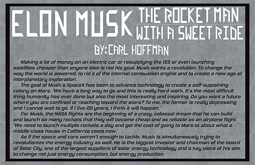
After reading and observing Evans broadside I get the feeling he is trying to show of futuristic and space exploration. The text is an excerpt from an article about how Elon Musk has been working to advance technology to create a self sustaining colony on Mars and the ways he is working through it. Futuristic technology advancement into space travel is the meaning being portrayed by the text. The font Evan design as the display level text is very geometric and slanted and the body of the text is set up with a different bold space age font. These elements help give off the mood of being desolate and futuristic.
Understanding the visual hierarchy presented by the broadside, I can see that the use of text placement and size shows what is more important to the viewer. This broadside attracts my eye from a distance because of the large display level type at the top in a white contrasting color to the rest of the dark composition. The main character of the article is enlarged the most within the title of the article and the rest of the tittle is smaller on two lines at the height of the type of the main character. From a far the title is the only thing that captures my attention because the body text is all the same font weight with slight distinctions of paragraphs with indentations. Looking at the broadside close up I was interested to read what the text was because the visual element was fluid throughout.
The chosen type styles are appropriate for the text as display level and for the type style. The display level is more of a decorative text that holds more meaning because if the sharp edges of the same width, long rectangular geometric type. This type of font would not be very legible when put into a large body of text like the excerpt from the article. The display level type is balancing on the line between decorative and modular because of the rectangular rounded, bold, italic style. The running text lines are very long which make it slightly difficult to follow the next line. The orientation of the running text is set up in four pretty even paragraphs but are very long sentences spanning across the whole page. A conceptual reason of why this is hard to read would be the dark gray and black running type are similar so the eye blends the text and the background together.
The spacial aspects of the type in relation to the mood, visual hierarchy, and chosen type styles have an important factor of the overall design of the broadside. The size and scale of the text at the top doesn’t leave much room for white space to naturally frame the title like how the author is frame with white space. In the running text the alignment is flush left with an indentation indicating a new paragraph. This flush left makes the text easier to read but the long lines are distracting for readability. The line spacing, leading, of the running text is very condensed and close. The letter spacing, tracking, is also very close together making the paragraphs seem more dense and tense which help convey the mood of technological advancement.
Some other decisions made that factor into the overall composition of the final broadside that work well are the choices of color and texture. The darker gray background with a thick black border are very suffocating and desolate which to me are adjectives I associate with space because you can’t breathe without oxygen in space and it is very quite. The use of positive and negative space could have been portrayed better by breaking up the text into multiple columns and creating more negative space since it was a larger amount of text. Overall this broadside was well designed and it gave off the correct feeling the text gave.
